15 fantasy portrait tips
Learn how to achieve realistic fantasy portrait paintings that stand out from the crowd.
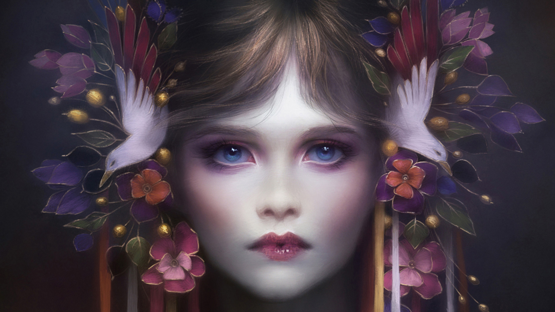
Fantasy portraiture is my favourite subject. Bringing an original character to life is exciting, but can be difficult to achieve. To avoid mistakes and save time I try to follow a few rules. But they're really just guidelines, so feel free to adapt, change and test other techniques that might better suit your painting process.
There's more to portraits than knowing how to draw a face. It's worth spending time and effort trying to understand how a face 'works', such as under a particular lighting setup. Such a skill won't be grasped overnight. The most important thing to bear in mind is to take your time. This is the best advice I can give, because nothing good comes from rushing a painting.
Take your time – nothing good comes from rushing a painting.
Melanie Delon
The main challenge in a portrait painting is to make the character stand out. Usually there's no surrounding decor in the environment to help you achieve this goal, and a finished, polished portrait can often end up looking flat and boring. Thankfully, there are several simple and effective ways to achieve a striking portrait.
01. Plan with preparatory sketches

Before starting an illustration, I always do some quick pencil drawings to lay down my ideas. This helps me to see more clearly what I want to do and express, and be more confident about the direction I want to take. I use these sketches to build the composition, reworking them slightly in Photoshop CC if necessary. Usually I like to keep them rough, because this gives me more freedom during the colouring process. I feel restricted by perfectly clean line-art.
02. Get the proportions right
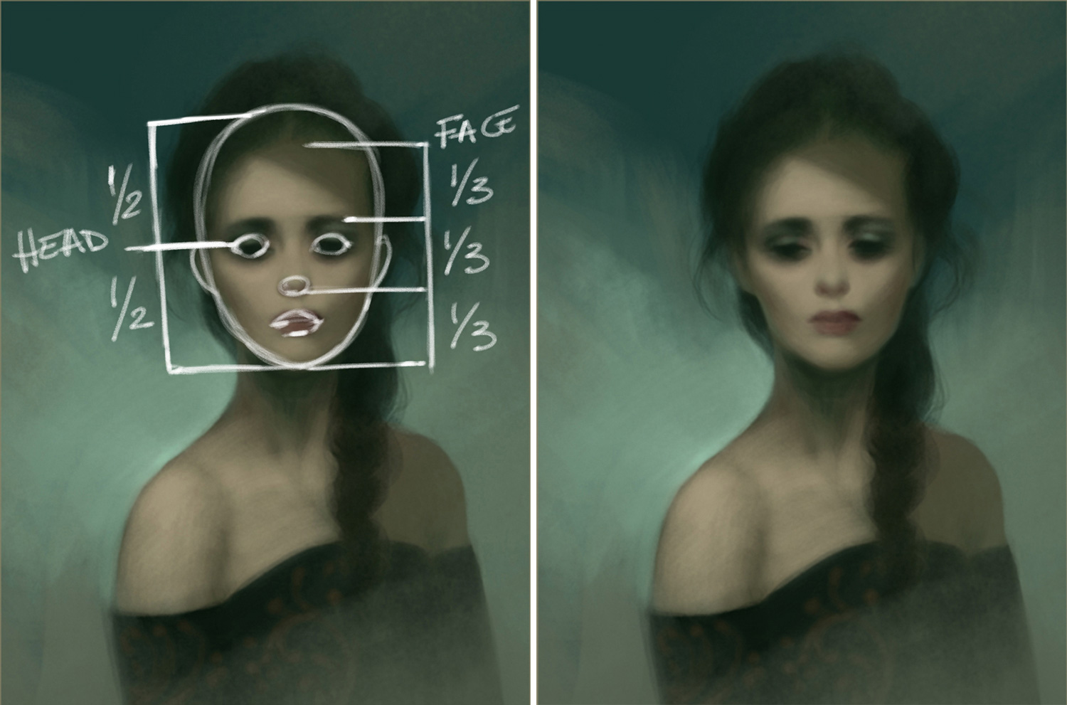
It's important to be aware of the proportions of a human face. Of course, they're only guides – everyone has a different face shape that doesn't necessarily meet the beauty standard – but it's essential to know these rules, if you're going to play by them and break them.
I recommend practising with facial proportions until it almost becomes instinctual to apply them to a portrait piece. I always start with a basic oval and then slowly add the facial features to build up the character's face.
03. Avoid pure black and white
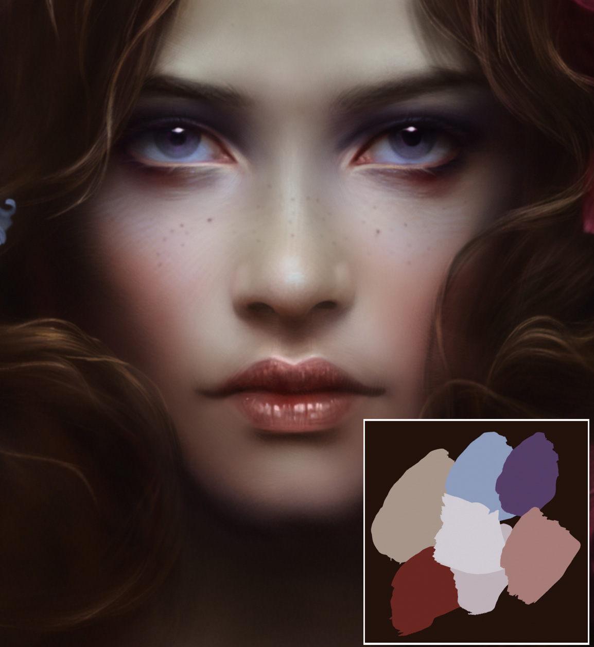
Usually the biggest mistake in a portrait painting is the skin's colour: it's never either beige or black. Skin comprises a multitude of colours, from pale blue around the eye, to pink, to hints of yellow for the mouth's corners. I start painting with very few colours, and progressively add more hues.
Get the Creative Bloq Newsletter
Daily design news, reviews, how-tos and more, as picked by the editors.
I save my colour palette in a corner of the illustration so it's always on hand. So I don't end up with a muddy look, I avoid using pure black or white. Instead, I increase the saturation to the colour I using for the shadows.
04. Develop a dynamic composition
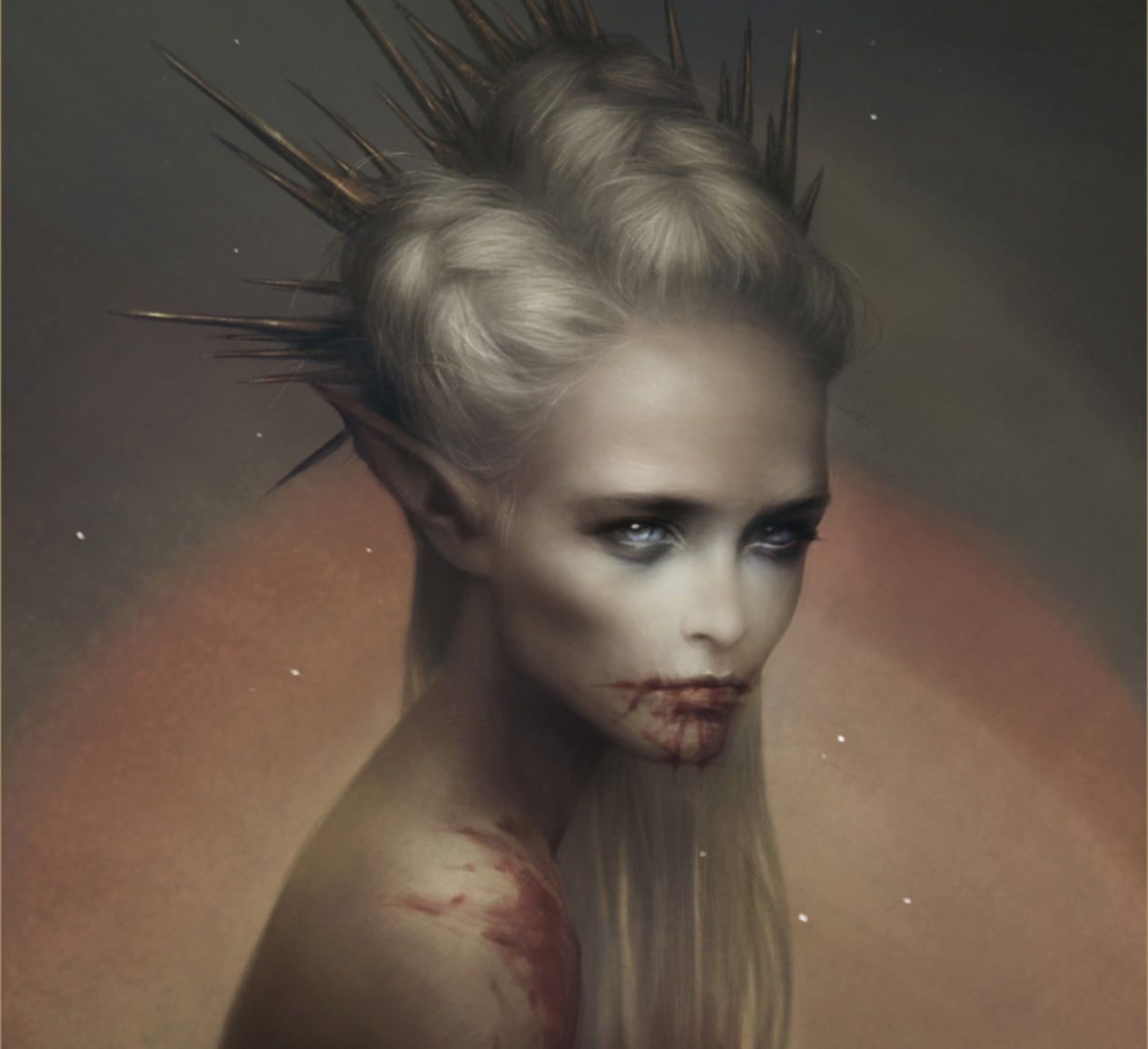
The composition and placement of the character in the illustration is essential for introducing dynamism to the painting. I always try to imply a slight torso movement, which avoids a straight and boring posture.
Placing the character's face in the centre is a classic approach and works well, but I also like to nudge the character towards a corner of the image to add a little originality, and free up space in the scene. I find that slightly tilting the character's head helps to add visual interest and life to an image.
05. Work the background
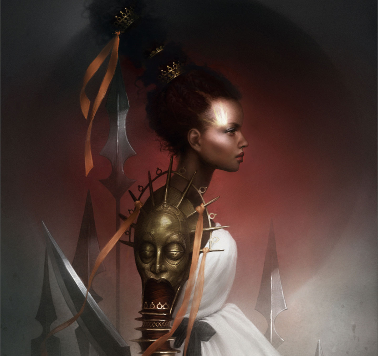
The background can also help give more impact to the portrait. I don't like to overload it with details, preferring instead to leave it relatively plain to avoid any unnecessary visual distractions. I usually add subtle texture and a gradient to avoid a flat, lifeless look. An alternative is to add blurred elements, such as a forest or a building, to give the character context and hint at their story.
06. Introduce realistic details
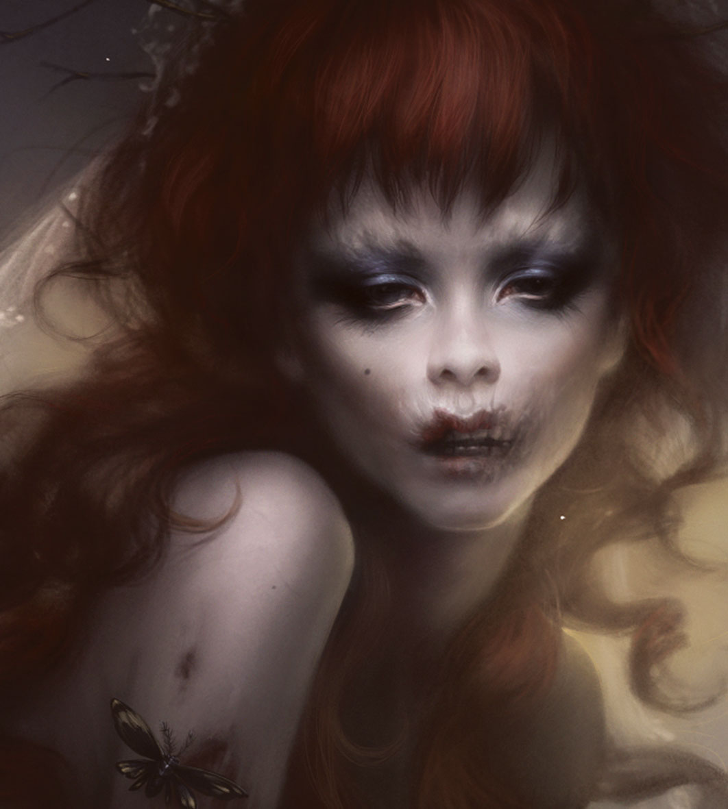
Small details such as veins or beauty dots won't be immediately apparent, but will give the last touches of texture and realism to portraits. These can also tell a story: for example, exposed veins can be useful for depicting a vampire or a person who's ill.
I generally use the same brush to create these details: a very fine brush that allows for precise work. I slightly blur the brushstrokes' edges to unify and soften the details.
07. Emphasise key facial features
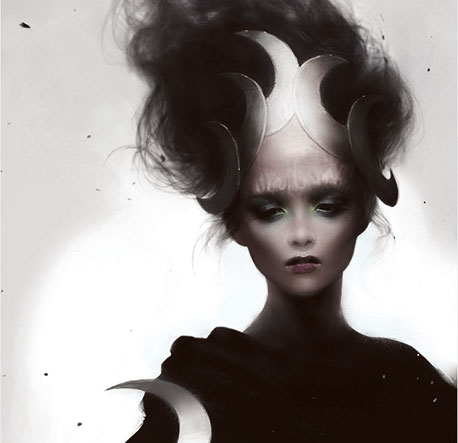
It's easy to get lost in the details, even in an intimate portrait piece. To avoid this and save time I don't detail the entire illustration, instead only working up the areas that I want to draw attention to. For a portrait the most obvious area is the eyes, but depending on the lighting and the story I want to tell I can add a second focal point, usually a key costume element.
08. Maintain eye contact
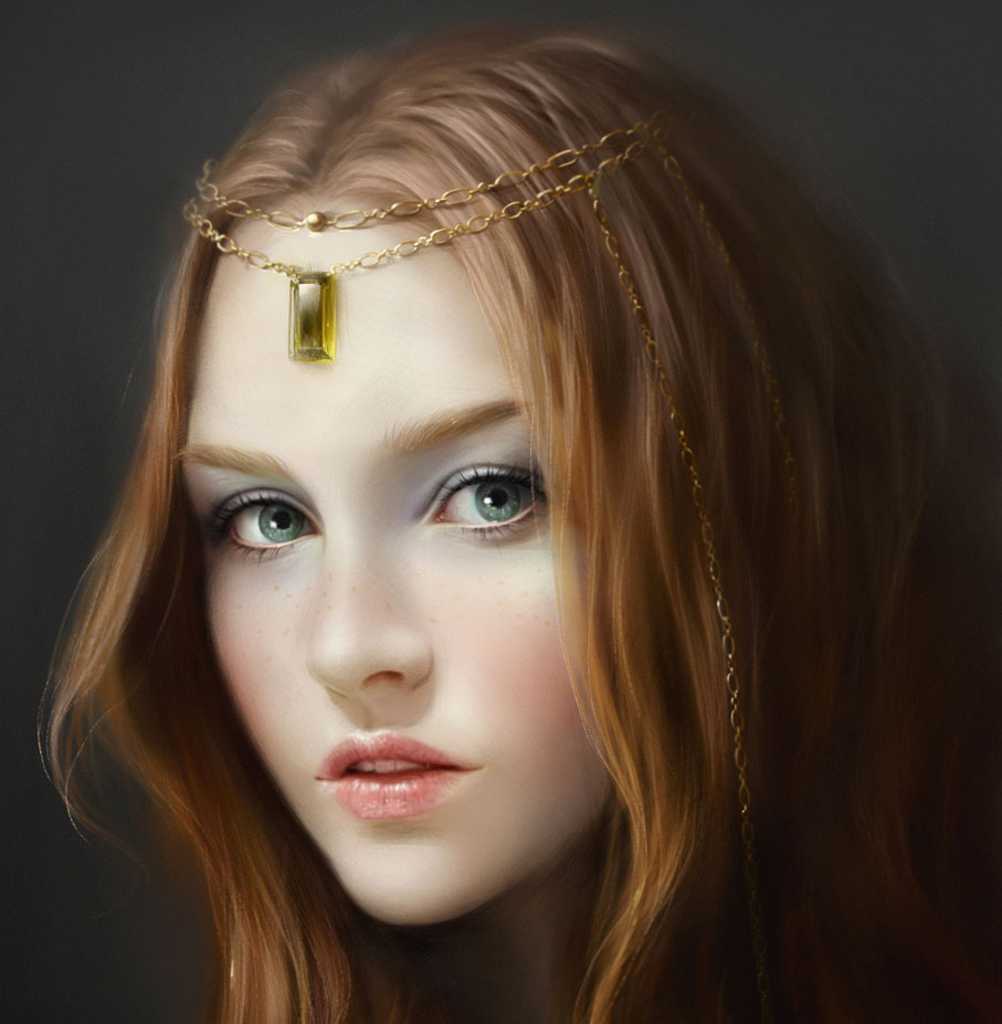
Even in the busiest of compositions, a face will always catch the viewer's attention. And to make the face even more powerful and striking, ensuring strong eye contact remains the most effective trick. The viewer is instantly connected with the character.
It's an effect that I use a lot in my portraits… perhaps a little too much! But I also love to play with more subtle glances, which are less direct and help to develop a sense of mystery, raising questions in the viewer's mind.
Next page: More top portrait painting tips

Thank you for reading 5 articles this month* Join now for unlimited access
Enjoy your first month for just £1 / $1 / €1
*Read 5 free articles per month without a subscription

Join now for unlimited access
Try first month for just £1 / $1 / €1
Mélanie is a freelance illustrator who specialises in fantasy. She is a digital painting instructor at CGMA.
