10 amazing things you can do with layers
One of the simplest aspects of Photoshop is also one of the most versatile.
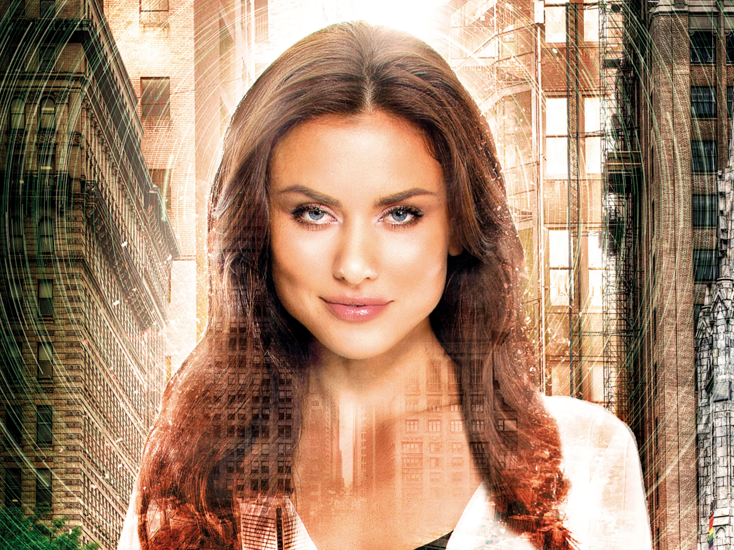
Layers are what enable you to build a project from the early foundations to the finishing touches. It's hard to believe it now, but they weren't always a feature in Photoshop CC; it was only in the third version that they were added.
These days though, layers are at the very centre of everything you do, and it's hard to imagine any kind of project without them. They're not just a tool to keep you organised, they help you structure your work, from the background layer up. The key to creating amazing imagery or experimental design isn't necessarily in how skilled you are as an artist: so long as you keep your layers and workflow simple, it's easy to create something incredible.
Whether you're embellishing your portraits, creating typography-inspired work or making an isometric composition, layers are key. There's so much to discover from this simple organisational feature, and by learning little tips and tricks to optimise your layer usage, you can improve your understanding and use of Photoshop as a whole.
They may not be something you notice when you look at a picture, but it's highly probable that the Layers palette will be behind the best images you'll ever create in Photoshop. To get you inspired, here are 10 amazing things you can do with them.
Download the files to accompany these tips.
01. Use Fill/Opacity
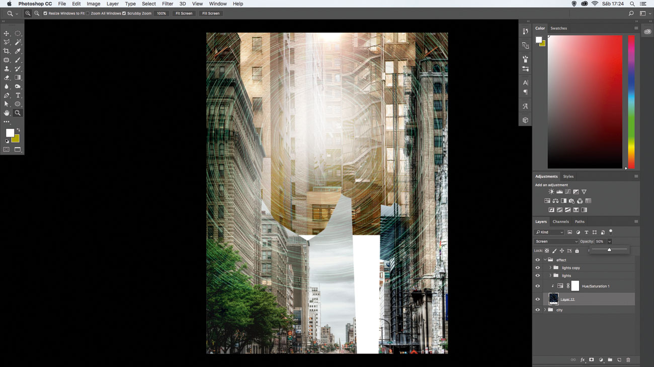
A good way to blend a new image or an effect into the scene is to work with Fill/Opacity. Place the 'main_texture.jpg' photo, change the blend mode to Screen and to make it softer, go to the Opacity menu and change it to 50%.
02. Convert to Smart Object
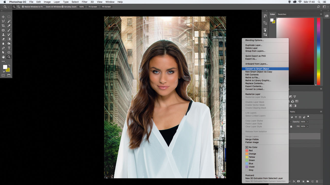
Click on the woman layer, ctrl/right-click and choose Convert to Smart Object. This will preserve the original size of the picture, so it's possible to decrease the size and then increase again without losing any image information.
Get the Creative Bloq Newsletter
Daily design news, reviews, how-tos and more, as picked by the editors.
03. Sharpen with merged layers
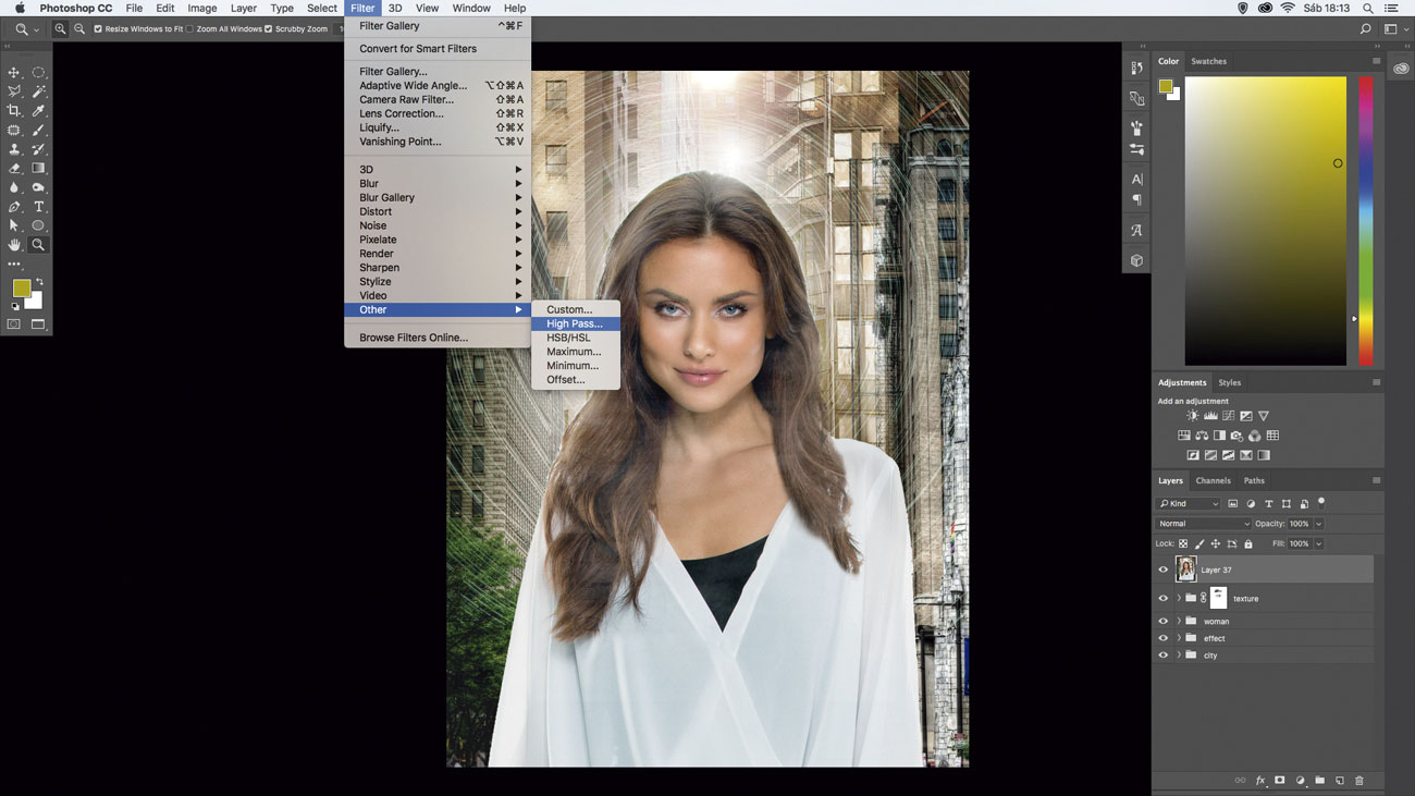
To quickly apply the High Pass filter to the whole image, select all the layers and merge at the top of your stack (cmd/ctrl+alt+shift+E). Then go to Filter > Other > High Pass, set to 2px and change the blend mode to Soft Light.
04. Add textures
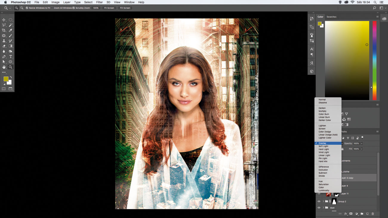
To make your artwork even more interesting, add a city texture to the clothes. To do that, add 'city_womans_clothes.jpg' and change blend mode to Overlay. To enhance it, duplicate (cmd/ctrl+J) and change Opacity to 80%.
05. Add atmosphere with filters/adjustments
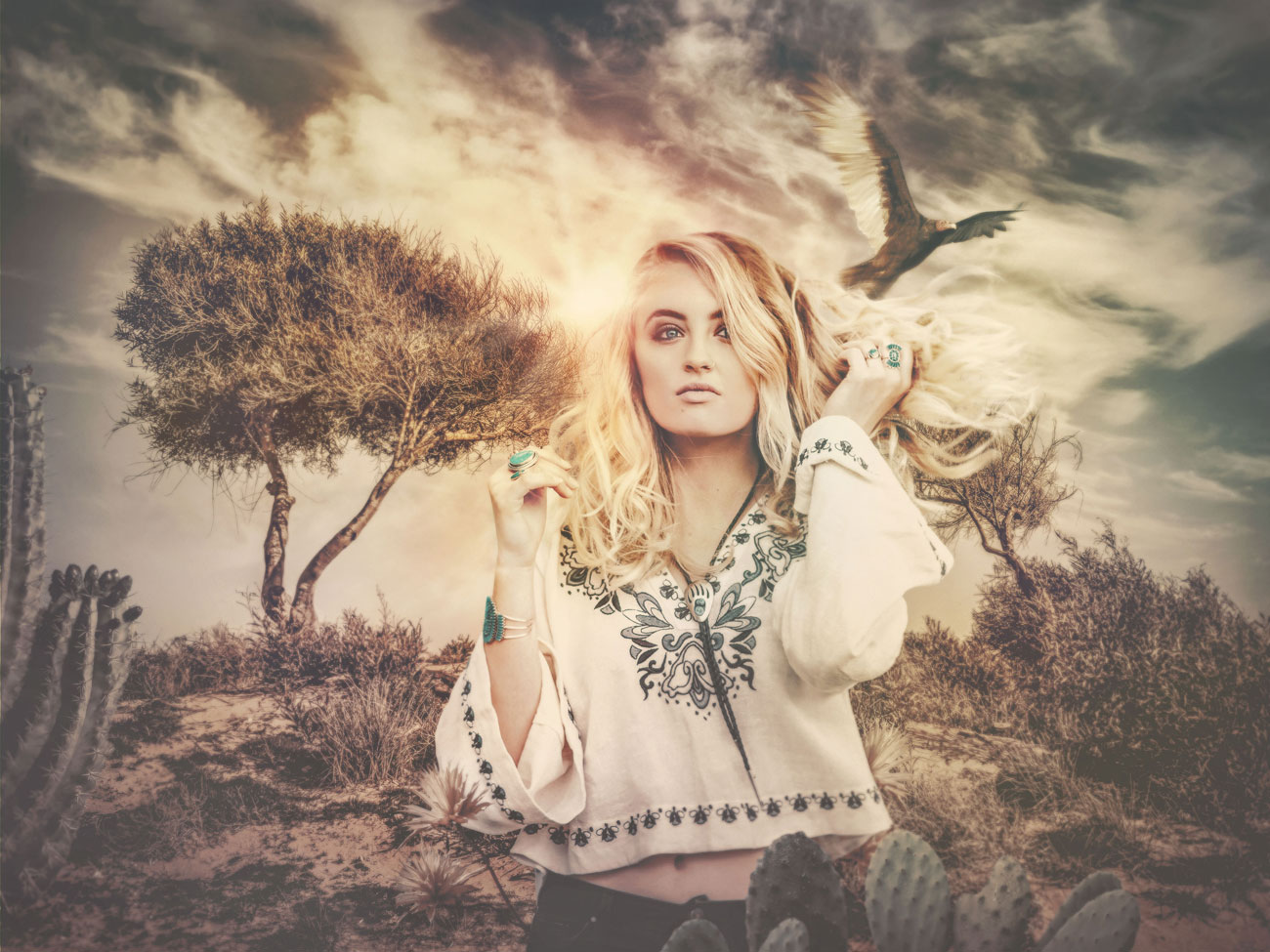
Choose a background, a model and an array of complementary objects. Select and isolate the elements. Place and arrange the pieces in the main PSD. Layer them up and mask where needed. Next merge your layers by selecting the top layer and pressing cmd/ctrl+opt/alt+shift+E. [Photoshop: ctrl/right-click on the layer, choose Convert to Smart Object.]
Apply a lens flare via Filter > Render > Lens Flare. In CC, enhance with Filter > Camera Raw Filter. Finally, employ various adjustment layers to both unify the disparate elements and establish and enforce the feeling.
Photo Filter, Hue/Saturation and Vibrance (CC) tilt the atmosphere towards warm desolation. Multiple Color Lookup adjustments (CC) tweak the colour and push the look.
06. Layer a fantastical composite
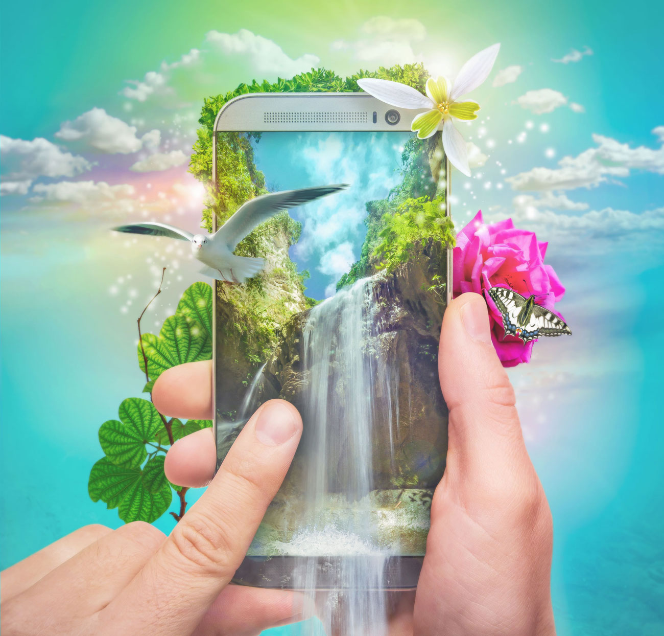
Masks (both clipping and layer) help you mix anything for incredible blends. This image's foundation is a stock photo of hands interacting with a smartphone showing a blank screen. A clipping mask is a great way to embed something inside a screen like this. Plot a shape layer with the Pen Tool (ensure it's set to Shape in the Options bar to keep it vector) to blanket the screen.
If you don't have the Pen Tool, create a selection of the screen using your favourite selection tool(s), add a new layer and fill the selection (any colour will do, as it will be covered).
Place an image above the shape. Move, scale, rotate and perform any transforms to get the image to fit the shape. opt/alt-click between the two layers to create a mask. Continue to move and transform the masked image for best placement. The rest of the image is elements that support the theme. Each are selected and isolated or merged with layer masks. These are placed above and below the smartphone layer to push dimension. A battalion of adjustment layers rounds out the look.
07. Create an isometric scene
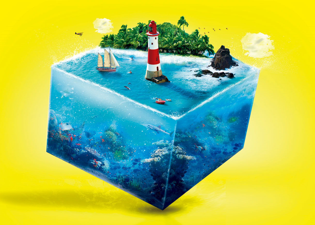
One of the most fantastic things about Photoshop is that you can recreate something that already exists – the sea and underwater life – but not how you'd expect.
Create a new layer, use the Rectangular Marquee Tool (M), make a square and paint it (alt+del) grey. Go to the 3D menu and choose 'New 3D Extrusion from Selected Layer'. Adjust the perspective, setting the angles around the axis. Finally set the Extrusion Depth to 15.4cm.
Next, create a new layer, use the Pen Tool (P) to make a selection around one face of the square, activate it (alt+enter), create a layer group (cmd/ctrl+G) and press Add Layer Mask. Now every image that will be placed inside the folder will follow the mask's shape.
To give a realist style, let's use the Filter Gallery. Select all the layers for the square's sides and merge (cmd/ctrl+alt+shift+E), then go to Filter > Filter Gallery, choose the Distort set, then the Glass filter and set Distortion: 10, Smoothness: 14 and Scaling: 66%.
08. Layer up a typographic composition
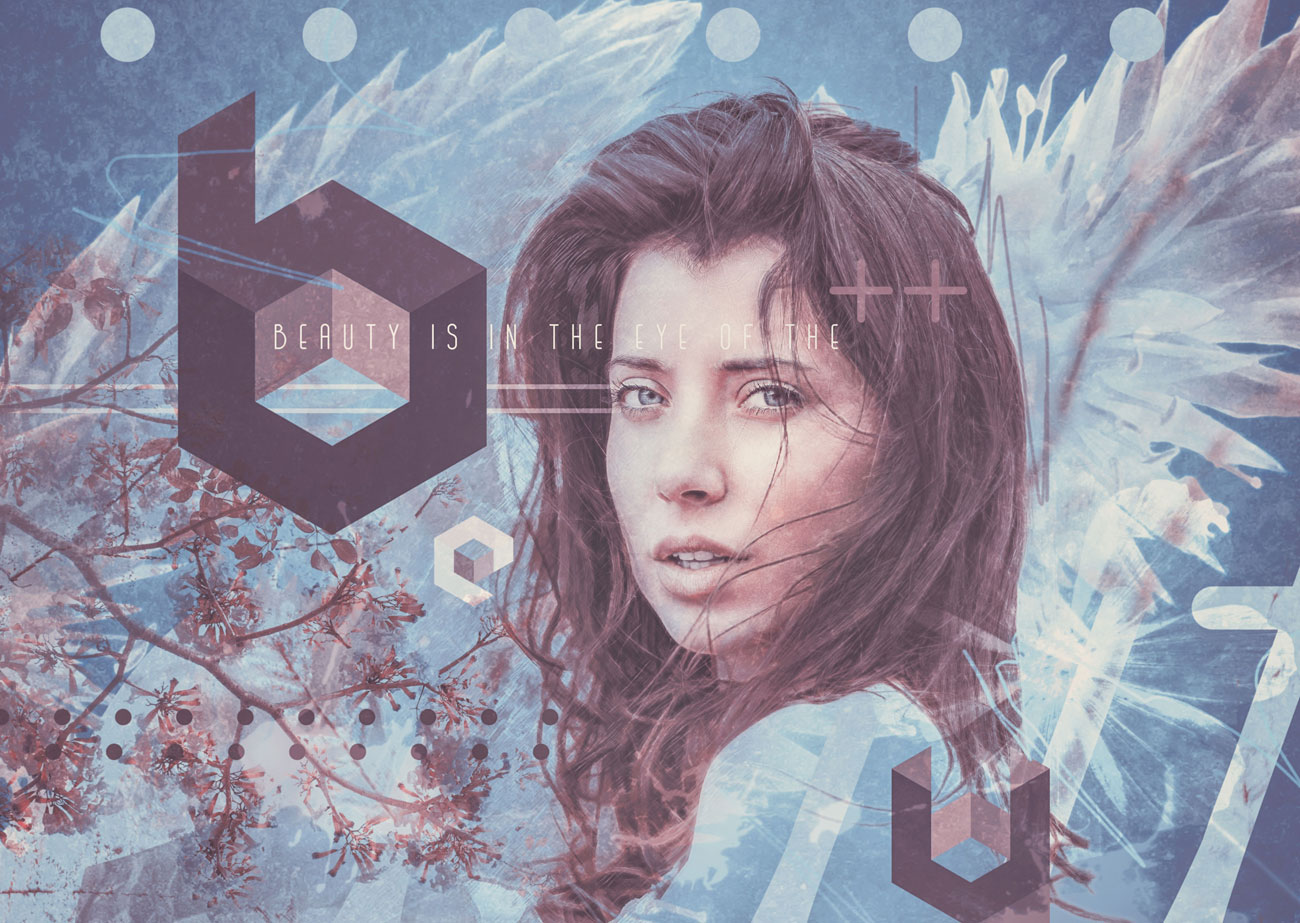
Mixing letterforms, words and images can lead to some engaging and thought-provoking visuals. Not only can your audience admire the end product, but you can have a blast crafting the puzzle-play of the composition.
Choose a focal point and a font or two, then start building up the foundation of the composition. If you'd like to create the letterforms yourself, by all means go for it. Scan your lettering in and trace and perfect with the Pen Tool. If you're a Pen Tool maestro, you can certainly try constructing the lettering directly on the canvas.
Use the Move Tool and Free Transform to arrange the elements. As you build things up, think of what can be added. Are there fonts that complement what you have going on? Are there images or elements that can be introduced to help drive your theme?
As the composition begins to evolve, you'll naturally find that some objects may no longer be needed. Paring down is typically an important part of the process. You can opt to hide a layer (click on the corresponding 'eye' icon) versus permanently trashing if you believe you might reconsider its inclusion at a later time.
Adding simple vector objects can be perfect for augmenting your typographic mix. Enlist the Shape Tool for geometric or custom shapes, or use the Pen Tool to plot your own shapes (be sure to set to Shape in the Options bar to keep them vector).
Finally, tie everything together with embellishments such as adjustment layers, freehand scribbling and overlaid textures.
09. Digital colouring with layers
Layers are the most basic, yet one of the most powerful features in Photoshop. The best way to describe a layer is to imagine sheets of paper stacked on top of each other. Each sheet can be transparent, opaque or contain all kinds of designs, photos, and text. Over the years, new features have been added to Photoshop, making the layers a complex structure. Today, features like adjustment layers, layer masks and clipping layers are all part of the layer universe.
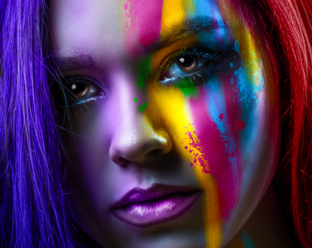
In this image, we used some of these features to create eye-catching digital art. To start, open a photo, then apply a Gradient Fill adjustment layer and change its blend mode to Color, to create a colourful transition over the woman's face. In the next step, duplicate the woman layer four times, placing all the layers on top of the Gradient Fill layer.
Then use a Color Balance adjustment layer to alter the colour of each layer, creating four colour variations (red, green, blue and yellow). Now change the blend mode for the layers to Darker Color or Lighter Color, depending on what works best to blend the images. Next, hide the layers using layer masks (go to Layer > Layer Mask > Hide All).
Finally, grab the Brush tool (B), choose a Spatter brush, vary its size, and set the Foreground colour to white. Now paint random strokes across the layer masks to reveal the colours and create this beautiful painted effect.
10. Add depth using layer styles
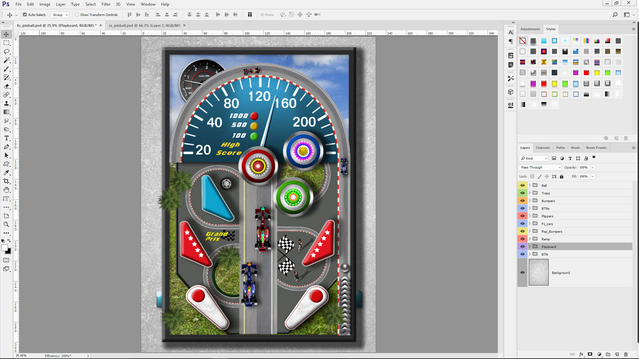
Layer styles are a powerful and versatile feature in Photoshop. They enable you to easily add special effects to a layer. The styles work on a single layer. These layers can be an image, shape or text. They are completely non-destructive, meaning the pixel data from the original image remains intact after applying the effect, letting you edit them whenever you want.
Every time you apply a new style to a layer, an 'fx' symbol appears next to the layer's name in the Layers panel. To edit the effect, double-click the 'fx' symbol to access the Layer Style window. You're probably familiar with some of the effects like Drop Shadow, Bevel and Emboss and Strokes – they are commonly used to add shadows and create a sense of depth. There are other styles that can be combined to create more complex effects, such as Color Overlay, Satin, and Inner/Outer Glow.
To apply a new style, go to Layer > Layer Style. Select the effect you want and tweak the settings to alter its appearance. Photoshop has some great styles ready to be used in your project. To access them, go to Windows > Style. Click on the Styles button at the top of the panel, then select the desired library from the drop-down menu in the upper-right area. In the Layer Style dialog you can add more styles, customise the effects, delete or save them.
This article originally appeared in Photoshop Creative. Buy back issues here.
Related articles:

Thank you for reading 5 articles this month* Join now for unlimited access
Enjoy your first month for just £1 / $1 / €1
*Read 5 free articles per month without a subscription

Join now for unlimited access
Try first month for just £1 / $1 / €1
