How to structure your CSS
Freelance interface and frontend developer Mike Byrne, also part of the Area 17 technical team, explains how he structures his CSS and why
- Knowledge needed: Basic CSS and HTML
- Requires: Text editor, some thought
- Project time: Quick to set up
- Download source files
This article first appeared in issue 218 of .net magazine - the world's best-selling magazine for web designers and developers.
As an experienced frontend developer, I’ve been writing CSS documents for 10 years now and it feels like I’ve been refining my method on every site I build. For most of this time I’ve been the sole frontend developer on a build and so my methods have been learned as needs must, rather than through any formal training or communication with other frontend developers. I have often wondered how other frontend developers go about doing their CSS and how it compares to how I do it; for all I know I’ve been doing it wrong for years ...
So in this article I’m going to talk about how I structure my CSS and why, for you to agree with or disagree with. It’s not to say this is the way to do your CSS, but it’s certainly a way that’s worked out pretty good for me.
My approach
The very first thing I do at the start of a job is to consume as much of the available artwork and any spec documents as possible. Usually I get the designer and a project manager to talk me through the artwork and their expectations. We discuss any interactions, any potential issues, browser expectations and generally I ask lots of questions. This is where I begin to think about what classes, what div structures and if I have any CSS from other projects I can port across to this new project. I’m engaging my brain to pre-problem solve the CSS for the site. If there’s something that I’m not sure about, now’s the time to do some research and maybe do some rough tests.
This whole process is easier on smaller websites and on websites built using the waterfall method of production – because the chances are you’ll have a lot of artwork available. If you develop using an Agile method, it can be trickier. This means more guesswork and leaning on your experience. It will also mean more CSS refactoring and the need to really communicate with the designers on the job. If you’re not sure what I mean by Agile and waterfall, you probably work waterfall and might want to check out an Agile method, such as scrum.
My CSS structure
I start every job now, as I have for years, with my own HTML boilerplate (download the source files above). I do this simply because I know what’s in it; because I put it there. I quite like the HTML5 boilerplate and have nicked things from it. My base has evolved from my experience. It doesn’t include any layout structures simply because I rarely seem to work with layouts that suit a solution like that.
I started to do this structure, partly because I like a little bit of discipline and order, and partly because of the nightmares I’ve had on the sustainability of websites as they have grown or changed. My old method was just to write CSS on an “as needed” basis; that is, if I was looking at the main navigation, I’d style that. And then next on the page might be the featured articles, so I’d style that.
Daily design news, reviews, how-tos and more, as picked by the editors.
And then next might be the news listing, so I’d style that. My CSS documents grew large, became confusing and shared styles became hard to manage.
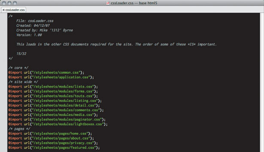
The major files in my CSS boilerplate are:
- cssLoader.css
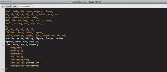
- common.css
- application.css
And then a couple of folders:
- /stylesheets/modules/
- /stylesheets/pages/
cssLoader.css is just a stub file that loads in other CSS documents, using @import. This file is for development and not the production server because @import does funny things in Internet Explorer that can cause a loading flash.

There’s also a limit of 32 imported files for IE, so I usually have a counter that I manually update – if I reach the limit I refactor things.
common.css is my resets plus classes that crop up in nearly every job that I do CSS. The reset used is basically the Eric Meyer reset, updated by Rich Clark for HTML5.

I then have some classes to float things, including a variation for images and a couple of methods to clear the floats.
Sometimes overflow: auto; doesn’t cut it and you need a good old <br class=”floatClear” /> or a <div class=”cleaner” />.
In here, too, are some simple text align classes and setting up of a style-able <hr /> (by wrapping it in a div).
The remaining classes are practical; hide an element, get rid of a border or background, bold text and a simple error class.
I use these so often that when I edit someone else’s CSS I forget that such classes aren’t standard CSS classes – a bit like base JavaScript functions such as split() or toString().
This file doesn’t change between jobs and if I do update it I use the updated version as the standard version in future jobs.
I use application.css as the central CSS for the whole site – styles that are defined here will be used on every page of the site and refined later, in other documents.
Importantly, I split up the CSS, with comments, so it is easier to find things in the future. I split this CSS up into these consistent sections:
- fonts
- body
- layouts
- general styles
- custom classes
- div specific styles
- page specific styles (optionally)
First thing I’ll put in this CSS is any font-face CSS, usually generated with Font Squirrel. It’s good to get fonts downloading nice and early.
Then I start to style the site. I start to look at the main structures of the site – the headers, the footers, the columns and so on – and get them into place. On some pages I may need to modify some of these: this I worry about later.
general styles is where I set up the site wide styles for text elements, forms and links. Again, different pages and different parts of pages will need their own styles so we’ll modify these styles later.
Quite often the sites we build have a recurring set of things, buttons that look a certain way or chevron background boxes with dotted borders and so on, but they appear, looking similar, in multiple places. So I group these kinds of styles in my “custom classes”. Sometimes these styles get tweaked later but generally it saves you re-writing the same style over and over.
My div specific styles, which I guess I should rename element specific styles in this modern HTML5 world – is where I style the HTML that sits inside those site wide areas like the header and footer. So now, rather than just giving the div#footer or footer its dimensions, borders and so on, I’m going to style the lists, paragraphs and so on inside of the footer.
At this point, the site will have a set of basic styles that will look consistent throughout the site; it will have its nice header, navigation and footer with maybe some columns and styled text styles. The individual pages might not yet fully resemble the page designs, but even in their “un-styled” form, they should look like they fit into the site. We can get to writing the custom CSS for each module and each page later.
Styling the individual modules/pages
Now I start to style the individual pages of the site. I either do this in my page specific styles in the application.css if it’s one of those three- to five-page sites, or within CSS documents in the modules and pages folders if it’s something larger. Splitting the CSS up into separate documents in a structured folder system easily allows multiple FE developers to work on the same site at the same time and allows whomever looks at the CSS to find the bits they need to edit more easily. Rather than having one 11,000-line CSS document (yes, I’ve been there), picking through several smaller CSS documents is much easier.
Modules
To me, a module is one of those bits of HTML that gets used in multiple places around a website, but is a bit more involved than just a specific link style. So on the DFI website many pages have a Spotlight or Press module in the right-hand column that appears on multiple pages of the site.

I try to group similar types of modules together in one place, so those that I call touts will all live in touts.css.
Typically I’ll have CSS documents in my modules folder to stay organised and are called simple names such as:
- lists.css
- touts.css
- comments.css
- detail.css
- listing.css
Lists.css is where I style all those article listing type lists. If, say, it was a website that sold CDs and DVDs and the design had a different design for the listing of each, I’d have a ul.listing_cd and a ul.listing_dvd styled up here.
detail.css and listing.css is where I style a basic page of each type. So, following the CD and DVD shop site idea, I’d style a basic listing and item detail page. Okay, so CD and DVD listing pages might have different elements or designs, or we might have to add tweaks for featured CDs, featured DVDs, sale products and so on. But I’ll worry about these later: as long as the basic listing and detail pages are styled I know that any new filter types of the listing will at least have some basic styles and won’t look too out of place on the site.
And now we style the specific pages themselves, things that haven’t been covered by application, modules and only appear in a specific place/section of the site. So here I’ll end up with a list of CSS documents a bit like this:
- home.css
- about.css
- privacy.css
- featured.css
To make this work, I add a helper class to either the body, or the main container of the HTML, for each page. Doing this automatically in an application based on the controller name is simple. The BE developers I work with do this automatically, but sometimes I get them to tweak the class names.
If the page needs some tweaks, make a CSS, make sure it’s linked in the loader (I still forget from time to time and wonder what I’ve done wrong ...) and get tweaking the styles. The header on the homepage is larger? Cool:
- .home h1 { font-size: 72px; }
And keep going until you’re done. This method has worked well for me over the years, but I do change it from time to time and I’d welcome any discussion on it. Look me up on Twitter and tell me what you think.

The Creative Bloq team is made up of a group of art and design enthusiasts, and has changed and evolved since Creative Bloq began back in 2012. The current website team consists of eight full-time members of staff: Editor Georgia Coggan, Deputy Editor Rosie Hilder, Ecommerce Editor Beren Neale, Senior News Editor Daniel Piper, Editor, Digital Art and 3D Ian Dean, Tech Reviews Editor Erlingur Einarsson, Ecommerce Writer Beth Nicholls and Staff Writer Natalie Fear, as well as a roster of freelancers from around the world. The ImagineFX magazine team also pitch in, ensuring that content from leading digital art publication ImagineFX is represented on Creative Bloq.
