How to design great web forms
Need to make a web form? Unsure where to start? Jessica Enders has a recipe for forms that’ll work for you – and the people filling them in
When it comes to forms, the temptation is to dive straight into the details. Do we need to collect phone numbers or just email addresses? Should this button say ‘Submit’ or ‘Apply’? And so on. But as with any successful design or development project, the best place to start is establishing the overall framework.
As the author of the famous Seven Habits of Highly Effective People, Steven R Covey, said: “Begin with the end in mind.” For forms, it’s important to clearly define what the form must achieve. The ‘six Ws’ of journalism are useful:
- What information do we need to collect?
- Why is that information needed?
- Who is going to use this information?
- How will the information be used?
- When do we need the information?
- Where is the information going to live?
You’ll see that these questions don’t talk about forms at all – their focus is on information. The form is just a tool for gathering this information. Therefore, its design should be determined by the information need. Discussing the above questions with key stakeholders will help elicit constraints, which will also influence the design of the form. These constraints may be about any part of the process, from the development platform (for example, to ensure connectivity with legacy systems) through to the need to collect data in particular formats (to be consistent with relevant standards, for instance).
The other key element of the framework you need is a good understanding of the context of use. Here we are moving away from the needs of the party collecting the information (the form owners) and towards the needs of the people filling out the form (the form fillers).
Is this form filled out at home, at work, at study or in transit? Do people need information from other sources in order to be able to fill out the form, or do they have it all in their heads? Are people distracted, stressed, in shock, rushed or unmotivated at the time of filling out the form? What level of commitment to your product or service has the form filler made?
Know your audience
You may have noticed that central to understanding context of use is understanding audience: the form fillers. You can design a form that meets the needs of the form’s owners, but it will be a failure unless it can be accessed, comprehended, filled out and submitted by the target audience.
There are three tools you may find useful in developing a real sense of the form’s fillers: segmentation, personas and scenarios.
Segmentation refers to working out the different groups of people that may need to fill in the form. For example, a pre-employment medical may need to be completed by the prospective employee, by a would-be employer and by a medical practitioner.
Segmentation can be done on any number of different dimensions, including:
- Role (as in our pre-employment medical example)
- Demographics (age, sex, educational attainment, income, location and so on)
- Level of engagement with the product or service (for example: unaware; aware but not considering; considering; decided to buy/acquire; have already bought/acquired)
- Perceptions and opinions (is the user happy to transact online with a credit card?)
- Preferences (such as ‘like to give a lot of information to get a more accurate quote’ vs ‘prefer to get a quick estimate without having to do much’)
Once you’ve segmented your target audience, you can work out which form fillers the form must work for and which elements are a ‘nice to have’.
Personas can be a useful way to represent your different segments. A persona is a narrative description of a person from within the segment (George the househusband or Sangita the analyst, for instance). They should stem from direct research with a representative sample from a segment. Go out; observe these people in their ‘natural habitat’. Find out how they think, feel and behave. If you don’t, personas are a dangerous fiction, likely to consist of stereotypes and weak understanding.
Get the Creative Bloq Newsletter
Daily design news, reviews, how-tos and more, as picked by the editors.
Segmentation tells us the groups of form fillers. Personas give us a tangible representation of these groups. Scenarios describe the behaviours of these personas with respect to your form, placing the target audience within the context of use. What was Sangita doing just before she came to the form? What does she want to get out of filling it in? What information has she got at hand, and what does she need to get from somewhere else? What questions does Sangita expect? What does she think will happen when and after the form is submitted?
Can we design now?
Phew! All this and we haven’t drafted a single question. It may seem strange, but trust me – every ounce of this upfront effort is worthwhile. Asking the six Ws minimises the chance of nasty surprises only being revealed in the design stage. Speaking from (painful) experience, I can tell you there’s nothing worse than designing and wireframing a multi-page form, reliant on real-time server updates, only to be told that such updates aren’t possible.
Segmentation, personas and scenarios also lessen the likelihood of spanners being thrown into the works later. But, just as importantly, these help ensure the design is user-centred, providing a mechanism for resolving internal disputes. Rather than opinion-driven decisions, the team can turn to the segmentation, personas and scenarios to see what makes most sense. Would George really go away and check his electricity meter just to be able to get this update?
Data items and questions
By this stage we have the framework for our form, and have developed a solid understanding of the target audience. Now let’s dive into the detail. First, we need to work out the data items for our form. A data item is a single piece of information the form must collect, such as the form filler’s date of birth.
I suggest compiling a list of data items before any sketching, wireframing or prototyping begins. It needn’t be complicated, but at the least it should include identifier (such as date of birth); storage format (string, DD-MM-YYYY) and whether the data item is mandatory or optional. If you’ve had experience with a waterfall software development process, you may recognise the list of data items as a central part of a functional specification.
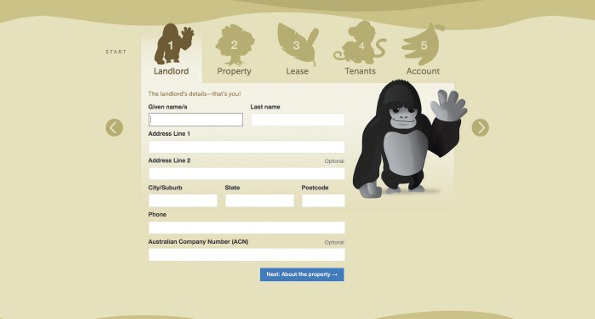
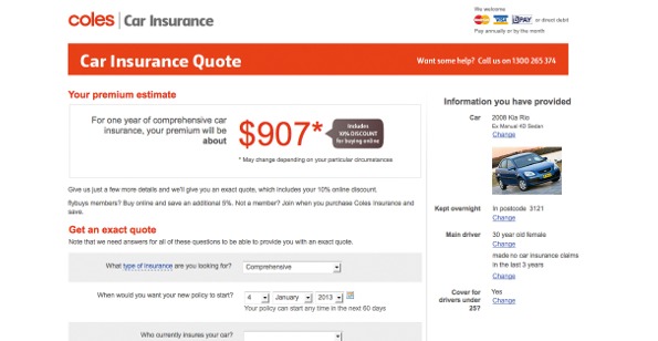
Note that a data item is distinct from the question that will appear on the form. The data item may be “policy start date” but the question may be, “When do you want your policy to start?”. It’s useful to distinguish the two elements, because the data item encapsulates the form owner’s need, whereas the question wording translates this need into something that works for the form filler.
In a similar way, the storage format may be different from the collection format. Telephone numbers are a great example of this. Let the form filler enter the number whatever way they are used to (with spaces, dashes, brackets and so on). This is the collection format. Behind the scenes you can parse this data, and even present it back to the user for verification, if needed, to ensure consistent formatting in the database.
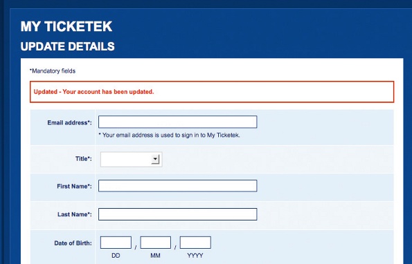
Once we have our data items, the next logical step is writing questions (doing this effectively is a topic in itself). You want them to be clear and concise, using language appropriate to the target audience. Don’t forget that question-level help text and the choice of answer options are as important as the question itself. And for each question you write, it’s a good idea to write the corresponding error message to be shown if the question is unanswered, or answered with invalid data.
Flow
Questions are the atomic elements of forms. There are many different ways the questions can be positioned. Some arrangements will be better than others at making an efficient and effective path. Because some questions will naturally form logical groupings, it’s best to follow these and order questions from the bottom up, rather than working out a structure for the form and trying to fit questions into that structure.
To ensure the flow through the form feels intuitive, and to maximise completion rates, the aim should be to have related questions together, expected questions before unexpected questions, and easier questions before harder questions.
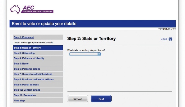
If your form extends over more than one screen, include a progress indicator. The best progress indicators describe actual steps, to give the form filler as sense of content, rather than referring to an abstract percentage complete.
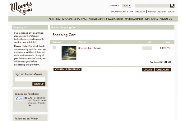
You’ll also need navigation elements, such as ‘Back’ links and ‘Next’ buttons. Notice the recommendation to use a button for the ‘primary’ action (the thing you ideally want people to do: keep moving forward) and a link for the ‘secondary’ action ‘Back’ (and also ‘Cancel’, if relevant). This visual and structural difference helps distinguish the primary action from any secondary action, providing an important cue to the form filler.
Layout
By this point you have the atomic elements of your form (questions) and have structured them into a flow. Now you’re ready to do what most people think of when they hear of form design: layout.
The visual design of your web form should be based on a combination of aesthetics, branding and the Gestalt principles of perception. The Gestalt principles that are most relevant to the layout of forms are colour, size, shape, figure/ground, proximity and similarity.
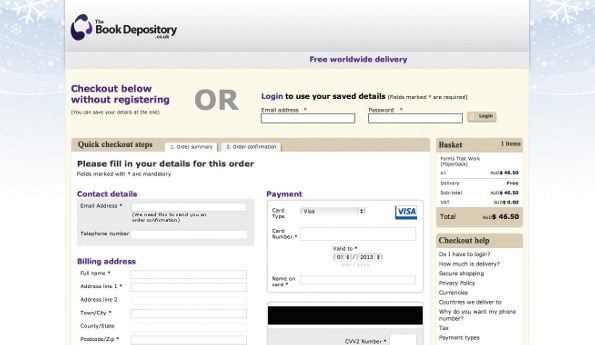
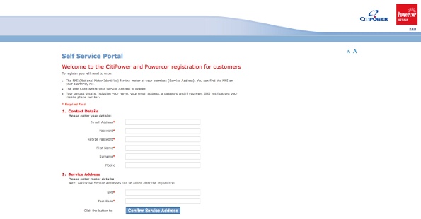
Colour, size and shape are attributes of individual elements on the screen. Make use of these attributes to highlight (such as appending a red asterisk to point out which questions are mandatory), communicate (the size of a text box informs users as to the expected amount of content) and maximise learnability (for instance, circles for radio buttons and squares for checkboxes).
The principles of figure/ground, proximity and similiarity, meanwhile, are about the relationship between elements. Figure/ground tells us that people naturally look for figures (in other words whole objects) in their surroundings. For forms, this means people are wired to detect elements such as buttons and text boxes – so these elements don’t need much embellishment.
The proximity principle tells us that people see objects that are close together as being related. A vast number of hard-to-use forms neglect this principle – for example, by placing labels closer to other labels rather than the fields each label corresponds to. When you’re laying out your form, think about the ways in which different elements are related, and make sure that the placement reflects these relationships.
The similarity principle tells us that people see objects that are similar as being related. The principle is relevant for web forms in the same way as it is for sites. On a website, we ensure the styling of different types of elements is consistent (all level one headings are bold and 3ems; all links are blue and underlined and so on). The similarity between how a H1 header appears on the homepage versus how a header appears on lower-level pages helps users to learn the site and engage more quickly.
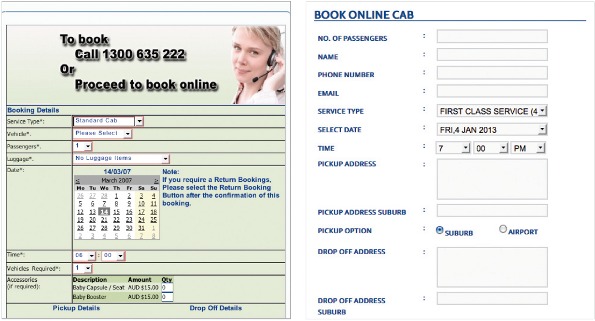
With web forms, similarity is important in exactly the same way. Being consistent within type (when styling page headings, section headings, questions, answer options, help text, buttons and links) will help the filler understand the form – and therefore move through it – more quickly.
We can also use similarity inversely, to help draw attention to things. Secondary buttons within a form (such as those used to validate an address) can be styled slightly differently to primary buttons (by shading them in a less prominent colour, for example). Having the same shape conveys that secondary buttons and primary buttons are all buttons, but the different colour communicates the different priority.
Testing
By using the process described here, the chances are good that your form will work well straight out of the gate. But every context of use and audience is different, so it’s imperative to test your form out in the real world.
This can be illustrated by just one small example. Some years ago, I was working on a home insurance quoting form. Certain items in the home (such as jewellery and bicycles) are portable, and can be taken outside the home. The level of cover for these items can be different from items that are not generally portable (such as the kitchen sink). Consequently, we had a question on the form that made reference to items ‘inside the home’ and ‘outside the home’.
It was only when testing the form with members of the target audience that we discovered some people thought ‘outside the home’ meant anywhere at all besides the inside of the building (for instance, in the backyard or while at the shops) whereas other people thought ‘outside the home’ meant only those spaces still on the property (in the backyard, but not while at the shops).
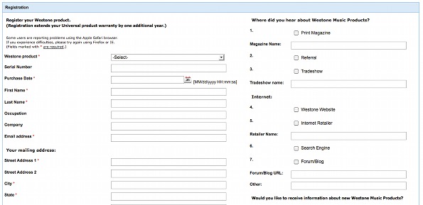
This was just one part of one question on a multi-page web form. You can imagine what other things we learned about other questions, as well as the flow, layout and overall process, from testing the form with typical users in realistic settings.
The steps, in sequence
To summarise: identify the form’s goals, constraints and process by asking the six Ws – what, why, who, how, when, where; detail the context of use; develop an understanding of the target audience through segmentation, personas and scenarios; list data items; write questions (including answer options, help text and error messages); design elements of flow (question order, chunking, progress indicators and navigation); lay it all out; and test, test, test!
Following these steps will ensure you end up with a form that meets the needs of all parties, owners and fillers alike.

Thank you for reading 5 articles this month* Join now for unlimited access
Enjoy your first month for just £1 / $1 / €1
*Read 5 free articles per month without a subscription

Join now for unlimited access
Try first month for just £1 / $1 / €1

The Creative Bloq team is made up of a group of art and design enthusiasts, and has changed and evolved since Creative Bloq began back in 2012. The current website team consists of eight full-time members of staff: Editor Georgia Coggan, Deputy Editor Rosie Hilder, Ecommerce Editor Beren Neale, Senior News Editor Daniel Piper, Editor, Digital Art and 3D Ian Dean, Tech Reviews Editor Erlingur Einarsson, Ecommerce Writer Beth Nicholls and Staff Writer Natalie Fear, as well as a roster of freelancers from around the world. The ImagineFX magazine team also pitch in, ensuring that content from leading digital art publication ImagineFX is represented on Creative Bloq.
