How to apply Flash principles to HTML
Old habits can die hard. But don’t worry, Paul Wyatt and Joseph Luck are here to guide you through launching a site in HTML – with traditional Flash sensibilities
This article first appeared in issue 234 of .net magazine – the world's best-selling magazine for web designers and developers.
For years Flash has been a great creative tool for websites, animation and even broadcast work, but it’s becoming increasingly necessary to look at new ways to build websites and display content.
A key personal motivation behind this tutorial was a folio website, originally designed seven years ago as a showcase of the ‘campaign website’ flavour – with a filing cabinet dropping from the sky and displaying content with animations and transitions in between seemingly everything. Over seven years this website had been updated but failed to keep up with career and work changes, and the demands on it to display different types of content. Something that was easy to update, would work on everything and also serve as a ‘shop window’ for work was required.
But Flash and the showman go hand in hand, and those sensibilities endure. The new site was to have a resizable image-based homepage showcasing full browser width and height images to their best. The aim was for this to rotate and transition from one image to the next and on the sub-homepages have a cut-down version. Clean, bold typography and clear labelling were also key.
The goal was to razzle-dazzle, Flash-style, in HTML. Having started the production collective 3 Men & a Camera with Matt Holding, the need for this site was paramount. The two of us sat down (with Paul as designer and Joe as developer) to figure out how it could be built.
Making a shop window
A prominent feature of www.paulwyatt.co.uk is the use of full-bleed images and rotators, which feature on the home and sub-home pages and serve as the shop windows for the site. The screenshots and stills from the work speak for themselves (although in a bold, you-can’t-miss-’em manner).
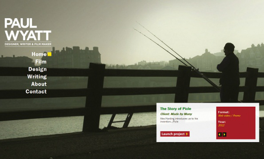
In this tutorial we’ll be delving into HTML, CSS, WordPress, PHP and jQuery, so that you can use WordPress to make your own resizable home screen rotator.
Homepage rescalable image (CSS)
.homebackground{
z-index:-200;
overflow:hidden;
min-height: 720px;
min-width: 1280px;
width:100%;
height:auto;
}
.homebackground img{
position:absolute;
width:100%;
height:auto;
}
In order to create a scalable background image for your home page, first create a container (.homebackground) CSS style (project specific). In this case, the z-index CSS property is set to -200 because we need to position the image behind all of the other page content. We also need to set a min-height and min-width property, which tells the browser the minimum dimensions that we want our image to scale to, and set the overflow property to hidden. If we don’t do the latter, then when the browser is smaller than the min-height and min-width values, the image will force scroll bars – when we want it to be seamless.
We need to tell images inside the container how to behave. To do so, we use the CSS selector .homebackground img. This will apply the properties to all images inside .homebackground. Selectors like this are useful when properties need to be defined for elements inside containers. For our home background, we want images placed on top of each other so they can be rotated through. We use the position CSS property; position: absolute will force images inside .homebackground to lay on top of each other starting from the top left corner.
<div class="homebackground">
  <img src="image1.jpg" />
  <img src="image2.jpg" />
  <img src="image3.jpg" />
  <img src="image4.jpg" />
</div>
What this results in is a stack of images one on top of the other.
function bgresize(){
  var viewportwidth = $j(window).width();
  var viewportheight = $j(window).height();
  var imagewidth = $j('.home').find('.homebackground img').first().width();
  var imageheight = $j('.home').find('.homebackground img').first().height();
  var imageratio = imagewidth/imageheight
  if (viewportheight > imageheight) {
    $j('.home').find('.homebackground img').css('width',viewportheight*imageratio).css('height', 'auto');
}
  if (viewportwidth > imagewidth ) {
    $j('.home').find('.homebackground img').css('width', viewportwidth).css('height', 'auto');
}
  if (viewportheight < imageheight) {
    $j('.home').find('.homebackground img').css('height', viewportwidth/imageratio).css('width', 'auto');
}
  if (viewportwidth < imagewidth ) {
    $j('.home').find('.homebackground img').css('height', viewportheight).css('width', 'auto');
    }
  }
In the CSS .homebackground img property, the width is set to 100% and the height to auto. This will scale the image based on the container’s width, and adjust height accordingly (retaining aspect ratio). What about when the browser and image aspect ratios are different? If the browser width is too small for the height, blank space will appear at the bottom of the page – we don’t want this.
Get the Creative Bloq Newsletter
Daily design news, reviews, how-tos and more, as picked by the editors.
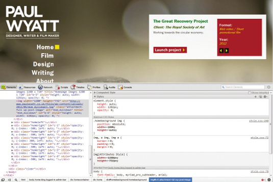
To get around this, we’ll use some jQuery. We need to compare the viewport dimensions with those of the image when the browser is resized. What we’re doing is recalculating the correct image dimensions and setting them when the browser dimensions exceed the image dimensions. This function will get the image and viewport dimensions and then the aspect ratio of the image.
- If viewport height is greater than image height, match image width to viewport height * the image ratio and set the CSS height to auto (so the CSS will automatically calculate the image height in relation to the new width).
- If viewport height is less than image height, match image height to viewport width / the image ratio and set the CSS width to auto (so the CSS will automatically calculate the image width in relation to the new height).
- If viewport width is greater than image width, match image width to viewport width and set CSS height to auto (this is for the CSS to automatically calculate the image height in relation to the new width).
- If viewport width is less than image width, match image height to viewport height and set CSS width of the image to auto (this is for the CSS to automatically calculate the image width in relation to the new height).
We wrap this section of code into a jQuery function, which can be called later on in the code. In order to do this the following is added.
Function bgresize(){
}
We need to grab our variables so the following is added:
var viewportwidth = $j(window).width();
  var viewportheight = $j(window).height();
  var imagewidth = $j('.home').find('.homebackground img').first().width();
  var imageheight = $j('.home').find('.homebackground img').first().height();
  var imageratio = imagewidth/imageheight
The next step is to perform our comparisons from our variables:
if (viewportheight > imageheight) {
    $j('.home').find('.homebackground img').css('width',viewportheight*imageratio).css('height', 'auto');
    }
  if (viewportwidth > imagewidth ) {
    $j('.home').find('.homebackground img').css('width', viewportwidth).css('height', 'auto');
    }
  if (viewportheight < imageheight) {
    $j('.home').find('.homebackground img').css('height', viewportwidth/imageratio).css('width', 'auto');
    }
  if (viewportwidth < imagewidth ) {
    $j('.home').find('.homebackground img').css('height', viewportheight).css('width', 'auto');
    }
  }
If you are using the absolutely positioned rotator and there is a large amount of images in our background slideshow, this jQuery plug-in may take some time to resize the images. The www.paulwyatt.co.uk site features eight background images in a slideshow.
To round off, the final piece of code is to initiate our new resizing plug-in.
$j(window).load(function() {
  $j(window).resize(function(){
bgresize();
});
bgresize();
})
The $j(window).resize selector will fire the containing code when the browser windows are resized. To fire our new function when the browser is resized, we place the following code inside the window resize:
Bgresize();If you have named your function differently, then place:
Yourfunctionname();Using WordPress
We used WordPress as a backend to www.paulwyatt.co.uk to upload content and images to the site. Download WordPress and a virtual server LAMP for Linux, MAMP for Mac or WAMP for Windows; the idea is that WordPress can be used to store the content of your pages and parts making up your site. Imagine a chest of drawers containing numbered files: each drawer is a category/tag and the files are the posts inside. In www.paulwyatt.co.uk, posts are used to store images on the homepage.
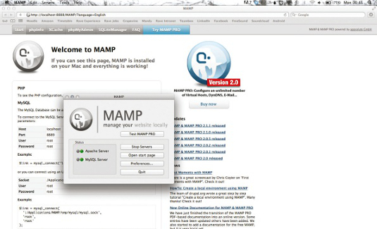
In our example, our WordPress blog was set up using MAMP for Mac. Download and install the latest version of MAMP, open MAMP (Fig 1) and navigate to the Apache: this is where you specify your website root (folder) where all of your web page content is stored and, more importantly, where WordPress is. Unzip your WordPress zip file into a directory on your hard drive. Select that folder in the Apache panel. In this tutorial I’ve created a folder called test site. Click OK and MAMP will automatically reset the servers.
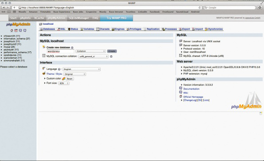
Next we need to create a MySQL database for WordPress to use. Click Open start page in the MAMP options panel and navigate to phpMyAdmin to create the database (Fig 2). With the MySQL database set up for WordPress to use, we need to tell WordPress which database to connect to. Type http://localhost:8888/wp-admin/ into your favourite browser. WordPress will check if it has been configured yet. If you have used a fresh install of WordPress, then a window should appear (Fig 3).

Click Create a Configuration File and fill out the details shown in Fig 4. These will be provided to you by your website host if you purchased a hosting package with MySQL connectivity for a WordPress installation on the World Wide Web. For the use of MAMP, the username is root and the password is root. Usually website hosting companies will use localhost as the database host but you will be able to find this information in your hosting account too.
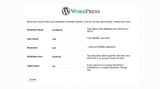
Once you have filled these details out, click submit and run the install on the following pages: you have installed WordPress! Next, you detail out your website name and password for you to log into your own site (seems a bit odd at first!). Once this is done, you’ll be taken to the WordPress login screen and you can log into WordPress for the first time.
To grab images for the homepage background, we set up the WordPress query you put between the earlier <div class="homebackground"> tags:
<?php query_posts( array('posts_per_page' => 8 ) ) ?>
<?php if ( have_posts() ) : while ( have_posts() ) : the_post(); ?>
<?php the_post_thumbnail('full'); ?>
<?php endwhile; ?>
<?php endif; ?>
This is saying to WordPress, “If there are posts in my WordPress, display the first eight featured images from them”; the_post_thumbnail() is the PHP WordPress function that tells WordPress to get the image for the post. The parameter full tells WordPress to get the full-size image. This query (if you’ve used SQL) is similar to an SQL query, where the code will pick up values from the database based on parameters given. We’re picking up images for the first eight posts.
Sub-page rotator element
The sub-page rotator element seems tricky at first and involves HTML, CSS, PHP and jQuery, all tied in WordPress. The same process is used for the sub-page rotators as for the homepage: one image placed on top of the other. We grab the images from WordPress using WordPress PHP functions (adding some PHP magic of our own), style the images using CSS and rotate through them using jQuery. All of the jQuery code here is wrapped around the following jQuery:
$j(window).load(function() {
});
We can’t have those images displaying one on top of each other all the time. As we’re using the jQuery opacity animation as the basis of our rotator, it makes sense to set all of the images’ opacity to 0 except the first in the HTML markup:
// opacity fade all except first
    //home
    $j('.home').find('.homebackground img').animate({opacity:0},0);
    $j('.home').find('.homebackground img').first().animate({opacity:1},0);
This will find all .homebackground img elements, fading them (except the first), so we can control opacity more easily in the next steps. Before moving onto jQuery we amend our previous HTML markup so we can identify each image.
<div class="homebackground" id="homebackground">
    <?php query_posts( array('posts_per_page' => 8 )) ?>
    <?php if ( have_posts() ) : while ( have_posts() ) : the_post(); ?>
      <?php $count = $count+1 ?>
        <?php the_post_thumbnail('full', array('id' => 'b-'.$count));?>
      <?php endwhile; else: ?>
    <p><?php _e('Sorry, no posts matched your criteria.'); ?></p>
  <?php endif; ?>
</div>
You should notice the addition of the count PHP variable. We’re adding a numbered ID for each image, starting from one upwards. In this example, we have eight images, which will have the ID b-1, b-2, b-3 and so on.
// get initial next current prev
    // home
    var initnext = $j('.home').find('.homebackground img').first().attr('id');
    var subnext = parseInt( initnext.substring(2) )+1;
    var next = 'b-'+subnext;
    var current = $j('.home').find('.homebackground img').first().attr('id');
    var prev = $j('.home').find('.homebackground img').last().attr('id');
To start our carousel, we must find out what image we’re on, and what our next and previous ones will be. We need to grab the initial values before we start rotating, so the rotator knows what to do when the page loads. We can use these values to get the next set once we start rotating. We’re storing the image ID in these variables so we can use them in the next code snippet.
// store carousel function
    function carousel(){
        $j('#' + current).animate({opacity:0},300);
        $j('#' + next).animate({opacity:1},300);
        prev = 'b-'+parseInt( current.substring(2) );
        current = 'b-'+parseInt( next.substring(2) );
        tmpnext = parseInt( next.substring(2) ) +1;
        if (tmpnext > maxcount) {
            tmpnext = 1
            };
        next = 'b-'+tmpnext;
    };
This fades out the image, fading in the next over 300ms. Then we’re calculating the previous, current and next values for the next carousel rotation. Before, we numbered each image, enabling us to perform calculations in jQuery, making finding the next image set easier. Notice the ending of the snippet: if the next image ID (after adding one) is greater than the maximum number of images, we want to reset the next image to 1; else if it isn’t we can carry on as normal. This is so the rotator can keep rotating seamlessly without the jQuery pulling image IDs that don’t exist. We define maxcount thus:
// get max number featured
    var maxcount = ('.homebackground img').length;
Finally we need to initiate our carousel:
// initiate carousel
    var timer = null;
        timer = window.setInterval(function(){carousel(opacitytime)}, 5000);
The window.setInterval is a command that will fire a piece of jQuery code over and over again; here the interval is 5000ms but you can set it as you want. setInterval is also able to stop and start, but that’s beyond this tutorial’s scope.
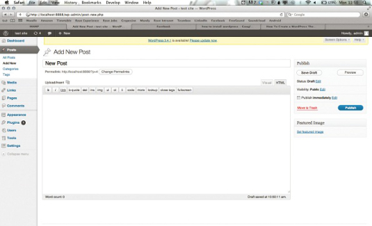
Earlier we used MAMP to set up a WordPress blog on a virtual server. Once you have logged into your WordPress install you should see the window in Fig 5. This is the WordPress dashboard, where you will be managing your posts. Click Add New; now you should find the screen where you can add a new post. We’re only concerned with the featured image area so click set featured image.
Once here you can drop your post’s featured image; it will display on the homepage background. Drop your first background image; click use as featured image then Save all changes. Close the window; above the set featured image should be a small version of the image. All that’s left is to click publish post.
We need to open home.php In the previous examples, we used PHP to grab the images from WordPress into the HTML, and we need to do the same here:
<div class="homebackground" id="homebackground">
    <?php query_posts( array('posts_per_page' => 8 )) ?>
        <?php $count=0 ?>
    <?php if ( have_posts() ) : while ( have_posts() ) : the_post(); ?>
      <?php $count = $count+1 ?>
      <?php the_post_thumbnail('full', array('id' => 'b-'.$count));?>
    <?php endwhile;?>
    <?php endif; ?>
</div>
You should now have a homepage with a resizable background. If you want to add more images, simply add more posts with featured images.
Discover 45 brilliant WordPress tutorials for designers

Thank you for reading 5 articles this month* Join now for unlimited access
Enjoy your first month for just £1 / $1 / €1
*Read 5 free articles per month without a subscription

Join now for unlimited access
Try first month for just £1 / $1 / €1

The Creative Bloq team is made up of a group of art and design enthusiasts, and has changed and evolved since Creative Bloq began back in 2012. The current website team consists of eight full-time members of staff: Editor Georgia Coggan, Deputy Editor Rosie Hilder, Ecommerce Editor Beren Neale, Senior News Editor Daniel Piper, Editor, Digital Art and 3D Ian Dean, Tech Reviews Editor Erlingur Einarsson, Ecommerce Writer Beth Nicholls and Staff Writer Natalie Fear, as well as a roster of freelancers from around the world. The ImagineFX magazine team also pitch in, ensuring that content from leading digital art publication ImagineFX is represented on Creative Bloq.
