New talent: Chelsea College of Art 2015 show
From 3D-printed vectors to illustrated infographics, Chelsea offers up a great graduate show.
If you're looking for the best new graduates for your studio or agency, don't miss Computer Arts' New Talent special, issue 243, featuring the team's handpicked selection of the UK's best graduates – on sale 24 July 2015.
This year's Graphic Design and Communication graduates from the University of the Arts, Chelsea offered up some defining projects that both looked to the future but was also inspired by the traditional methods of the past. From screen-printing to interactive apps, there's a clear difference between the creative process – but that's not to say any of them are any less inspiring than the other.
Here, we pick our 10 favourites from the show, which include playing cards, infographics, typography, interactive apps and 3D printed vectors. There's even a mural thrown in for good measure! Take a look at the variation on offer.
Can't make it to the show? Be sure to check out the UAL stand at D&AD New Blood, and come and say hi to us on the Computer Arts stand too.
01. Miranda Bené
- Course: Graphic Design & Communication
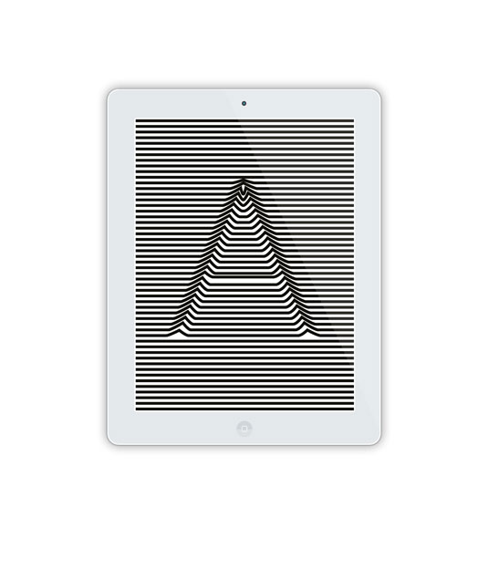
- Project: Inspiration Infinite
"It's always a challenge to communicate your ideas visually and make it as engaging and beautiful to someone else as it is in your own mind," explains Bené. "Especially with graphic design it needs to communicate well but also have appealing aesthetics. The final concept came out beautifully, I think."
"It's such a great feeling when you finally (in my case) get it onto an iPad and can interact with a piece of design you'd spent so long developing. It was valuable to be able to delve into such a vast amount of communicative design through one single piece of inspiration. It really opened my eyes to the amount of ideas one piece of design can give, and through that, the journey in which it can take you."
02. George Farrell

- Course: Graphic Design & Communication
- Project: Yu
Yu is a wallpaper app that allows you to express yourself through the use of patterns and shapes. Farrell wanted to explore the choices we make, that define the style of pattern we represent; these are broken down into four sections shape, structure, style and colour.
"My biggest challenge was bridging the gap between how to represent expressions through the simple choices I make," he says of the 'Yu' app. I was really happy with my final outcome and felt that I communicated the idea of expression in a new and visually pleasing way."
03. Stella Murphy
- Course: Graphic Design & Communication
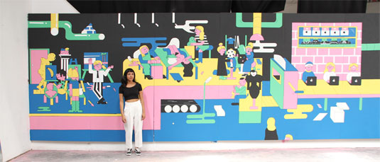
- Project: Mural
"I think with this project the biggest challenge was the sheer man hours that had to be put into finishing this huge piece for the deadline," explains graduate Stella Murphy, who along with this huge mural, created an accompanying colouring book. "I had a lot of sleepless nights and probably inhaled a lot of spray paint in the beginning stages before I discovered it was easier to use wall emulsion paint."
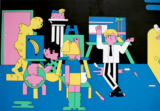
"I set myself the challenge of using a medium that I wasn't necessarily that comfortable with and I'm glad I did as I think it's worked quite well with my illustrative style," she continues. "I think I've discovered a love of working massive. I definitely wouldn't turn down the chance to do another mural."
04. Joshua Kwan

- Course: Graphic Design & Communication
- Project: Palace Pass
Palace Pass is an animated log-in screen that trains user password memorisation. Inspired by the mnemonic techniqe 'memory place,' Kwan's project is simple yet original. "Learning Adobe Edge Animate whilst also producing the entire outcome within a month was difficult," Kwan offers.
"In retrospect it seemed pretty silly to gamble your final degree project's production on an entirely unfamiliar software. I do think it's a bit rushed. The mnemonic parts of the project should've been tested and integrated more within the design."
05. Henry Thomas Lloyd
- Course: Graphic Design & Communication
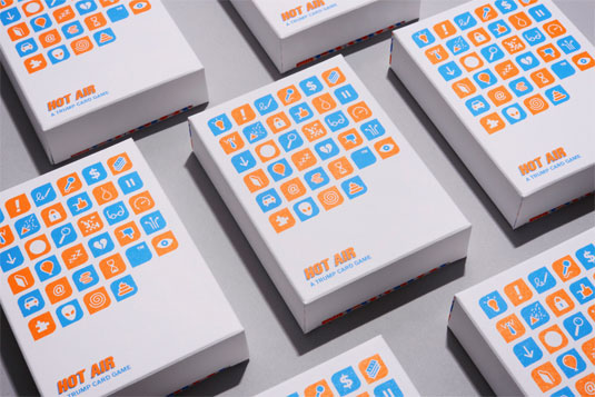
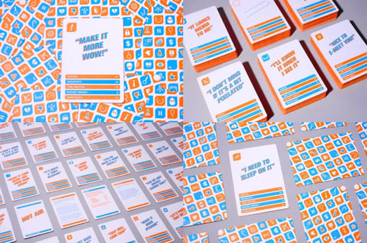
- Project: Hot Air
"'Hot Air' is a design-chat trump card game where players have to out-bullshit their opponent!" Asking creatives about their most annoying industry phrase, Henry Thomas Lloyd created a set of playing cards that is surely going to be a hit for anyone who's ever worked with a client.
"The biggest challenge was definitely making it funny and relevant to designers," Lloyd explains. "I wanted them to laugh and engage directly with the content; luckily I got some great contributors so it all worked out. I've had some great feedback and it got a fantastic reaction in our final show."
06. Penny Whitehouse

- Course: Graphic Design & Communication
- Project: Quantifiable Creativity Questionnaire
"With this project, I think the biggest challenge was actually finding the best balance for the tone of the questionnaire," says Whitehouse. "I created the QCQ as a reaction to my time at 'art school', and how dissasociative the work we were doing felt when held up against all these oddly quantitative marking criteria that sounded totally empty in actual meaning for such subjective and variable work compared to science based subjects."
"I wanted it to be transparent without being sarcastic, fun without being crass, act as social commentary without being overly pleased with itself or arrogant. It was access to information we all are probably aware of in varying degrees but taken one step further so that it became interactive."
07. Louise Nyborg

- Course: Graphic Design & Communication
- Project: Paus
"The project itself was a huge challenge and undertaking, I’d never made a website before and had a steep learning curve when it came to digital design," says Nyborg of her final project 'Paus' – a website that, in our hectic world, encourages people to slow down through animations and interactive elements.
"I'm quite happy with the final outcome," she continues. "But being the perfectionist that I am, there are always thing that I notice and want to change. Now I'm a graduate, I don't know where my work will be heading, which I think is exciting."
08. Elvn Seet Kwang Chun
- Course: Graphic Design & Communication
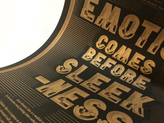
- Project: Smith Modular Sans
"The biggest challenge I faced was to set the brief for myself," explains Elvn Seet. "One of the worst moments during my design process was to sit in front of a blank canvas not knowing how to proceed; that same anxiety also helped me focus on my research, and eventually I settled on creating a typeface referencing the 19th Century Arts and Crafts movement."
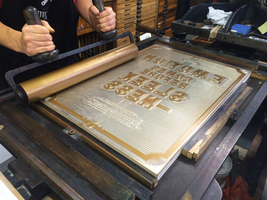
"My project embrace the spirit of hand-made. The outcome was manually printed on a letterpress using a printing block that was engraved on an industrial machine, the ink transfer left a beautiful imperfection on prints, making each print a unique one. Having too used to working with digital medium, this project made me realised design needs not to be clean, fast or precise."
09. Marilyn Baker

- Course: Graphic Design & Communication
- Project: Trajectory
Marilyn's work showcases vectors in an entirely new way that you'd be hard pressed to notice on your trip around Chelsea's Graphic Design and Communication Graduate show. 3D printing her original vectors, it ensures her illustrations become tangible, therefore creating a more interactive experience for her viewer.
10. Francine Oliver
- Course: Graphic Design & Communication
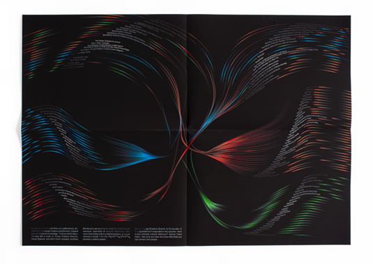
- Project: Cultural Connections
"I knew that I wanted to collect references from as many designers/creatives as possible. In the initial stages of the project I was concerned that I was wholly reliant on external contacts and worried if I would be able to get enough responses," explains Oliver, who created this 'Cultural Connections' infographic. Exploring the diverse and extensive cultural knowledge of creative people, Oliver created a total of five infographics.
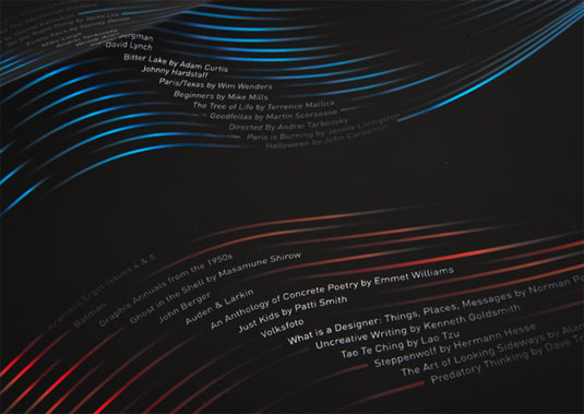
"However, generally people in the industry were very willing to participate in the project. I found twitter to be an invaluable tool as it allowed me to converse quickly and get very concise answers. In the end was able to collect over 100 references from around 65 designers/artists/etc, which was good!"
Half-price Computer Arts subs offer!

To celebrate 2015 degree show season, you can get an incredible 50 per cent off an annual subscription to Computer Arts magazine. For £39 you'll receive 12 months of industry insight, opinion and inspiration, delivered to your door.
Plus: sign up by 7 July 2015 and you'll receive Computer Arts' New Talent issue, featuring an extensive guide to 2015's most outstanding design graduates.
Liked this? Try these…
- How create the perfect exhibition in a week
- 5 pro techniques for post production in Adobe Photoshop
- Free Photoshop brushes every creative must have

Thank you for reading 5 articles this month* Join now for unlimited access
Enjoy your first month for just £1 / $1 / €1
*Read 5 free articles per month without a subscription

Join now for unlimited access
Try first month for just £1 / $1 / €1
Get the Creative Bloq Newsletter
Daily design news, reviews, how-tos and more, as picked by the editors.

Sammy Maine was a founding member of the Creative Bloq team way back in the early 2010s, working as a Commissioning Editor. Her interests cover graphic design in music and film, illustration and animation. Since departing, Sammy has written for The Guardian, VICE, The Independent & Metro, and currently co-edits the quarterly music journal Gold Flake Paint.