New Talent: GSA Communication Design degree show 2015
10 of the best graduates from Glasgow School of Arts' Communication Design degree show
If you're looking for the best new graduates for your studio or agency, don't miss Computer Arts' New Talent special, issue 243, featuring the team's handpicked selection of the UK's best graduates – on sale 24 July 2015.
If you're in the Glasgow area, you've got until the 20 June to check out the fantastic design work on show at the Glasgow School of Art 2015 degree show.
If Glasgow isn’t on your doorstep, fear not: the talented communication design graduates are holding an exhibition in London from 25-27 June 2015, at Blackhall Studios, 73a Leonard Street, London (10am-6pm).
Here are 10 highlights – among many – from the communication design course to watch out for…
01. Michael Bremner
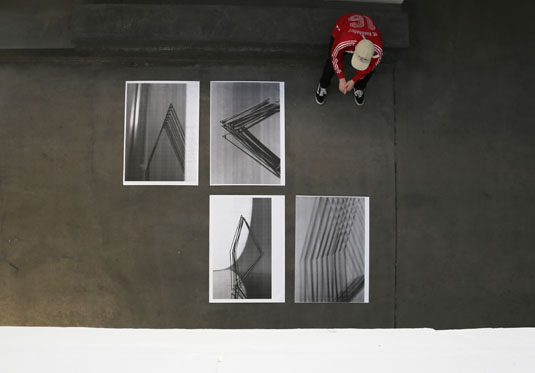
Michael's project Univers is a forensic examination of proportion and composition using Adrian Frutigers Univers Type system as a starting point. He explores form and counter-form, light and dark, and the history of print and digital typesetting using contemporary techniques and materials.
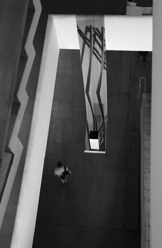
"The most challenging part of the project was to explore Univers and Swiss typography without mirroring what has gone before," he told us.
02. Kat Loudon
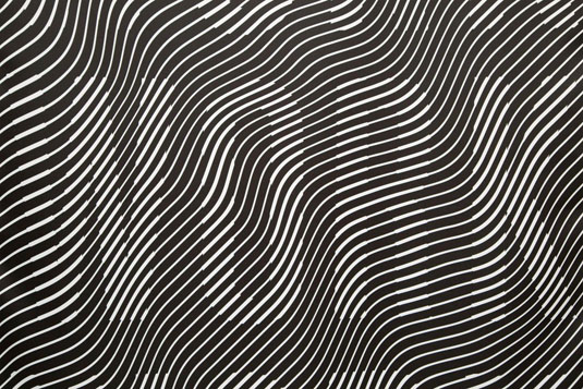
For her project Morris, Kat set out to make the writings of William Morris more accessible.
"William Morris is often overlooked as a writer," she told us. "My work focused on avoiding his strong aesthetic and distilling his writings on art, creativity and socialism."
Kat found that the most challenging part of the project was finding a way to condense his words without adding her own personal stamp to them, so she used a computer programme to do the work.
"I wanted it to be non-personal," she explained. "When I found a computer programme that would do the job it was a breakthrough.
"Morris hated machines, so I thought it was a good comment on his place today in the modern world of art and design."
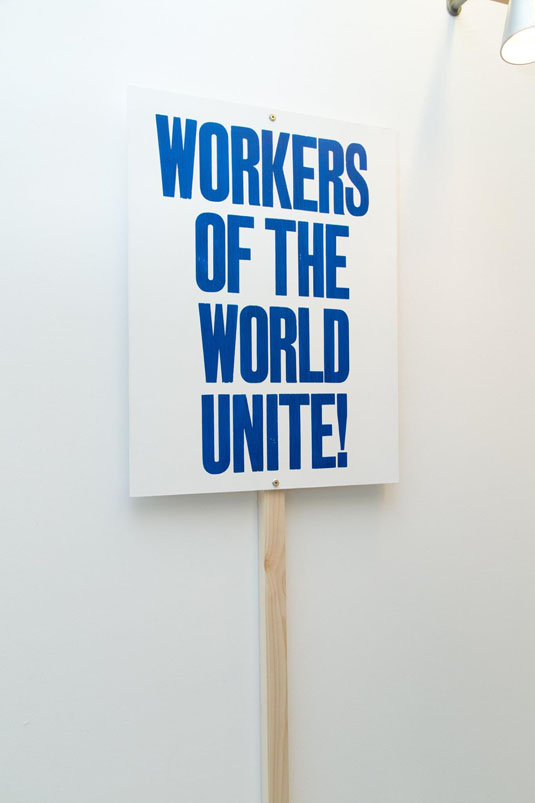
This project also gave way to a personal breakthrough for Kat as a designer. "During an interim tutorial my tutor told me to not be scared of my own ideas and just go for it," she told us.
In the end she had the confidence to take the placards, banners and embroidered denim jakets covered in William Morris’s writings that she had made down to George Square for the May Day March.
03. Sarah Bethan Jones
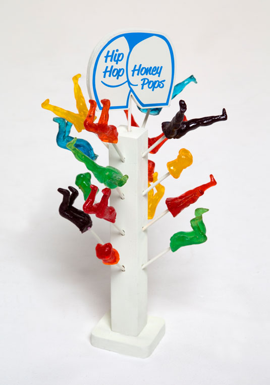
For Hip Hop Honey Pop Sarah looked at gender in hip hop music videos, finding that "the women are often little more than a sexualised prop to help sell an artist".
In order to make a comment on how such images are received by young people, Sarah made lollipops in the shapes of the hip hop women's body parts.
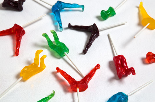
"It is both the intent and profit motive behind the mainstreaming of these highly sexualised images that these lollipops aim to expose, and how desensitised younger generations are to such imagery," she told us.
Sarah found that people were quite willing to interact with this project, and she felt that using a "subtle approach to a serious issue" had been a success.
04. Peter Holliday
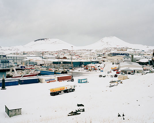
Peter Holliday travelled to Iceland to take photographs intended to document a facet of humanity's relation to the Earth.
"I wanted to show the relationship between mankind and the changing environment against the geography of the Vestmannaeyjar Archipelago in Southern Iceland within the context of the eruption of Eldfell in 1973," he explained.
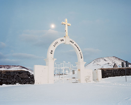
The experience of standing for long periods in sub-zero temperatures and the process of capturing the images gave him the opportunity to develop some existential insights: "This project affirmed my belief that landscape is an extremely important feature of the human condition, underpinning our very existence both physically and emotionally in a multitude of ways."
05. Imogen Ayres
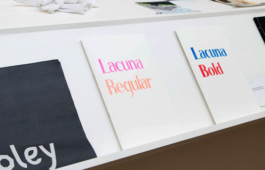
Imogen came up with the idea to design her own typeface when she was feeling frustrated with a research-based project. "I decided to try and make a typeface in a couple of days, with no references or initial idea - effectively designing subconsciously," she told us.
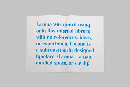
Without research or reference to visual source material, the letterforms were inspired by Imogen's general exposure to typeography - she refers to this as "subconscious design".
"The most challenging part was fine-tuning tiny details and letter spacing that so that it could actually be a functional typeface," she said.
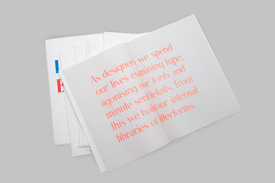
This project taught Imogen that successful work is often that which is created purely for the sake of enjoyment, and weeks of research and development aren't always necessary.
Next page: five more highlights from this year's GSA communication design degree show - plus get a half-price subscription to Computer Arts...

Thank you for reading 5 articles this month* Join now for unlimited access
Enjoy your first month for just £1 / $1 / €1
*Read 5 free articles per month without a subscription

Join now for unlimited access
Try first month for just £1 / $1 / €1
Get the Creative Bloq Newsletter
Daily design news, reviews, how-tos and more, as picked by the editors.

The Creative Bloq team is made up of a group of art and design enthusiasts, and has changed and evolved since Creative Bloq began back in 2012. The current website team consists of eight full-time members of staff: Editor Georgia Coggan, Deputy Editor Rosie Hilder, Ecommerce Editor Beren Neale, Senior News Editor Daniel Piper, Editor, Digital Art and 3D Ian Dean, Tech Reviews Editor Erlingur Einarsson, Ecommerce Writer Beth Nicholls and Staff Writer Natalie Fear, as well as a roster of freelancers from around the world. The ImagineFX magazine team also pitch in, ensuring that content from leading digital art publication ImagineFX is represented on Creative Bloq.
