New talent: meet the best of D&AD New Blood
We exclusively reveal 17 of tomorrow’s design superstars from 2015's D&AD New Blood.
If you're looking for the best new graduates for your studio or agency, don't miss Computer Arts' New Talent special, issue 243, featuring the team's handpicked selection of the UK's best graduates – on sale 24 July 2015
D&AD New Blood kicked off at London's Spitalfields Market on 1 July, in all its chaotic, creative glory. For two days, the enormous graduate fair – packed with rows and rows of work from the cream of the UK's design gradate crop – takes over the historic market space.
If you're looking to discover tomorrow's design superstar for your studio or agency, this is the place to be. Hundreds of 2015's most promising creative graduates, from 85 leading creative courses and 50 different universities and colleges, have picked their best work and it's all out on display.
The New Blood exhibition is free and open to the public on Wednesday 1st and Thursday 2nd July, from 10:30am to 8pm. If you're going, don't miss award-winning designer Radim Malinic – aka Brand Nu – live-drawing on the Computer Arts stand on Wednesday afternoon.
But if you can't make it, don't worry. As one of the judges of Best Stand category, we were lucky enough to be invited to the private viewing yesterday. Here are our top 17 highlights of 2015's D&AD New Blood exhibition.
01. Matt Reilly
- University: Arts University Bournemouth (AUB)
- Course: BA (Hons) Graphic Design
- Projects: B440ML and Broken Promises
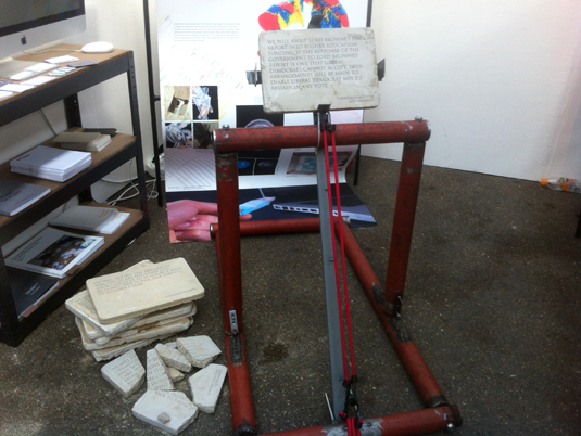
Matt Reilly's New Blood project – a "makeshift industrial" installation and video – is a comment on broken promises made by the government.
The promises are set in concrete slabs, with the catapult set to launch and break those that aren't kept. It's a nice highlight in a strong stand from Arts University Bournemouth's Graphic Design course.
Get the Creative Bloq Newsletter
Daily design news, reviews, how-tos and more, as picked by the editors.
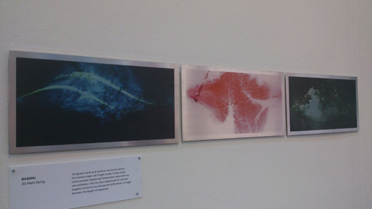
Reilly's photographic exploration of the "stories a beer can might reveal if it could communicate" received a Top Dog, Best of Show award.
"Replacing littered beer cans with my own pinholes, I left the cans exposed for various lengths of time to try and see the difference in image between the length of exposure," he explains.
Here are our highlights from the 2015 Arts University Bournemouth Graphic Design and Illustration degree shows.
02. Dom Okah and Libby Parfitt
University: University of the West of England (UWE)
Course: BA (Hons) Graphic Design
Project: Curiosity - Why Our Future Depends On It
Curiosity is a charming animation and illustration project by Dom Okah and Libby Parfitt, created in response to an RSA brief entitled Moving Pictures.
"Our narrative aims to make an informative piece of audio delivered by Ian Leslie more accessible to a wider audience," says Okah. Featuring beautiful textures and engaging characters, it's a stunning piece – if you're at D&AD New Blood it's worth a watch.
Here are our highlights from UWE's 2015 degree show.
03. Warin Wareesangtip
- University: Arts University Bournemouth (AUB)
- Course: Visual Communication (BA Hons)
- Work: Unhinted 96
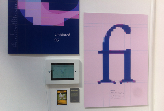
Unhinted 96 is an experimental treatment of the Adobe Garamond typeface, and was awarded a Top Dog, best of show, at D&AD New Blood. The project was inspired by the way in which early digital type was rendered on screen, where text was grid-fitted in an operating system that could only turn pixels on and off.
"The purpose of this typeface is to celebrate the hinters; craftsmen who are the backbone of the digital type era," says Wareesangtip.
04. Sam Cox
- University: University of the West of England (UWE)
- Course: BA (Hons) Illustration
- Work: The Doodle Man
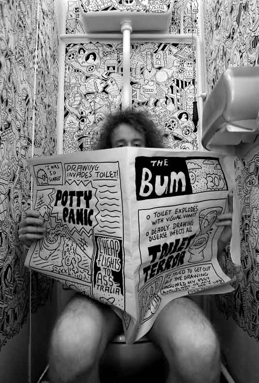
One of our biggest highlights - both of this year's exhibition and the private viewing event - was meeting talented University of West England graduate Sam Cox.
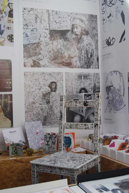
We especially liked his striking political satire, The Doodle Man, which explores the idea of world domination through drawing. If you're visiting the show, it's worth finding Cox and having a chat.
05. Tiziano Summo
- University: University of Westminster
- Course: Design for Communication MA
- Project: Tabu
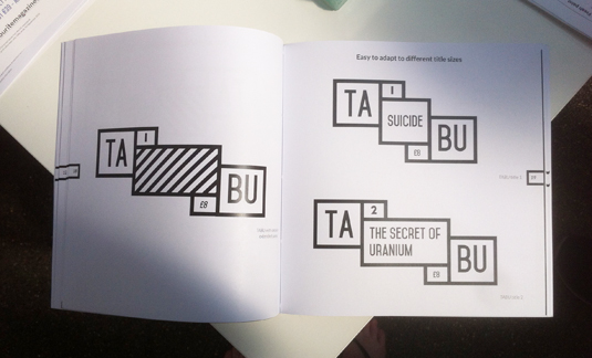
Tiziano Summo's D&AD New Blood project explores the word 'taboo' through a magazine and poster format. We were especially impressed with the interactive branding, which features a bold, dynamic logo.
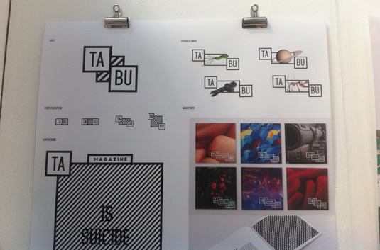
The project "approaches taboo topics by shedding light on mystery" using a "scientific method with an objective point of view," says Summo, who's at New Blood and ready to explain the project in more depth.
06. Gabriel Murad
- University: Middlesex University
- Course: BA (Hons) Photography
- Project: The Great Leap
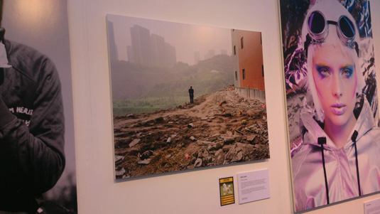
Gabriel Murad picked up a best of show award for The Great Leap, a powerful series of images depicting the rapid growth of three municipalities in China: Beijing, Shnaghai and Chongqing, and the port of Ningbo.
"China's thriving economy has led to a rapid development in new infrastructure," explains Murad.
"The demolition of old buildings within city centres is taking place so as to further modernise cities. Urban farms are being obliterated and the old suburbs are being knocked down to make room for skyscrapers and high-rise apartments."
07. Nina de Willebois
- University: Plymouth College of Art
- Course: Graphic Design BA (Hons)
- Project: A Sentimental Journey (thermochromatic journey)
Dutch graphic designer Nina de Willebois was inspired by African designs and "Western flat design" in her final year project, A Sentimental Journey. We liked her thermochromic leopard, which reveals hidden symbols - representing hidden meanings and stories - when viewed under a heat source (like the Spittlefields market venue).
Here's our round-up of the Plymouth College of Art Graphic Design degree show.
08. Edinburgh Napier University: Best Stand
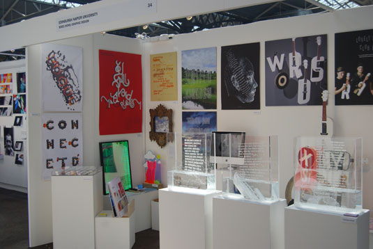
- Course: BDES Graphic Design
- Project: Entire stand
For the second year running, Edinburgh Napier University's Graphic Design course picked up Best Stand at D&AD New Blood.
Noted for the strong concept and excellent execution of all the work featured, the exhibition itself is well planned, featuring an engaging range of different projects - and with enough space to let each project breathe.
We're huge fans of Cameron Knott's typographic posters and water-filled posters, in particular, but the calibre of work is exceptionally high across the Edinburgh Napier University stand.
Here's our round-up of Edinburgh Napier's 2015 Graphic Design degree show.
09. James Parr and Adil Dad
- University: University of Central Lancaster (UCLAN)
- Course: BA (Hons) Graphic Design (James Parr)
- Course: BA (Hons) Digital Graphics (Adil Dad)
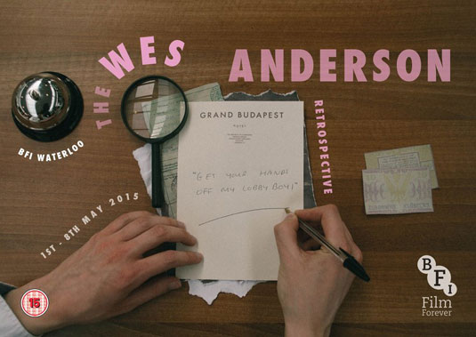
- Project: The Wes Anderson Retrospective
Another Top Dog, best of show, winner at this year's D&AD New Blood festival was The Wes Anderson Retrospective – a type-based celebration of Anderson's movies that expresses emotion through written words. "We went with Wes Anderson because of his unique and quirky take on films," the pair told D&AD.
"Promoting a retrospective of his movies using only type was a challenge. We scoured through several of his interviews and realised that his production methods are always carefully hand crafted and the attention to detail is maximum."
"We figured out that most of the type in his films had been handwritten by himself so we played on this."
10. Chester Holme
- University: Kingston University
- Course: BA (Hons) Illustration and Animation
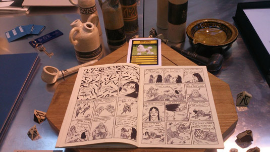
- Project: Revelations
Revelations is a multi-faceted, narrative-led project exploring the construction and eventual dispelling of a belief system.
Consisting of a two-part graphic novel and a series of ceramic objects, the project caught out eye – and the Best in Show judges too, who awarded the project a Top Dog. "Physical props add real-world validity to a long-form comic," says Holme.
11. Addena Charlotte Grubb
- University: Ravensbourne
- Course: BA (Hons) Motion Graphics
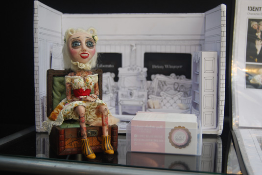
- Project: Horror TV Channel
For incredible handmade props, seek out Addena Charlotte Grubb's stunning handiwork on Ravensbourne's Motion Graphics stand.
The skill and attention to detail is top-class, and brings a new level of meaning to the films. Without a doubt, this is one of our favourite projects in the show this year.
12. Laura Sim
- University: Gray's School of Art, Robert Gordon University
- Course: BA (Hons) Communication design
- Project: Five senses
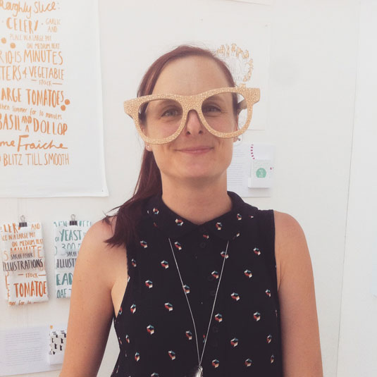
Don't miss the beautiful wooden glasses on Laura Sim's display. Part of the highly engaging Gray's School of Art stand – which encouraged a lot of discussion between some of the Best Stand judges, with many considered and well-crafted calls-to-action for visitors – Sim's display caught our eye with its intriguing focus on the senses.
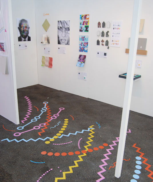
Sim's campaign features a framed mirror and a selection of oversized, abstract, laser-cut glasses to remind people "in a fun way" of the importance of regular eye checks.
13. Jessica Lauw
- University: Northumbria University
- Course: BA Graphic Design
- Project: Betrayal at the Speakeasy
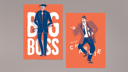
We were drawn to the graphics in Jessica Lauw's card game at the University of Northumbria stand. Inspired by the prohibition era of 1920s New York, the stripped-back colour palette is particularly effective.
14. Ida Marie Woldsund
- University: Southampton Solent University
- Course: Graphic Design and Illustration (BA Hons)
- Project: Illustration
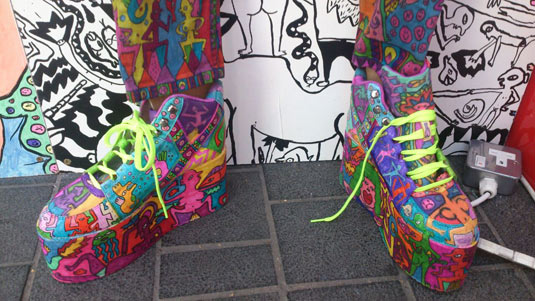
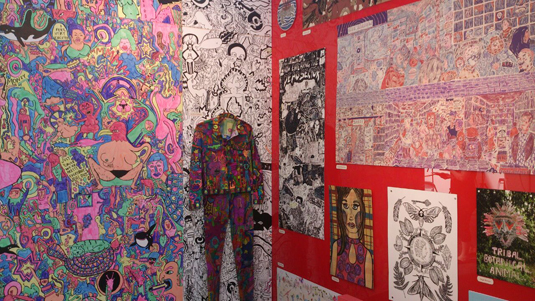
You can't walk past Southampton Solent University's Graphic Design and Illustration stand without noticing Ida Marie Woldsund's eye-catching large-scale illustration. We especially liked the detail on the shoes.
15. Edinburgh College of Art - Best Stand runner-up
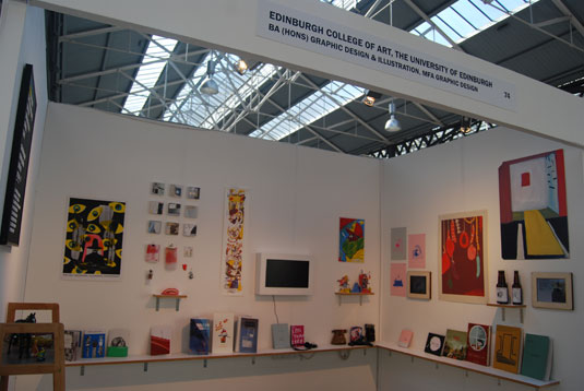
- Course: BA (Hons) Graphic Design and Illustration
- Project: Entire stand
Two creatives to catch our eye on the Edinburgh College of Art stand - which was a runner up in the Best Stand category - were George Douglas and Ailsa Johnson.
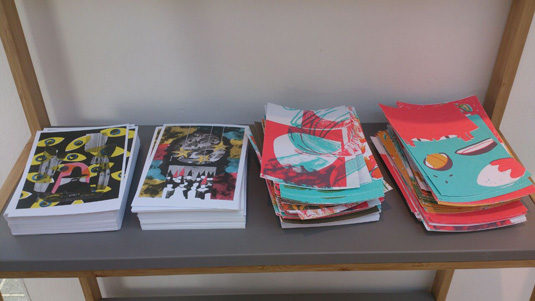
The calibre of work across the stand is exceptionally high, so make sure you stop in and see what all the fuss is about.
16. Leeds College of Art
- Course: Graphic Design BA
- Project: Entire stand
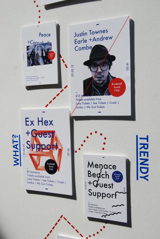
Another stand that caught our eye during judging was Leeds College of Art. Featuring a consistently good standard of work, the stand also makes good use of white space.
We particularly liked the way some of the pieces – by Sam Cook, Danielle Muntyan, Adam Garbutt and Harrison Park – have been integrated into the stand itself, with key elements pulled out of the work and used as decoration around the display.
Here are our highlights from the Leeds College of Art 2015 Graphic Design degree show.
17. Annalize Haughton & Becky Townsend
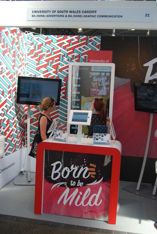
- University: University of South Wales Cardiff
- Course: Graphic Communication BA (Hons)
- Project: Sugar and Spice poster
While judging the Best Stand, the Computer Arts and Creative Bloq team spent a long at University of South Wales Cardiff's stand. The work is displayed digitally on a Surface, inviting visitors to interactive with each graduate's work.
We enjoyed the interactive element of the stand – and Annalize Haughton and Becky Townsend's collaged Sugar and Spice poster in particular caught our eye, amongst a range of good work.
Half-price Computer Arts subs offer!
To celebrate 2015 degree show season, you can get an incredible 50 per cent off an annual subscription to Computer Arts magazine. For £39 you'll receive 12 months of industry insight, opinion and inspiration, delivered to your door.
Plus: sign up by 7 July 2015 and you'll receive Computer Arts' New Talent issue, featuring an extensive guide to 2015's most outstanding design graduates.

Thank you for reading 5 articles this month* Join now for unlimited access
Enjoy your first month for just £1 / $1 / €1
*Read 5 free articles per month without a subscription

Join now for unlimited access
Try first month for just £1 / $1 / €1
Julia is editor-in-chief, retail at Future Ltd, where she works in e-commerce across a number of consumer lifestyle brands. A former editor of design website Creative Bloq, she’s also worked on a variety of print titles, and was part of the team that launched consumer tech website TechRadar. She's been writing about art, design and technology for over 15 years.
