What Massimo Vignelli can teach designers today
Justin Reynolds examines the legacy of the late designer and the lessons we can learn from him.
Massimo Vignelli (1931-2014), who died last week, was one of the great designers of the 20th century.
Vignelli, together with his wife and lifelong design partner Lella, and the generations of gifted designers who worked at his New York agency Vignelli Associates, produced many of the most iconic designs of the past 50 years, defining visual identities for the New York City subway, IBM, American Airlines and the US National Parks Service. His work extended beyond graphic design to encompass consumer products, furniture, clothing, architecture and even the interior of a church.
He was celebrated for his teaching as well as his work. (Michael Bierut, a Vignelli protégé, testifies to his mentor's kindness and encouragement in a moving tribute written for Design Observer.) Which means Vignelli's legacy is of fundamental importance to all designers. The web emerged too late in his career to allow him to make a direct contribution to the medium, but the design principles that guided his work have had a profound impact upon the processes and aesthetics of both traditional and digital design.
Modernist principles

Those principles were developed during the golden age of 20th century modernist design, the decades following World War II when the systematic approach to graphic design pioneered during the 1920s and '30s by movements such as the Bauhaus, Constructivism and de Stilj was refined into a rigorous set of maxims and processes suitable for day-to-day commercial work. The body of design theory and best practice formulated by the modernists continues to serve as bedrock knowledge for today's designers.
Vignelli, along with other leading 20th century designers such as Josef Müller-Brockmann and Paul Rand, with whom much of his career overlapped, made a significant contribution to that process of professionalisation. His work applied the principles he had learned from his forebears and peers with uncompromising rigour, and his teaching in turn refined and extended them further.
Though he was a man of great personal warmth and humour, Vignelli's conception of the nature and practice of design was austere. For him, design was an severe, ascetic discipline, demanding self-denial and humility. The designer's ultimate objective is not the pursuit of beauty, self-expression or wealth, but rather the forensic application of the guiding principles of design to every project, large or small.
Methodology

Vignelli's design methodology is well documented in many interviews, articles, books and videos, but is summarised with particular clarity in The Vignelli Canon, a short book he wrote towards the end of his career which with typical generosity he made available as a free PDF download.
Get the Creative Bloq Newsletter
Daily design news, reviews, how-tos and more, as picked by the editors.
The first half of the book, with sets out Vignelli's fundamental design principles in no more than 40 pages, is one of the clearest guides to the modernist design aesthetic available anywhere.
The designer's first objective when beginning a new project, says Vignelli, is to attain a clear understanding of the 'semantics' of the task before her: the designer must take time to understand the nature of the client and their audience, and how the subject of the design will relate to sender and receiver in such as way as to make sense to both.
Design syntax
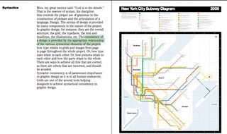
Once the designer is satisfied they understand the meaning of the project, they can move on to researching an appropriate 'syntax' for the design, a visual grammar, the set of design elements most suitable for the task at hand. In Vignelli's words:
The consistency of a design is provided by the appropriate relationship of the various syntactical elements of the project: how type relates to grids and images from page to page throughout the whole project. Or, how type sizes relate to each other. Or, how pictures relate to each other and how the parts relate to the whole. There are ways to achieve all this that are correct, as there are others that are incorrect, and should be avoided.
Correct definition of the project's semantics and syntax creates a framework within which the designer can exercise his imagination to develop an 'appropriate' design. For the professional designer creativity can only come into play within the grid of possibilities established through completion of the first two stages in the design process.
Design is one
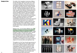
Vignelli believed these principles - semantics, syntax and appropriateness - should be applied to all projects across every field of design, whether the subject be the layout of a business card or the architecture of a skyscraper. As he put it, 'Design is one':
The discipline of Design is one and can be applied to many different subjects, regardless of style. Design discipline is above and beyond any style. All style requires discipline in order to be expressed. Very often people think that Design is a particular style.
Nothing could be more wrong! Design is a discipline, a creative process with its own rules, controlling the consistency of its output toward its objective in the most direct and expressive way.
Intellectual elegance

For Vignelli the design process must at all times exemplify painstaking clarity of thought: successful design is the physical manifestation of an ideal he referred to as 'intellectual elegance', which his Canon describes in the most exalted tones:
We often talk about Intellectual Elegance, not to be confused with the elegance of manners and mores. For me, intellectual elegance is the sublime level of intelligence which has produced all the masterpieces in the history of mankind.
It is the elegance we find in Greek statues, in Renaissance paintings, in the sublime writings of Goethe, and many great creative minds.
It is the elegance of Architecture of any period, the Music of all times, the clarity of Science through the ages. It is the thread that guides us to the best solution of whatever we do. It is the definitive goal of our minds - the one beyond compromises.
It elevates the most humble artifact to a noble stand. Intellectual elegance is also our civic consciousness, our social responsibility, our sense of decency, our way of conceiving Design, our moral imperative. Again, it is not a design style, but the deepest meaning and the essence of Design.
Timeless quality

The pursuit of intellectual elegance invests design with a timeless quality:
We are for a Design that lasts, that responds to people’s needs and to people's wants. We are for a Design that is committed to a society that demands long lasting values. A society that earns the benefit of commodities and deserves respect and integrity.
The intensity of Vignelli's commitment to design had a religious quality, his pursuit of 'intellectual elegance' bearing comparison with the believer's pursuit of God. It's revealing that his writing always refers to 'Design' with a capital 'D'. And that, like many designers of his generation, he dressed simply, often in black, an austere uniform somewhat evocative of the monk's habit.
The high seriousness with which Vignelli pursued his craft is characteristic of the modernist movement that suffused the 20th century. For modernists in every field - design, literature, art, music and architecture - the collapse of traditional religious belief left a vacuum that human culture had to fill. The pursuit of excellence took the place of the worship of God.
Typographic principles
Vignelli's work is characterised by great simplicity, exhibiting something of the purity of religious symbolism: think Orthodox icons, the severity of Reformed church architecture, and the austere spaces of Gothic cathedrals.
His graphic design is of particular interest to digital designers, exhibiting a particularly pure expression of the modernist typographic principles that inform professional online design.
All of his designs make disciplined use of the grid, organising content into modules created by the interplay of rows and columns. He makes careful use of asymmetry and whitespace to invest his designs with tension and dynamism.
Horizontal rules
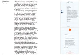
The use of horizontal rules to further demarcate the ordering of content was a particular characteristic of his work. His canon overflows with characteristic enthusiasm for the creative possibilities afforded by the grid: for Vignelli, whitespace evokes the great open spaces of the American landscape, and gridlines are redolent of musical notation:
It is just like in music, where five lines and seven notes allow one to make infinite compositions. That is the magic of the grid.
He favoured the use of strong imagery and bold colour schemes, often restricting himself to the use of the primary colours, blue, red and yellow. This helped give his designs clarity and directness:
Visual strength is an expression of intellectual elegance and should never be confused with just visual impact - which, most of the time, is just an expression of visual vulgarity and obtrusiveness.
Minimal approach
His use of type was similarly severe. Vignelli often used just one typeface for each design, and often simplified matters even further by avoiding use of italics and bold, relying instead on gradations of scale to establish typographic hierarchy. And - famously - he used only a handful of typefaces through his entire career.
Vignelli welcolmed the design possibilities afforded by new technology, but lamented the proliferation of redundant typefaces made possible by the accessibility of type design software:
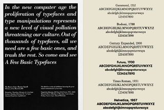
The advent of the computer generated the phenomena called desktop publishing. This enabled anyone who could type the freedom of using any available typeface and do any kind of distortion. It was a disaster of mega proportions. A cultural pollution of incomparable dimension. As I said, at the time, if all people doing desktop publishing were doctors we would all be dead! Typefaces experienced an incredible explosion. The computer allowed anybody to design new typefaces and that became one of the biggest visual pollution of all times.
Vignelli went so far as to arrange an exhibition demonstrating the range of work his agency had been able to undertake using only four typefaces: Garamond, Bodoni, Century Expanded, and Helvetica.
A deceptive simplicity
Vignelli's graphic design work has a deceptive simplicity. Simple grids. Simple use of whitespace. Simple photography. Simple typography. Any designer might think: "I could do that."
And they would be right. Vignelli's work is eminently accessible. There is nothing mysterious about it. Everything is transparent, out in the open. Every aspect of his designs have been created in the full light of well established design principles that anyone can learn and implement. That is the whole point of the modernist design process: to move design from the cloudy subjective realm of inspiration to the well-lit objective world of documented repeatable process.
But the example of Vignelli's life and work also serves to demonstrate that knowledge of sound design principles is not enough. Design is not merely an intellectual process, it is a moral discipline. The obsessive, exalted terms in which Vignelli refers to design demonstrates his acute understanding of the self-sacrifice that good design requires.
Vulgarity
The pursuit of 'intellectual elegance' requires that the designer overcome the constant temptation to reinterpret design as a channel for self-expression, to follow fashion, to try out new techniques unsuitable for the task at hand. For Vignelli, all of that is 'vulgarity':
We are definitively against any fashion of design and any design fashion. We despise the culture of obsolescence, the culture of waste, the cult of the ephemeral. We detest the demand of temporary solutions, the waste of energies and capital for the sake of novelty.
Good design has a moral dimension. Its function is to meet the common interest of all parties: the client, their audience, and wider society. The designer's satisfaction consists in a thorough realisation of the project's objectives, not the expression of a personal need.
For Vignelli this austere discipline was a wholly absorbing life-long pursuit: even the most humdrum project is fulfilling if it follows the correct process:
I strongly believe that design should never be boring, but I don't think it should be a form of entertainment. Good design is never boring, only bad design is.
Passion for design

Some designers, like Vignelli, will find design an all-consuming passion. Like him, they will be entranced precisely because of the discipline it demands, the purity of intention it requires.
But others will find that design, as conceived by Vignelli, is not a sufficiently broad channel for all that they might want to express. And there is nothing wrong with that.
It is entirely to be expected that many designers will be creative types who will experience keenly the limitations that professional design imposes on their scope for free expression.
Need for subjectivity
The answer, I think, is not to reconceive design as an artistic endeavour, to bend the boundaries of what good design practice permits so as to allow for the exercise of subjectivity. Vignelli's understanding of the nature of design is surely right: it is a pragmatic, technical pursuit, not an artistic one. Of its very nature design cannot serve as a vehicle for subjective expression. That would be to misunderstand the kind of discipline it is.
Rather, designers for whom design, so to speak, is not enough, need not give up design, but make sure they have other creative outlets, such as art, illustration, painting, music, or writing. It is unfortunate that design is so often represented as a 'creative' field without qualification of what the word 'creative' means in this context. Understood correctly, the creativity that designers exercise is constrained, channelled within the parameters set by the task at hand. The designer, unlike the artist, does not begin with a blank canvas.
Vignelli was a great designer because he understood the ascetic nature of design, and loved it for that very reason. In that sense, perhaps, he was rather unusual. For many of us design will provide professional satisfaction, but no more and no less than that. We should not be deceived by the sentimental, and sadly prevalent, contemporary notion that design is set apart from other professions as a field in which 'creatives' can follow their 'passion'.
Vignelli's example teaches us what we should expect from design, and what we should not, and the satisfaction and sacrifice involved in doing it well.
Words: Justin Reynolds
Justin Reynolds is a web designer, blogger and copywriter based in Edinburgh, Scotland.

Thank you for reading 5 articles this month* Join now for unlimited access
Enjoy your first month for just £1 / $1 / €1
*Read 5 free articles per month without a subscription

Join now for unlimited access
Try first month for just £1 / $1 / €1
The Creative Bloq team is made up of a group of design fans, and has changed and evolved since Creative Bloq began back in 2012. The current website team consists of eight full-time members of staff: Editor Georgia Coggan, Deputy Editor Rosie Hilder, Ecommerce Editor Beren Neale, Senior News Editor Daniel Piper, Editor, Digital Art and 3D Ian Dean, Tech Reviews Editor Erlingur Einarsson and Ecommerce Writer Beth Nicholls and Staff Writer Natalie Fear, as well as a roster of freelancers from around the world. The 3D World and ImagineFX magazine teams also pitch in, ensuring that content from 3D World and ImagineFX is represented on Creative Bloq.
