Design a chrome and plastic button in Photoshop
Making UI elements should be part of every designer’s toolbox. Here's how to make a cool looking chrome and plastic button in Photoshop.
Words: David Montrose
Given the ever-increasing popularity of smartphones and tablets, as a designer it's likely that at some point you’ll find yourself being asked to create an app interface.
Whether or not you’re into skeuomorphic design, at the very least this should be an experiment in using bevels and shadows, and like any design, a process of tweaking settings until it looks right.
One of the most fundamental elements of an user interface is a button, so here we'll show you how to create a smart looking chrome and plastic button in Photoshop CS6.
01. The basic chrome button
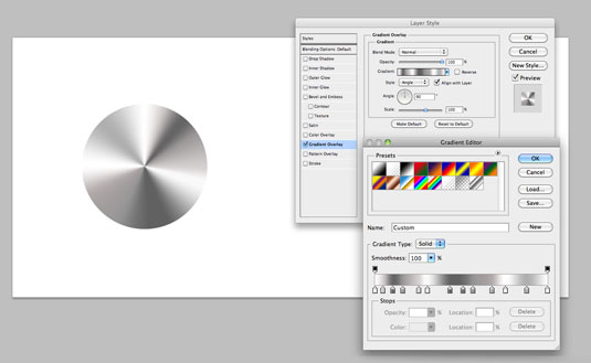
Create a new document and draw a white circle, making sure you leave room for the rest of the image. Call this layer 'Button'.
In the layer’s Gradient Overlay settings, click on the gradient graphic a number of times to create new points. Choose a slightly darker or lighter shade of grey for each one (see above).
In the 'style' dropdown of the gradient overlay settings choose 'angle' and untick ‘Transparency Shapes Layer’ in Blending Options. It should now start to look like a metal disc.
If there’s a solid line in the gradient, go back to the layer's gradient settings and ensure the left and right colours are the same.
Get the Creative Bloq Newsletter
Daily design news, reviews, how-tos and more, as picked by the editors.
02. Add a brushed metal effect
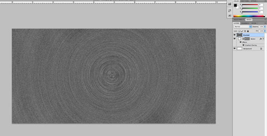
Make a new layer above the Button and fill it with black; call this layer ‘Brushed'. Choose Filter>Noise>Add Noise then 'Gaussian' and 'Monochromatic' and set the noise level to around 200.
Go to Blur>Radial Blur and choose ‘Spin’ + ‘Good’ and increase the level to 20. You should now have a noisy spiral.
03. Mask it off
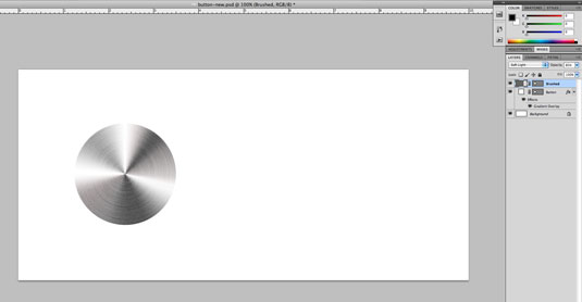
In the Brushed layer's Transparency setting choose 'soft light' and take it down to 85%. Drag the centre of your spiral until it matches with the centre of the Button.
You should now see a more realistic brushed metal effect. To stop the Brushed layer affecting any other layer, alt-drag the path from teh button layer to the Brush layer to mask it off.
04. Create form and lighting
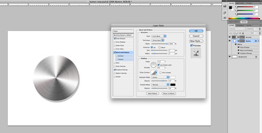
To add some shape, double click on the Button layer and select ‘Bevel and Emboss’. Choose style: ‘Inner Bevel’; Technique: ‘chisel hard’; Depth: ‘1000%’; Direction: Up, then soften it slightly.
The size will depend on the size of your document, so start with 1px and increase from there – just a slight edge.
Bring the bevel’s Shadow Mode opacity down to around 20%.
For depth, add a 'multiply' drop shadow to the Button layer. Distance and transparency is up to you. Try a lesser distance, harder edge and more transparency, a bigger and heavier shadow – see what works.
05. The losenge
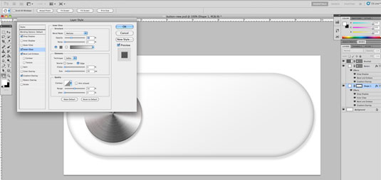
Draw a round-edge rectangle and call this layer 'Losenge'. Add Bevel and Emboss, and turn the bevel's softness all the way up, and the Shadow Mode down to 10%.
Add a grey Inner Glow set to 'Multiply' and a very light Gradient Overlay and Drop Shadow to further emulate a light source.
Alt-J the button layer and call the lower version ‘Outer bevel’. Give it a small outer bevel, replacing the Highlight mode with a light grey on multiply. Turn off all other effects on this layer.
06. Finishing touches
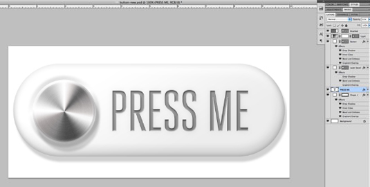
On the Button layer, add a soft inner white glow at around 60% using ‘Screen’ transparency. Above the button layer, add a new black to white Gradient Layer and call it 'Light'.
Then, Alt+drag the Button layer’s shape path onto it, so it’s masked to the size of the button. Cmd+t and scale it down by a couple of percent, enough to show some edge glow on the Button.
Angle the gradient so it matched your global light and change the layer transparency to ‘soft light’ at around 30%. Add some text to mark what the button does with a downward inner bevel, small inner shadow, tweak your shadows to match… and you’re done!
Liked this? Read these!

Thank you for reading 5 articles this month* Join now for unlimited access
Enjoy your first month for just £1 / $1 / €1
*Read 5 free articles per month without a subscription

Join now for unlimited access
Try first month for just £1 / $1 / €1

The Creative Bloq team is made up of a group of art and design enthusiasts, and has changed and evolved since Creative Bloq began back in 2012. The current website team consists of eight full-time members of staff: Editor Georgia Coggan, Deputy Editor Rosie Hilder, Ecommerce Editor Beren Neale, Senior News Editor Daniel Piper, Editor, Digital Art and 3D Ian Dean, Tech Reviews Editor Erlingur Einarsson, Ecommerce Writer Beth Nicholls and Staff Writer Natalie Fear, as well as a roster of freelancers from around the world. The ImagineFX magazine team also pitch in, ensuring that content from leading digital art publication ImagineFX is represented on Creative Bloq.
