Design a stunning letterhead: 10 expert tips
A beautiful letterhead can make all the difference to the success of your branding. Here's how to make one.
There's a huge difference between receiving a letter on standard blank paper, and getting one topped with a beautifully designed letterhead. A letterhead acts as a marketing opportunity, provides an opportunity for brand engagement and, apart from anything else, lend credibility to the words on the page.
- Brilliant Photoshop tutorials
Designing an effective letterhead is a unique challenge. Sometimes your letterhead design will be the first interaction a customer has had with a particular company, while other times it will be used to reinforce the brand identity. It's crucial to get the details right, but to also produce something that's eye-catching, and memorable. See amazing examples on our letterhead design post.
01. Keep it simple
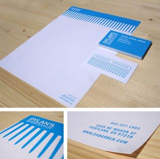
One of the most important principles behind an effective letterhead is to keep the design as simple as possible. Keep in mind that a letterhead is essentially a delivery mechanism. It's important your letterhead looks and feels great in the hand, but the design should make way for the content of the letter that's printed over it.
By all means use your design to showcase the content, but don't try to wrestle it for the reader's attention. It's useful to ask yourself whether you're competing with the content: if you're in doubt, simplify your letterhead design.
02. Use the right software
There are times when it makes sense to use Photoshop as your design tool, and it's perfectly possible to design a letterhead using Photoshop, but there are far more suitable tools available for the job.
At the top of the list are Illustrator and InDesign. Both these tools have excellent typography controls and are vector-based, making it easier to draw simple elements and reposition them effectively.
If you only have Photoshop available to you, keep in mind that print-destined artwork should be produced at 300dpi and if you're printing your letterheads commercially there will be a bleed requirement (consult with your print supplier).
Get the Creative Bloq Newsletter
Daily design news, reviews, how-tos and more, as picked by the editors.
03. Use hierarchy in your design
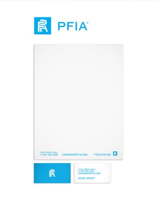
Letterhead design, like almost every other field of design, is about communicating important information effectively. Usually (although by no means always) the most critical piece of info you need to communicate is who's writing the letter – the company or individual responsible. After that, a return address, telephone number or email address are all needed; but they're not quite as important as the company name. Or are they?
You need to decide on the critical pieces of information your letterhead should convey, and design based on this hierarchy. Key information should be positioned obviously and accessibly, while less important information can be reduced in size and tucked away in a less obtrusive area.
04. Choose the right details
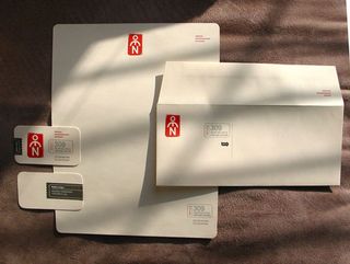
It's not always necessary to include every last detail on a letterhead. Consider who will be using the stationery. If it's specifically for the managing director's secretary, and will always be used just by them, perhaps it makes sense to include a direct dial to the secretary's office. If it's more general stock to be used for many different applications, go for a general number instead.
There may be certain legal requirements for information must be included, such as registration numbers for accrediting bodies such as Companies House, or The Charity Commission. But beyond those requirements, consider what information is really necessary, and choose the right details for your letterhead.
05. Design for the medium
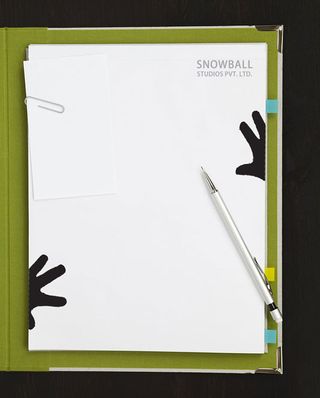
It used to be that letterheads were exclusively designed for print; they'd be professionally printed and then typed over (or printed over) in the office. Yet paper is becoming a precious commodity in the digital era, and many letterhead designs will only every see an office printer – being printed directly using a Word template or similar.
You need to understand how your letterhead design will be used, because there's little point designing a full-page bleed when the office printer doesn't print to the edge of the sheet. Instead, if you're designing for a self-print solution, use generous margins at the edge of the page and avoid extremely light tints that might not reproduce well on office equipment.
06. Represent the brand
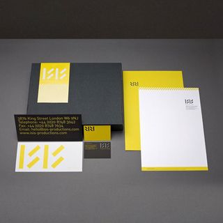
Make sure you carefully represent the company's branding when designing your letterhead. This isn't just about the logo, but the choice of colour scheme, font(s), imagery, and much more. If your logo has an exclusion zone, make sure you adhere to it on your letterhead. Equally important is to use the correct font – Helvetica won't cut it if the corporate font should be Univers!
07. Exploit stock characteristics
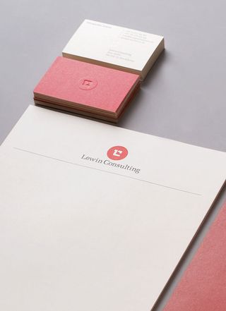
If you're designing for print, there are many wonderful paper stocks available from companies such as GF Smith. Each has its own characteristics – some have a rich, textured surface while others are smooth and heavyweight.
Using the choice of stock as part of your letterhead design process can help to cement your artwork in its new home, producing something pleasingly tactile and visual.
Do keep in mind the need for practical application, though – there's no point designing a letterhead on 320gsm card if your client's office printer can't handle that weight of stock!
08. Add special effects
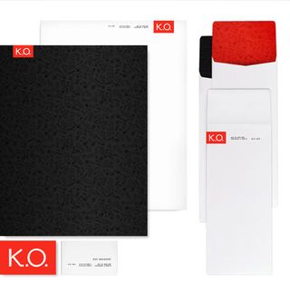
If you're getting your letterheads printed professionally, consider what special effects you can employ to make your design take on an extra lustre.
A simple way to add sophistication to your design is to print solid colour on the reverse of the letterhead, and overprint a spot-UV design that will reflect light differently to the non-UV-printed areas. This is a cost-effective but visually impressive effect.
Other options include using a specialist printer for letterpress effects (embossing and debossing), foil blocking, and die-cutting.
09. Consider alignment and positioning
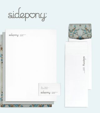
Remember that your letterhead design should relate the branding to the medium – take advantage of the size and shape of the letterhead to inform decisions about where you place individual elements.
For example, in a standard A4 portrait letterhead, consider indenting the logo half its icon width from the edge. This balance of shape and offset will help cement your design on the page, creating a connected design.
10. Use colour sparingly
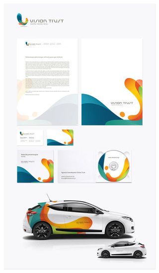
This rule applies to pretty much anything you design, but is worth repeating regardless. Colour is a great way to draw attention to your design, and to specific areas within your letterhead. Not only can it highlight a section, but it can also communicate specific ideas and emotions, create associations and, of course, reinforce branding.
Colour is an extremely powerful tool that can make or break your letterhead design – but as the saying goes, with great power comes great responsibility. Use colour sparingly and make the most of the impact it brings to your letterhead design.
Related articles:

Thank you for reading 5 articles this month* Join now for unlimited access
Enjoy your first month for just £1 / $1 / €1
*Read 5 free articles per month without a subscription

Join now for unlimited access
Try first month for just £1 / $1 / €1
Sam is a designer and illustrator based in Scotland, UK. He splits his time between art and design, motion and video and writing for various creative titles. He has written a book about web design, Pro CSS3 Layout Techniques and contributed to typography book, Fonts and Typefaces Made Easy.
