Key terms every graphic designer should know
Whether you're a newbie, student or just in need of a refresher, read this guide.
Graphic design, like any profession, is littered with jargon and phrases you might not be familiar with. Here are some of the key terms you should know, with a brief explanation – in words you can understand – of what they mean, plus info on where to go to learn more.
A bit like a design style guide, we've separated our list into different section, with a page for the themes of images, typography, graphic design and printing. Use the drop-down menu above to navigate to the theme you're interested in. We'll start with terms related to images.
Image types
Raster images
Raster images (sometimes referred to as bitmap images) are made up of thousands of pixels that determine colour and form. Photos are raster images. Photoshop CC is the most common raster editor, enabling you to manipulate the colour and other properties of the pixels.
Because raster images are made up of a finite amount of pixels, resizing can be tricky. If you give a raster image larger dimensions in Photoshop, the software has to make up data in order to add the size. This results in a loss of quality.
Vector images
Vector-based images (such as those created in Illustrator CC) are made up of points, each of which has a defined X and Y coordinate. These points join paths to form shapes, and inside these shapes you can add colour fills. Because everything you generate is based around this, vectors can be blown up to any size without any loss of quality.
Get the Creative Bloq Newsletter
Daily design news, reviews, how-tos and more, as picked by the editors.

In recent times, Illustrator has progressed so much that vector graphics have become incredibly complex. You can now add gradients, complex shapes and more to create highly detailed, scalable vector images. Because vectors can be resized, they are often used for logos and other graphics that need to be used across many different outputs (from leaflet to billboard size, for instance).
For more details see How to create vector art: top tutorials.
Colour modes
When working in Photoshop or Illustrator, you have the option to set your document's colour mode to CMYK or RGB. There are some other colour modes, but CMYK and RGB are the two you really need to know about.
CMYK
CMYK is the standard colour mode for sending documents – whether it's a magazine, newspaper, flyer, brochure, annual report and so on – to the printer. It stands for cyan, magenta, yellow and key.
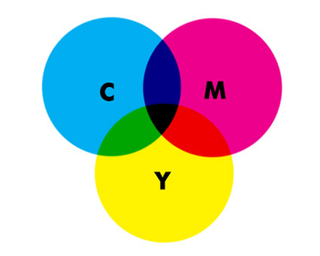
'Key' in this instance means black. It's referred to as key because in four-colour printing, cyan, magenta and yellow printing plates are carefully keyed, or aligned, with the key of the black key plate.
When you send a job to the press, cyan, magenta, yellow and black plates are made (on a traditional press, anyhow) and then aligned to print on paper. You can add Pantone, or fifth colours, as separate plates.
RGB
RGB stands for red, green, blue, and is used for screen output. Because CMYK has a more limited colour gamut than RGB (which is essentially what the eye sees and how screens output), you can experience a loss of colour when converting from RGB to CMYK in these applications.
For more on colour systems, read this article.
Image resolution
Resolution is another key term that is often confused. There are two main acronyms used when dealing with resolution: DPI and PPI.

DPI
DPI is only of concern when you're creating work for printed output. It stands for 'dots per inch' and refers to the number of dots per inch on a printed page. Generally, the more dots per inch, the better quality the image. 300DPI is the standard for printing images.
PPI
PPI stands for 'pixels per inch' and, as you'd expect, refers to the number of pixels per inch in your image. If you make an image larger in Photoshop, you will increase the number of pixels per inch (with Photoshop making up the data) and you will lose quality. There's an excellent explanation here.
Bear in mind that resolution only applies to raster graphics, because vectors do not work in pixels.
Next page: Typography terms you should know

Thank you for reading 5 articles this month* Join now for unlimited access
Enjoy your first month for just £1 / $1 / €1
*Read 5 free articles per month without a subscription

Join now for unlimited access
Try first month for just £1 / $1 / €1
Rob is editorial, graphic design and publishing lead at Transport for London. He previously worked at Future Publishing over the course of several years, where he launched digital art magazine, ImagineFX; and edited graphic design magazine Computer Arts, as well as the Computer Arts Projects series, and was also editor of technology magazine, T3.
