20 brilliant beer label designs
There's been an explosion of inventive and original beer label designs in recent years. Here are some of the best.
The label is the beverage bottle's shopfront, where it displays its logo design or handmade cursive fonts in order to attract custom. Wine bottles may get more of the spotlight when it comes to label design, but a recent trend to home breweries and the growing popularity of small run craft beers is opening up a whole new world in beer label design.
While companies such as InBev may have the market cornered in terms of big name beers like Budweiser, Beck's, or Stella Artois, it's the smaller brew houses – which you may never of heard of until now – that are getting really creative with their label designs. So here we've gathered together some of the most creative examples of beer bottle label designs to inspire you.
01. Goldhawk Ale

With such a memorable name, Goldhawk was always going to need a strong logo to reflect the defining features of their mascot. They have avoided using any distracting text on the front label, and instead created a bold design of a hawk, in one colour, on a transparent sticker to show the colour of the golden or pale ale. Visually impactful, it gives the craft beer a strong identity in a competitive market.
02. Around The World Beer Flight
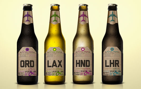
Another inspiring design comes from this special six pack – Around The World Beer Flight. Design agency Solarium Creative were tasked with coming up with an eye-catching label design whilst portraying the taste of the beers themselves.
"Experience a true beer flight around the world with Artificial Horizon's specialty six pack. Inspired by vintage luggage labels, I created each beer label to represent major airports worldwide," explains Solarium Creative's Andrew Sailer. "I'm also considering designing the six pack case as an old suitcase".
03. Sakiskiu Alus
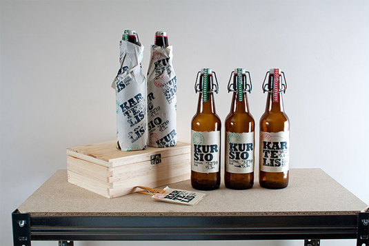
Sigitas has done an incredible job with this branding for Sakiskiu Alus beer. It took an unusual approach, designing and producing a kit that includes a rubber stamp for each type of beer; this kit enable the brewer to mark the labels themselves. The combination of rubber stamped labels and hand-made paper design gives off a real craft beer feel and showcases the originality and care of this brilliant brewery.
04. Half Acre

Half Acre describes its beer as "a reflection of those that keep it alive, the people that hoist the beer and the places where it's found" – and that ethos is also reflected within the labels. After each beer is lovingly crafted, the label is designed to reflect the inspiration behind the brew. Ranging from cats and robots to donkeys and daisies, the label designs are just as delicious as you'd expect the beer to be.
Get the Creative Bloq Newsletter
Daily design news, reviews, how-tos and more, as picked by the editors.
05. Yoho Brewing Company
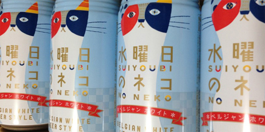
Japan's Yoho Brewing Company decided to make American and British style beers in cans. This quirky, colourful illustration really brings this craft label design to life. We love the clever use of colour within the typography, as well as the subtle use of spots and stripes.
06. Russell Brew Co. Angry Scotch Ale
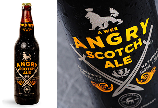
Why wrap your beer bottle with a label that can peel off when you can print it right on the bottle? Russell Brewing Co's Angry Scotch Ale, brought to you by the people at Atmosphere Design, features ink right on the bottle. It's a good way to save on paper and glue while also creating a striking design.
07. St. Stefanus
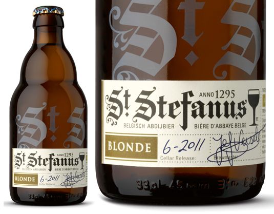
When you look at the label created by Brandhouse for St Stefanus, you are seeing history. In fact you are seeing almost 700 years of beer brewing tradition, dating back to the Augustijn monks who originated the recipe. Some elements of the font used on the bottle and label even come from songbooks found in the Augustijn's monastery library.
08. Grimm Brothers Magic Mirror
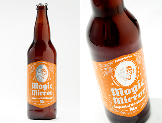
Inspiration for beer labels, and in this case even a beer's name, can come from anywhere. The folks at The Tenfold Collective mined fables and fairytales for design and naming ideas to create the labels for the Grimm Brothers series of ales. In the case of Magic Mirror, they incorporated a reflective label in order to conjure up the ghostly figure in the reflection.
09. Cervecería Sagrada

While Corona may be the most recognizable beer exported from Mexico, Cervecería Sagrada is a Mexican craft beer that captures the country's colorful history and spirit in its label. Designer José Guízar was inspired by Lucha Libre wrestlers, who wear colorful masks and have equally colorful personalities. During the 1950s Lucha Libre were considered folk heroes and starred not only in the wrestling ring, but also in comic books and movies in Mexico. Guízar's labels recreate the masks of some of the most famous and recognisable of them.
10. Camden Town Beer

The creative minds at The Tenfold Collective sure can create some nice looking labels. Their work for Camden Town Brewery uses individual colours and fonts to help differentiate between their series of lagers. The addition of little details like the halo over the word 'lager' on Camden's Hell lager adds another layer of interest to these designs.
11. Innis & Gunn
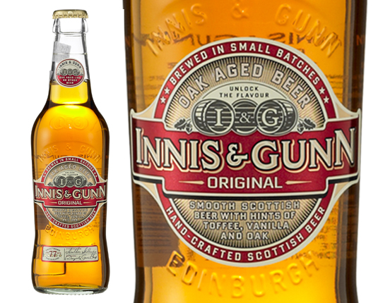
If you haven't heard of the creative team at Stranger & Stranger then their design for the Innis & Gunn label is great introduction. They do some of the best package design work in the industry, which is easily reflected in the amount of detail you see in this Innis & Gunn label. They manage to invoke both a classic and modern aesthetic with the use of red and gold and classic illustration elements.
12. Lade Gaards Brygghus
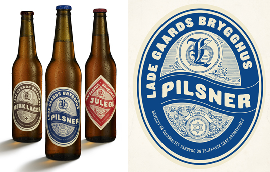
Many artists like to illustrate by hand. Anette Kirkeby is no exception, even when it comes to beer labels. Her work for Lade Gaards Brygghus is completely illustrated by hand, even the typography. The effect this creates is a classic feel that helps to capture some of the history of the long tradition of brewing beer.
13. 1295 Brewing Co.
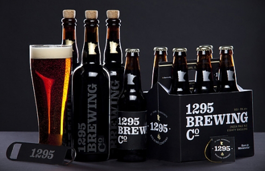
Sometimes simplicity is the best policy. Tom Hayes and Taylor Pemberton used simple black and white labelling to create a quiet but bold design for Ben Hough's home brewed beer. The font choice in the case of the larger bottles' painted-on labels gives the brand a vintage feel that harkens back to the days of bootleggers and prohibition. The name 1295 is actually Ben's home address number, which is a nice insider detail.
14. Hilliard's Brewery
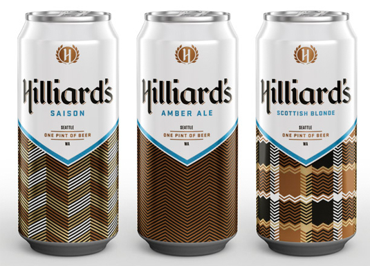
We can't discuss beer labels without throwing in at least one beercan design. Seattle's latest craft beers from Hilliard's Brewery are a testament to classic Americana. The can design from Mint explores a feeling of nostalgia for the '70s with its use of font, dominant blue and white colour, and earth tone plaid patterns.
15. Scotts Brewing Co.
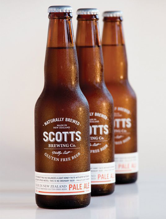
Scotts Brewing Co. is yet another great example of understated, but effective beer label design. The designer Penny Dombroski went with a print-on bottle solution that was both economical and easy to read. The label wrap at the bottom is a nice way of allowing Scotts Brewing to differentiate their ales by putting the ale type on a printable surface while the logo on the bottle remains the same.
16. Liberty Ale
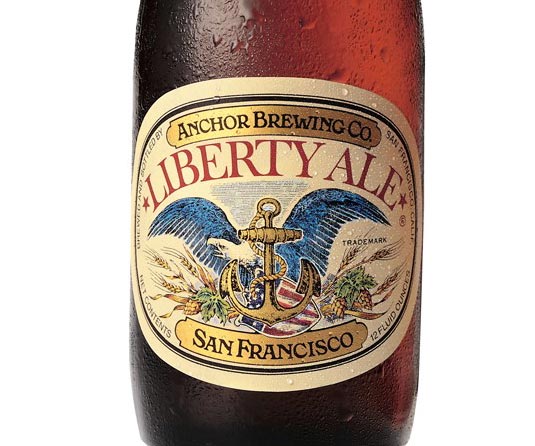
San Francisco's Liberty ale was created to mark the bicentenary of Paul Revere's historic ride to warn Congress the British Army was coming. Originally designed 40 years ago by Jim Stitt the design has changed little.
It's a historic label for a historic beer. Full of craft and detail just like the product. And it's got an American Eagle on it.
17. Skinner's

Cornwall, UK-based brewery Skinner's worked with six leading artists to develop a distinct look for each of its ales. Cornish Trawler's tattoo-inspired design was illustrated by Alex T Frazer, who has worked with Mogwai and Ben Folds Five. Cornish Knocker has been reimagined by Joe McLaren, an artist who has worked widely in newspapers and publishing, while Hops 'n' Honey's charming look comes from Rose Forshall.
Underground artist Stevie Gee designed Porthleven's label; Lushingtons' beautiful design has been created by local illustration collective ASide; Penny Come Quick was created by illustrator and fine artist Chris Odgers; and Skinner's own Nick Beringer brought new life to his Betty Stogs design.
18. Sixpence Stout (Tap East)
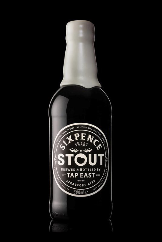
This East London Christmas stout designed by Midday beautifully brings to life the seasonal Christmas pudding flavour of the beer. The indulgent custard inspired wax neck seal is a nice touch, as is the traditional crafted label with its playful modern twist in the typography.
19. Brewdog
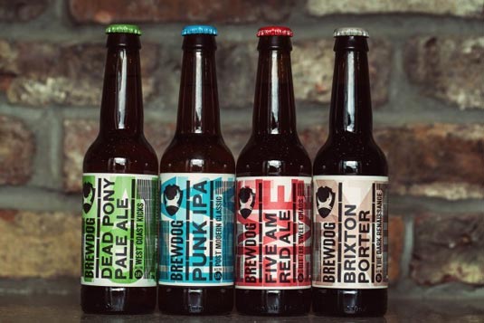
Great beers, great labels. Brewdog updated their branding last year, whilst you could argue that the redesign is less disruptive on shelf and in the chiller, it has maintained the brand's character. The new design swaps a little bit of edge with a little bit of style.
The labels feel great in the hand, beautifully tactile, you cannot help but rub your finger over the raised type. The composition, textures and tone of voice of these labels are great, and they fit nicely into the Brewdog's growing brand world.
20. Guinness Porter
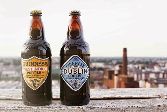
The recipes for these Porters (well hopped dark beer) are said to have been inspired by old brewing books dating back to the eighteenth century. So it is fitting that the designs should pay homage to a bygone era.
Whilst these labels are not creatively groundbreaking, they are still without doubt beautiful. Hand-drawn lettering, differing die cut label shapes and a great paper stock ooze craft.
Words: Ben Whitesell, Stuart Humm, and the Creative Bloq team
Ben Whitesell is a media designer specializing in a variety of different types of content creation. Stuart Humm has been creative director at Coley Porter Bell since 2012.
Like this? Read these!
- The beginner's guide to flat design
- Pro tips to create an inspirational mood board
- Discover these mind bending examples of trompe l'oeil
- Download the very best free icons today
- Get the best free vector art for your projects

Thank you for reading 5 articles this month* Join now for unlimited access
Enjoy your first month for just £1 / $1 / €1
*Read 5 free articles per month without a subscription

Join now for unlimited access
Try first month for just £1 / $1 / €1

The Creative Bloq team is made up of a group of design fans, and has changed and evolved since Creative Bloq began back in 2012. The current website team consists of eight full-time members of staff: Editor Georgia Coggan, Deputy Editor Rosie Hilder, Ecommerce Editor Beren Neale, Senior News Editor Daniel Piper, Editor, Digital Art and 3D Ian Dean, Tech Reviews Editor Erlingur Einarsson, Ecommerce Writer Beth Nicholls and Staff Writer Natalie Fear, as well as a roster of freelancers from around the world. The ImagineFX magazine team also pitch in, ensuring that content from leading digital art publication ImagineFX is represented on Creative Bloq.
