Fourth of July special: top 20 iconic US logos
To celebrate Independence Day, Creative Bloq's American-in-residence Sammy Maine has rounded up the most star-spangled logo designs ever created.
Creating a logo design is both a craft and and artform, and few places do it as well as the home of global capitalism.
We've gathered some of the most iconic, innovative and globally recognised logos ever created in the land of the free: as soon as you spot them, you instantly think of both the US and the all-American company they represent.
So here are our top 20 US logos. From coffee to burgers and motorcycles to airlines, they've all stood the test of time...
01. American Express
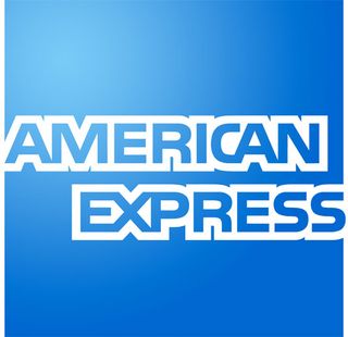
Founded in 1850 in New York, American Express was among the first companies to gain international recognition during the economic emergence of the US. While its original logo featured a Viking, the iconic 'blue box' logo has become one of America's most recognised visual idenitities. Symbolising trust, integrity, quality, security, reputation and simplicity, the success of this logo proves that less is most certainly more.
02. Bank of America
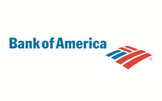
Another bank logo that goes for the simple approach (after all, who wants to think of their banking as complicated?). Bank of America has, suitably enough, opted for the red, white and blue of the flag as its main source of inspiration, evoking an intense feeling of patriotism. The logo also symbolises an American farm, appealing to the working class of America to further soldify the bank as a trustworthy brand.
03. Best Buy
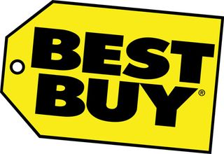
The Best Buy logo has been through a number of changes over the years. The yellow tag logo was first introduced in 1989 and has since become one of the most easily identifiable logos in the corporate world, thanks to its simplicity and bold use of colour.
In 2008, another logo was launched using a modified version of Klavika typeface. It featured a refined tag and whilst this new logo appears at selected stores of Best Buy, its replacement status still remains unspecified.
Get the Creative Bloq Newsletter
Daily design news, reviews, how-tos and more, as picked by the editors.
04. Boeing
The Boeing logo first started out as a vertical, winged Boeing totem, which was designed in 1928 for use as a symbol for the airline services during the 1930s. In 1947 the totem was replaced by a new trademark: the word 'Boeing' in the Stratotype typeface.
It made for an iconic design that has been praised by many a logo design fan. The Stratotype alphabet is now reserved exclusively for the Boeing logotype and the alphanumeric designators on Boeing aircraft.
05. Burger King
Making its debut in 1967, as Insta Burger King by James McLamore and David Edgerton, the logo has gone on to become one of the most recognisable in the entire world.
Made up of a burger shape and teamed with three eye-catching primary colours, the logo attracts all age groups to the food chain. The typography truly reflects the company's vibrant nature and has proved that when a logo design is done right, it can stand the test of time.
06. CBS
The American public got its first look at the CBS eye logo on October 20, 1951. Since then it has become one of the world's most recognisable icons. Designer William Golden was the man behind the eye concept, which has seen many changes in colour, size and dimension over the years. But the overall design for the commercial broadcasting television network has not been altered in over half a century.
07. FedEx
The FedEx logo is legendary among designers. Created by Lindon Leader of Landor Associates and Leader Creative, the infamous design has won over 40 awards, worldwide, and Rolling Stone Magazine also ranked it as one of the eight best logos of the past 35 years. For those of you who don't know (and we're sure that's not many) the genius behind this design doesn't lie within the bold lettering or bright colours, but with the small white arrow between the e and x.
08. Pepsi
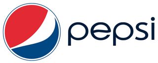
Pepsi's iconic red, white and blue circle logo is instantly recogniseable. The soft drink's logo has seen many changes since its production first began back in the 1890s, the first being a scribbled script design. It was only after 50 years after Pepsi's conception that first hints of the iconic logo we know today were first seen. The most recent iteration was revamped by New York-based Arnell Group back in 2008, featuring a 'smile' and a less formal rounded lowercase typeface.
09. Walmart
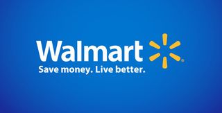
American multinational retail corporation Walmart launched in 1962 without a true logo. For the first two years, when the Walmart name appeared in print, the font and style were chosen at the whim of the printer. The first official logo, adopted in 1964, was simply the company name in Frontier font, which served Walmart for 20 years. Since then, the logo has seen many changes, the latest iteration being the most significant change to date, introducing a new font and spark.
10. Walt Disney
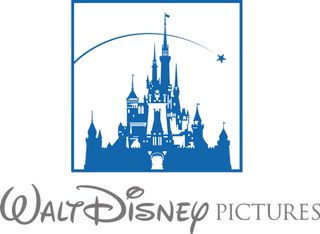
The Walt Disney company is one of the best-known motion picture producers in the world - the name instantly invoking thoughts of beautiful animations and some of the best-loved cartoon characters the world has ever known. Since the company began, the logo has been a stylised version of the founder’s signature. During the company's history, different animations and styles have been added to the logo to mark special events and movie releases, but the infamous signature has, to a large extent, remained unchanged.
11. McDonald's
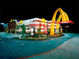
Possibly the most famous fast-food chain in the entire world, McDonald's started in 1954 when Ray Croc opened a small burger restaurant in Des Plaines, Illinois. Its logo was originally designed by Jim Schindler in 1962 to represent two golden arches, which later transformed into the 'M' for 'McDonald's.' The gold and red colour palette has become synonymous with the company as it’s covered the globe with cheap and cheerful restaurants.
12. Coca-Cola
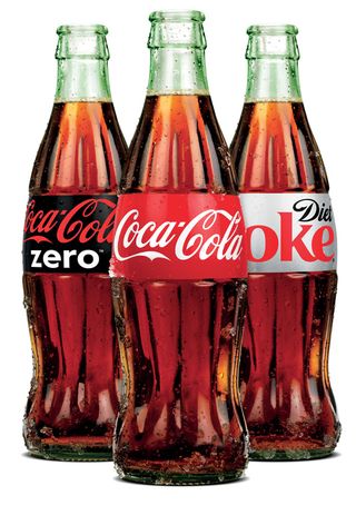
Created by pharmacist John Pemberton, Coca-Cola has gone on to become the world's best-selling beverage; available in almost 200 countries. It was in 1885 that book keeper Frank Mason Robinson came up with the now ubiquitous logo design. (According to some, he also came up with the brand's name and the use of the cursive script.) Although the logo itself has altered throughout the years, the typography and colour scheme has remained close to the original. Like it or not, there's no denying it's one of the world's most recognisable logos ever invented.
13. Starbucks
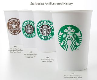
When you think of coffee, you don't necessarily associate it with a mermaid. So it's odd, then, that the Starbucks logo seems to work so very well. According to some, the 'Siren' is to represent the enticing aroma and irresistibility of the coffee. The first (brown) logo was designed by an employee of designer Doug Fast in 1971. Fast then took over and started to turn the logo into what it is today. You can see that the 'Siren' has become a lot less 'naughty,' seeing as we can now only witness her head and shoulders. And omitting the 'Starbucks Coffee' typography has only made this logo stronger.
14. I love NY
If you ever needed proof that the KISS principle (Keep it Simple, Stupid) works, check out this so-simple yet so-effective logo for the city that never sleeps. Milton Glaser designed it pro-bono for a campaign by the New York State Department of Commerce that was only expected to last a few months. The pop art-influenced design has since become synonymous with New York and adorns countless T-shirts and posters to this day. The ‘I Heart…’ design has also been copied by purveyors of tourist merchandise the world over, despite vigorous action by the city to defend its trademark. After the September 11 attacks, Glaser created a modified version, reading "I Love NY More Than Ever", with a little black spot on the heart symbolising Ground Zero.
15. Nike Swoosh
One of the world’s most recognisable logos was created by a student for just $35. Phil Knight, founder of the multibillion sportswear company, asked Carolyn Davidson for a design that suggested movement; but he didn’t like any of her ideas. Eventually, under the pressures of a looming packaging deadline, Knight chose her rendering of what became known as the “Swoosh” (we’re not supposed to call it a tick, apparently), saying: ‘"I don't love it, but it will grow on me." We guess it probably did. This simple shape has become one of the world’s best-known logos, works in any colour and has even set itself free from the word 'Nike’ to represent the brand on its own terms.
16. Budweiser
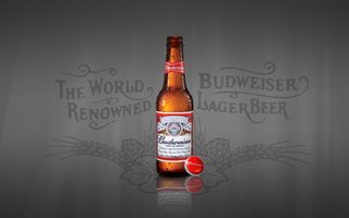
It may be produced by a Belgian-Brazilian beer conglomerate, set up by a German, and inspired by a Czech brewing tradition, but Budweiser has still become the most American of all beers. The iconic red label, bearing a coat-of-arms-style design, has remained relatively unchanged since 1876, and continues to serve as a siren call to millions of Americans to "grab a bud". That said, the occasional varient is permitted, such as the last year's stars and stripes look created for a patriotic campaign to raise money for US military heroes.
17. Ford
Ford went through a few logos following its launch in 1903. But it’s this blue oval design, which first appeared in 1927, that has set the basic shape and colour of its insignia ever since. And if anyone was in any doubt about the value of good design, consider this: six years ago the entire company nearly went under, and needed a $23 billion dollar loan. A syndicate of banks led by Citibank, Goldman Sachs and JPMorgan Chase demanded the little blue logo as collateral for the loan. One pervading myth surrounding the logo is that the script is based on founder Henry Ford’s signature: it’s not. It was actually created by one of his draftsmen, Childe Harold Wills.
18. Apple
Over the past decade, Apple has completely taken over the computing world. Its logo has become instantly recognisible all over the globe and many of us are confronted by this little Apple every day of the week. The original design, which featured a striped, multi-coloured fruit, was created by Rob Janof in 1977. Surprisingly, he received no brief from the man at the top, other than: 'don't make it cute.' It's gone through a number of alterations since, mostly concerning colour, with a recent revamp not going down too well. Fundamentally, we think it's the logo's simplicity that makes it stand out from the crowd.
19. American Airlines
For almost half a century, this distinctive logo design (left) was recognisible throughout the world. Designed by Vignelli Associates in 1967, the simple font, red, white and blue colouring, and strong eagle image portrayed everything that American Airlines wants to be seen as: a loyal, hard-working American airline. Then last year, the company released this new dramatically different, new design:

Created by Futurebrand, the new logo kept the red, white and blue colouring, the eagle and the company name - but dramatically reinvents them with brighter colours and a pared down approach. It's a bit too early to tell whether this 21st century design will become as iconic as the earlier logo, but after the company filed for bankruptcy in 2011, that's probably the least of their worries..
20. Harley Davidson
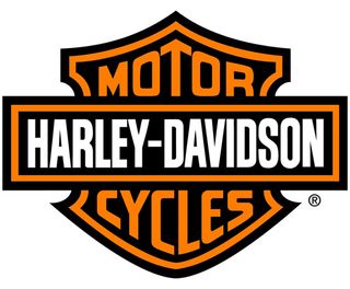
This is a logo that ticks all the boxes. Not only is it synonymous with the motorcycle brand but people from all over the world (including non-motorcyclists) immediately associate it with the company. The original design, created by Davidson’s aunt Jane Davidson, had a very different approach, featuring hand painted red striping with the words “Harley-Davidson Motor Company” on the fuel tanks.
As the company grew, so did the logo. It had a close branding relationship with Carmichael Lynch for almost 30 years before moving over to VSA Partners, whose other clients include McDonald's, Coca-Cola and Target. The company continues to grow and we think this has a lot to do with this timeless logo. Apart from anything else, licensing of its brand and logo accounted for $40 million (0.8%) of Harley-Davidson's net revenue in 2010.
Have we missed your favourite US logo off the list? Let us know about it in the comments!

Thank you for reading 5 articles this month* Join now for unlimited access
Enjoy your first month for just £1 / $1 / €1
*Read 5 free articles per month without a subscription

Join now for unlimited access
Try first month for just £1 / $1 / €1
Sammy Maine was a founding member of the Creative Bloq team way back in the early 2010s, working as a Commissioning Editor. Her interests cover graphic design in music and film, illustration and animation. Since departing, Sammy has written for The Guardian, VICE, The Independent & Metro, and currently co-edits the quarterly music journal Gold Flake Paint.

