20 expert tips to improve your bitmap illustration
Rob Carney speaks to the world's top illustrators to give you essential tips for progressing your bitmap illustration career.
Over the course of interviewing some of the world's best established and up-and-coming illustrators for this series of professional tips, one thing has become clear. No matter how you work - whatever medium or software you choose - the concept, or idea, is the most important part of your piece.
Every single one of the talented illustrators and designers that we've featured here confirmed this, before going on to offer their valuable software and industry-focused nuggets of advice to help you further your skills and career.
If you're looking to work Photoshop harder to add real depth and texture to your work, there's something here for you - and even if you think you know it all, there's bound to be at least one tip here that's never occurred to you!
01. Scan, and blur the edges
"Recently I've scanned in my own painted textures, and placed them on shapes and stock imagery to give those elements a nice and subtle texture, making a piece more unique. Also, I always drop soft brushes on the edges of every shape I do, to create a soft light effect on it."
Rik Oostenbroek
Digital artist, www.secretshowcase.com
02. Understand masking
"The skill involved in using Photoshop's masks is vitally important. I use masks on all of my images, be it for clearing a certain area without actually destroying the layer content, or simply to paste stock imagery inside other elements in a project. It's an extremely versatile technique."
Jos Oliveira
Graphic designer and illustrator, www.onrepeat.net
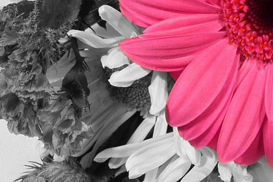
03. Use Selective Colour
"I'm growing to be an even bigger fan of the Selective Color function. It's an invaluable tool for making sure your images have the right colour values for print, especially when your black is near 400%. I like to take five minutes at the end to make sure all the colour values are right, and the image pops out."
Radim Malinic
Art director, illustrator and designer, www.brandnu.co.uk

04. Preserve 'the soul'
"It's always possible to fine-tune stock images and photography by using graphics, brush strokes, or anything expressive in your own style. But I believe, for a perfect fusion of illustration and photography, the bottom line is that you should preserve the 'soul' of the image."
Johnny Cheuk
Graphic designer and illustrator, www.johnnycheuk.com
05. Capture textures
"Take full advantage of the Blend modes when applying texture to your illustrations or photos. Speckle and custom brushes are fantastic, but you can't beat the rawness of textures from real life. Fill an album with photos of things like brick walls, water ripples, pavement slabs or grains of salt."
Jonny Wan
Illustrator, www.jonnywan.com
06. Save versions
"I try and save a few versions of an image as I go along. That way I can experiment a little, and if it's not working I can go back to how it looked earlier or have final versions to compare. I find that layering textures and scanned-in surfaces helps to prevent an image from ending up looking too digital."
Garry Milne
Illustrator, www.garrymilne.co.uk
07. Use Actions
"I'm not really a technical guy - more of a caveman, really. But something that has helped me a lot with speed and efficiency when I'm working is the use of Photoshop Actions. It's a nice little tool to have at your fingertips when you find yourself doing the same thing over and over again."
Josh Vanover
Visual artist, www.spaceknuckle.com

08. See it as a tool
"Photoshop should be viewed as a tool. It's a phenomenal piece of kit that enables you to enhance your ideas, but you should understand what you're looking to achieve. I view the greatest techniques in Photoshop to be the ones you have to work at refining - that you make your own and are part of your process."
Tom Lane
Designer and illustrator, www.gingermonkeydesign.com
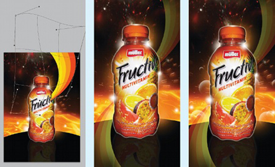
09. Warp it
"Experiment with the Warp tool to transform shapes and pictures to create a dynamic effect that fits best with your idea. Benefit from the underrated power of the Transform Warp tool."
Tim Vanhaeren
Founder and director, www.into1.be

10. Think of negative space
"Spend time working on your composition, and make sure that you always think about negative space too. It's often said, but remember that less can be more. It's very easy to get carried away with layers in Photoshop. Oh - and always do a sketch before you start a new project."
Ben Thomas
Digital artist and photographer, www.ben-thomas.com
11. Don't rush in
"I always remind myself that there must be a pre-defined style and an idea of my own behind every illustration. Illustrating without thinking is to be avoided. In addition, I always try to avoid exaggerated or overly-extravagant styles of imagery - with too many filters and the like - hoping to bring my works closer to reality."
Johnny Cheuk
Graphic designer and illustrator, www.johnnycheuk.com
12. Don't forget about ink and paper
"I've heard about print problems from so-called illustrators. Some people haven't grasped CMYK and moan about glowing pinks not coming out. It proves that not everyone who manages to install Photoshop is an illustrator. There's no point sweating over the image if you can't print it properly."
Radim Malinic
Art director, illustrator and designer, www.brandnu.co.uk
13. Don't let the computer rule you
"Don't let the computer control you. You're the artist - not the computer. Approach the computer as an artist does his canvas and oils: use these programs as you would any other medium. Explore, and find new ways to use these amazing machines. Don't feel as though there is a set way to go about things."
Josh Vanover
Visual artist, www.spaceknuckle.com
14. Don't forget to name layers
It's a basic point, but one that's so often overlooked by creatives - and so important: don't forget to name and organise your layers. As Tim Vanhaeren points out: "After a couple hours of playing, you won't find anything in that mess. Use your layer folders to organise them."
Tim Vanhaeren
Founder and director, www.into1.be

15. Don't forget the focus
"Whenever I do something theme or client-based, I always drop the main object in first, as it's essential for the entire composition. I only start detailing when the main object is in position. The more layers and smaller objects you have to move if the client's not satisfied, the more frustrated you will be."
Rik Oostenbroek
Digital artist, www.secretshowcase.com
16. Don't be nondescript
"I'm not a big fan of those nondescript stock images, especially the ones of girls in bland poses. Always try to shoot or scan your own stuff, and experiment with different media. If you're not a keen photographer, try to approach someone you admire and see if they would be willing to collaborate."
Ben Thomas
Digital artist and photographer, www.ben-thomas.com
17. Don't scale type
"When working with type in Photoshop illustrations, don't scale type manually, just change the font size. It's easier and you don't lose quality. Also, stay away from the Text Wrap presets - they're only good for basic experiments, not for professionals. Instead use the Pen tool and create your type on a path."
Jonny Wan
Illustrator, www.jonnywan.com
18. Don't get messy
"If the client needs to include a source file, I try to keep the arrangement of the Photoshop layers simple and easy to understand. Sometime clients want to tune some of the elements, such as colours, so it's important to have an organised PSD document to work from."
Jos Oliveira
Graphic designer and illustrator, www.onrepeat.net
19. Don't filter it
"I would say a Photoshop 'no-no' would be to just utilise a simple filter from the list. Applying a cut-out effect and so on to an image is instantly recognisable, and can make the work seem immature. Try and find an approach that will leave people wondering, 'How have they done that?'"
Garry Milne
Illustrator, www.garrymilne.co.uk
20. Don't throw it all in at once
"I strongly advise against the use of the 'move it around until it looks good' or 'build up as many layers as possible until it's interesting' techniques. That whole approach has been done to death. It comes across as unconsidered, and is totally counterproductive to understanding your own creativity."
Tom Lane
Designer and illustrator, www.gingermonkeydesign.com
Do you have any bitmap illustration tips? Don't keep them to yourself - share them in the comments below!
Words: Rob Carney

Thank you for reading 5 articles this month* Join now for unlimited access
Enjoy your first month for just £1 / $1 / €1
*Read 5 free articles per month without a subscription

Join now for unlimited access
Try first month for just £1 / $1 / €1
Get the Creative Bloq Newsletter
Daily design news, reviews, how-tos and more, as picked by the editors.

The Creative Bloq team is made up of a group of art and design enthusiasts, and has changed and evolved since Creative Bloq began back in 2012. The current website team consists of eight full-time members of staff: Editor Georgia Coggan, Deputy Editor Rosie Hilder, Ecommerce Editor Beren Neale, Senior News Editor Daniel Piper, Editor, Digital Art and 3D Ian Dean, Tech Reviews Editor Erlingur Einarsson, Ecommerce Writer Beth Nicholls and Staff Writer Natalie Fear, as well as a roster of freelancers from around the world. The ImagineFX magazine team also pitch in, ensuring that content from leading digital art publication ImagineFX is represented on Creative Bloq.
