How to design a business card: 7 top tips
Discover how to design a business card that makes a lasting impression.

Wondering how to design a business card? Once you've made your business plan, you've formed your business and created your branding, you're ready to approach potential clients. There are many ways to do that and to place your business at the forefront of prospective clients' minds. In this digital era, the business card might seem like the last thing to consider, but it's surprising how these humble pieces of stationery have held on to their place in the business world. And if you haven't got one, you could be missing out on leads.
Not all business cards are created equal, however, and there are a lot of poor quality business cards out there. While it's possible for any small business to design its own cards using stock icons and order them from an online printer for the price of lunch, the results aren't going to be very impressive. In this guide, we'll look at how to design a business card that stands out and helps differentiate your business from the competition by following 10 key tips.
For inspiration, see our selection of the best business card designs, and if you're looking for a quick solution, see our pick of the best business card templates. For more advice on setting up and promoting your creative business, see our guide to how to start a design business, how to improve your graphic design skills, and our tips for the perfect résumé for creatives.
how to design a business card: 10 tips
01. Remember your basic design principles
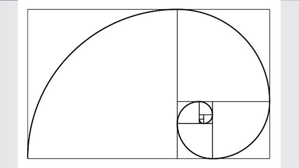
It might seem obvious but it’s worth reiterating that a business card is a piece of printed design material like any other. This means the basic principles of paper-based design apply when it comes to designing business cards.
You should ensure you maintain a minimum size for your typography to maintain legibility and keep your key copy at least 5mm from the trim edge. Work at 300dpi for the best image reproduction and design in CMYK unless you’re working exclusively with spot colours.
Many designers also find it helps to use a grid to design business cards, as this can help ensure correct alignment and the right hierarchy of information (see our guide to grid theory for a recap).
02. Get creative (within the constraints)
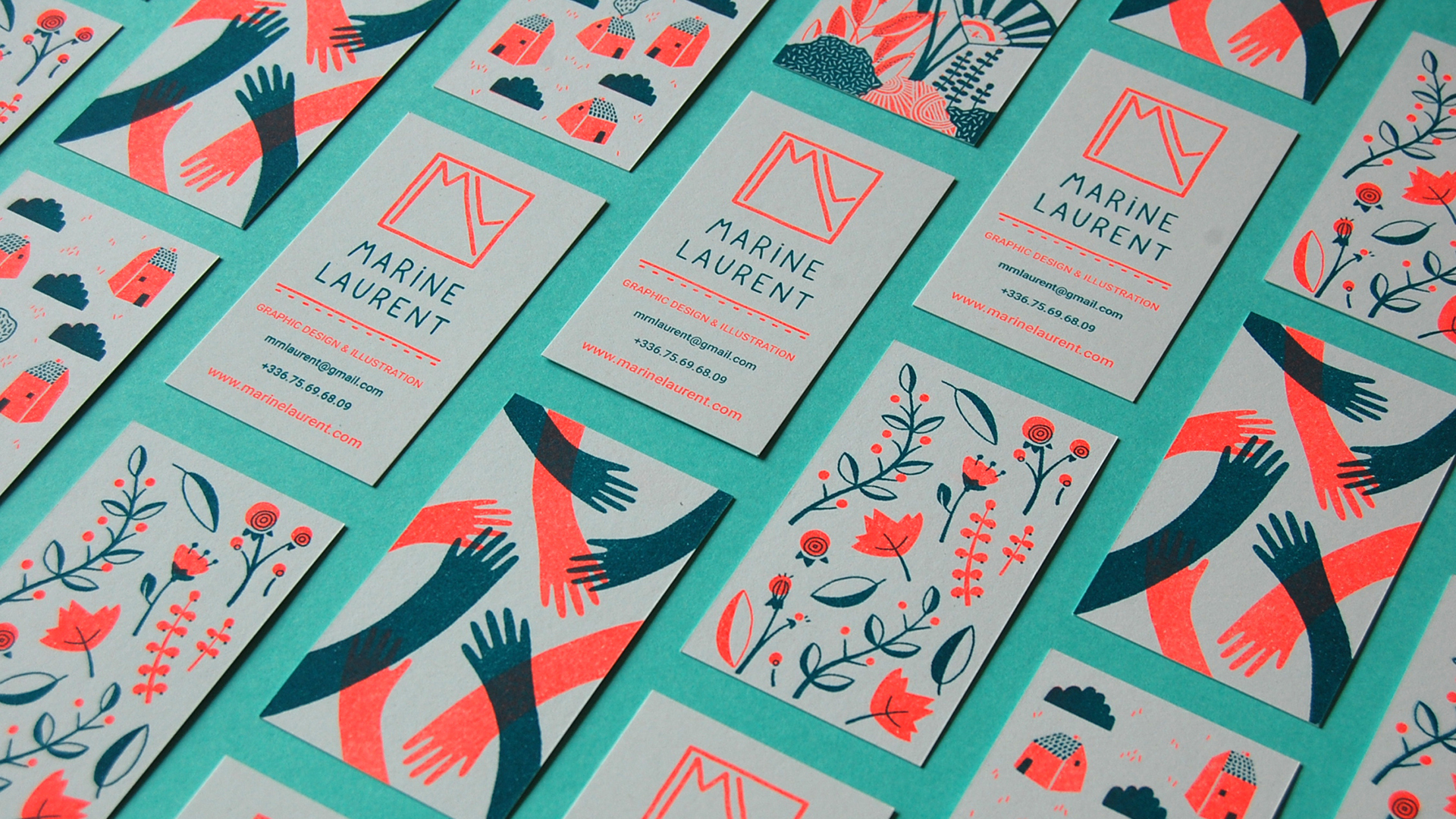
You can get very creative with business cards. Experimenting with colour and texture can really help a business card to stand out, but remember that the 'standard' sizes are standard for a reason. A business card needs to be easy to stow in a pocket, wallet or organiser and cards designed in very different sizes or formats may be more likely to get lost or thrown out.
There are actually a couple of 'standard' sizes depending on where you are in the world. One typical business card size is 55 x 85mm, but you'll see many other sizes quoted on the web – check with printers. There are also standards in terms of the content you'll want to include. While an image or a name alone can look bold, it's not much use if people don't know how to get in touch with you. You'll typically want to include at least a business name, phone number and email address. You might also want to include a website address, physical address and social media handles depending on which of those your business has.
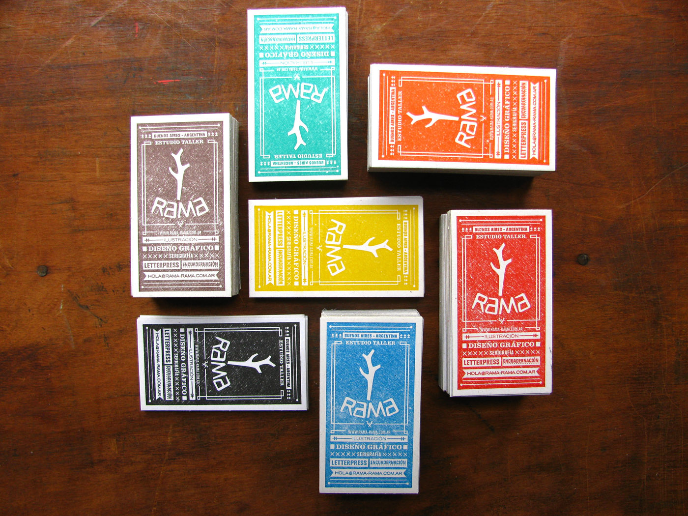
Even though the size and restricts you somewhat, you can still get creative with the space and work your design around presenting the essential information in a creative way – and remember there are two sides to a business card. You'll probably put the information on one side, leaving the other side available for an eye-catching design.
Just be sure to avoid a couple of fairly common pitfalls when designing business cards. Ensure you provide a bleed as specified by your printer – this is commonly 3mm, but can be 5mm, so be sure to check. It's also usually best to avoid using a straight border around the entire card as this will show up any misalignment in the trim if the card isn't perfectly cut.
03. Use a quality support
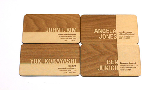
Cheap business cards give themselves away immediately due to the quality of the support. They quickly crease or lose their colour and soon end up chucked in the bin. A quality heavyweight card stock is more durable and gives a much more pleasant feel in the hand, creating a much more professional impression.
Most business cards are printed on card stock, which is the most cost-effective option for printing. But if you want to get more creative (and you can afford it), you can print onto all sorts of different materials including transparent plastics, metals, wood or even slate. Just remember that a business card needs to be portable and easy to file away in a pocket or briefcase. You could print your business cards yourself. You can find letterpress kits on eBay at reasonable prices, allowing you to convert any card stock into your own business card with ease.
Another instant way to add impact to your business card is to use a special finish. Special finishes include the likes of foil blocking, spot-UV and metallic inks. While they can add a significant cost to your print, they offer the chance to create something that's a lot more visually impressive and memorable. Different printers offer different options for finishes, so ask around to find out what they can do for you. Don't be afraid to go to a specialist if your usual printer only offers straight four-colour print.
04. Make it tactile
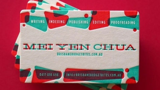
A quality support and special finishes can allow you to design a more tactile business card through embossing or debossing text or designs. An even more eye-catching technique that can ensure your card spends more time in the hands of prospective clients is to use a die-cut process to remove elements from the card stock, leaving a void. You can either use a die to change the shape of your card (by rounding the corners, for example), or you can cut shapes out of the centre.
Dies are expensive to create the first time, although increasingly printers are offering laser-cut options that make it economical to create a die-cut look on shorter print-runs (check out our guides to the best laser cutters and best cricut machines if you want to print your own). There are some very creative examples on the web, like this die-cut letterpress stationery. When combined with creasing you can use the process to create architectural features in your card design (take a look at the example below).
06. Make your business card useful
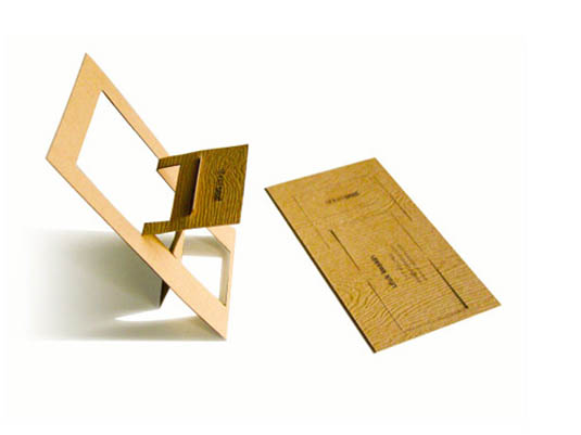
One of the problems with paper is that it’s everywhere. Some people hold on to every bit of paper they receive, amassing a paper mountain, while others are far more ruthless and recycle things at the first opportunity. To avoid the risk of being recycled, it can help to give your business card a second function.
Of course, you have to be careful when you consider how to design a business card with a function since it should be something that's relevant to your business and to your clients, and if making something useful means straying too far from the usual business card shape and size, your card might not be kept. That said, we've seen some very clever examples of 'useful' business cards, from business cards that serve as phone holders to seed packets, bottle openers and more.
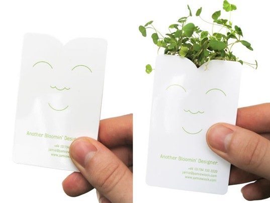
You don't want to copy an idea that's already done the rounds, but sometimes incorporating function as well as form into a business card design can not only ensure that a prospective client keeps your cards, but also that they spend more time looking at it and more likely to remember it when they need to hire someone for a job.
07. Double-check your business card design
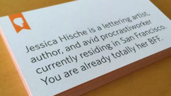
The final tip in our guide to how to design a business card applies to every bit of print work you do, but it’s so crucial that it’s worth repeating for business card design. Before you send your business card artwork off to the print shop (or before you start printing a lot of copies yourself if you're printing your own), make sure you’ve double- and triple-checked every single detail.
Make sure you've included the details that you need to and that they're all correct. As we mentioned above, name, position, telephone number and email address are essential in almost all cases. We'd recommend asking someone else to look over your design to make sure it covers everything they would need (we've seen plenty of examples of business cards that include Instagram or Facebook icons, but don't mention a username). And finally, check the spelling! There’s nothing worse than getting back your cards and discovering a typo in your name or email address or name. Check twice, print once is a wise adage.
Read more:
- The best places to sell design online
- 18 standout design portfolios to inspire you
- The best laptops for graphic design

Thank you for reading 5 articles this month* Join now for unlimited access
Enjoy your first month for just £1 / $1 / €1
*Read 5 free articles per month without a subscription

Join now for unlimited access
Try first month for just £1 / $1 / €1
Get the Creative Bloq Newsletter
Daily design news, reviews, how-tos and more, as picked by the editors.

Sam is a designer and illustrator based in Scotland, UK. He splits his time between art and design, motion and video and writing for various creative titles. He has written a book about web design, Pro CSS3 Layout Techniques and contributed to typography book, Fonts and Typefaces Made Easy.
