How to create a brilliant print and digital portfolio - part 2
Luke O'Neill concludes his step-by-step guide to seamless print and digital publishing by finishing the second page, finalising the portfolio, and uploading to Behance.
With Adobe Creative Cloud you can work seamlessly across both print and digital, all within InDesign and the Digital Publishing Suite (DPS) - plus a little help from our old friends Illustrator and Photoshop. In the second part of this tutorial I’ll complete the simple app design that will showcase your work as well as your digital skills, and can also easily be applied to a beautiful, bespoke A5 piece of print.
Here you'll find steps 1-15, now we'll continue with step 16...
16. Scrolling pages
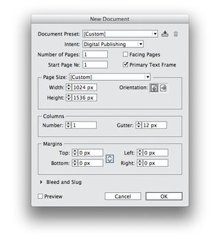
Back to digital. Let’s create our second page – this time a scrolling page, twice the size of a standard iPad screen with a height of 2048 pixels. Paste over the original grid and snap guides to the squares to create our grid. If you need more room later you can adjust the document size.
17. Place images in the grid
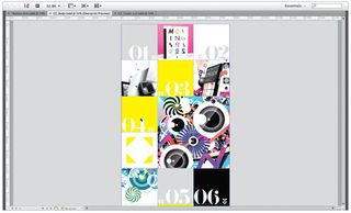
Now start to place images within the grid. Number them up, placing the double arrow that we created earlier to indicate which number relates to which project. You may wish to vary the layout with different sized images to increase the visual appeal.
18. Button creation

To enable users to view smaller images at a larger size, create ‘expand’ and ‘close’ buttons at 30x30px, and group each onto their respective black background. I created my buttons using the four-triangle graphic from earlier and the + character from Helvetica, outlined and rotated.
19. Duplicate and resize
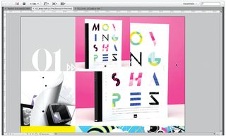
Duplicate and re-size the images so that a small and larger one for each number fill four of the squares on the grid, saving the two separate images at exactly the right pixel dimensions. Turn both images into a multi-state object, naming the first ‘01’, and its states as ‘01 Small’ and ‘01 Big’.
20. Advanced states
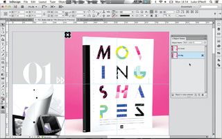
Place the ‘expand’ button where you want it to appear over the image, copy and then delete it. Select the ‘01 Small’ state, and go to Paste Into State from the top-right drop-down in the Object States panel. Repeat this for the ‘close’ button, pasting it into the ‘01 Big’ object state.
Get the Creative Bloq Newsletter
Daily design news, reviews, how-tos and more, as picked by the editors.
21. Adding actions
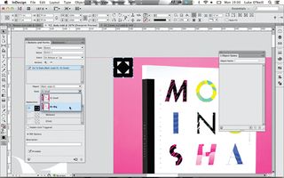
With the ‘01 Small’ state selected, double-click through to select our ‘expand’ graphic and in the Buttons and Forms panel hit Convert to Button at the bottom of the panel. Under the Event drop-down select On Release or Tap. Under Actions, click the + icon, and from the drop-down select Go To State and select Multi-state 01: 01 Big, so that when clicked, it will reveal our larger image. Repeat this process for the ‘close’ button but direct it to the ‘01 Small’ object state to revert back to the original smaller images.
22. Finalising buttons
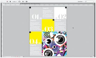
You can add more interactivity in the same way, by creating simple buttons and multi-state objects. I’ve set a simple caption style for each project and added a 20px inset border on each edge by Ctrl/right-clicking on the text frame. Place the captions where you want them to appear next to each project and draw some ‘i’ icons.
23. Tidying up interactivity
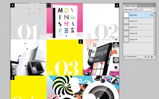
We don’t want any captions to appear when you navigate to the page, so draw an empty ‘close’ box and place it out of the way in the corner of the document. Select the empty box and the caption boxes, and turn them into a mulit-state object, ensuring that the empty box appears at the top of the stack and each caption is named up.
24. Finalising interactivity
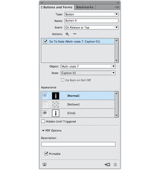
Turn all the ‘i’ icons into buttons and link them to their respective project so you can easily navigate from one caption to the next. Colour the captions to match their respective project number. You can also add a colour for when the button is selected by using the [Click] pane in the Buttons panel and colouring the document graphic.
25. Quickly to print
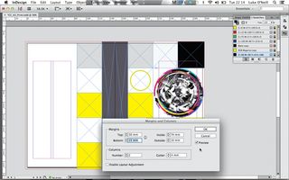
Now switch back to print. Add spreads to your A5 print document, including the squares and spine in the same way as for the cover. We want to run the captions in a more traditional column format, so under Margins and Columns set the values to: Top: 30mm, Bottom: 15mm, Inside: 74mm, Outside: 10mm, Columns: 2, Gutter: 4mm.
26. Finalising print
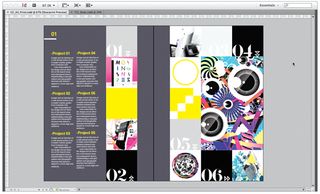
Now that we have our basic grid, we can quickly and easily add content without having to worry about the intricacies of adding interactivity. As this is print and not digital, it’s probably best to separate the captions from their respective projects to avoid overwhelming the viewer with a mosaic of different elements.
27. Final tweaks, and to Behance
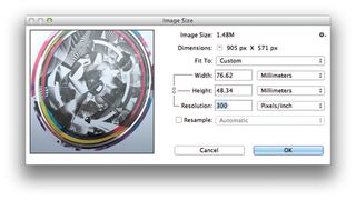
Finally, go back through your print document, ensuring that all images are in CMYK mode, at 300dpi and not used any larger than 120% on the document. You can then export the file to PDF and, using Photoshop, upload it directly to your Behance or ProSite portfolio (File>Share on Behance) for review or comments.
Words: Luke O’Neill
Art editor of T3 magazine and former art editor of Computer Arts Collection, Luke works in the fields of design, art direction and illustration across both print and digital.
This feature first appeared in The Ultimate Guide To Adobe Creative Cloud.
Now read these:
- Photoshop tips, tricks and fixes to try today
- Free Photoshop brushes every creative must have
- Free Photoshop actions to create stunning effects
- The best Photoshop plugins

Thank you for reading 5 articles this month* Join now for unlimited access
Enjoy your first month for just £1 / $1 / €1
*Read 5 free articles per month without a subscription

Join now for unlimited access
Try first month for just £1 / $1 / €1
The Creative Bloq team is made up of a group of design fans, and has changed and evolved since Creative Bloq began back in 2012. The current website team consists of eight full-time members of staff: Editor Georgia Coggan, Deputy Editor Rosie Hilder, Ecommerce Editor Beren Neale, Senior News Editor Daniel Piper, Editor, Digital Art and 3D Ian Dean, Tech Reviews Editor Erlingur Einarsson, Ecommerce Writer Beth Nicholls and Staff Writer Natalie Fear, as well as a roster of freelancers from around the world. The ImagineFX magazine team also pitch in, ensuring that content from leading digital art publication ImagineFX is represented on Creative Bloq.
