How Hey Studio seduced Apple with geometric shapes
Behind the scenes at one of Barcelona's most innovative studios.
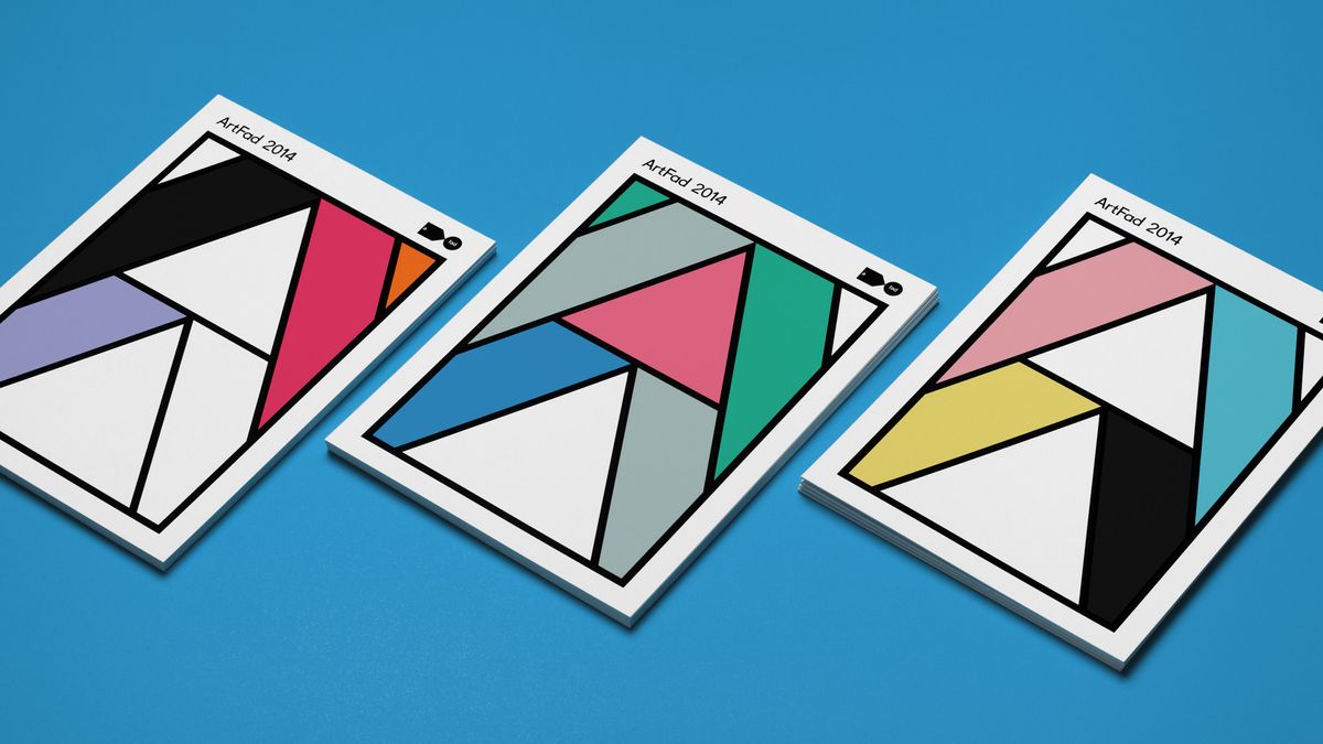
Hey Studio is an attitude, not just a particular style of design or illustration. The studio's work transmits positivity that runs like a thread throughout its eye-catching portfolio.
Specialising in brand identity, editorial design and illustration, its output is defined by clever use of geometry, together with clean typography and a lively colour palette, summed up by studio founder Verònica Fuerte as 'works that transform ideas into communicative graphics'.
Fuerte set up the studio in 2007 after several years spent as a post-graduate working for a variety of design studios in Barcelona. Within a year she was joined by fellow Elisava graduate and Hey Studio partner Ricardo Jorge, and together they built Hey into the multi-disciplinary studio that it is today.
Here we bring you this interview with Fuerte, from the archives...
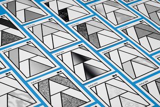
Complementing Fuerte's extensive design skills with Jorge's illustrative flair, the pair quickly established a foothold in the Spanish design industry, creating work for Gandules, ArtFad contemporary arts and crafts awards and Monocle magazine.
"We were only two for a very long time," says Fuerte. "Initially we only had a few clients – most of them were friends. We worked a lot together to have a big portfolio and develop Hey's style. International clients also came and over time we started to have a lot more projects."
Since then the studio has added designer and typographer Mikel Romero, Eva Vesikansa, who joined as a student in 2013, and creative manager Paula Sánchez.
Situated in the historical neighbourhood of Barrio Gótico in Barcelona, Hey works out of a shared workspace. "Our location is very inspirational," continues Fuerte. "Before arriving to the studio we pass through theatres, shops, galleries, institutional buildings and so on, and see people and daily scenes that give us ideas for projects."
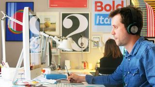
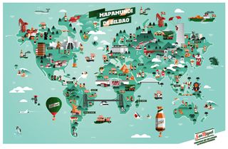
The size of the team, and close-knit working environment, naturally leads to high-energy conversations and brain storming sessions where they can each bounce ideas off each other; producing consistently impressive, bold and colourful designs for clients like Apple, Monocle, Nokia, Microsoft, The Wall Street Journal and more. In 2014, Hey was also chosen as one of the 17 'up-and-coming' artists for Pick Me Up London.
When a new brief comes in, the process is always the same. "We research, observe, work things up in a group and then settle on ideas," says Fuerte, who actively encourages a collaborative approach, with little hierarchy. "We are four designers – each of us can resolve an idea in an aesthetically different way. It's good for the client to see a multitude of solutions."
Their marked styles mean that the formal process is faster, though this varies for illustration commissions due to the often tight deadlines. "We don't have time to create different solutions in these cases," says Fuerte. "The first idea needs to be a good one."
A new graphic frontier
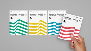
Every year, Hey handles the design of the CCCB's open-air cinema season Gandules in Barcelona. Each season there is a different topic, and the team works collaboratively to produce a design or illustration which can be applied to the Gandules progammes.
For its 2010 identity, Hey illustrated a new dawn to represent the cinema season theme of 'Action!' and how crisis generates new approaches and possibilities. More recently the theme of 'Away from Home' was chosen for 2014, with the studio creating a series of bold geometric illustrations that depict a flag and the sea, which Fuerte describes as "a frontier between countries and cultures."
When questioned about what has been Hey's most experimental work to date, Fuerte references the studio's brand identity for the Film Commission Chile; an organisation set up to promote Chile as a movie production destination and assist production teams on choosing destinations.
"It was quite ambitious and they got in touch with us directly," Fuerte says. The team grabbed the opportunity to apply its own signature style to the branding project, taking inspiration from duct/gaffer tape.
"The tape is omnipresent in the world of movie production. Tapes unite, join, mark, hold, point, remind and help to work," explains Fuerte. Illustrations of the tape resemble the classic movie celluloid film, and as a concept the tape serves to speak about the linking missions of the FCCh.
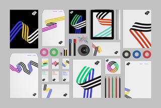
"The image is drawn up in different directions with variations in the colour palette created to represent the diversity of landscapes we can find in the Chilean territory." Together all elements combine to compose a unique image, with a well-defined personality.
Almost all of Hey Studio's client base is international. The studio made an appearance at BCN/MCR in 2013, as one of the most innovative and cutting-edge, Barcelona–based design agencies, alongside Lamosca, Lo Siento, Mayúscula and Mucho, curated by Manchester-based freelance designer Dave Sedgwick as a culture exchange between the two cities.
Colour brings clients
Following on from numerous speaker engagements, G F Smith together with It's Nice That invited Hey Studio to take part in their 'Colour in Context' event in Edinburgh, alongside photographer Jess Bonman and art director Sarah May. Fuerte took the stage to discuss how Hey uses colour, referencing an early project for the Spanish Laus Design Awards in 2010.
"It was a real challenge for us to design something that was for designers – all the eyes would be on the execution." Creating an abstract campaign that reflects the passing of time, the 'L' – standing for Laus – was represented in different colour paper sheets in the shape of a die. It was a launchpad for a collaboration with ArtFad that still endures today.
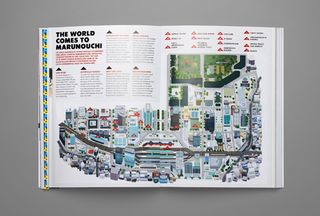
Perhaps one of the studio's most high-profile projects to date has been its work with Monocle magazine, which covers global affairs, business, culture, design and more. Hey's initial commission from the client back in 2010 was to design an illustrated cover on the subject of re-imagining the working day.
This was in fact one of the studio's first forays into character design, however it has since led to a lasting working relationship with the London-based publication. "Monocle magazine is known worldwide and the publication has an extensive network of designers and collaborators, so the first time they contacted us was an amazing moment," says Fuerte.
Complementing Hey Studio's creative output, self-initiated projects provide further opportunity for creative exploration, described by Fuerte as vital to the studio "in order to explore, innovate, and move forward."
Hey's 2013 solo exhibition at London's Kemistry Gallery prompted a further exploration of character design – a cheeky reimagining of ancient Greek gods – each with their own powers, weaknesses and back story. For Hey, it's clear that personal projects are almost as important as its commercial works.
"We always try to make our work reach a wide audience and be simple to understand," says Fuerte. "Playing around with this synthesis, you come upon solutions that are quite basic and obvious, and which many people usually like."
Hey Instagram
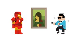
Riding the wave of its newfound interest in character design, the studio conceived 'EveryHey' – a project that exploded on Instagram. Illustrating an icon from pop culture and posting it every day, the dedicated account has amassed over 44,000 followers since its inception, becoming the studio's most well-known personal project – not bad for something that simply began as a bit of fun.
"Side projects give us the space to push our creative boundaries and develop a passion that is then injected into clients' work." The project also inspired the production of the limited edition Hey Characters: A Book for Friends, which the studio sent out to clients and friends in order to showcase "literary characters, designed the way we like."
Fuelled by a need to share its passion for typography, illustration and bold graphics, the studio has now branched out into online retail, on the back of a successful pop-up at OFFF Festival in Barcelona.
It's natural to wonder if this entrepreneurial behaviour led to more client work, or if selling work became a goal in itself. Fuerte answers: "Selling work is definitely something we aspire to do. Our shop is truly what Hey is. So the high purchases are synonymous of our success as designers and creators. We are very glad people like what we do."
Profitable character design
As the studio grows, character design continues to enrich its creative output; from cover illustration for quarterly design publication Process Journal, to a recent Studio DBD and TwentyTwentyTwo gallery collaboration further evidencing the studio's versatility.
Hey illustrated a book titled Gol! featuring characters of individual star players from all 32 different teams. In addition to this, Hey also designed two stamps for the June issue of Vanity Fair referencing a few characters from a very famous film.
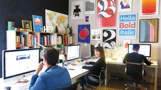
Arguably one of the most innovative Barcelona-based design agencies, Hey Studio is clearly one to watch. Nurturing close relationships with many of its clients on an international level, yet retaining a balance between commercial work and experimental projects, it enjoys a level of freedom many can only dream of.
"It doesn't matter if the project is large or small, prestigious or frivolous," concludes Fuerte. "When both sides trust each other you can take things up a level and do something really exciting."
The full version of this article first appeared inside issue 241 (June 2015) of Computer Arts. As it was so popular back then, we thought we'd resurface it for 2017.
Liked this? Try these...

Thank you for reading 5 articles this month* Join now for unlimited access
Enjoy your first month for just £1 / $1 / €1
*Read 5 free articles per month without a subscription

Join now for unlimited access
Try first month for just £1 / $1 / €1
Get the Creative Bloq Newsletter
Daily design news, reviews, how-tos and more, as picked by the editors.
Founder & director of Inkygoodness, Lisa is a published writer and arts journalist, focusing on creative business, graphic art and illustration and design education. Her words have appeared in Computer Arts magazine, Creative Bloq, Digital Arts and IdN.
