The fall and rise of Dutch design
Rick Poynor reveals how a feisty spirit and fresh influences have given Dutch design a new lease of life.
The question 'What is Dutch graphic design now?' is harder to answer than it used to be. The Netherlands, like London, has become a Mecca for designers seeking a highly creative place to work that offers many opportunities. Dutch graphic design was once unambiguously the creation of the Dutch. Now it's produced by a multinational cast of designers who perhaps travelled there to study and stayed, or simply decided that it would make an ideal base from which to make a fresh start.
Consider a project such as Works That Work, an unusual, outward-looking design magazine that has attracted attention and admiration since it launched early in 2013. Its publisher and editor is the multi-talented Slovakian designer Peter Bil'ak, who has lived in The Hague since he completed his postgraduate studies in the 1990s at the Jan van Eyck Academy in Maastricht. Bil'ak decided that he wouldn't have time to design Works That Work himself – although he set its visual direction – so he asked a local studio named Atelier Carvalho Bernau to do the job. Susana Carvalho is Portuguese; Kai Bernau is German. They have lived in The Netherlands for around a decade since studying type and media at the Royal Academy of Art (KABK) in The Hague.
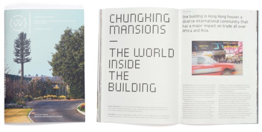
Given its multinational creators, is Works That Work strictly speaking a piece of Dutch design? Its typographic style and layout are restrained, giving it a controlled, conceptual appearance, though one not without warmth. "We believe in 'modern', not in 'ism'," say Carvalho and Bernau. "While our work often comes out as sober and reduced, this is not a dogmatic attitude or a preference, but always a reaction to the content and the ideas that we shape."
An international outlook
Works That Work doesn't look especially Dutch - if by that we mean modernist and belonging to the lineage that stretches from Piet Zwart in the 1920s to Experimental Jetset in the 2000s - but nor does it suggest any obvious alternative point of origin. Since this English-language magazine was conceived, designed and published in The Netherlands, we have to regard it as a product of the expanded field that is contemporary Dutch design.
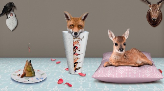
Nor is this international dimension in any way unusual now. Other examples of non-Dutch designers who are fully integrated into the Dutch scene include long-term residents such as type designer David Quay (in Amsterdam) and graphic designer Simon Davies (Rotterdam), who are both British; The Stone Twins, Declan and Garech, who swapped Dublin for Amsterdam; and Ryan Pescatore Frisk, an American who partners a Dutch designer, Catelijne van Middelkoop, in Strange Attractors in Rotterdam.
As a result of these inward-bound influences, combined with the openness to new developments of a small but highly successful trading nation, Dutch graphic design is probably more variegated and tougher to characterise now than it has ever been.
It's still possible to find younger and middle-career Dutch designers who adhere to the old, outsider's image of a 'Dutch graphic designer'. Such a figure is likely to be an uncompromising and highly motivated individual, who produces work that has an instantly identifiable personal signature. But a lot of the homegrown design coming from The Netherlands these days looks much less obviously Dutch, even if these designers are still inclined to believe that they belong to an enduring Dutch design tradition of international renown.
Get the Creative Bloq Newsletter
Daily design news, reviews, how-tos and more, as picked by the editors.
When I questioned the creative vitality of the country's recent graphic design in an essay for the Dutch Design Yearbook in 2010, I found myself summoned to Amsterdam to explain this shocking opinion in a public debate provoked by the article. One thing I concluded from that entertaining episode is that Dutch graphic designers remain as feisty as ever.
For many designers who are not Dutch, there is one senior figure - most definitely a modernist - who has become emblematic of all that is admirable, and might still seem imitable, about the achievements of Dutch graphic design after the Second World War. That figure is the charming, silver-haired, elder statesman Wim Crouwel.
Crouwel in context
It isn't so long since the design community was celebrating Crouwel's 80th birthday, and after that his retrospective at the Design Museum in London, which moved to the Stedelijk Museum in Amsterdam. The fact that the show originated abroad says a lot about the regard in which Crouwel is held outside his country.
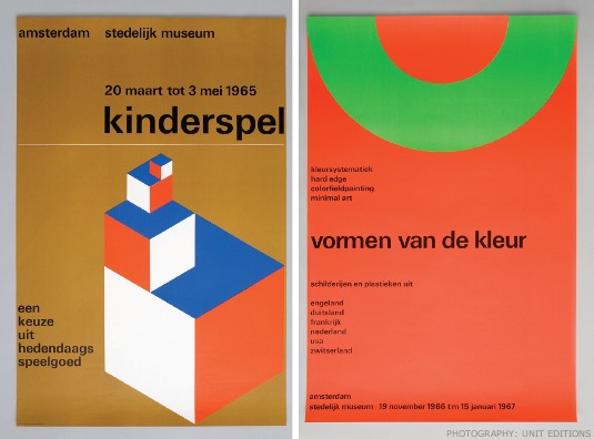
As Crouwel turns 85, there can be few graphic designers who are unaware of his stature in European design, or haven't admired his pared-down but often quirky designs, his futuristic and still fashionable typefaces, and his rigorously conceived identity, posters and catalogues for the Stedelijk Museum. While Crouwel is undoubtedly a significant figure, the view from the UK does tend to elevate him at the expense of other equally forceful and charismatic designers. Those who know The Netherlands' design history well understand that Crouwel must be seen in context as a designer who embodied a hard-line point of view that other Dutch designers didn't necessarily agree with, and even actively opposed.
The most outspoken foil to Crouwel was Jan van Toorn. Where Crouwel was a partner in a commercially minded consultancy, Total Design, Van Toorn chose to maintain a small, culturally orientated studio, working with a few assistants. Where Crouwel preached - and this was no exaggeration at the time - the need for 'objective' communication in which the client's message was the overriding concern, Van Toorn argued for a subjective, politicised approach in which the viewer was constantly reminded of the client's intentions and the designer's presence as a mediator. Crouwel and Van Toorn clashed publicly on a number of occasions and one particular debate in 1972 has acquired legendary status.
A new wave
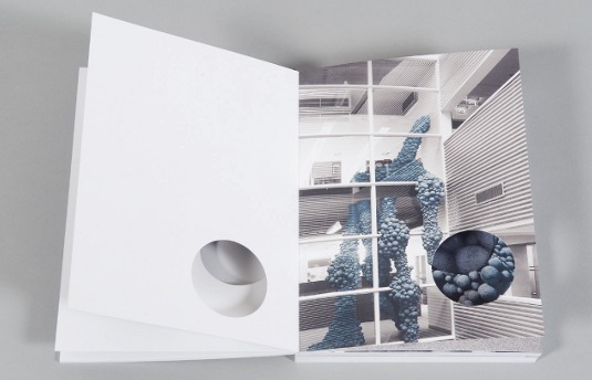
Even more wayward, in some respects, was Anthon Beeke, who worked as an assistant to Van Toorn for a short spell in the 1960s. For Beeke, content and meaning came before any aesthetic considerations - they would generate their own form. He produced imagery with a directness and sometimes sexual frankness that was astonishing in its day, and he had a forthright personality to match. There was a hint of lurking menace in any meeting with Beeke, as though one were being tested. A reassessment of his work is long overdue, partly because we have had to wait so long for a monograph. Now a big book entitled It's a Miracle! has appeared and the assembled images confirm Beeke as a fearless graphic agitator whose work deserves to be much better known outside The Netherlands.
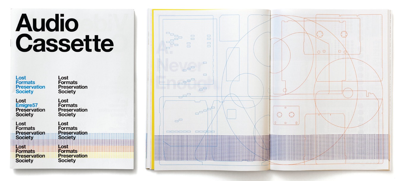
The legacy of these and other innovators of Dutch design can be seen, though often in a mutated or updated form, in work by some contemporary designers. Crouwel, for instance, has his most obvious baton-carriers in Experimental Jetset. We are so used to thinking of the trio as enfants terribles that it comes as a jolt to realise that it is 12 years since they made a startling international debut with the Lost Formats Preservation Society issue of Emigre, the experimental design magazine founded in California by Dutch émigré Rudy VanderLans.
Jetset took Crouwel's typographic rigour and sense of structure and turned it into an audaciously consistent visual and intellectual statement about the need to circumvent the image-making excesses of contemporary culture by emphasising the material qualities of the designed object. Following in Crouwel's footsteps, Jetset produced an identity for the Stedelijk Museum while it occupied temporary premises near the central station in Amsterdam. The team's high profile in the art world led to a prestigious commission to design a new identity for the Whitney Museum of American Art in New York.
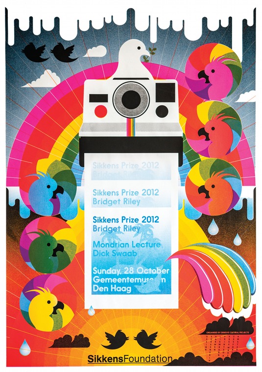
Anthon Beeke's couldn't-give-a-damn irreverence has passed down to companies such as KesselsKramer in Amsterdam and Studio Kluif in 's-Hertogenbosch. These agencies, like Beeke in his own way, both sit on the line between design and advertising. They aim for immediate impact: striking, even aggressive imagery, and strong ideas.
Purists are boring
"Having a style is like being in jail" is 'Kluifism' number one on Studio Kluif's website. When the studio's founders, Paul Roeters and Jeroen Hoedjes, did a book about themselves a few years ago, they titled it Purists are Boring. Could they have been thinking of apostles of graphic perfection such as Crouwel, who would be incapable of voicing such a sentiment? Yet, in one key area, Studio Kluif stays close to the old model of the design studio. There are no account managers – clients deal directly with the designers, a personal relationship that allows ideas to flow without retraint.
With Studio Kluif - self-described as "tough, no-nonsense and determined, with a hint of humour" - it is at least clear what the company is offering. KesselsKramer's website, tackily styled as a place to come and get your nails painted, seems devised to repel all but the most persistent inquiries.
This wilful elusiveness hasn't stopped Erik Kessels - found photo collector, and author of Advertising for People Who Don't Like Advertising - making an international name for himself with jaw-droppingly tasteless promotional campaigns for the so-ghastly-it's-good Hans Brinker Budget Hotel in Amsterdam; not so much a "hint of humour" as a big steamy dollop. Here, once again, graphic purism is absolutely unthinkable. The look is entirely at the service of the concept and riveting the viewer's attention.
If there is a leading edge in Dutch communication design today, it probably lies somewhere in the nexus of digital culture, the academy and the idea of treating design as a platform for new kinds of research. Designers such as Lust in The Hague and Catalogtree in Arnhem turn complex fields of digital data into visually intelligible form. Studio Moniker, formed in 2012 in Amsterdam by Luna Maurer, Jonathan Puckey and Roel Wouters, explores the effects of technology in daily life through interactive projects. Joost Grootens, today one of The Netherlands' most celebrated designers, applies the same rigorous thinking to books, atlases and information design.
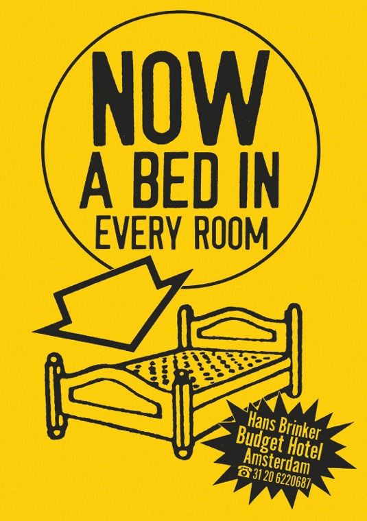
Graphic experimentation and beauty of form is not an end in itself in these projects, but a by-product of systematic precision in the visual handling of data. Grootens also leads the Information Design MA at Design Academy Eindhoven, where Catalogtree and Simon Davies are teachers.
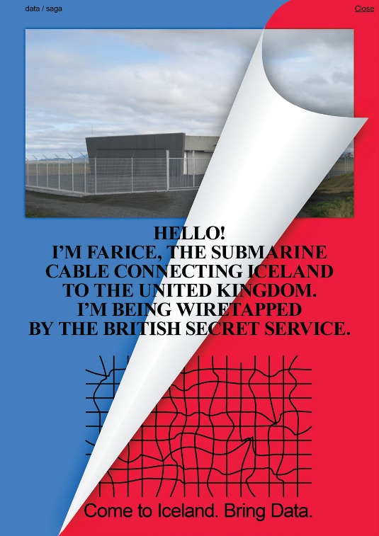
Metahaven, a partnership of Daniel van der Velden and Vinca Kruk, is the team that has done most to establish the idea of the design studio as a kind of nomadic, research-led think tank, producing speculative projects where the visual form is just as important as any written component. This work, which includes identity proposals and product design for WikiLeaks, is often politically motivated and intellectually taxing.
Fellow designers have struggled with the sharp, dense, angular aesthetic of Metahaven's designs, but the duo wants its output to have a layer that resists easy assimilation. Of all Dutch designers, it seems the closest in outlook to Jan van Toorn, with whom Van der Velden studied at the Jan van Eyck Academy in the 1990s. Van der Velden is now himself a lead tutor in the Think Tank for Visual Strategies Design MA at the Sandberg Institute, a key course in the development of recent Dutch graphic design thinking.
In 2011, I saw the Sandberg course up-close when I was invited to join the graduation jury. While most of the students' work involved a graphic component, 'graphic design' had exploded to become a multiform activity driven by social engagement and a broad range of research aims. The following year, a student from the course, Noortje van Eekelen, pulled off a truly noteworthy feat when her graduation project, The Spectacle of the Tragedy, was publicised by news organisations around the world, from the New York Times to Le Monde to the Daily Mail.
For one part of the project, which particularly fascinated people, Van Eekelen created a kind of Pantone chart out of press photos, showing how the German chancellor Angela Merkel wears the same jacket styles in dozens of different colours. After a coup like that, it was no surprise that Van Eekelen was snapped up earlier this year by Het Financieele Dagblad, a Dutch newspaper, as a graphic designer. She is clearly a talent to monitor, and will undoubtedly form part of the increasingly bright-looking future of Dutch design.
Words: Rick Poynor
The founding editor of Eye magazine, Rick Poynor was also a co-founder of Design Observer and acts as a visiting professor in Critical Writing at the Royal College of Art. He is a frequent visitor to The Netherlands, writes regularly about Dutch graphic design and is author of the monograph Jan van Toorn: Critical Practice.
This article originally appeared in Computer Arts issue 223.
Liked this? Read these!
- Create a perfect mood board with these pro tips and tools
- The ultimate guide to logo design
- Download the best free fonts

Thank you for reading 5 articles this month* Join now for unlimited access
Enjoy your first month for just £1 / $1 / €1
*Read 5 free articles per month without a subscription

Join now for unlimited access
Try first month for just £1 / $1 / €1

The Creative Bloq team is made up of a group of art and design enthusiasts, and has changed and evolved since Creative Bloq began back in 2012. The current website team consists of eight full-time members of staff: Editor Georgia Coggan, Deputy Editor Rosie Hilder, Ecommerce Editor Beren Neale, Senior News Editor Daniel Piper, Editor, Digital Art and 3D Ian Dean, Tech Reviews Editor Erlingur Einarsson, Ecommerce Writer Beth Nicholls and Staff Writer Natalie Fear, as well as a roster of freelancers from around the world. The ImagineFX magazine team also pitch in, ensuring that content from leading digital art publication ImagineFX is represented on Creative Bloq.
