7 scarily good designs inspired by the world of horror
Who doesn't love a good ghost story or horror movie? These inspired creations from the worlds of art, graphic design and branding took that inspiration and run with it...
Happy Hallowe'en! As you may have noticed, today it's October 31st, aka All Hallow's Eve, and we've got all things ghostly, ghoulish and altogether horrific on our minds today.
And we're not the only ones to catch the horror bug - these seven inspired designs, from the worlds of art, graphic design and branding, all make the most of our penchant for the spooky...
01. Horrorgami
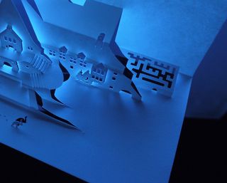
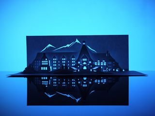
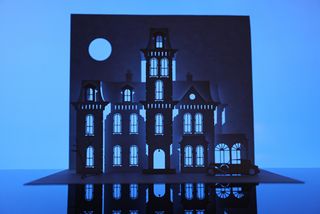
Kirigami is essentially origami with scissors, which doesn't sound scary at all. But when it's in the hands of London-based designer/artist Paper Dandy, and you throw the theme of horror movies into the mix, you end up with something horryfyingly good.
Horrorgami was Paper Dandy's first exhibition, and showcased 13 buildings of famous locations from classic horror movies (including The Shining, Psycho, The Exorcist and more!).
02. 80s horror movie poster
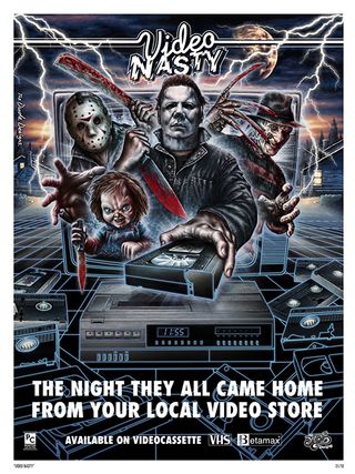
The 80s, decade of VHS and Betamax, was a golden era for the horror movie and so this limited edition print - illustrated by The Dude Designs - got us a little excited when news of its release hit Creative Bloq towers. The brilliant design features Chucky, Michael Myers, Freddy Krueger and Jason Voorhees. What more could you want?
03. Horror game press kit
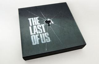
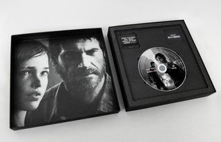
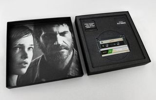
Survival horror video game The Last of Us was one of the most anticipated releases in the video game industry for quite some time. And we were especially impressed with the packaging for this exclusive press kit, created for Sony by Fluid.
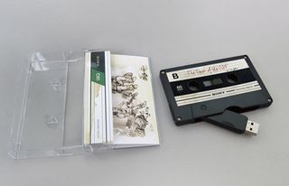
Featuring gorgeous typography, incredible attention to detail and a whole host of extras, including a cassette tape/USB crossover, they really went all out for the release. If anyone reading this is looking to put together a press kit, this is how to do it.
Get the Creative Bloq Newsletter
Daily design news, reviews, how-tos and more, as picked by the editors.
04. Horror characters in butter
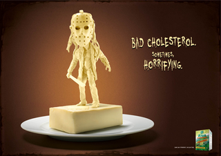
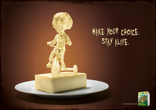
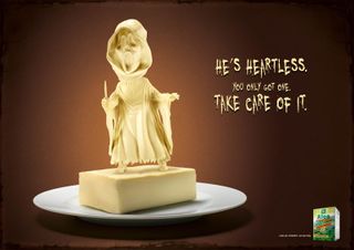
Heath supplements company Bioenergy Nutrition wanted to promote the benefits of levels of cholesterol and triglyceri to its Italian customers. But rather than opting for clichéd images of happy, smiling families and natural landscapes, they decided to turn to the dark side.
Milanese advertising agency Alch1m1a ADV created this macabre series of print ads casting butter as the baddie in an instantly recognisable way - sculpting three well known horror icons out of the fatty sandwich spread.
05. Horror book covers
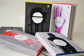
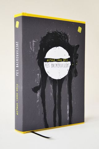
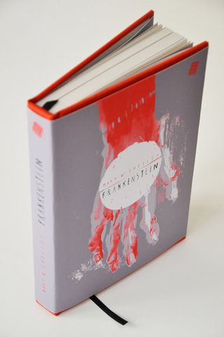
Czech artist Nikola Klímová specialises in illustration and print design, spending much of her time designing book covers for classic novels. For this project, Klímová focused on the horror genre, creating striking designs for classics including Bram Stoker's Dracula, Mary Shelley's Frankenstein and Arthur Conan Doyle's The Hound of the Baskervilles.
The colour palettes chosen for each title are also spot on, the majority using black, grey or blood red but in a way that sets them apart from the standard horror genre treatment.
06. Horror movie charity prints
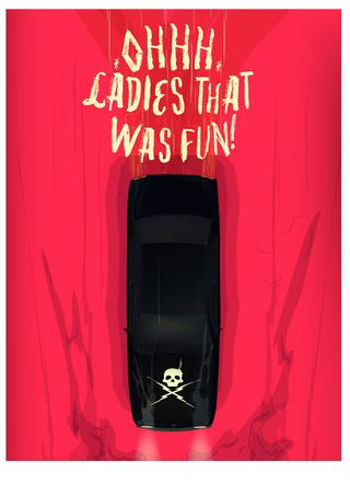
If you're a fan of scary movies, you'll love these frighteningly fabulous prints - inspired by the likes of The Shining, Candyman, IT and A Nightmare on Elm Street. The series was created by Creative Spark, who have created a special 'Little Print Shop of Horrors' for the occassion. All proceeds made from the prints will be going towards Creative Spark's goal of raising £10,000 for their favourite charity - Forever Manchester.
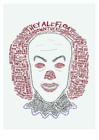
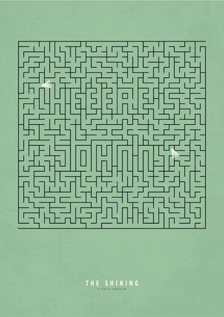
See more prints and purchase your favourites on Creative Spark.
07. 200ft horror projection
Two UK design agencies decided to do something a little different for last year's Halloween. Play Nicely, a multidisciplinary design, technology and creation studio, teamed up with Taxi Studio, a team of creatives who recently celebrated their 10th anniversary, to create an incredible 200ft high, 3D projection onto the side of Bristol's famous Clifton Suspension Bridge.
First, dressed in animal masks, they lured their audience to the bridge. The crowd were expecting to watch two graffiti artists spraying the underside of the bridge, so they were taken aback when they were disturbed by what looked like an enormous, terrifying troll breaking through the wall. Check out the video - it has to be seen to be believed!
Like this? Read these!
- Illustrator tutorials: amazing ideas to try today!
- Great examples of doodle art
- Brilliant Wordpress tutorial selection
Have you seen a great example of horror-inspired design? Let us know in the comments box below!

Thank you for reading 5 articles this month* Join now for unlimited access
Enjoy your first month for just £1 / $1 / €1
*Read 5 free articles per month without a subscription

Join now for unlimited access
Try first month for just £1 / $1 / €1
The Creative Bloq team is made up of a group of design fans, and has changed and evolved since Creative Bloq began back in 2012. The current website team consists of eight full-time members of staff: Editor Georgia Coggan, Deputy Editor Rosie Hilder, Ecommerce Editor Beren Neale, Senior News Editor Daniel Piper, Editor, Digital Art and 3D Ian Dean, Tech Reviews Editor Erlingur Einarsson, Ecommerce Writer Beth Nicholls and Staff Writer Natalie Fear, as well as a roster of freelancers from around the world. The ImagineFX magazine team also pitch in, ensuring that content from leading digital art publication ImagineFX is represented on Creative Bloq.
