Discover the design history of Gotham City
The grim, gritty urban environment of Gotham is an integral part of Batman's dark appeal. Graphic designer Joe Stone looks at the visual evolution of the infamous city.
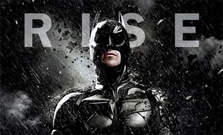
From his very first comic book appearance back in 1939, Batman has dwelt in a much more grounded setting than most other superheroes, fighting seedy low-lifes in grimy alleyways and across shadowy rooftops. Inspired more by pulp crime and noir serials than science fiction or adventure, his world is one that we can relate to. As Batman has grown in popularity and recognition, spreading from the printed page to television and cinema screens, so too has this world evolved.
Twisted mess of spires
From the very first shot of Tim Burton's Batman, Gotham City shines through as a classic movie design. A twisted mess of gothic spires and arches, with lean buildings towering over the darkened streets, it gives a striking sense of place.
Masterminded by production designer Anton Furst, who won an Oscar for his interpretations of Gotham and the Batmobile, the 1989 vision of the city remains one of the most memorable and well recognised, even having a profound effect on the way Gotham has since been represented in the comics.
Art-deco direction
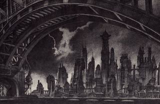
The 1992 sequel Batman Returns pushed the aesthetic in a more art-deco direction. Furst was tied into other obligations, so set design duties were handed over to frequent Burton collaborator Bo Welch.
Welch says fascist architecture and the World's Fair were two main influences on his design for the city, resulting in much more theatrical sets and the appearance of large statues throughout Gotham.
Towering metal
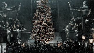
Barbara Ling pushed the theatrics further as the set designer for Joel Schumacher's Batman Forever.
Towering metal figures littered the city skyline to hold up buildings and the zany locales increased, culminating with the Riddler's man-made island fortress (a giant version of his Riddler Box device, complete with watery death-trap at the bottom).
Get the Creative Bloq Newsletter
Daily design news, reviews, how-tos and more, as picked by the editors.

The city and its inhabitants were a lot brighter, and the tone of the entire film was more lighthearted and family-friendly than in previous instalments of the 1990s Batman movies.
Neon disaster
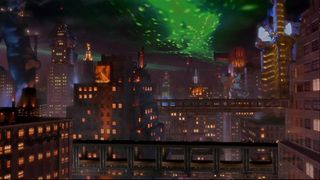
But Batman Forever's gaudy landscapes were nothing compared to the garish disaster that was 1997's universally panned Batman and Robin.
Despite being largely set at night, Gotham was reminscent of a bright, cartoony rave, with outlandish buildings and gigantic statues at every turn. Anything that could possibly glow – from billboards to graffiti to the characters themselves - did.
Barbara Ling was once again the set designer on the movie but seemed to take the concepts and set pieces back 30 years to the over-the-top campness of the Adam West TV series (at least it suited the hokey, pun-heavy screenplay...).
Back to basics
Eight years later, the franchise was rebooted and the entire aesthetic redesigned from the ground up by Christopher Nolan and his production designer Nathan Crowley in Batman Begins.
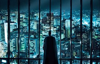
Taking everything back to basics, both men immersed themselves in the world of Gotham, building models of the city in Nolan's garage and tackling the project as if it were a real place rather than the nightmarish comic book landscape of previous movies.
Gone were the hulking statues and twisted spires, replaced instead with gritty slums and industrial infrastructure.
Real-world locations
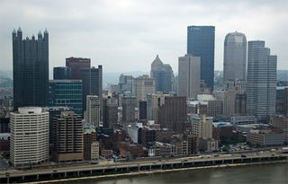
Gotham scenes in Nolan's trilogy were filmed across several different locations including Chicago, Pittsburgh and LA. The new trilogy moved the look and feel of the city even further away from the comic book roots and planted it firmly in the real world.
Inspired by actual metropolises like New York and Tokyo, Nolan and Crowley thoroughly succeeded in grounding the city in an almost mundane reality. The look and feel of Gotham in the recent movies has been much less of a factor, taking a back seat instead to character-driven storytelling.
So much more could be said about the rich history of Gotham City's design, which has shaped the franchise across comics, cartoons, movies and more for the last 70 years. The enduring legacy of the world Batman and his enemies inhabit stands testament to the strength and depth of its design, and Gotham City remains one of the most evocative landscapes in superhero history.
Written by Joe Stone
Which Gotham city design is your favourite? Let us know in the comments box below!

Thank you for reading 5 articles this month* Join now for unlimited access
Enjoy your first month for just £1 / $1 / €1
*Read 5 free articles per month without a subscription

Join now for unlimited access
Try first month for just £1 / $1 / €1
The Creative Bloq team is made up of a group of design fans, and has changed and evolved since Creative Bloq began back in 2012. The current website team consists of eight full-time members of staff: Editor Georgia Coggan, Deputy Editor Rosie Hilder, Ecommerce Editor Beren Neale, Senior News Editor Daniel Piper, Editor, Digital Art and 3D Ian Dean, Tech Reviews Editor Erlingur Einarsson, Ecommerce Writer Beth Nicholls and Staff Writer Natalie Fear, as well as a roster of freelancers from around the world. The ImagineFX magazine team also pitch in, ensuring that content from leading digital art publication ImagineFX is represented on Creative Bloq.
