How to create a pop-up promo card
Looking for a cheap and effective way to catch people's attention of potential clients? Karen Lewis shows you how.
When sending out promotional print mail to potential clients, you need to create something with impact that will leave a lasting impression and intrigue the recipient to find out more about you. A handmade pop-up card is a fun and light-hearted way to do this. Personal and innovative, it’s likely to help you stand out from the crowd.
In this tutorial I’ll explain how to make a pop-up card: we’ll bring type to life so that it jumps up and out of the page. Using InDesign CS6, we’ll create the template and add some simple effects to give the type impact. As well as explaining the basic pop-up formula, I’ll also cover some important tips for cutting and folding your card design.
The best thing about this process is that it’s not only effective, it’s also inexpensive and relatively quick to do – all you need is a printer, some basic tools and a steady hand.
Step 01
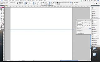
To begin, first create a new document in InDesign. I’ve chosen to work with a standard A4 page so that the text won’t be too tricky to cut. Using the Pen tool, draw a dotted line horizontally through the centre to indicate where your page will fold in half. You can use the Align panel for this: select Align to Page, and click Vertical Centres to position the line accurately.
Step 02
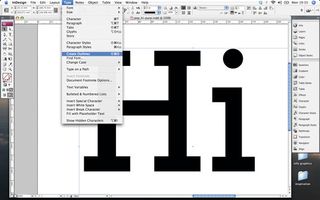
Next you need to decide what your pop-up text will say. If you keep it short and sweet with a simple introductory greeting like ‘Hi’, it will make your job easier, particularly if you are intending to send multiple cards.
It’s also best to select a bold font as this makes a sturdier pop-up element. Create outlines of your text (Cmd/Ctrl+Shift+O), giving it a coloured stroke and a white fill, then separate your letters using the Direct Selection tool: select all the points of one letterform, copy and delete them, then paste them in place (Cmd/Ctrl+Opt/Alt+Shift+V).
Step 03
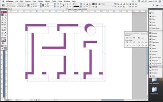
To create a shadow effect, group, duplicate and offset your text (hold Cmd/Ctrl+Opt/Alt+Shift and drag it into position). Copy the original text, paste the copy in place and punch this through the offset text using the Subtract command in the Pathfinder panel. Set the fill colour of the punched shape, and use the Direct Selection tool to drag the corner points out to create a diagonal line and produce a 3D effect. Repeat this for all the necessary points.
Get the Creative Bloq Newsletter
Daily design news, reviews, how-tos and more, as picked by the editors.
Step 04
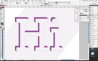
To create the lined pattern I’ve used, draw a diagonal line with the Pen tool at your desired angle. Hold Cmd/Ctrl+Opt/Alt+Shift to duplicate the line, and drag the new one by the distance you want your lines to be spaced. Duplicate this action (Cmd/Ctrl+Opt/Alt+Shift) multiple times until the pattern fully covers your text. Select the lines, group and position them where you want them to go through the text. Then copy, delete and select your text, and paste it inside (Cmd/Ctrl+Opt/Alt+V). You can amend the style of your lines at any time by going to Object>Select>Content when your text is selected.
Step 05
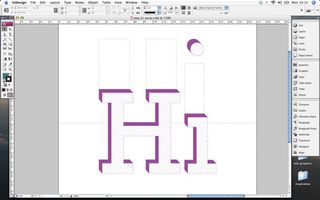
Next we need to position the type and add adjoining tabs that will enable the type to stand away from the page. Group your text elements, horizontally centring the group on the page. Drag it downwards (holding Shift) to the point you want it to pop out from. You then need to create tabs that are the same height measurement as this coming away from the top of your letters. I created boxes with a dashed stroke (weight 0.5pt and 10% black) to guide where to cut and fold. Now measure the distance between the stem of the ‘i’ and the tittle (the dot), and move the tittle, positioning it above the tab by the same measurement.
Step 06
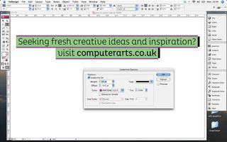
Add a sentence or two letting the potential client know where they can view more work and how to contact you. I gave a boxed outline effect to my text, and underlined it (go to Window>Type>Character, select the drop-down menu, go to Underline Options and tick Underline On). Select the colour and experiment with weight and offset measurements until you achieve the desired effect.
Step 07
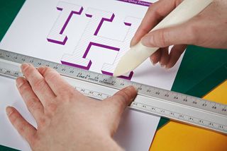
Before you print, delete the dotted line running through the centre of your page, leaving two small markers at either side of the page to subtly indicate where you should score the card. When you have printed your design onto a suitable card stock, use a bone folder to score the card where the folds will be. The design should be horizontally scored across the top of the tabs, at the top and bottom of the letters, and through the middle of the page.
Step 08
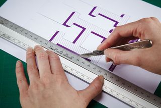
Once scored, start to cut around the sides of the text and along the dotted markers of your tabs using a sharp scalpel. Be careful not to cut around the letters and tabs completely – they need to remain attached to the top and bottom of the page.
Step 09
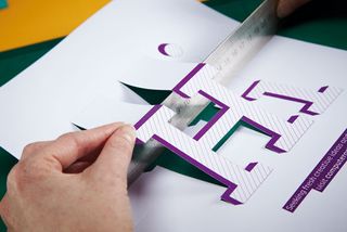
The next step is to pop out your design. To achieve straight edges, push a metal ruler into the scored areas, to encourage the page to fold. The text should be folded three ways – the bottom scored edge folds up, the middle score folds down and the top scored edge folds up. The card should also be folded through the centre (which I did last).
Step 10

To finish, back your design with some brightly coloured and contrasting card to emphasise the 3D effect, using double-sided tape to stick the two pages together.
Words: Karen Lewis
This tutorial originally appeared in Computer Arts

Thank you for reading 5 articles this month* Join now for unlimited access
Enjoy your first month for just £1 / $1 / €1
*Read 5 free articles per month without a subscription

Join now for unlimited access
Try first month for just £1 / $1 / €1
The Creative Bloq team is made up of a group of design fans, and has changed and evolved since Creative Bloq began back in 2012. The current website team consists of eight full-time members of staff: Editor Georgia Coggan, Deputy Editor Rosie Hilder, Ecommerce Editor Beren Neale, Senior News Editor Daniel Piper, Editor, Digital Art and 3D Ian Dean, Tech Reviews Editor Erlingur Einarsson, Ecommerce Writer Beth Nicholls and Staff Writer Natalie Fear, as well as a roster of freelancers from around the world. The ImagineFX magazine team also pitch in, ensuring that content from leading digital art publication ImagineFX is represented on Creative Bloq.
