CA cover design contest: final 8 revealed
We can now reveal the top designs in Computer Arts' third-annual cover design contest!
For the last three years, Computer Arts has run a contest in partnership with D&AD New Blood for students and recent graduates to design the cover of our New Talent special.
For this year's brief, our finishing partner Celloglas offered up an extra-special finish for the entrants to get creative with: pearlescent varnish.
We can now reveal the final shortlist of eight, one of which will receive a £500 commission to develop their idea into the final cover of the issue, which goes on sale 22 July.
Subscribe to CA now to guarantee your copy, and save 50% in our special graduate season offer!
Davide Osella
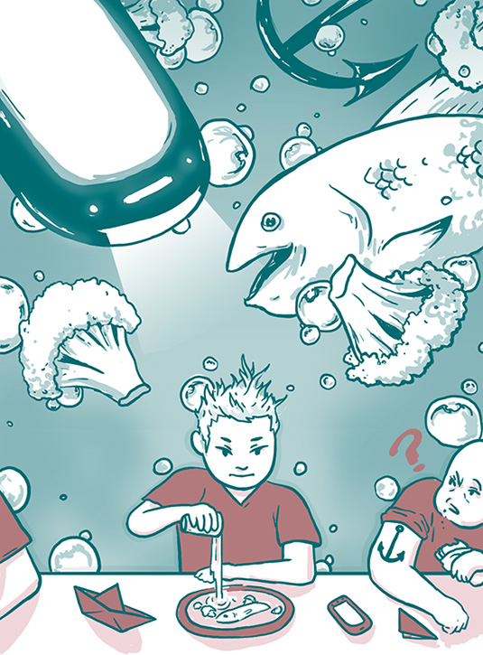
"My artwork represents the ability of an artist to find inspiration everywhere around him," explains Davide Osella.
"In the picture we see a young male pouring water into his dish at a bar counter. Everything he has around is inspiring his 'artist trip', depicted on the background."
"Broccoli and a fish, part of his lunch, are floating in a deep water atmosphere. His nearby fellow's anchor tattoo is there too, and his phone transforms into a futuristic submarine."
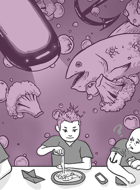
Osella suggests applying the pearlescent varnish over the background and hair of the central character. "In this way, everything touched by his 'artistic inspiration' would be identified by this special treatment," he explains.
Grace Murray
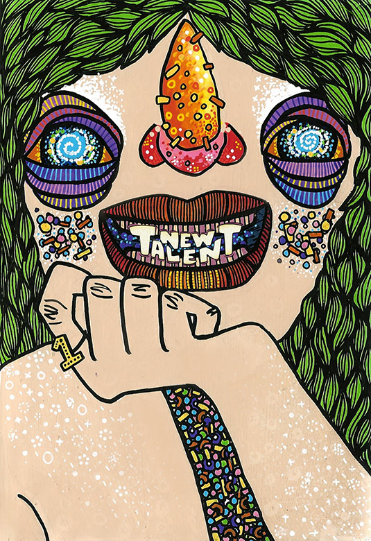
A recent Visual Communications graduate from Cork Institute of Technology, Grace Murray chose to illustrate the "excitement and eagerness" of new graduates.
"My character is colourful and eye catching, to make sure no one misses her," Murray explains. "She's got drive and fresh talent coursing through her veins (and teeth)."
Murray proposes applying pearlescent varnish to the character's eyes to add some extra sparkle, as well as parts of her cheeks and nose.
Izzi Hays
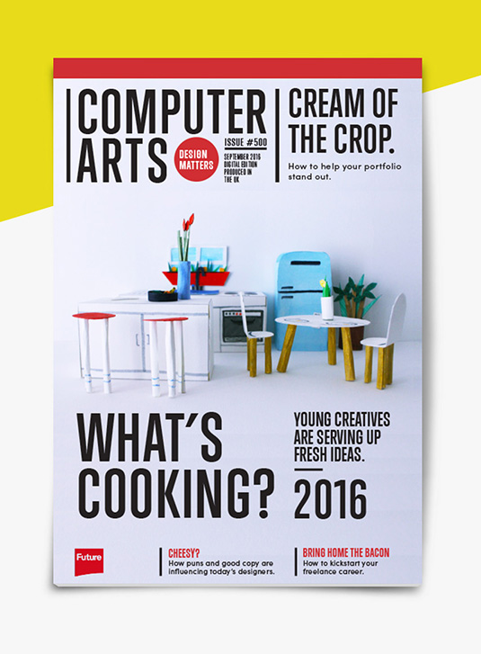
"Fresh talent is always about what is happening, and the up-and-coming," observes Izzi Hays, who used the colloquial phrase 'what's cooking' as a starting point for her cover concept.
"I created a miniature kitchen scene entirely out of paper, some markers, a lot of hot glue, and a little watercolour," she says. "The viewpoint into the kitchen allows the viewer to feel that they could step into it and create something fresh and exciting."
Hays proposes applying pearlescent varnish to the main title and strapline to add depth and intrigue, and also suggests turning CA's 'design matters' badge into a peelable sticker.
Karine Fortier

A recent graduate London College of Communication, Karine Fortier chose to depict the "shared emotions of success, and the excitement of the continued journey" in her playful design.
The 'I ❤ CA' stickers are a clear homage to the great Milton Glaser, who she quotes in her entry: "The real issue is not talent as an independent element, but talent in relationship to will, desire, and persistence. Talent without these things vanishes and even modest talent with those characteristics grows."
Fortier suggests applying pearlescent varnish to the confetti cloud, the stars and the hearts on the stickers to emphasis the playful, celebratory feel of her design.
Krystina Chapman
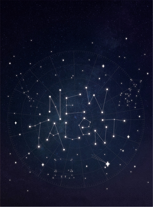
A graduate in Graphic & Communication Design from the University of Leeds, Krystina Chapman uses a two-level metaphor in her design, which depicts the main coverline as a constellation in the night sky.
"This not only refers to the suggested theme of 'rising stars', but also alludes to the metaphor 'written in the stars' – as if the new bloods' passion for design is in their destiny," she explains. "The lonesome shooting star is breaking the mould and standing out from the crowd."
Chapman would apply pearlescent varnish on particular stars, to make them twinkle and shimmer. "Light would really bring the cover to life, and highlight the title," she adds.
Melanie Edwards

Melanie Edwards interprets the 'fresh talent' theme as a pair of young creative students literally blooming like flowers.
She proposes applying the pearlescent varnish on the sky to achieve a shimmering reflective effect. "I want readers to see their reflection in the varnish," she continues. "Perhaps this will encourage them to imagine themselves as the blooming creative students featured in the magazine in the future."
Sebastinella Dunne

For Arts University Bournemouth graduate Sebastinella Dunne, breaking out of university and into the working design industry could feel like heading into another huge world – and her design reflects this.
"Many design graduates have shining talent to add to the industry, but it takes guts, self belief and determination to burst out of our small bubbles and jump into the wider design world," she argues, adding that the pearlescent varnish would finish off the bubbles nicely.
Vadym Solovyov
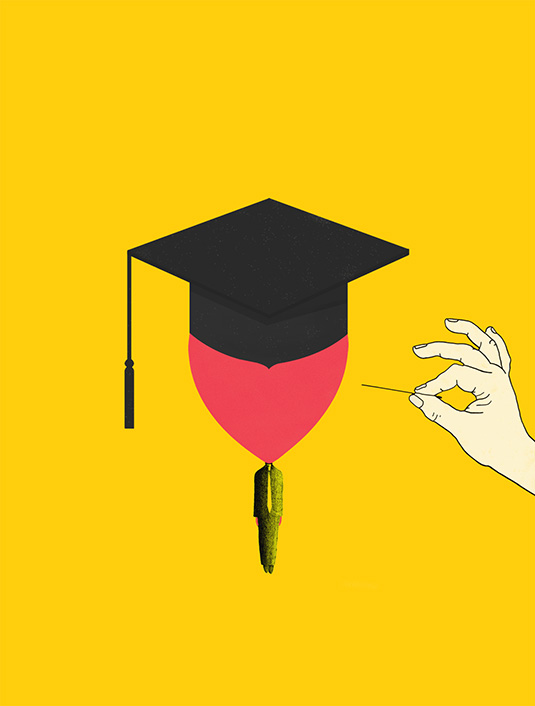
Through his balloon-headed man concept, Vadym Solovyov depicts fresh graduates as having an over-inflated sense of themselves as they enter the industry, a delusion waiting to be popped by reality.
"While studying, young people are acquiring more knowledge and skills – it's like a balloon getting more helium, flying higher and higher," he explains.
"After graduation they come face-to-face with the real world, with real obstacles on the way to success." With one touch, he adds, the balloon can burst and they'll fall to earth with a bump.
Get a half-price subscription to CA
We know it isn't always easy being a new graduate. So to celebrate 2016 degree show season, get an incredible 50 per cent off an annual subscription to Computer Arts magazine.
For just £39 you'll receive an entire year of industry insight, opinion and inspiration, delivered to your door. Plus: subscribe before 8th July to guarantee your copy of CA's 2016 New Talent issue!

Thank you for reading 5 articles this month* Join now for unlimited access
Enjoy your first month for just £1 / $1 / €1
*Read 5 free articles per month without a subscription

Join now for unlimited access
Try first month for just £1 / $1 / €1
Get the Creative Bloq Newsletter
Daily design news, reviews, how-tos and more, as picked by the editors.

Nick has worked with world-class agencies including Wolff Olins, Taxi Studio and Vault49 on brand storytelling, tone of voice and verbal strategy for global brands such as Virgin, TikTok, and Bite Back 2030. Nick launched the Brand Impact Awards in 2013 while editor of Computer Arts, and remains chair of judges. He's written for Creative Bloq on design and branding matters since the site's launch.