10 ways to boost your creativity with new tech
Add zing to your design work with these tips for making the most of digital technology.

Digital technology means that magazine content can now be enriched by sound and image. You can unwrap 3,000-year-old mummies at the British Museum without even touching them.
Even changing rooms (like those in development by eBay's retail innovation team) can detect which garments you try on and search for alternative sizes or matching accessories. Thankfully, they don't yet pass judgment on how big your bum looks.
The ability to get the most from the diverse opportunities that digital techniques offer, stems from research, driving engagement and thinking big. But you need the right balance with creativity: too technical and you lose the audience.
Engaging experiences
"Everything we do is about storytelling and emotion from the beginning to the end," says Jake Barton, founder of New York-based interactive specialist Local Projects.
"We use cutting-edge technology and love to innovate, but if the project doesn't serve more engaging experiences that transport visitors, then it will be out of date in no time."

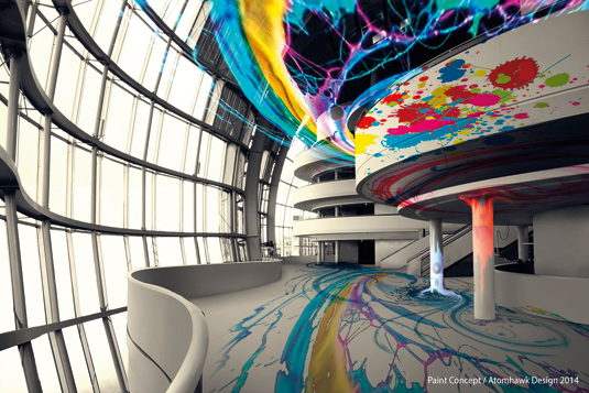
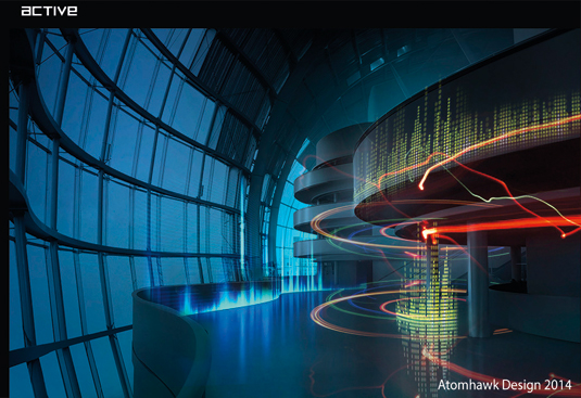
The team at digital design studio Mbryonic and Atomhawk Design agree. In December 2014 they were commissioned to mark the tenth birthday of music venue Sage Gateshead with an iPhone and iPad app, as well as an Oculus Rift version based on an experimental concert that used the walls, balustrades and steps of the iconic music venue as musical instruments.
The team used 3ds Max to model a fully interactive 3D space using floorplans and on-site photographs, and developed an 80s-influenced Tron environment and interface which visitors could then use to make their own beats.

"We try to use visual excitement to draw attention to real content and ideas," adds Local Projects' Barton.
So what's the best way to integrate cutting-edge new digital techniques into your design work - without undermining your creativity? Here are 10 top tips...
01. Idea first, logistics later
Answer briefs without any specific technology in mind, and never force technology into a project. A campaign will only be a success if the technology and creative message work in perfect and complementary harmony.
02. Engaging content is king
Futureproof your work by focusing on content. It's great to innovate and use cutting-edge technology, but the world moves so fast that whatever you do, in five years your work will look out of date. Make sure the content is engaging enough to endure.
03. Utilise cheap tools
Now is the best time ever to incorporate digital technology into art. There are a huge range of cheap and very powerful tools available that are very easy to use like Unity, Open Frameworks and Touch Designer.
04. The internet has answers
The amount of knowledge available on the internet is astonishing. You are guaranteed that someone out there has already done what you want to do and they are usually willing to share their solutions.
05. Create shareable content
Digital projects must service the brands or institutions you work with. Think about their priorities in terms of footfall and online traffic. Link your final product to their digital platforms and create shareable content that further promotes your project beyond its environment.
06. Collaborate with the experts
It's important to have the media owner with you from beginning. Get them onboard at first meeting so you can encourage them to take the design to its limits. Making them feel included and part of the team will drive them to take more risks.
07. Nail your storytelling
Cutting-edge technology can feel cold if you don't really nail your storytelling. Infuse your project with a strong narrative so you can provoke emotion from the beginning to the end.
08. Liberate your users
Put the power in the hands of the user. Don't just show your audience something, make your project as interactive as possible. They will come away with a much better experience if they've had the opportunity to create something themselves.
09. A simple UX is key
However complex the technology the user interface must be clear, friendly and easy to use. If it's not intuitive or too technical then you'll lose your audience.
10. Don't overdo it
Too much gimmickry will confuse the core message. To create the 'wow' factor, it's better to really excel at one thing. The more techniques you use, the more it will affect the budget, the timeline and the risks.
Liked this? Try these...
- 3 top character design tips from Adventure Time's lead designer
- What happens one hour after drinking a can of coke
- How to build an app: try these great tutorials
This full version of this article first appeared inside issue 239 of Computer Arts, the world's best-selling creative design magazine. Get up to 55 per cent off a subscription to CA here.

Thank you for reading 5 articles this month* Join now for unlimited access
Enjoy your first month for just £1 / $1 / €1
*Read 5 free articles per month without a subscription

Join now for unlimited access
Try first month for just £1 / $1 / €1
Get the Creative Bloq Newsletter
Daily design news, reviews, how-tos and more, as picked by the editors.
The Creative Bloq team is made up of a group of design fans, and has changed and evolved since Creative Bloq began back in 2012. The current website team consists of eight full-time members of staff: Editor Georgia Coggan, Deputy Editor Rosie Hilder, Ecommerce Editor Beren Neale, Senior News Editor Daniel Piper, Editor, Digital Art and 3D Ian Dean, Tech Reviews Editor Erlingur Einarsson, Ecommerce Writer Beth Nicholls and Staff Writer Natalie Fear, as well as a roster of freelancers from around the world. The ImagineFX magazine team also pitch in, ensuring that content from leading digital art publication ImagineFX is represented on Creative Bloq.
