Add depth and texture in Illustrator
Jeffrey Bowman explains how to use grids, gradients and textures to add depth to your illustrations.
- Software: Illustrator CS5 or later
- Project time: 2 hours
- Skills: Add depth with the Grain effect; create halftone patterns; set up a grid in Illustrator
Adding extra depth to an image can be a quick process that utilises some simple tools offered by Illustrator.
Using the Grain effect you can add a retro texture, which, combined with some halftone patterns and simple brush strokes, can turn a flat-looking illustration into a rich texturised design. Over the following steps, I'll show you how.
- Expand your vector know-how with out Adobe Illustrator tutorial list
01. Set up a grid
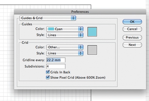
Setting up a grid is the first thing to do. Work out the width of your document and divide it by the amount of segments you want, then navigate to Preferences > Guides and Grids, and insert the figure into the Gridline Every field. It’s entirely up to you how many sub-divisions you want.
02. Rough out the illustration
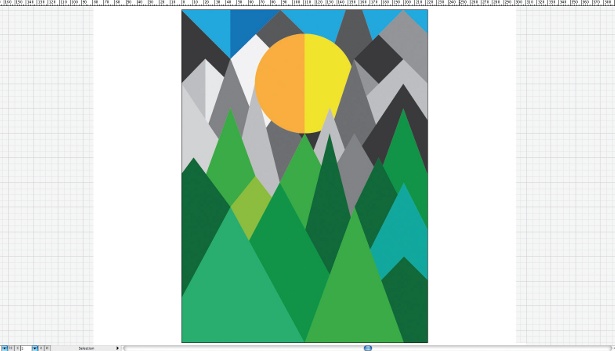
Now that you have your grid, rough out your illustration, ensuring you select 'Snap to Document Grid' (View > Grids & Guides). I’ve created a mountain scene with the sun as the focal point. I turned my rulers on (Cmd/Ctrl+R) to find the centre of my canvas.
03. Choose the colour palette
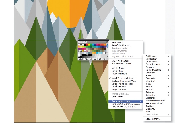
Choose an appropriate colour palette - I've gone for something organic and have used tone to start adding depth. Illustrator has some really nice pre-determined colour palettes in the Swatch fly-out menu (select Open Swatch Library).
04. Add texture to shapes
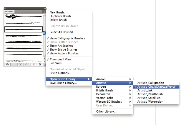
Now let's add texture to the edges of our flat shapes to give them a slight hand-drawn feel. Open the Brushes panel, select the drop-down menu and go to Open Brush Library > Artistic > ChalkCharcoalPencil.
05. Make the shape whole
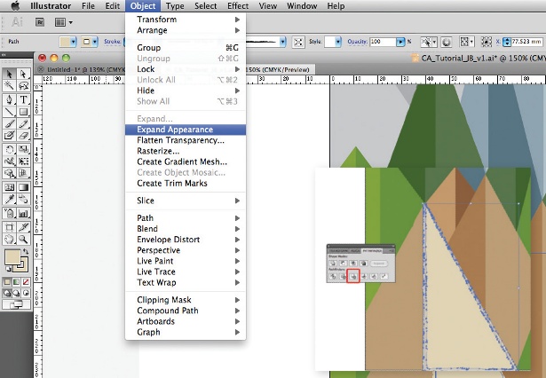
Select a shape and apply your chosen brushstroke. Once you're happy with the stroke, go to Object > Expand Appearance. Next, select Merge from the Pathfinder panel: this will make the shape whole, rather than retain the stroke. Repeat this for all of the elements you add the stroke to.
Get the Creative Bloq Newsletter
Daily design news, reviews, how-tos and more, as picked by the editors.
06. Create a gradient
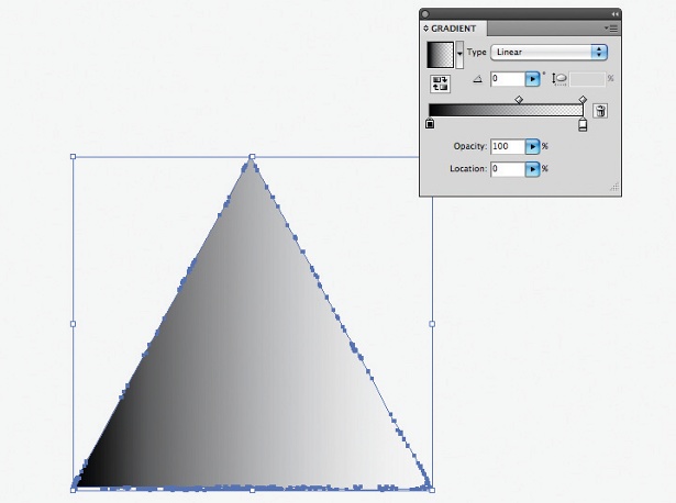
Next, we want to add a nice gradient with a textured, grainy feel. This will add depth, but with a retro style. The first thing to do is copy a segment of your illustration.
07. Apply the gradient
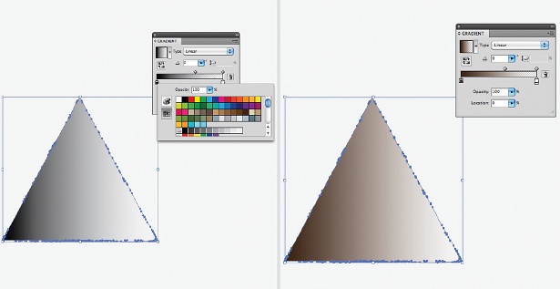
Now apply your gradient, preferably ensuring it fades from dark to white. You can do this by clicking into the Gradient panel and then clicking the default black stopper - this should open up your swatches.
08. Texturize the gradient

Go to Effects > Texture > Grain. Set the intensity to 74, contrast to 50 and grain type to Sprinkles. You can experiment with all these settings until you are happy. Hit OK and, finally, in the Transparency panel drop-down menu, select Multiply. Now place your gradient back over the shape.
09. Experiment with the gradient
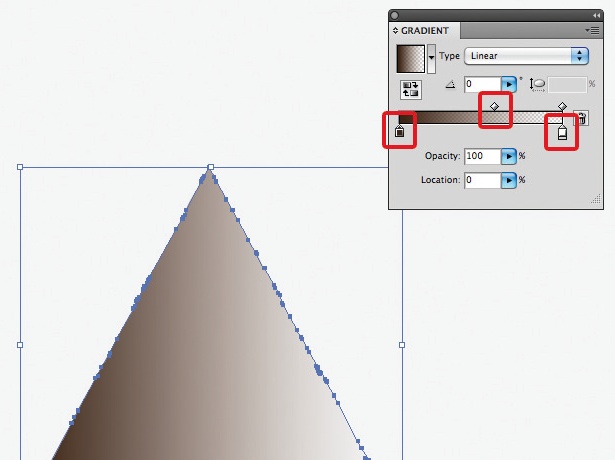
You can experiment with the direction and scale of your gradient by selecting the Gradient tool and dragging the cursor left to right or vice versa. Tweaking the sliders within the Gradient panel will also enable you to control the size of the gradient. Experiment with this process: long gradients lead you into a design; short, sharp gradients create a shadow effect.
10. Add halftone patterns
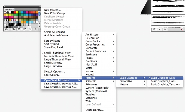
Next we want to add some halftone patterns. Utilising another pre-set panel in Illustrator, open the Swatches drop-down menu and go to Open Swatch Library > Patterns > Basic Dots. We want to customise the colour to suit our colour palette.
11. Colour up the dots
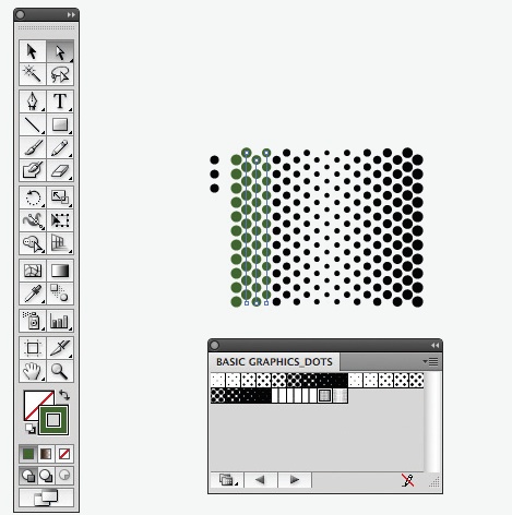
Grab and then drag the pattern swatch you want onto your desktop. Then, with your Direct Selection tool, carefully click the line of the dots and colour it up. Repeat this for all the rows of dots.
12. Apply the texture

With your black arrow, pick up the group of dots and drop it into your normal swatch panel. Next, copy a section that you want to apply it to, select the swatch and move the element back: you now have a halftone texture.
13. Play with colour

Playing around with the colour and intensity of the dots will help create a really interesting effect. However, all these steps will only be a success if the colours are adding to the sense of depth.
14. Finishing details
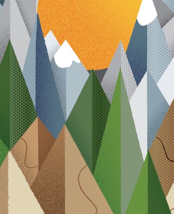
Lastly, start adding in the finishing details. I created snow on the tops of the mountains in my scene, and also a path that is just a single stroke. These extras help guide the viewer through the design.
Liked this? Read these!
- Create a perfect mood board with these pro tips
- The ultimate guide to designing the best logos
- Download the best free fonts

Thank you for reading 5 articles this month* Join now for unlimited access
Enjoy your first month for just £1 / $1 / €1
*Read 5 free articles per month without a subscription

Join now for unlimited access
Try first month for just £1 / $1 / €1

The Creative Bloq team is made up of a group of art and design enthusiasts, and has changed and evolved since Creative Bloq began back in 2012. The current website team consists of eight full-time members of staff: Editor Georgia Coggan, Deputy Editor Rosie Hilder, Ecommerce Editor Beren Neale, Senior News Editor Daniel Piper, Editor, Digital Art and 3D Ian Dean, Tech Reviews Editor Erlingur Einarsson, Ecommerce Writer Beth Nicholls and Staff Writer Natalie Fear, as well as a roster of freelancers from around the world. The ImagineFX magazine team also pitch in, ensuring that content from leading digital art publication ImagineFX is represented on Creative Bloq.
