8 things you didn't know about design for film
Inside secrets from the Oscar-winning Grand Budapest Hotel.
Wes Anderson's stylised action-comedy The Grand Budapest Hotel scooped up Oscars for best production design, costume design, makeup and score. As lead graphic designer on the film, Annie Atkins handcrafted Anderson's fictional empire of Zubrowka one postage stamp and pastry box at a time, working closely with production designer Adam Stockhausen and Anderson to bring the cult film-maker's meticulous vision to life.
Atkins has also worked on Laika's stop-motion masterpiece The Boxtrolls, for which she the incredible Victorian packaging worn by the curious underground creatures.
We caught up with Atkins to find out what it's like to work as a graphic designer in the high-profile world of film. Read on for her top tips, tricks and advice.
01. It's not all about the cinema audience
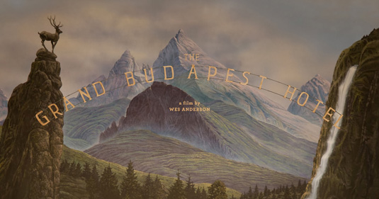
"When we create graphic props and set pieces, we're not always making them for the cinema audience – these are pieces that are dressed into the sets to create a more authentic experience for the director and actors to work in," says Atkins.
"Every period film you see will have shopfront signage and street posters and offices full of paperwork and maps and documents. These are all items that are made by the show's graphic designers specifically to fit the genre, period, and style of the script. It's about setting up a scene."
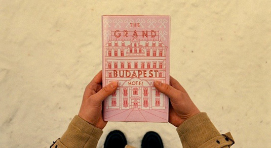
For example, the signage for the titular hotel features typesetting inaccuracies taken directly from real references of the period the film was set in.
02. Your props must feel real
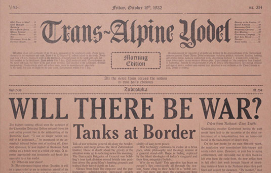
The designer's job is to make props that feel authentic for the actor. Remember: what you see on screen isn't what the actors are facing.
"In real life, film sets don't look like they look in the movies – they're full of lights and cables and people standing around in North Face jackets," smiles Atkins. "So anything you can do to give an actor or director a more authentic experience on set is going to go some small way in helping the final cut of the movie."
Wes Anderson wrote every single article found inside the Trans-Alpine Yodel newspaper that features in The Grand Budapest Hotel. His efforts weren't wasted, either. "There's a lot of waiting around on film sets, so people tend to read the fake newspapers," adds Atkins.
03. Set design is all a trick
A film's art department can be huge, with all kinds of specialists from model-makers to painters, scenic artists, draughtsmen and plasterers.
"Design is rarely neglected in filmmaking, but sometimes it seems invisible because an audience assumes that everything they see on a screen was already there," explains Atkins. "They don't think for a second that it was all built up from nothing on a stage in Bray. That's the magic of design for film: you're not always supposed to be aware of it. It's all a trick."
04. Learn the period quickly
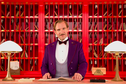
"I usually get around 6-8 weeks prep before shooting starts, and that's the essential time I take to become fully immersed in the period I'm working to," says Atkins. Working on a range of projects means it's usual for her to design for the same style or period more than once.
"I knew nothing about nothing about Eastern European 1930s when I started the Grand Budapest Hotel," she continues. "You need a good understanding of the history of the printing press, for example, to be able to imitate it convincingly on a laser jet."
05. Study antique design in the flesh
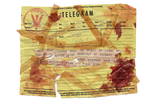
The one piece of advice Atkins would offer to design students? Study antique graphic design in the flesh. "There's no point doing a Google image search for a telegram. You need to understand the scale of the text and the texture of the paper in your hands, otherwise it's never going to work in an actor's hands."
06. Be prepared to live on set
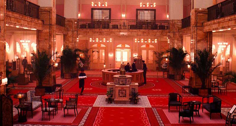
Although sometimes it's possible to work remotely, there's no substitute for getting on set. "Film sets are very physical environments and you need to be there with the rest of the crew wherever possible, so you can go down to the prop house or nip in to the set to take measurements," says Atkins.
"The prop master and the set decorator need you there, so they can grab you and show you stuff as it's being turned out. You also need to see the textures and weights of materials, and understand the scales of sets."
Practical considerations also have an impact – if you're working from home, you need to factor in time to travel to and from the set when required, which isn't always possible if you're working to a tight schedule.
07. Check your spelling
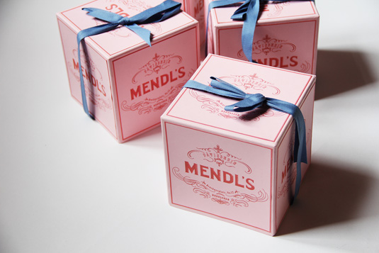
Atkins has one major regret from her work on The Grand Budapest Hotel: she didn't check the spelling on the iconic Mendl's box before it went to print.
"I'd spelt 'Patisserie' wrong – we only noticed it after we'd shot it a hundred times in various different scenes. I was mortified," she cringes. "We corrected it in post, and Wes was so nice about it, but I burnt bright red when I realised what I'd done, especially as spelling and grammar is something I take quite a lot of pride in and go on and on about to junior designers."
08. Last but not least…
Finally, Atkins has some some quick-fire tips for surviving on a film set. "Never run on a film set – they'll know you've forgotten something. Also: keep your paper supplies high… It's better to be looking at it than looking for it."
Liked this? Try these...
- How to publish your own books on a shoestring
- Why a leading London foundry is letting users trial fonts for free
- The designer's guide to working from home

Thank you for reading 5 articles this month* Join now for unlimited access
Enjoy your first month for just £1 / $1 / €1
*Read 5 free articles per month without a subscription

Join now for unlimited access
Try first month for just £1 / $1 / €1
Get the Creative Bloq Newsletter
Daily design news, reviews, how-tos and more, as picked by the editors.

Julia is editor-in-chief, retail at Future Ltd, where she works in e-commerce across a number of consumer lifestyle brands. A former editor of design website Creative Bloq, she’s also worked on a variety of print titles, and was part of the team that launched consumer tech website TechRadar. She's been writing about art, design and technology for over 15 years.
