7 steps to creating striking paper art
Create brilliant paper art like Zim&Zou's sculpted household items featured in the Washington Post.
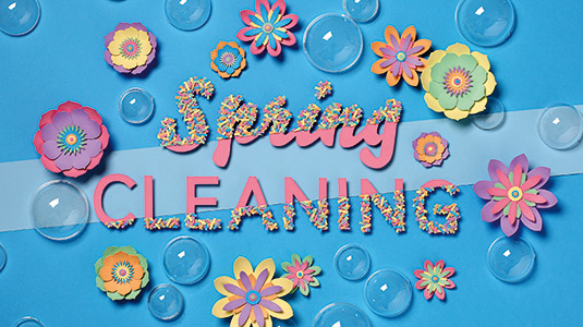
This paper art project was commissioned by The Washington Post to illustrate a feature in the paper's Local Living supplement. We've worked with them before – a few years ago we illustrated an article about the transportation links for Tysons Corner, near Washington, DC, so maybe that's why they came back.
The theme for this series of paper craft images was spring cleaning. We had to illustrate the cover and four section openers. The brief was simple, yet complicated, because we had to represent basic objects in a playful way. For this kind of project the client usually sends us a synopsis of the articles we have to illustrate.
The brief was simple, yet complicated, because we had to represent basic objects in a playful way
We had to sculpt a spray bottle to represent the trickier cleaning tasks, a dustpan because they had commissioned reviews of designer dustpans, and a sponge and bucket to represent cleaning products. Finally, we crafted a cardboard box and clothes for an article about de- cluttering services.
The cover was quite different in its treatment. The only important direction we received was to include the 'Spring Cleaning' headline. The mood had to be fresh, colourful and fun. We based the front cover on a cleaning gesture, with a line wiped across the page to represent this.
01. Sketch it up
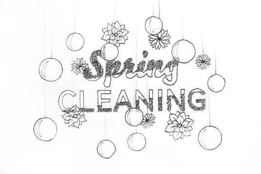
We created sketches to give the client a precise view of how we imagined the installations would look. When a project has a short deadline precision is important, but if it's a longer project, such as a window display, we like to introduce new things along the way. With paper, you can't change things easily or hit undo.
02. Selecting paper
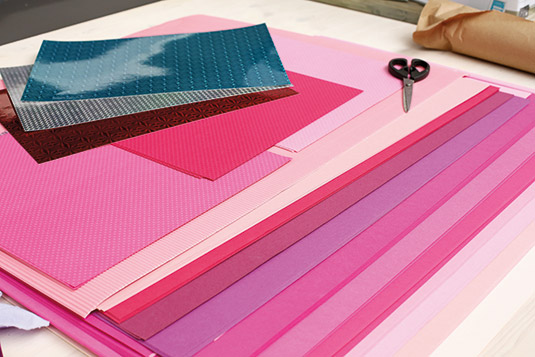
We used 310gsm sheets of coloured paper for this project. We use this weight of paper very frequently in our work, but when we create smaller objects we tend to use a lighter stock. We have a lot of different kinds of paper in the studio at all times – some with patterns, some gilded, some acetate sheets and more.
03. Light pastels

The colours for this project had to be light and fun, like a spring breeze. When we're sculpting an object we can spend hours finding the right colour combinations. We had to create a contrast between clean and dirty surfaces, so we used rhodoid, which is a thin translucent acetate sheet, to produce a shiny look.
04. Tools of the trade
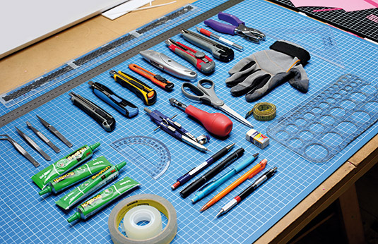
We used a range of tools, which are all readily available. The most important was the glue: we used scotch Gel Glue by 3m. It had to be strong, without affecting the paper itself, and it had to stay stuck. People are surprised that we don't use Xacto knives, but the blades break easily on the Kevlar cutting board.
05. Cut it out
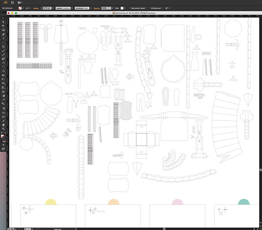
Each object needed to be carefully planned before we could make it. It's difficult to do this by eye so we now use illustrator for simpler shapes, and 3D software for more complex ones, but we try not to rely too much on the software. When a shape has been designed, I cut it out and Lucie does the assembling.
06. On the rostrum
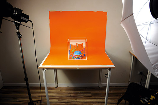
It took us less than two days to assemble the different scenes and shoot them. When we shoot, we add and take away elements, and generally choose the right shot by instinct. We use a canon 5D with a flash, and don't go for any fancy lighting set-ups or heavy retouching in Photoshop.
07. Job done
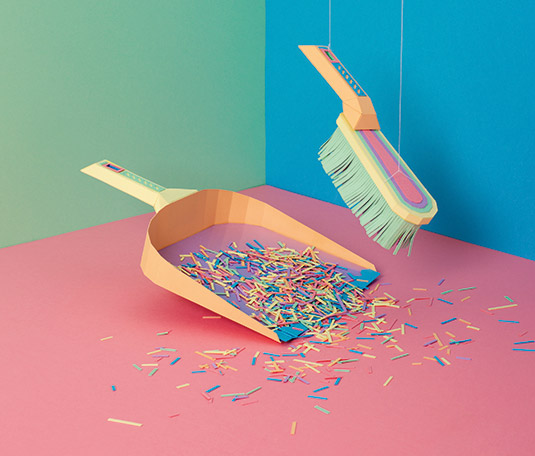
We chose final images that we were both happy with. We're obsessed with the quality of our craft and we don't like our pictures to look fake. We might remove some bits of dust or adjust the contrast but other imperfections remain. if there are threads, we deliberately leave them in so viewers can see that it's real.
This article was originally published in Computer Arts magazine issue 254. Buy it here.

Thank you for reading 5 articles this month* Join now for unlimited access
Enjoy your first month for just £1 / $1 / €1
*Read 5 free articles per month without a subscription

Join now for unlimited access
Try first month for just £1 / $1 / €1
Get the Creative Bloq Newsletter
Daily design news, reviews, how-tos and more, as picked by the editors.
