7 reasons why mood boards are worth the extra time
Mood boards are a tried and tested timesaving creative device. Here, designer and founder of creative agency Digital Surgeons, Peter Sena, explains why he thinks they're so effective.
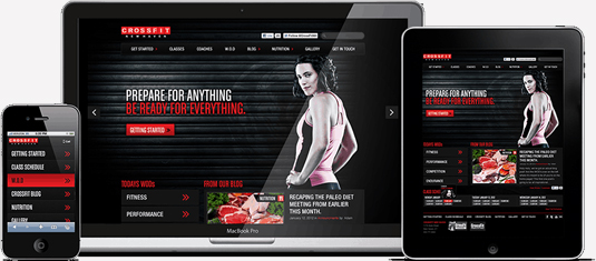
Mood boards are a collection of assets and patterns that eventually evolve into a style guide. They exist as a designer’s tactile and visual sandbox, a place where they can openly experiment with the different facets of a design. Mood boards allow creatives the ability to show clients and colleagues a proposed look without investing too much in a failed direction.
My design career has been primarily digital in nature; a field in which mood boards are more beneficial than many may realise. At Digital Surgeons, we use mood boards to establish an overarching visual language on a brand, product or site level. And we don't just stop at visuals on our mood boards either: we cover everything from voice and tone, ad-like objects, interactions and interface patterns.
With an entire ecosystem of digital devices taking the world by storm, the need for design systems is more apparent than ever. So, for all you digital designers out there who may be doubting the effectiveness of using mood boards, here are seven reasons to convince you otherwise, with some tips and examples along the way.
01. Mood boards are fluid
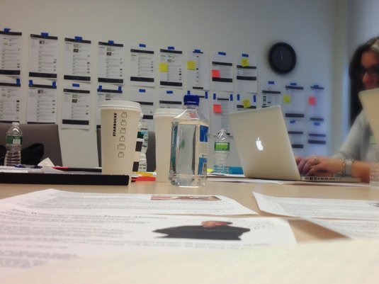
Just because the final design will be digital doesn’t mean the mood board has to be. Mood boards are very fluid and can transcend multiple mediums and dimensions.
02. They help establish the basics
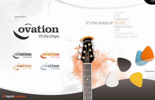
Mood boards help to establish all of the baselines that will eventually go into a style guide: color palettes, typography, layout, image treatments.
03. Collaboration is easier
Mood boards allow you to collaborate easily with your clients and reduce wasted design time. Nothing’s worse than creating a pixel perfect design that isn’t in the direction that a client was hoping for.
04. Mood boards help responsive design
Trying to embrace responsive design? Mood boards should be your first step - they can help to establish a design system that can be translated across any medium or device.
Get the Creative Bloq Newsletter
Daily design news, reviews, how-tos and more, as picked by the editors.
05. You can use them for front-end too
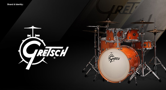
Mood boards can be really helpful for front-end developers. They establish user experience patterns by illustrating interface elements and demonstrate various ways to visualize content. By showing what potential interactions look and feel like on the mood board, developers will generally have less questions when building a site.
06. They are time-saving
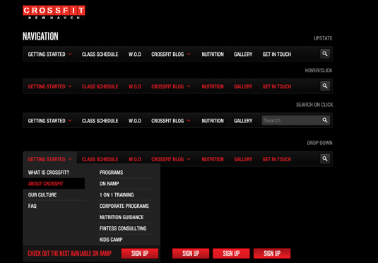
Mood boards lessen the ideation time of a design project by creating a library of approved patterns or modules. These artifacts can be used to quickly build new pages and features on a site.
07. Now use these resources
So, if you want to get started with mood boards, there's a host of sites and reads to help with your next creation. Here's some examples:
- Design systems - provides an overview of what mood boards are and how creating one will help you.
- styletil.es - a great site by Samantha Warren, which helps explain the benefit of using style tiles in your next design.
- Pinterest - not just for cupcake recipes and wedding planning anymore. Pinterest is an endless source of visual inspiration on whatever category you seek.
- Dribbble - surf the latest and greatest from designers all over the world for your inspiration cravings.
- Behance - An online portfolio site from all imaginable creative fields. Their recent acquisition from Adobe will hopefully keep them flush with cash and motivation to keep growing (and hopefully not lose their soul in the process).
- PatternTap - Pattern Tap is your one-stop shop for User Interface inspiration.
- Image Spark - a great site for discovering and curating and discovering mood boards. Unfortunately, it seems to be on the chopping block from its creators, so enjoy the images while you still can.
- mural.ly - a new site that aims to be the collaborative tool for designers to work together on a look.
- Musespeak - Another great collaborative tool for teams to create mood boards together.
- Moodshare - A great platform for search, creating and sharing mood boards.
Words: Peter Sena
Peter Sena is designer and founder of creative agency Digital Surgeons. Find him on Twitter at @petesena.
Like this? Read these!
- Free Photoshop brushes every creative must have!
- The best Photoshop plugins
- The ultimate guide to designing the best logos
Do you use mood boards? What are your thoughts on them? Let us know in the comments box below!

Thank you for reading 5 articles this month* Join now for unlimited access
Enjoy your first month for just £1 / $1 / €1
*Read 5 free articles per month without a subscription

Join now for unlimited access
Try first month for just £1 / $1 / €1

The Creative Bloq team is made up of a group of art and design enthusiasts, and has changed and evolved since Creative Bloq began back in 2012. The current website team consists of eight full-time members of staff: Editor Georgia Coggan, Deputy Editor Rosie Hilder, Ecommerce Editor Beren Neale, Senior News Editor Daniel Piper, Editor, Digital Art and 3D Ian Dean, Tech Reviews Editor Erlingur Einarsson, Ecommerce Writer Beth Nicholls and Staff Writer Natalie Fear, as well as a roster of freelancers from around the world. The ImagineFX magazine team also pitch in, ensuring that content from leading digital art publication ImagineFX is represented on Creative Bloq.
