5 essential cover design tips
T3 art editor Luke O'Neill runs through his cover design rules of thumb.
Designing a successful magazine cover is a tricky business. It's the part of any magazine that the most amount of time is dedicated to, not to mention the element that it is subjected to the most scrutiny. There are many different approaches to cover design depending on which sector your title sits in, but for the sake of these tips we'll be focusing mainly on consumer titles where the cover has to work a lot harder and can be the difference between a successful issue or a complete flop.
It's no secret that the newsstand is a volatile place to do business in these days and although there are giant stalwarts like Vogue that will outlive us all, and a raft of Indie success stories like 'The Gentlewoman' and 'Monocle', the common story within the consumer sector is that of decline. With an oversaturated and highly competitive market its never been more important to standout and engage with your audience.
Although it's true that there's no 'paint by number' surefire approach to designing a successful cover, there are a handful of rules of thumb that can be adhered to that will guide you in the right direction. Below are a few of my tips for creating a successful newsstand magazine covers.
01. Strong focal point

This may sound like a bit of a no brainer but its very important to have a clear focal point that draws the eye of the browser in, If they actually pick the magazine up then half the job is done. The focal point could be anything from a strong bold headline, a large number, or an arresting image such as a portrait.
When using cover models eye contact is very important and provides an easy way to instantly engage with the viewer. Whenever possible faces and eye contact should feature within the top third of the cover.
02. Use of colour
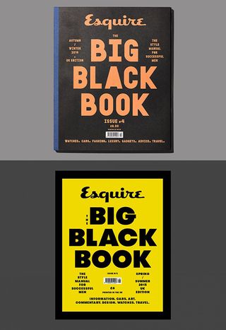
There's an old adage that says "green should never be seen on a cover" and it'll come as no surprise that red is the most prevalent colour used on covers for its attention grabbing qualities. Either way, the use of colour on covers is extremely important and as with any area of design, the colour-scheme that you choose will affect the tone and overall feeling of the cover.
Reds and yellows both have standout qualities but can come across too salesy and brash if overused. Black covers are seen to not sell by some people but a black cover can provide a perfect canvas for some beautiful eye-catching foil blocked typography. Equally with green, it would be a different story if you employed a squint-inducing fluoro Pantone green rather than a CMYK mix which is always going to look a bit murky.
Get the Creative Bloq Newsletter
Daily design news, reviews, how-tos and more, as picked by the editors.
03. Be consistent but never boring
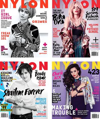
As with any serialised form of design, magazine covers should be recognisable in their overall approach from issue to issue so that they're recognisable but not too similar as to be confused with the previous issue or worse still, be seen as boring. This can be easily achieved through static elements such as the position and colour of the masthead/logo, a unifying and consistent colour scheme and typographic approach or by having a consistent photographic style from issue to issue.
This should be seen as an overall approach rather than a restrictive set of rules and you should never be afraid to do something different and amazing just because it breaks a few rules.
04. Typographic hierarchy and shelf placement
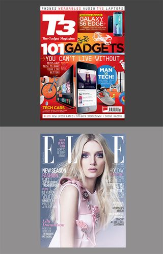
It will come as no surprise that typographic hierarchy within cover design is extremely important but so is its placement on the cover. Its often not just a case of creating the most visually appealing combination of image, main headline and secondary cover hits, consideration must also be paid to how these will appear on the newsstand and where the eye will be drawn to first.
In terms of typographic hierarchy the main headline must be the biggest and have clearest standout and eyes will always be drawn to big numbers and graphic devices such as circles or pluses, followed by smaller secondary cover lines and lists that can be used to suggest a "packed' issue.
The position of cover lines should be affected by how a magazine is displayed on the shelves. Magazines are generally displayed in one of two ways, either in waterfall fashion so that the top third will be visible or overlapping so that the left third is most visible. This is why many mags choose to have their logo in the top left (T3, Red, GQ, etc) enabling full visibility of the brand and also allowing the opportunity to feature a cover line in the top right and also on the left hand side immediately under the logo.
05. Break the rules and make it an event
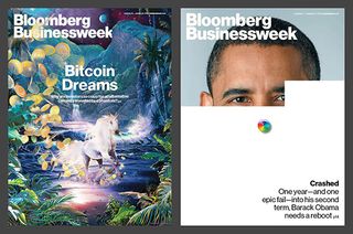
The above are meant simply as guidelines and good working practices more than a hard and fast set of rules that must be adhered to. Most magazines will throw the rule book out every now and again and create one off "event issues' when the subject and market conditions warrant it.
Film magazines are particularly good at doing this with big new film releases, and the September issue of a fashion magazine will always be an event and invariably their biggest selling issue of the year. Some magazines throw the rule book out every issue like Bloomberg Business Week, creating bespoke and sometimes crazy cover solutions each issue, which in itself becomes a consistent cover design approach.
Like this? Read these...
- The best photo apps for iPhone, iPad and Android
- Free graphic design software available to you right now!
- The best photo editors

Thank you for reading 5 articles this month* Join now for unlimited access
Enjoy your first month for just £1 / $1 / €1
*Read 5 free articles per month without a subscription

Join now for unlimited access
Try first month for just £1 / $1 / €1
The Creative Bloq team is made up of a group of design fans, and has changed and evolved since Creative Bloq began back in 2012. The current website team consists of eight full-time members of staff: Editor Georgia Coggan, Deputy Editor Rosie Hilder, Ecommerce Editor Beren Neale, Senior News Editor Daniel Piper, Editor, Digital Art and 3D Ian Dean, Tech Reviews Editor Erlingur Einarsson and Ecommerce Writer Beth Nicholls and Staff Writer Natalie Fear, as well as a roster of freelancers from around the world. The 3D World and ImagineFX magazine teams also pitch in, ensuring that content from 3D World and ImagineFX is represented on Creative Bloq.
