10 tips for designing an event brochure
Event brochures need to be a balance between the impactful and informative. Simon Tilbrook guides you through the best way to achieve this.
Designing event brochures is great fun. Because they are often one-off or occasional projects, you can give full rein to your creative flair and produce something that makes a real impact and provides a talking point for visitors.
Typical events (and series of events) that benefit from brochure printing are:
- Concerts
- Lectures
- Theatre tours
- Literary festivals
- Jazz festivals
- Openings of new shops/restaurants/bars
- Seasonal events at garden centres
- Exhibitions at galleries or museums
- Conferences
- Trade shows
- Workshops
Whilst these events differ greatly in style and audience, there are some common features that any brochure printing project will almost always need to include. Here's our roundup of the 10 most important considerations.
01. Front cover
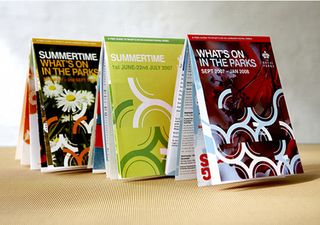
No matter what kind of brochure you're designing, an eye-catching front cover is crucial in order to encourage your readers to pick it up in the first place. So make sure you use large display typescripts, strong colours and striking images right on the front cover. It's not necessary to add too much text, if any - just a few choice snippets to get the reader engaged and excited.
02. Contents
Not all brochures need a contents page or contents section. But if your brochure is longer than a few pages and has more than three sections, you should consider including one. Not only is a list of contents useful for the reader, but also its layout can help to break up that first page and be pleasing to the eye.
03. Block text
Most brochures contain block text elements, perhaps explaining background information about the event, its history and the philosophy that lies behind it. Make sure that the amount of text you use is appropriate for the audience and the way in which they will be using the brochure. Consider whether your readers will be reading these sections in their entirety there and then, reading the brochure at home after the event or simply flicking through to find the sections relevant to them.
04. Maps and floorplans
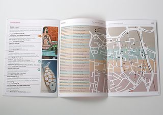
Since all events take place somewhere, it's common practice to include some sort of visuals to help with visitor navigation. Whilst you can go all out with a fabulous design here, don't forget that the most important feature is whether your map or floorplan is usable. So keep things clean, clear, well proportioned and well labelled. Use keys and colour coding will help to de-clutter busy visuals.
Get the Creative Bloq Newsletter
Daily design news, reviews, how-tos and more, as picked by the editors.
Often combined with a floorplan is information about visitor facilities. Using easily recognisable icons and placing this information in a separate box or shaded area can help visitors who need to find details quickly. Depending on the brochure printing process you are using, you might be able to incorporate fold-out or removable sections too.
05. Directions and location
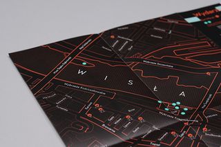
More practical information you'll need to include pertains to travel. Depending on whether your audience is local or not, this might be anything from an simple address or a very localised map to car, train, tube, bus or even aeroplane information. You might go further and need to add details of local hotels or B&Bs too. Design-wise, using small icons to represent different modes of transport can be very effective and also serve to save valuable space.
On a similar theme, if your event has a special location (eg, if the event is being held at an historic country house), you may choose to devote an entire page or two to describing the venue or location itself, perhaps including some photographic images.
06. Lists
Whether it's the names of exhibitors, artists or sponsors, an event brochure of more than a few pages is likely to require a list of some sort. Here, you need to ensure that you are not overwhelming your reader with sheer quantity, so if your lists are very long, do incorporate stylistic elements such as colour coding, text colour and careful placement of images. Use of specialist brochure printing techniques such as embossing or use of metallic inks can also serve to give a dull list that extra pizzazz too.
07. Schedule of events
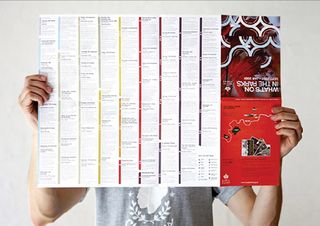
A schedule or timetable is central to an event brochure and so if your brochure printing process allows, you might choose to dedicate one or more centre spreads for this purpose. As with maps and floorplans, the most important considerations here are usability and accuracy. Visitors to your event should be able to easily and quickly access the information they require and they may return to this page several times, so be clear, correct and concise.
08. Biographical information
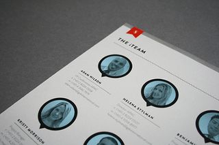
Event brochures very often need to incorporate biographical information, perhaps for keynote speakers, for performing artists or for exhibiting company profiles. Since this information is not crucial to the practical functioning of the event in the way that a map or a timetable is, you have a little more creative license here. Do include photographs or illustrations, and ensure that your style here and throughout your brochure is consistent with your event philosophy.
09. Contact details
Ensure that contact details for the event are prominent and easy to find. On the back of the brochure is typically where people will first look for this information, so unless you have a good reason not to, it makes sense to adhere to this expectation. As well as including the usual contact information, don't forget to add a QR code if appropriate, so that readers can find out more information immediately online. If you plan well in advance, you could include special offers and visitor interactivity this way too.
10. Printing specs
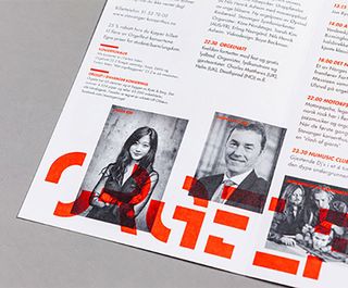
Finally, don't forget to check the technical specifications with your brochure printing company to ensure that you've complied with any margin, bleed or colour requirements before you submit your file.
All being well, you will have created a brochure that is not only eye-catching, informative and user-friendly, but also something that will serve as a keepsake of the event for years to come.
Words: Simon Tilbrook
Simon Tilbrook is the owner of Swallowtail Print, a premium brochure printing and design firm focused on delivering maximum value to their clients. Further bio on Simon can be found here, and for more design and printing tips connect on Google+.
Liked this? Read these!
- Free graffiti font selection
- Illustrator tutorials: amazing ideas to try today!
- Free Photoshop actions to create stunning effects
- The ultimate guide to designing the best logos
Have you seen a great example of brochure printing and design? Let us know in the comments below!

Thank you for reading 5 articles this month* Join now for unlimited access
Enjoy your first month for just £1 / $1 / €1
*Read 5 free articles per month without a subscription

Join now for unlimited access
Try first month for just £1 / $1 / €1
The Creative Bloq team is made up of a group of design fans, and has changed and evolved since Creative Bloq began back in 2012. The current website team consists of eight full-time members of staff: Editor Georgia Coggan, Deputy Editor Rosie Hilder, Ecommerce Editor Beren Neale, Senior News Editor Daniel Piper, Editor, Digital Art and 3D Ian Dean, Tech Reviews Editor Erlingur Einarsson and Ecommerce Writer Beth Nicholls and Staff Writer Natalie Fear, as well as a roster of freelancers from around the world. The 3D World and ImagineFX magazine teams also pitch in, ensuring that content from 3D World and ImagineFX is represented on Creative Bloq.
