10 screen-related terms every designer should know
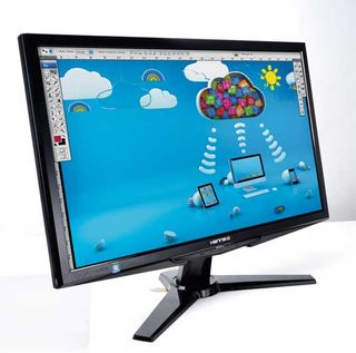
It's important to make sure your designs render correctly on your monitor, and for that you need to understand the basics of screen technologies. Let us acquaint you...
Cut through the technical jargon with our no-nonsense guide to today's screen technologies and monitor features. If you don't know how brightness is measured or why response time is important, then this is the article for you...

01. Gamut
This is a critical feature for design - it's a measure of the range of colours the monitor can display. Wide gamut monitors are more suitable for professional work. Budget monitors have a limited gamut, so they can't display some of the brighter and more intense colours used in design work.
02. Candelas
Brightness is measured in cd/m - candelas per square metre - typical values are 250-400. More brightness isn't necessarily better, although it makes it easier to use the monitor in a bright room. Too much brightness wastes power and causes eye strain - but if it's available, you can always turn it down if your retinas are melting.
03. Colour spaces
Colour spaces determine the colour range you can work in. The standards for graphics are sRGB and Adobe RGB (1998), although sometimes you'll also see specialised colour specs for video, such as CIE. An ideal monitor can show the full Adobe RGB (1998) colour range, as sRGB limits the visible colours.
04. Screen connectivity

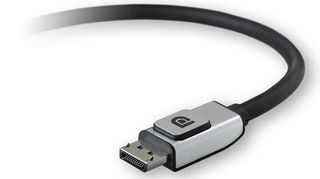
Over the years connector types have drowned in acronym soup - HDMI, VGA, DVI. Ignore them and choose a monitor with a DisplayPort connector. This newer technology supports finer and more accurate control of colour than you'll find with the older choices.
05. Contrast settings
Absolute contrast is less useful than a measure of the blackest black, which tells you how much light bleeds through a panel. Sadly, you won't find that number quoted in the specs. For standard contrast specs 1,000:1 is typical, and good enough. Dynamic contrast - 10,000:1 or more - is useless for Photoshop and video editing, but makes commercial DVDs look more cinematic.
06. Diagonal size
Don't forget that physical sizes - 22in, 30in, etc - are measured diagonally, and not horizontally across the base. So the difference between a 20in, 22in and 24in monitor is smaller than you might expect. And diagonal size is only approximately related to resolution (see below.)
Get the Creative Bloq Newsletter
Daily design news, reviews, how-tos and more, as picked by the editors.
07. LED backlighting
LEDs are a popular choice for graphics because they can give good colour performance. But this is only true for monitors with three-way red, green and blue LED clusters. Beware of the much cheaper single-colour white LEDs used in budget designs - although they're advertised as 'LED backlighting', they're not in the same league.
08. Panel types - TN vs VA vs IPS
Not all LCDs are the same. TN (twisted nematic) panels are cheap but have limited performance. VA (vertical alignment) are middle-of-the- road. IPS (In Plane Switching) give the most intense and accurate colours so are the best choice for design, but they're not cheap.
09. Response time
This is the time it takes the panel to switch pixels from one colour to another. (The time for switching from full black to full white would be more useful, but you won't find this number quoted.) Response time is irrelevant for static design. If you're editing video, look for 5ms or less - 2ms is ideal.
10. Resolution
This is the number of pixels shown by the panel - typically 1680x1050 for a 19in-22in monitor, 1920x1080 for a 22in-24in and 2560x1600 for a 30in. More is better, as long as it scales with the panel's diagonal size. If the diagonal is too small, text will be scaled down, possibly making it hard to read.
Like this? Read these!
- 101 Photoshop tips, tricks and fixes to try today
- Our favourite web fonts - and they don't cost a penny
- Amazing examples of experimental design

Thank you for reading 5 articles this month* Join now for unlimited access
Enjoy your first month for just £1 / $1 / €1
*Read 5 free articles per month without a subscription

Join now for unlimited access
Try first month for just £1 / $1 / €1
The Creative Bloq team is made up of a group of design fans, and has changed and evolved since Creative Bloq began back in 2012. The current website team consists of eight full-time members of staff: Editor Georgia Coggan, Deputy Editor Rosie Hilder, Ecommerce Editor Beren Neale, Senior News Editor Daniel Piper, Editor, Digital Art and 3D Ian Dean, Tech Reviews Editor Erlingur Einarsson, Ecommerce Writer Beth Nicholls and Staff Writer Natalie Fear, as well as a roster of freelancers from around the world. The ImagineFX magazine team also pitch in, ensuring that content from leading digital art publication ImagineFX is represented on Creative Bloq.
