Brochure design: 10 top creative tips
How do you make sure your brochure design really dazzles? These top tips will get you started.
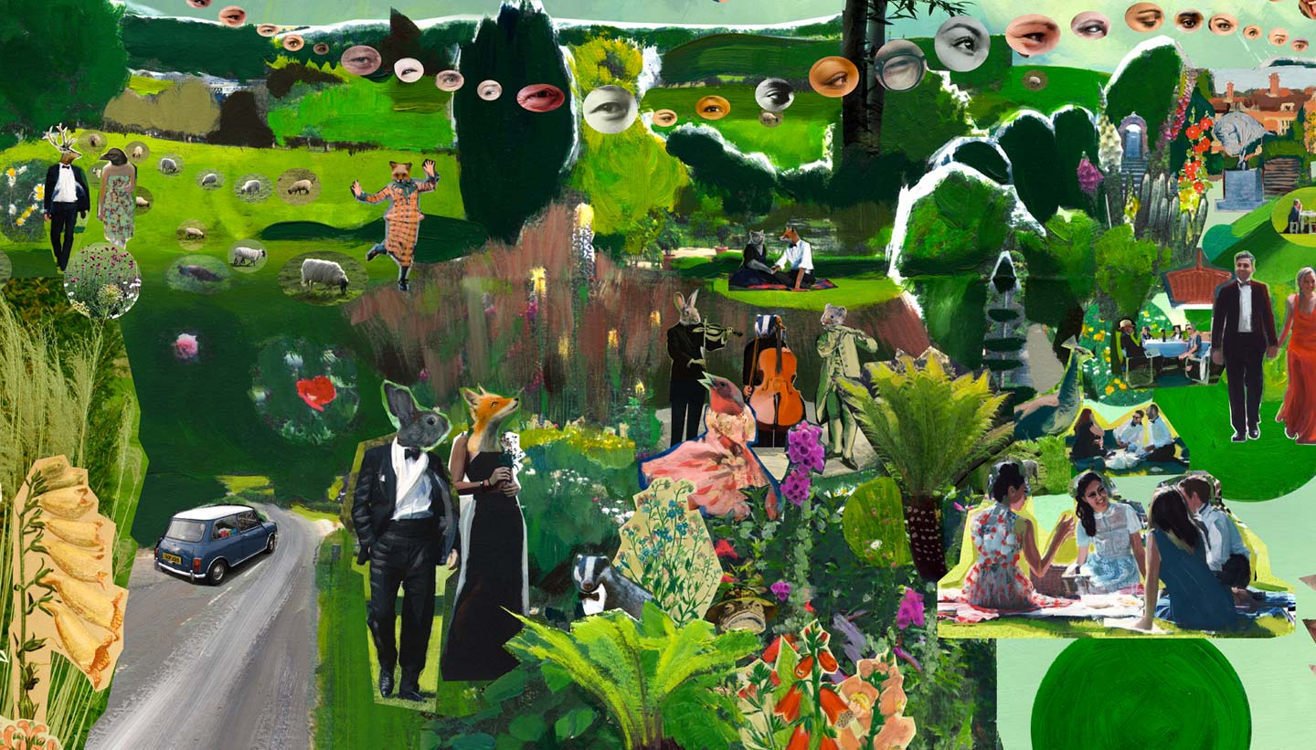
Do you want to make sure your brochure design draws attention? Well, look no further because we've asked the experts and put together a series of tips to elevate your brochure from good, to great.
If you'd rather not start from the beginning with your brochure design, we have a selection of great brochure templates . But if you want to go the whole hog and create the whole thing from scratch, you'll want to make something that can take pride of place in your design portfolio.
So, let's get started with our top tips.
01. Know your purpose before you start
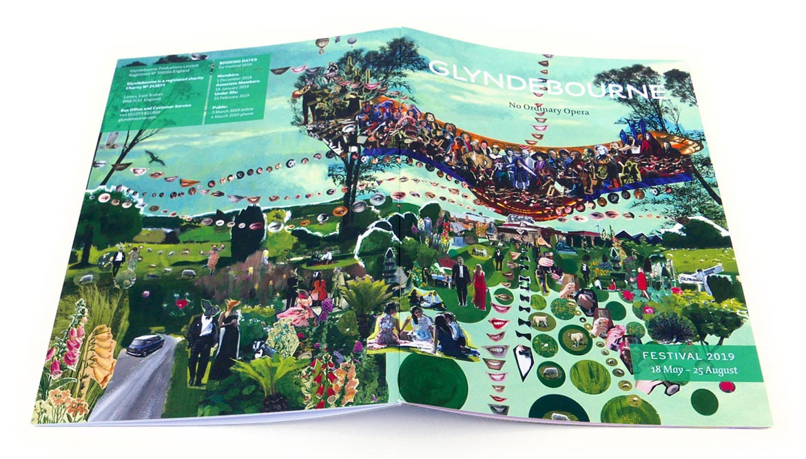
When you're thinking about how to design a brochure, start by asking clients why they think that they need a brochure. Then ask them to define their objectives. Sometimes they just want one because their last brochure didn't work. If they've come up with a brief for you, take a step back from that and look at exactly what it is they're trying to achieve.
02. Limit your fonts

You don't need many fonts when you're thinking of how to design a brochure – just a heading, subheading and body copy font. But we see it all the time: people think they need to find a headline font nobody has ever used before. Clients will usually take the lead on fonts as they'll often have a corporate identity already in place.
03. Take stock of your paper stock
Talk about paper stock before you put pen to notepad. If you're working for a client, ask if it has to be the standard A4. Find out if they've considered using uncoated paper, for example. Check out this post for more on how to choose the right paper stock for your project.
04. Get your copy right

Great copy is often the most undervalued element in brochure design. A lot of people don't understand that copy needs to be considered as part of the overall design concept. At the early stage of any brochure design project, experiment with the copy to see if it needs reworking. Headlines aren't something to just drop in later.
05. Put readers first
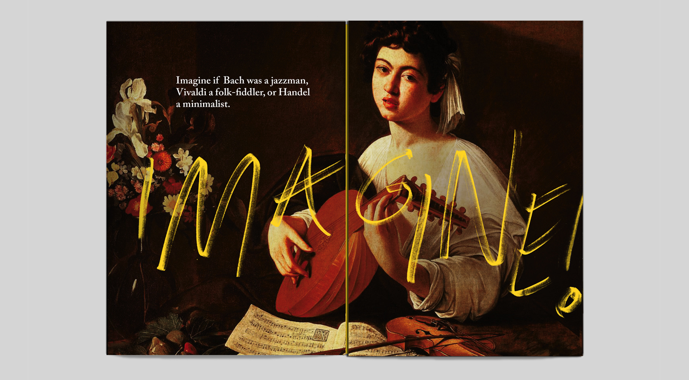
When thinking of how to design a brochure, keep the end purpose in mind. Is this a brochure that's going to be posted out in response to requests made on a website? Is it a giveaway at an exhibition, or a leave-behind brochure? When someone opens it, what will it say to them? Design for that person, not for yourself.
06. Use simple statements

You want to know how to make a brochure that stands out, right? Sometimes the simple ideas are the best. If a client has decided they want lots of cliched images to get a particular point across, it's probably better to scrap them. The solution might be to use a typographic cover instead, and make a very literal statement about what they want to say.
07. Set pen to paper
Break out the layout pads and try drawing and sketching ideas to start with. Share all your ideas among everybody, rather than taking a brief away for two weeks and then presenting three concepts to see which one the client hates the least.
08. Keep what works
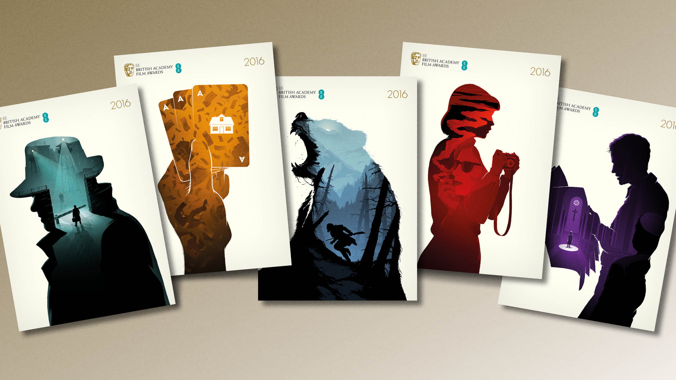
Don't try to be wacky or different just for the sake of it when you're thinking of how to design a brochure that gets noticed. For example, most designers use the same 10 to 20 fonts across a lot of the projects they work on. There are sound design reasons why Helvetica is used a lot, and why Rockwell is a good headline font.
09. Make a good first impression

Brochure designs need to fit in with what the client does as a business. Charities don't want luxury brochures that'll make people think they've spent a lot of money on them, whereas a new product might need a brochure that looks amazing on an exhibition stand.
10. Get the imagery right
To make a product brochure pleasurable to flick through, you need good photos. If you're using stock imagery – budgets don't always stretch to a photoshoot – try to find pictures that don't look like they're stock images. Never cut corners.
This article was originally published in Computer Arts, the world's best-selling design magazine. Subscribe to Computer Arts here.
Related articles:

Thank you for reading 5 articles this month* Join now for unlimited access
Enjoy your first month for just £1 / $1 / €1
*Read 5 free articles per month without a subscription

Join now for unlimited access
Try first month for just £1 / $1 / €1
Get the Creative Bloq Newsletter
Daily design news, reviews, how-tos and more, as picked by the editors.

Kerrie Hughes is a frequent contributor to Creative Bloq, and was once its editor. One of the original CB crew, Kerrie joined the team back in 2013 after moving from her role as staff writer on 3D World. Since then she's written regularly for other creative publications such as ImagineFX, Computer Arts and Digital Camera World. After a stint working for the police, Kerrie is back reviewing creative tech for creative professionals.
