Infographic design secrets: 10 tips for dynamic data visualisation
Great infographic design can really get you noticed. Here are 10 tips for dynamic data visualisation.

Infographic design starts with 'why?'
The key to a memorable infographic is to understand its purpose. What are you trying to achieve? As Matthew Scharpnick, co-founder of Elefint Designs, points out: "take some time to figure out the audience and the message before you move into design."
Make the complicated, uncomplicated...
There's an old clich that proclaims that "a picture is worth a thousand words." That's the big idea behind the infographic. The best examples encapsulate or explain an idea in a simple, visual way.
Map it out first
Don't make it up as you go along. Sit down with a pencil and paper and map out the flow of your infographic before you do any serious illustrative work. Consider using sidebars to break things up and make the design more digestible.
Don't try to include everything
Some infographics are huge and require some serious screen-scrolling before you reach the end. These might be taking the format too far. So, strip away redundant data and concentrate on the key message.

Offer a fresh perspective
Good infographic design doesn't just take data and visualise it with pie charts and bar graphs. Anybody can do that in Excel or Numbers.
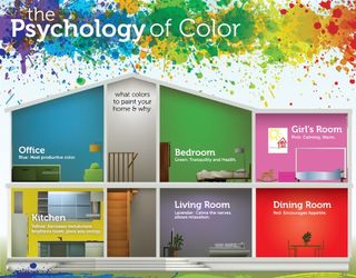
As well as illustrating data sets and highlighting patterns within them, make sure you give your data a twist and come at the presentation from a fresh perspective. See The Psychology of Colour infographic above and take a look at 10 great infographics (to inspire you to create your own).
Do your research
It doesn't matter how pretty your infographic design looks if you've got your numbers wrong. Research. Then research some more.
Make your artwork stand out
Getting the 'info' part of an infographic nailed is one thing. The 'graphic' element is your opportunity to shine. Don't just ape another infographic's visuals. Bring your own style into play and create something that truly stands out.
Choose a delivery system
The basic infographic type is the 'explainer' - a clever, visual representation of basic data. This might be something like Dreaming of dry sheets or who has the biggest military budget. But other formats can work well.
Consider infographic design that compares and contrasts data (like 'Geek vs Nerd' below; tells a story through a timeline/flow chart; or annotates something, like a product. Lists can also be visualised, as can 'how to'/tutorial content.

Minimise the words
Seems obvious. But some infographics let more explanatory words creep in than is really necessary. The whole point of this medium is to communicate ideas with shapes, graphs, diagrams and pictures. If you have to explain your infographic then it isn't doing its job.
Make it sharable
Make it easy for your infographic to get discovered. Include social media buttons on your blog or website, including one for Pinterest. Like any blog post, your infographic design should be topped with a great headline to help it get noticed on less visual channels like Twitter, Reddit and RSS feed readers.
Finally, don't underestimate the value of dosing your infographic with some humour. Unless, that is, you happen to be visualising the retreat of the Arctic glaciers and the end of the world... But How the Americans see Europe works nicely.
When all these elements come together, you'll have created an infographic that attracts attention, has strong visual appeal and illustrates important issues/data in an accessible way.

Thank you for reading 5 articles this month* Join now for unlimited access
Enjoy your first month for just £1 / $1 / €1
*Read 5 free articles per month without a subscription

Join now for unlimited access
Try first month for just £1 / $1 / €1
Get the Creative Bloq Newsletter
Daily design news, reviews, how-tos and more, as picked by the editors.
The Creative Bloq team is made up of a group of design fans, and has changed and evolved since Creative Bloq began back in 2012. The current website team consists of eight full-time members of staff: Editor Georgia Coggan, Deputy Editor Rosie Hilder, Ecommerce Editor Beren Neale, Senior News Editor Daniel Piper, Editor, Digital Art and 3D Ian Dean, Tech Reviews Editor Erlingur Einarsson and Ecommerce Writer Beth Nicholls and Staff Writer Natalie Fear, as well as a roster of freelancers from around the world. The 3D World and ImagineFX magazine teams also pitch in, ensuring that content from 3D World and ImagineFX is represented on Creative Bloq.


