Google Fonts website gets a major redesign
Google overhauls the user interface of its open source type library.
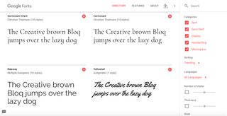
Google Fonts, the free web fonts resource, has had a major redesign. The user interface is completely overhauled and now comes with several brand new and incredibly useful features baked-in.
Browsing for free fonts for your design projects has never been easier thanks to the new layout, and you can even test them out with different backgrounds at the click of a mouse or prod of a screen.
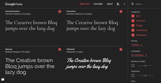
The slick new user interface allows you to search fonts by style, thickness and slant, so you can drill down exactly the font type you require right there on the homepage.
You can preview your selections instantly by simply typing in the example text field of the font of your choice, then you can change the background colour to blue, black, yellow or leave it as the default white.
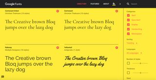
And, as always, all fonts in Google Fonts are free and open source, making the right typeface accessible to everyone for all your projects - and you can share favourites and collaborate easily with friends and colleagues.
The redesigned Google Fonts is online now.
Get the Creative Bloq Newsletter
Daily design news, reviews, how-tos and more, as picked by the editors.

Thank you for reading 5 articles this month* Join now for unlimited access
Enjoy your first month for just £1 / $1 / €1
*Read 5 free articles per month without a subscription

Join now for unlimited access
Try first month for just £1 / $1 / €1
Craig Stewart is a writer, SEO strategist and content marketer, and is a former editor of Creative Bloq. Craig has written about design, typography, tech and football for publications including Creative Bloq, T3, FourFourTwo and DSG, and he has written a book on motoring for Haynes. When he's not writing, you'll usually find Craig under his old car learning about DIY repairs the hard way.
Related articles
-

-

-

-
