Best Flash sites ever
When the first version of Flash was launched in 1996, little did we know how it would revolutionise website design over the ensuing decade. Rob Ford counts down the Top 20 Flash sites of all time
FutureSplash Animator shipped in May 1996 and after being unsuccessfully pitched to Adobe was acquired by Macromedia in December 1996, becoming Macromedia Flash 1.0. Adobe’s acquisition of Macromedia then saw the initial pitch go full circle and today, what was once just another small animation app has led to the creation of a whole online world that we all pretty much take for granted.
FutureSplash Animator shipped in May 1996 and after being unsuccessfully pitched to Adobe was acquired by Macromedia in December 1996, becoming Macromedia Flash 1.0. Adobe’s acquisition of Macromedia then saw the initial pitch go full circle and today, what was once just another smallanimation app has led to the creation of awhole online world that we all pretty much takefor granted.
Without doubt, Flash has become the design and development community’s number one tool and through some exceptionally talented individuals and agencies we’ve seen some amazing, pioneering and downright creative multimedia websites go live.
Through my work at leading web award site FWA I’ve pre-screened over 200,000 Flash websites over the years, and seen both the best of the best and the worst of the worst. To compile my top 20 I’ve gone right back to1997, when the first true wave of Flash sites started to grace our screens, and continued right up to the present day.
If you’re like me you’ll be tempted to turn a few pages to see what the number one is right away – but I’d urge you not to!
Please note that some of these sites are old now and may seem very dated, but in their heyday they were making people’s jaws drop, just like some of the great sites of today.
20. Nike Air
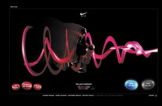
As a company with global reach and one of the world’s biggest brands, Nike is renowned for bringing us cutting-edge web experiences. This pioneering website for the Nike Air brand is the perfect example. It engaged visitors by allowing them to interact with a runner or basketball player, using their keyboard to generate a visual array of eye-popping effects on screen. As with most top quality, award winning Flash sites, the production level here is of the highest order. After the huge success of this site, other developers were soon to adopt the visual effects idea, but none of them managed to pull it off quite like Big Spaceship did here.
Get top Black Friday deals sent straight to your inbox: Sign up now!
We curate the best offers on creative kit and give our expert recommendations to save you time this Black Friday. Upgrade your setup for less with Creative Bloq.
Launch date: 2006
Claim to fame: Pioneering user-generated motion effects
19. Mono*crafts
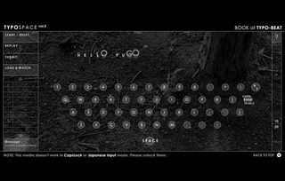
Some say that this site is where it all started. Yugo Nakamura is a household name to everyone in the Flash community and was the first person to really start pushing the boundaries of Flash through some crazy experimentation, something that was rife back in the early days and is often lacking now. This site used progressive and unseen-before navigation to house Yugo’s experiments with Flash. If you look through them you might even notice some techniques that are still being used today. This site may look very dated now, but think of it as like one of the very first silent movies by Charlie Chaplin: they both wowed contemporary audiences and they both shaped the future.
Launch date: 1999
Claim to fame: The experimental master inspired a community
18. Saab Animal Vision
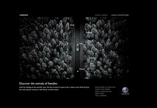
In 2005 we were seeing more and more video on the web, but most of it was failing to capture users’ attention. This site showed how video could be used intelligently, giving visitors the impression that they were behind the camera in the middle of a winter’s night – alone ina dense forest, somewhere in Sweden. The sound effects gave the experience a true edge, as all you could see were a car and the eyes of an animal. This simple idea was so superbly executed that it would see the site become a contender for Site Of The Year 2005.
Launch date: 2005
Claim to fame: The combination of video and atmosphere made for a winning campaign
17. NRG.be
Peter Van den Wyngaert’s NRG.be is one of those landmark websites that got many people into using Flash for the first time, back in the heady days of the late 1990s. The innovative use of shape tweening made for an interface that did things we’d simply never seen before. Den Wyngaert also added some voice effects, which later went on to grace many of his clients’ websites, including the infamous Kimble. This site, which employed a distinctive graphic style that was instantly recognisable, was made with Flash 3 and soon picked up Shocked Site of the Day in July 1998, which gave it instant worldwide exposure. NRG.be went on to be voted the most influential site of 1998.
Launch date: 1998
Claim to fame: One of the first examples of shape tweening, this laid strong foundations for the web we know today
16. Comcastic
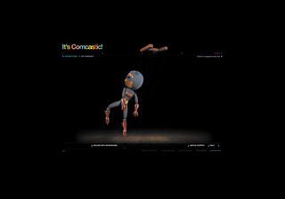
This is a really delicious website in many ways. Wonderful colour and high-quality sound have been used throughout. There are two sections to the site: one enables you to create your own puppet – from sporty to superhero to robotic – while the other offers a set of interactive games aimed at challenging you toset a new world speed-mouse record. The most exciting element is the ability to use your mobile phone (USA only) to ring your puppet and make it talk... it can eventalk to other puppets! The puppet physics are so unbelievably realistic that you can easily forget you’re not playing with a real toy. The world speed-mouse record challenge is also great fun and the five tricky yet addictive games will have you playing for hours.
Launch date: 2005
Claim to fame: Using a mobile phone to play with a puppet
15. PDK
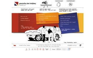
Who would have thought that a website selling something as dreary as car loans would have been in our list – let alone one directed at the Polish market? However, this slick creation shows how, by combining clever and cute illustrations – which are drawn right in front of you – you can give a potentially boring subject the cool factor and street credibility. It’s simply amazing when you consider this site is more than three years old – it still seems as fresh as the day it was first launched and, incidentally, was one of the most awarded websites of 2004.
Launch date: 2004
Claim to fame: Animation allows corporate to be cool
14. Philips Bodygroom
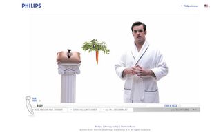
With the domain name ShaveEverywhere.com it might not surprise you that this site is all about the Philips Bodygroom, a grooming kit for men. This is definitely a website that once seen will never be forgotten. While it doesn’t push the limits of Flash or use any extra-special techniques, the concept and implementation of this idea is what makes it so outstanding. Some believedit was pursuing a rather risky strategy, with lines like “The longer you wait, the longer your pubes get” and bleeped-outwords when the demonstrator refers to a man’s genital area. But take another look at this site now and you won’t fail to appreciate this clever approach to marketing to men.
Launch date: 2006
Claim to fame: Site of the year…for your genitals?
13. Red Universe

This unique agency website gives every visitor a character and the ability to chat with other characters – and even fly and punch them in the face if you so desire. This very bold approach for an agency site took a risk in not focusing on its portfolio but just creating something original and unforgettable. Its success was instant and there were occasions when over 200 people were on the site at any one time chatting away to each other. It’s also loaded with Easter eggs, so if you type in the correct message you’ll change your character into something more outrageous. For example, you could try “may i please have some blueberry pie?”
Launch date: 2007
Claim to fame: A live chat community with a twist
12. tokyoplastic

In late 2002 there was a general consensus that web design had gone a bit flat and boring and that we’d seen it all. Then, in early 2003, a duo calling themselves tokyoplastic changed all of that. Their whole brand image was centred on a Japanese geisha and some bizarre creatures. This is one of the most difficult sites to describe because it’s so unique. Giving you an adrenaline rush (or was that a fright?) when you clicked on the loaded graphic and the site swallowed you up, tokyoplastic showed us how to make the most of vector graphics and 3D, fused with awesome sound and FX for an unforgettable, intriguing and almost unnerving surfingexperience.
Launch date: 2003
Claim to fame: Proving that personality wins through
11. Leo Burnett Canada
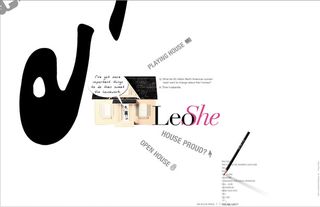
It was no surprise that the FWA judging panel overwhelmingly selected this as the Site Of The Year 2005, as it must be one of the greatest agency portfolio sites ever launched. It used something that was just emerging in 2005, the zoom interface, whereby on clicking an object you’d zoom right in to the next area. While Leo Burnett wasn’t the first company to use it, the way it did so and the depth it gave to the site is what made it stand out from the competition. The navigation concept conveyed personality without obstructing the basic purpose of the website. Revolving around the Leo Burnett mantra that big ideas come out of big pencils, you got to click around the site with a big black pencil as your mouse pointer.
Launch date: 2005
Claim to fame: One of the best agency sites of all time
10. Audi R8
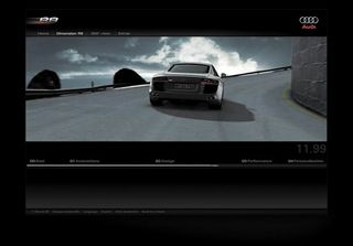
The Audi R8, a car that boasts groundbreaking innovations, now has a website to match it. The site has interactive and informative areas, but the highlight is the incredible video and 3D motion effects. Some people will argue that this isn’t in fact a website, it’s a video – but where do we draw the line between the two? Do we even need to draw a line? Whatever you consider this to be, let’s just say it’s a pioneering experience that offers a glimpse of next-generation websites with high-impact video and visual effects. This is indeed progress through technology – or Vorsprung Durch Technik – for the Audi faithful.
Launch date: 2006
Claim to fame: High quality 3D video with incredible results
9. Neostream
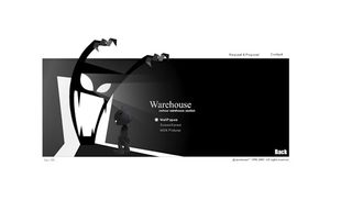
One of the true innovators of cutting-edge web design and oneof the most eagerly anticipated launches since the previousversion garnered such high acclaim, multimedia company Neostream Interactive delivered 50,000 volts of animation heaven that shocked the world on launch in 2002. This was a total WOW! site that oozed personality and characterright from the splashscreen, where the Neostream mascot shook his finger at you.On entering, visitors were able to ‘slap’ the mascot aroundby moving their mouse back and forward across him. Each section of the site was brimming withamazing motion, animation and sound, making for an experience that’s still highlighted as many web surfers’ favourite today.
Launch date: 2002
Claim to fame: Using a mascot to full potential
8. EYE4U
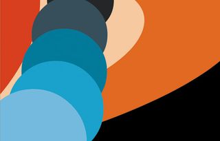
You could argue this was the perfect example of what Flash was originally created for. The site made full use of vector graphics that would scale perfectly to any user’s monitor size, as well as some bitmap images that, naturally, pixelated when stretched to match all screen resolutions. Viewing this site now is like listening to some very old rave or acid music – it started a whole new era but, alas, seems so dated today. Having said that, if you’re new to the web, you should take the chance to see where its roots were planted.
Launch date: 1998
Claim to fame: A classic example of what Flash used to be
7. Who’s We Studios
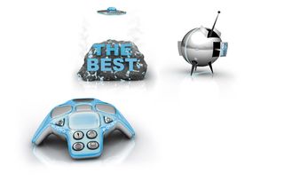
I can clearly remember the day this launched, 1 May 2002: I was instantly blown away. The rolling finger loader was clever in itself and paved the way for an even more creative site ahead. This was one of the earliest examples of a heavy use of bitmap images in Flash and created a viral effect on launch. The whole attitude of the site was one of arrogance and it was something you either loved or hated. When you click on a button that says “who are we” and a UFO flies across the screen and produces a giant rock that says “THE BEST”, you know the company has balls. It was a huge shame that it eventually split.
Launch date: 2002
Claim to fame: The power of attitude and humour
6. Full Throttle
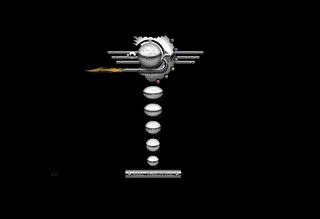
It still amazes me how David Gary managed to create this site with Flash 2 and then 3. Back in 1999 we were all on dial-up and most were at 33.6K. I was rocking the latest high speed of 56K! A big problem at that time was huge waiting times for loading and one of the reasons why Flash started to get a bad reputation. David Gary was the first to load up a game before the site started to load, so that users could play Pong while they waited. A stroke of genius. The site itself boasted a chrome interface with a complete exhaust system that blew out super-realistic flames and smoke. The atmosphere was set through wind noise, barking dogs and the sound of a revving Harley.
Launch date: 1999
Claim to fame: Still standing the test of time
5. Get The Glass
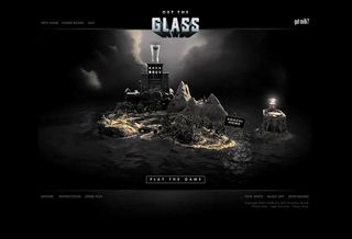
North Kingdom is one of my top three favourite agencies and this site, which promotes milk, is a great example of why. When I first saw it, the hairs on the back of my neck stood up. I thought to myself that this was the best site I’d seen since… well, the one you’ll see in a minute atnumber one (no peeking!). The site is based on a board game that you have to play to help the milk-deprived Adachi family break into Fort Fridge to get the Glass. Roll the dice and experience some of the highest quality production, built fromthe ground up, that you’ll eversee. Oh ... make sure that you don’t get caught by the cops and endup in Milkatraz!
Launch date: 2007
Claim to fame: Taking production levels to new heights
4. Advanced Studios v3
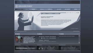
This was voted the most inspirationalFlash site of the decadeso far, and deservedly so. Ironically, being the most famous hasalso made it the most copied or ripped as well. The wonderful moving cloud sequence – as if you’re looking up and out ofsome high-tech building – combined with futuristic sound effects and simple, yet original, pagetransitions took Flash sites to awhole new level. At the time it was launched it felt like the perfect website, and it made a lot of people pick up the web design baton and start getting creative.
Launch date: 2001
Claim to fame: The most copied website ever
3. Gabocorp
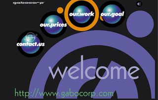
Known as the Daddy of Flash, Gabo Mendoza is one of the great pioneers who started the whole wave of what we see today. His 1997 website stated: “You are about to enter a new era in website design. This is the new standard for all things to come.” If someone wrote that today they’d be laughed off the web. But those couple of sentences Gabo put on his site ten years ago have turned out to be stunningly prophetic. Remember that in 1997 we had to try and make things move by using animated gifs or those dreadful lake applets. Gabo made things move on user interaction. He made things move right across your screen. He set the new standard...and the rest is history.
Launch date: 1996
Claim to fame: This is where it all started
2. Road Runner
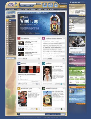
This huge Flash portal for Time Warner’s Road Runner customers, made by FI, was and still is a true landmark in proving what can be achieved in a full Flash environment. This huge portal, which covers 20 separate content areas, was the first to seamlessly incorporate Google search in a Flash website. Its ability to seamlessly load video without having to pop open a new window was hardly seen at this point. Road Runner set a benchmark for web portals and is still waiting to be surpassed four years later. Word on the street is that FI is about to launch something to top this site and maybe it will be a future ‘best Flash site ever’ – but only time will tell...
Launch date: 2003
Claim to fame: Proving how Flash can handle content
1. Vodafone Future Vision
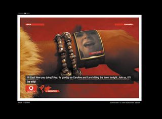
Roll the music... “Straight in at number one!” Okay, here we go... the best Flash site ever is Vodafone Future Vision, made by North Kingdom. When this site launched in January 2004 it was way before its time. The funny thing is, its aim was to promote what Vodafone saw as the future of technology. The fact that they managed to create a site that was so progressive and innovative as well is quite amazing. It would go on to be one of the most highly awarded sites of all time, as well as being the only one ever to pick up both FWA Site of the Year and FWA People’s Choice Award in the same year. Lots of original techniques were used and influences from it were even spotted in TV adverts shortly after. Hands down, this is the website that all designers and developers wish they’d been a part of and which, at the time of launch, totally blew away its audience. A very worthy winner and a site that must be kept live for all eternity.
Launch date: 2003
Claim to fame: The best Flash site ever!

Thank you for reading 5 articles this month* Join now for unlimited access
Enjoy your first month for just £1 / $1 / €1
*Read 5 free articles per month without a subscription

Join now for unlimited access
Try first month for just £1 / $1 / €1
The Creative Bloq team is made up of a group of design fans, and has changed and evolved since Creative Bloq began back in 2012. The current website team consists of eight full-time members of staff: Editor Georgia Coggan, Deputy Editor Rosie Hilder, Ecommerce Editor Beren Neale, Senior News Editor Daniel Piper, Editor, Digital Art and 3D Ian Dean, Tech Reviews Editor Erlingur Einarsson and Ecommerce Writer Beth Nicholls and Staff Writer Natalie Fear, as well as a roster of freelancers from around the world. The 3D World and ImagineFX magazine teams also pitch in, ensuring that content from 3D World and ImagineFX is represented on Creative Bloq.
