Working with a simple colour palette
Discover how this portrait was created in gouache using complementary colours.

Whenever I start a new painting I always use a complementary colour palette (i.e opposite colours on the colour wheel), specifically reds and greens. I find there is a tremendous range of colour to be found in such a simple palette.
I built on this technique while teaching, as I wanted to give my students a simple approach to creating a portrait.
I paint in gouache, and use round brushes in sizes 2, 4, 6 and 10. The important thing with these brushes is to ensure they have a sharp point, so it’s easy to paint details. The point of a brush is like the point of a pencil. Talking of which, it’s essential to start your painting with a pencil drawing using a strong reference, like a photo – you will need it throughout the painting process.
I usually paint on cold-press illustration board. I apply a thin layer of acrylic gesso to the surface as well as the back – this creates a more stable surface and allows paint to be removed at any stage. Some student painters are terrified of making mistakes, so knowing you can lift the paint off is reassuring.
01. Get the drawing right
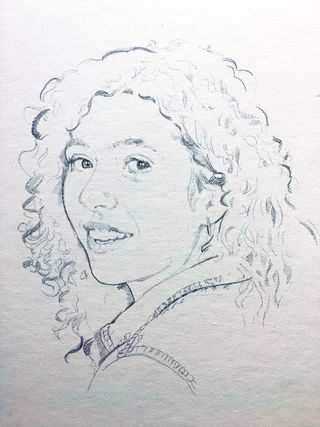
Make sure you have a strong drawing to work from. Use a hard pencil, such as an F or 2H. If you use a soft pencil like 2B or 4B, you will wash the drawing away with your first application of paint. You want your pencil-work to be bold, as you will be looking for the drawing as you continue to layer the paint.
02. Lay the initial colour
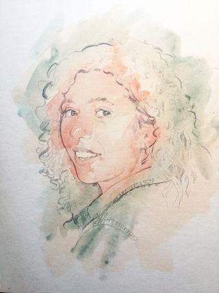
Using a palette of reds and greens, I put down transparent layers of paint. Starting with a large brush (no 10), I broadly lay down the initial colour. I’m looking to create a flesh colour for the face, which in this case is a mix of Cadmium Red and Oxide of Chromium (green). I’m working to a mid-value base.
03. Let the layers dry
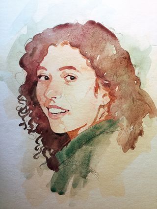
Gouache dries quickly, so I let each layer dry before applying the next. It’s a good idea to apply each layer as directly as you can – if you scrub the brush repeatedly over an area, you will only pick up the paint from the first layer. Having said that, the ability to pick up the paint will come in handy at a later stage…
Get the Creative Bloq Newsletter
Daily design news, reviews, how-tos and more, as picked by the editors.
04. Add in the mouth, eyes and nose
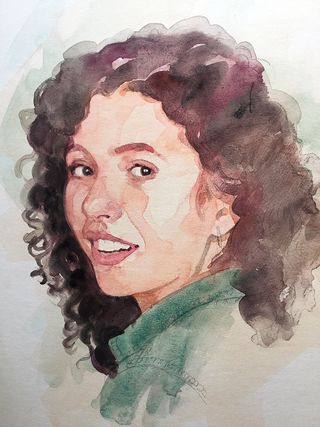
I continue to increase the values as I go, getting darker and darker. Using a smaller brush (the no 2) I start to fill in the smaller details of the eyes, mouth and nose. It’s important to hold onto the drawing at every step. You need to see the face smiling back at you as you go.
05. Increase the depth of colour
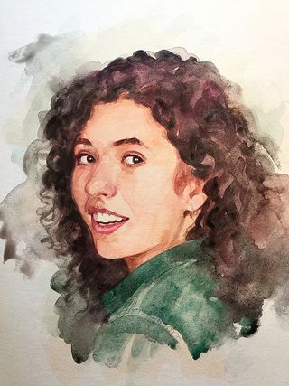
As I darken the value of the hair around the face, it enables me to increase the depth of the values of the skin tones. Once again, I am building the entire painting as I go, not concentrating on a single area. As you see here, the painting could be considered finished, even at this stage.
06. Get your whites right
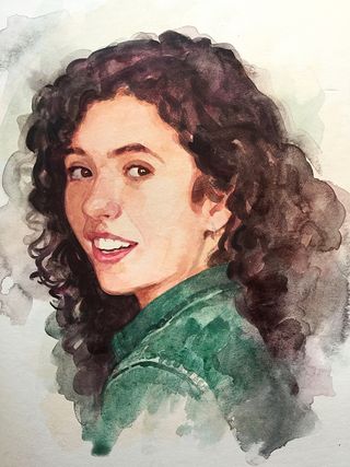
I’m still pushing the dark values of the hair around the face, as well as defining the curls. I’ve also darkened the whites of the eyes, which is an important observation to make. The whites of the eyes are never actually white. Note that the teeth also change in value as they recede into the mouth.
07. Soften the edges
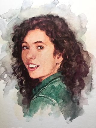
Here I’m working of softening some transitions. I’m putting a mid value in the background and softening the hair into it. The eye automatically jumps to areas of high contrast and sharp edges. The main focal point of this painting is the centred eye, as you see here – it’s the area of both the highest contrast and the sharpest edges. Hair should always be painted as softly as possible. I soften the transition as the hair meets both the face and the background.
08. Lift out highlights
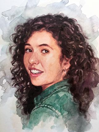
I’m now starting to look at the hair more closely, picking out the highlights. This is achieved by painting water onto the areas I want to lighten, then dabbing it with a paper towel. This is where the gesso surface comes into its own, as it means you can lift paint to create highlights or correct paint that might have gone too dark.
As I continue, I work on the nose, keeping the paint a little pinker with a touch of Bengal Rose. No matter what your reference might suggest, paint the nostrils with a warm red hue – the nose, eyelids and mouth all contain blood vessels close to the surface that should always appear warm in colour.
09. Add in the darkest areas

I’m putting in the darkest parts of the hair and face now – it’s the final push in terms of values. I look for the darker tones on the side of the face and around the mouth, trying to capture each little change in value that I see. This will increase the depth around the eyes. I pick up the details of the eyelashes and also the hoop earring. I use opaque white paint to capture the highlights.
10. The finishing touches
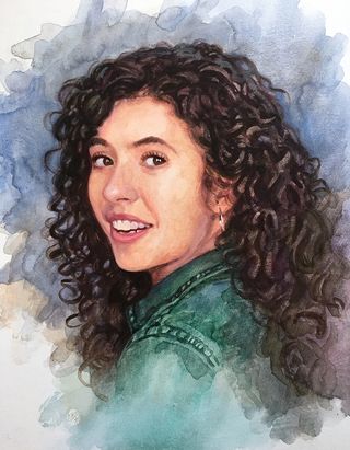
I lighten the right cheek by lifting the paint – brushing with water and dabbing at it with a paper towel, as before. This last stage is all about softening transitions and working final details. Some of the harder edges that happen with the initial paint washes can be softened by using a damp brush and blending.
It can be hard to know when a painting is finished, I have often been accused of missing good stopping places. Some paintings I leave loose, while others I render until the cows come home. Ultimately it’s your choice.
This articles was originally published in Paint & Draw magazine issue 4. Buy it here.
Related articles:

Thank you for reading 5 articles this month* Join now for unlimited access
Enjoy your first month for just £1 / $1 / €1
*Read 5 free articles per month without a subscription

Join now for unlimited access
Try first month for just £1 / $1 / €1
