Why you need to overhaul the way you show cybersecurity in your designs
What visuals would you use if a client set you the task of illustrating the issue of cybersecurity? Many designers still opt for dark colours, screens full of flying numbers, and perhaps an anonymous hooded figure hunched over a keyboard.
It’s a lot like something from a William Gibson novel, and it’s an image that is starting to feel more than a little tired. With 2020 almost upon us, does this sinister and sensationalised idea of cyber doom really represent the depth of breadth of the cybersecurity field?
Much of the imagery used to illustrate the sector in articles and marketing materials still draws from 1990’s pop culture – chains of green numbers straight from The Matrix (1999) or stylishly disaffected young people care of Hackers (1995). This was a time when the internet was new and unfamiliar, but with 95 per cent of UK households connected, the internet is now part of daily life; not something people want to feel afraid of.
The word 'hacker' itself has even spawned ubiquitous non-threatening uses, with hackathons fostering innovation and collaboration, and life hacks offering shortcuts to self‑improvement. As a result, cybersecurity today is as much about feeling safe as it is about danger, and companies know by now that more positive visuals can make their businesses seem less threatening.

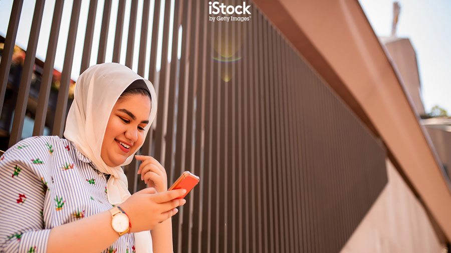
In a trend noted at iStock by Getty Images, editors are increasingly choosing a more optimistic and more human aesthetic that focuses on the solutions rather than the threats. iStock has seen increases of more than 100 per cent in searches for 'cybersecurity', 'information security' and 'data privacy', while searches for 'hacker computer' are down by 30 per cent.
What does this mean for designers? Firstly, think positive. Ditch the sinister image of the hacker to avoid your work immediately looking tired and out of date, and focus instead on making people feel safe. Product users and potential customers want to feel reassured, not afraid. For example Cybersecurity firm Hunters.AI uses friendly graphics with warm colour palettes inspired as much by Kandinsky and Mondrian as by cyberpunk science fiction. Focus on the solution rather than the threat for a more welcome and more contemporary feel.
Secondly, if you’ve been hired for a project by a computer security provider, bear in mind the results of this 2019 study by the Hewlett Foundation and IDEO showing that computer security experts feel that hoodies, circuit boards, padlocks, and pop‑up windows don’t accurately represent who they are or what they do.

Those working in the industry consider themselves innovators and defenders, and want to be pictured as such, so think about how you show the industry’s people in your imagery. Steer away from these cliches and show the human side, for example with smart professionals working in server rooms, and the client is less likely to come back with extensive revisions.
As well as looking more contemporary and making people feel better, humanising cybersecurity is also more accurate. Phishing attacks, the most common form of cybercrime, exploit human weakness through a simple e‑mail, not through any complicated coding.
For a more human take on this vulnerability that highlighted the ubiquitousness of the internet in our lives, but without any code in sight, data‑protection firm Varonis launched an ad campaign that features an oblivious naked man going about his daily business as a metaphor for being vulnerable online.

But think also about the real dangers and how they work. Cybercrime will surely continue to evolve as fast as technology, and increasingly visuals will be needed that paint a clear and true picture of what users are up against online, and how the available solutions can help them.
If you want to take advantage of this trend and refresh your design with more contemporary imagery, iStock can help you with a vast collection of imagery. To read about more of the trends identified by iStock & Getty Images, take a look here and save 10% on any credit pack with code ISTOCK10 (live until 31 Jan 2020).

Thank you for reading 5 articles this month* Join now for unlimited access
Enjoy your first month for just £1 / $1 / €1
*Read 5 free articles per month without a subscription

Join now for unlimited access
Try first month for just £1 / $1 / €1
Get the Creative Bloq Newsletter
Daily design news, reviews, how-tos and more, as picked by the editors.

Joe is a regular freelance journalist and editor at Creative Bloq. He writes news, features and buying guides and keeps track of the best equipment and software for creatives, from video editing programs to monitors and accessories. A veteran news writer and photographer, he now works as a project manager at the London and Buenos Aires-based design, production and branding agency Hermana Creatives. There he manages a team of designers, photographers and video editors who specialise in producing visual content and design assets for the hospitality sector. He also dances Argentine tango.
