Why graphic designers need beautiful websites
Why you need to sell yourself online, and how to do it.
As a graphic designer, when a Google search tells you that you’re one in about thirty million results (calculated in 0.37 seconds), suddenly you can feel a little insignificant. Your website is your space to set out your stall and display your wares in the bizarre bazaar of the internet. But is your website helping to sell your work, or is it giving off mixed signals?
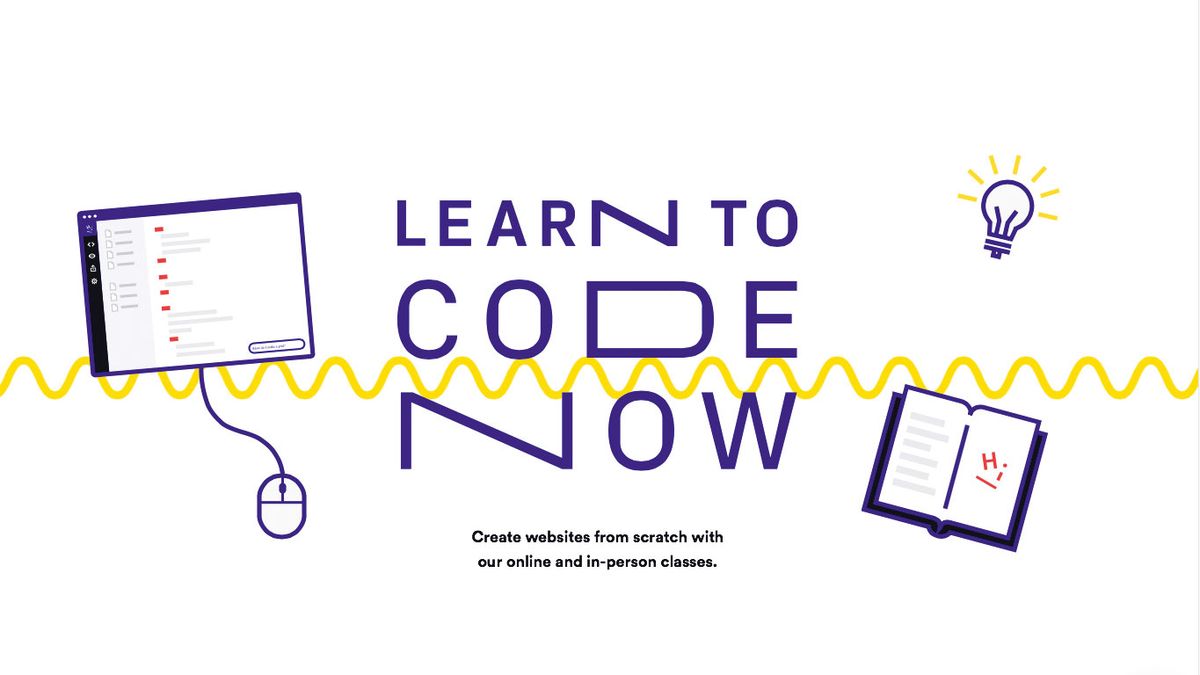
To find out more, we spoke to Rik Lomas, the founder of code school SuperHi about how to make a site that stands out, and how to pitch yourself online.
Lomas made his first website in 2001. “It was an underground online magazine for the other students in my sixth form, which kind of took the piss out of the teachers. The idea was originally from a friend’s magazine, but we found it took forever to get it printed and distributed, so we put it on the web instead.”
Lomas quickly got frustrated with the limitations of drag-and-drop web design packages like Dreamweaver, so just started playing around with the code. “I self-taught myself over a long, long period of four years with lots of getting stuck with no one to talk to – it took me way longer than it should have!”
Make your website design unique
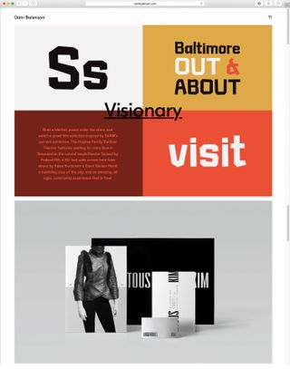
Today, there’s a plethora of platforms where you can quickly get a website up and running, but we asked Lomas if there’s a subtext that designers should be aware of.
“Some designers talk about ‘creatively breaking the rules,’ then use a standard template that another designer has made on a generic hosting platform. Is a designer being creative if they can only use templates? Do they even know how to break the rules? They’re called templates for a reason – they’re example guides for the average person to use. You set yourself apart by knowing how to get out of those templates,” he says.
Lomas started SuperHi to help users break away from templates. “We wanted to not only teach better, more practical material, but make tools for beginners to learn to code. Many of our students have tried services like Codecademy. But because they get stuck and find it really dull, they assume learning to code is dull too.
Get the Creative Bloq Newsletter
Daily design news, reviews, how-tos and more, as picked by the editors.
"Think about your worst teacher at school and how you probably hated going to those lessons. Now think of the best teachers and how sometimes they would blow your mind with what they teach. We teach the same thing [as Codecademy], but we teach completely differently,” says Lomas.
Market yourself in different places online
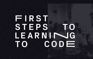
When you learn to make websites in a different way to most people, it stands to reason that your website will immediately start to feel distinctive, and more you. “A lot of the best designers really get their personality and their politics into their work” says Lomas. “The authenticity of it is something you can really feel. You can see it in their social media as well as their work.”
Beyond the bubble of your personal site, it’s useful to be anywhere online where you can show off your work. “Sites like Ello, The Dots, and Dribbble are good places to start. Some people feel awkward about self promotion, but it’s part of the job of being a designer,” advises Lomas.
But bear in mind that when you hit ‘publish’ at home in your bedroom, you’re also on view to the rest of the world. Lomas is a self-confessed internet stalker. “Not in a creepy way,” he’s quick to add. But when he was recently hiring and someone applied with a decent CV, he Googled them.
“I found their Twitter, where they were being racist and offensive to pretty much everyone they were interacting with. It was shocking how different their application was to their online persona,” he states, adding that he chose not to take the application any further.
Inject websites with your personality
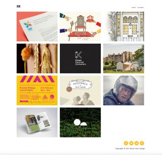
Whenever we check out a designer’s personal site, we always make a beeline to the About page. We're less interested in what someone says, than the way they say it and what this one page reveals about them. Do they reel off a list of awards and educational achievements? Or tell a joke? Or bitch about their old workplaces?
Lomas does the same, and he wants to know: “Does the person take themselves seriously or are they fun? Do they write well on top of designing well? The biggest two things I’d be looking for are willingness to learn and excitability.
“Nothing is ever perfect, and there will always be things you want to change."
Rik Lomas
"I want to work with other people who love to learn about as many things as possible, and I want to work with people who are excited and don’t just see designing as a job. The way you do this is showing a variety of personal and collaborative projects,” he advises.
If you have projects cluttering up your desktop that have never made it onto the web because you’ve been too preoccupied with tweaking the design of the site itself (or because you find uploading too laborious), Lomas has two words of advice: “Do it!”
“Nothing is ever perfect, and there will always be things you want to change. There’s parts of the SuperHi website I’m not happy with; I’m not unhappy with them but they could always be better, but people compliment us on them. They say, ‘Oh I really like this part,’ and I go, ‘Thanks,’ but secretly I think, ‘Ugh, that bit sucks, it could be so much better.’
"Being closer to your work means it’s harder to let go. There’s no right or wrong time to make things public, but the sooner the better.”
This article was originally published in Computer Arts, the world's leading graphic design magazine. Subscribe here.
Related articles:

Thank you for reading 5 articles this month* Join now for unlimited access
Enjoy your first month for just £1 / $1 / €1
*Read 5 free articles per month without a subscription

Join now for unlimited access
Try first month for just £1 / $1 / €1


