Football has undergone many changes in recent years, but one that may slip under the radar for the casual follower is the evolution of football clubs’ logos.
Many of the most iconic, recognisable badges have had facelifts over the last few years, with both British clubs and those around the world making changes. From giant clubs with international reputations like Manchester City and Juventus to smaller sides like Stevenage and Spanish team Alavés, many are at it.
It’s something that divides fans, too. For some, it’s an example of football 'losing its soul' or losing touch with loyal supporters. But for others, it’s simply something that makes sense from a business perspective – after all, football clubs are huge corporations.
Latest Videos From Creative Bloq
From signifying a new era to appealing to a global market or keeping up with design trends, there are a number of reasons why many teams are changing their logos, with the results having varying degrees of success (though most aren't up there with the best sports logos around). To find out more about the reasons behind changing logos in football, just keep reading.
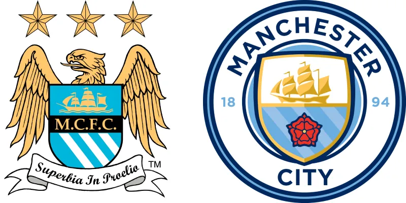
01. To appeal to a growing international fanbase
(Image credit: Manchester City FC)
Football is a global sport, and many clubs have supporters all across the world – not just from the city they’re based in.
As a result, some clubs have switched to simpler logos which can be instantly recognisable everywhere, and have widespread appeal. After being taken over by the Abu Dhabi United Group in 2008, Man City have become one of the world’s biggest, most successful, and most well-known clubs. Eight years later, they changed their logo to a simple emblem, with a circular design and the team name written clearly and simply.
Clubs may get rid of crests or icons that have a strong regional tie, with a greater proportion of their fans now not coming from the local area.
Get the Creative Bloq Newsletter
Daily design news, reviews, how-tos and more, as picked by the editors.
Clubs also need to bear in mind that different symbols and colours have different associations across the world, so having simpler logos potentially leads to less confusion or offence.
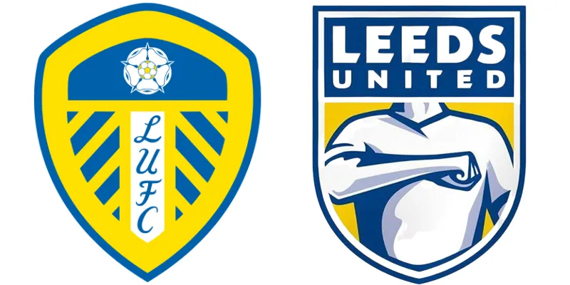
02. They have a greater digital presence
(Image credit: Leeds United FC)
Football clubs now have a huge presence on social media, with some of the biggest clubs boasting over 100 million followers on platforms like Facebook and Instagram. As a result, many have switched to logos which are more simple, and more easily recognisable on a smartphone screen, for example.
Simpler logo designs can be scaled and altered to suit a number of different settings, whether they’re icons on a small screen, on a football kit, or on the side of a stadium.
One controversial (and short-lived) logo change was that of Leeds United in 2018. Gone was the famous crest, featuring the iconic White Rose of York – a symbol of Yorkshire – and in its place was a badge inspired by the ‘Leeds salute’. While it was a simpler design, with even the script-like typography swapped out for a sans serif font, it was wildly unpopular with fans, with tens of thousands signing a petition to revert back to the old logo.
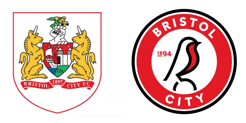
03. To keep up with wider design trends
(Image credit: Bristol City FC)
Something that began a few years before football club logos really began changing was the move from skeuomorphism to flat design in user interfaces. Skeuomorphic design – which mimics things from the real world – was phased out by the likes of Apple in the early-to-mid-2010s, in favour of flat design – which uses simple 2D icons and shapes.
The simplification of football club logos mimics this trend, in a way. In general, logos are becoming simpler. Take Bristol City. Their logo used to feature Bristol’s coat of arms and a banner with the team’s name underneath, very much a classic British football club logo.
However, in 2019 they switched to a new roundel logo. Gone is the coat of arms, and in its place is a robin, alluding to the team’s nickname of ‘The Robins’. Roundels in particular appear popular at the moment, for reasons including their adaptability to different colour backgrounds, the ease which which you can make outlines, and the way they lend themselves to social media.
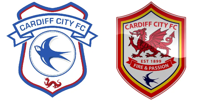
04. To signal a new era
(Image credit: Cardiff City FC)
Sometimes, football clubs will change their logo to signify a new era, or a break from the past. For example, in 2012 the owner of Cardiff City, Vincent Tan, changed the club’s logo and branding from blue to red in a major alteration, two years after he took over the club as part of a Malaysian consortium.
However, this was an occasion on which the change in logo was negatively received. In 2015, the logo changed again back to the club’s traditional blue, and the bluebird – long associated with the club – rose in prominence on the logo again.
05. To look more fashionable on clothing
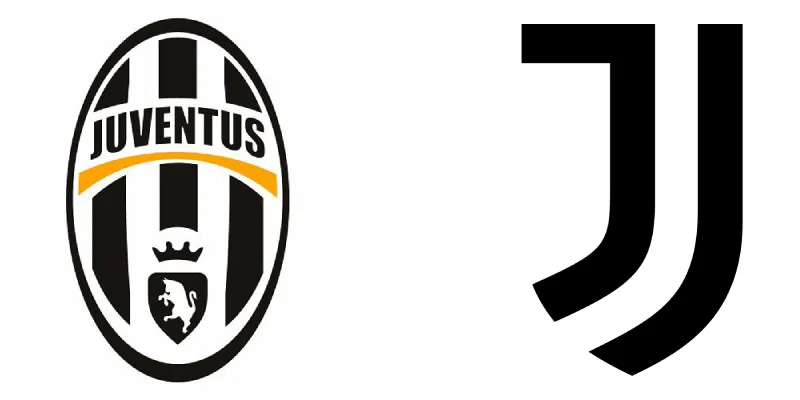
(Image credit: Juventus FC)
Today, the biggest football clubs are not just football clubs but fashion brands, too. So, they may change their logos to something that looks less like a traditional football logo.
Take Juventus. The Italian giants had one of the most iconic badges in the game, but changed their logo in 2017. One of the most controversial changes, they swapped out their famous oval logo with the black and white stripes to one with an upper-case ‘J’ and a lower-case ‘j’.
The owners’ aim was to take Juventus from simply a successful football team to a huge lifestyle, fashion, and entertainment brand. Part of this was the make the logo something more modern and abstract, in line with the logos of modern athleisure brands rather than other football clubs.
06. To pay tribute to previous designs
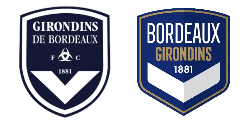
(Image credit: Girondins de Bordeaux)
This might seem counter to some of the other reasons, but sometimes a club will change the badge to hark back to a previous design. This might be to honour an anniversary or a successful period in the club’s history, or to curry favour with older, more traditional, supporters.
This is something that French team Girondins de Bordeaux did in 2021 when a new owner took over the club. They’d previously changed the popular logo they’d had since 1993 to one that looked more modern, but changed it back to the old design after the change proved unpopular among fans.
Among all of the new club logos, there are certain recurring themes. They include roundels, sans serif typography, flat design and flat colours, and a lack of decoration for a more minimalist approach.
It remains to be seen whether the current trends will continue. We can look at the rise in neumorphism – which fits somewhere between skeuomorphism and flat design – over the last two or three years. Could there be a happy medium between the traditional, often almost grandiose old logos and the minimalist new ones? The next few years will give us a good indicator. To find out more about what we should expect, see this year's hottest graphic design trends.
Thank you for reading 5 articles this month* Join now for unlimited access
Adam is a freelance journalist covering culture and lifestyle, with over five years’ of experience and a Master’s degree in Magazine Journalism from Cardiff University. He’s previously written for publications including The Guardian, The Independent, Vice and Dazed, and was Senior Editor at DogTime.com from 2022 to 2023. When he’s not writing, he’s probably drinking coffee, listening to live music, or tinkering with his Apple devices.