Why designers should reject Apple’s love of minimalism
Pauline Saglio on making digital interactions more tangible, and human.
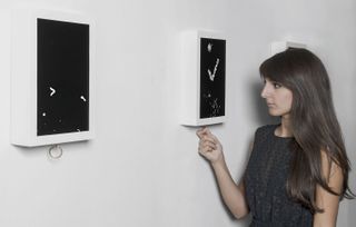
Thanks largely to Apple's love of minimalism, we interact with the digital world in increasingly pared-back ways. Touchscreens are now ubiquitous, and pinching, swiping and tapping have become shorthand gestures to get what you want with the minimum possible effort.
But screen-based interactions don’t have to feel cold and impersonal – interaction designer Pauline Saglio's innovative projects bring an analogue flavour to the digital world. According to Saglio, digital designers can benefit from a more human, real-world touch. Not in terms of skeuomorphic faux-leather stitching and 'wooden' bookshelves, but by introducing a simple, tactile joy that smooth, glassy screens lack.
In collaboration with Mathieu Rivier, Saglio has developed a niche for combining the tangible with the digital. Following her talk at Design Indaba in Cape Town, she chatted to us about how to make digital products more human...
Designing more tangible and personal interactions

Why is it important to make digital interactions more human?
Pauline Saglio: Screen-based interaction only stimulates visual feedback, and I think that’s a dangerous way to develop your mind. My projects help you think about interaction in a more tangible way.
You become desensitised to sensory feedback, and are only used to receiving immediate, visual feedback. This tends to unconsciously reinforce the way we comprehend the world. It becomes all about immediacy, and over-consumption, with no effort-based interaction.
How can you make digital interaction less impersonal?
Get the Creative Bloq Newsletter
Daily design news, reviews, how-tos and more, as picked by the editors.
PS: I think it's not only about the interaction, but more about the experience. People often confuse UI and UX. User experience is not only about how you interact with a screen, but the whole experience.
I don’t think a specific tangible interaction, or a specific UI, makes a good UX. The entire project is the experience – the combination of interaction and visual proposition.
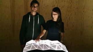
What tools do you use?
PS: At the moment we are using openFrameworks, but maybe it will die in a couple of years. For instance, we used to work in Flash Player, programming in AS3, but the software is now dead.
Projects that we've made in AS3 are now frozen in time, and it's very complicated to make small changes without starting everything again in openFrameworks.
For every project, we have to think of an entirely new way to use technology, which can be a very creative part of the process. And there are sometimes real challenges when it comes to showing your installation to the public.
Can you give an example of that?
PS: For my diploma project, Rewind, I thought users would be sensitive to the fragility of the mechanism and would respect it. But in fact, from the very first exhibitions, the users broke all the mechanisms – revealing my mistake.
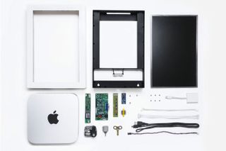
The habit of interacting digitally has already desensitised users to physical feedback, and how to respect the fragility of a mechanism. Nowadays, we think that if an object breaks, its design is at fault. We question the object, rather than our own actions.
Glass breaks, and if we drop it, no-one questions its fragility. Why shouldn't all objects, digital or not, be treated with the same respect?
Organic digital forms often feature in your projects. Does evoking the real world help achieve a more emotional connection?
PS: The real world has always inspired humanity. But with the advent of new technologies, we only try to go deeper into the technical performance, and don't think about its application anymore.
I like to remind people of the beauty hidden behind imperfection, fragility and authenticity. People think technology is the gateway to a perfect world, and digital often strives for advanced perfection, but I have no problem telling myself it's an imperfect extension of humanity. Maybe I'm not demanding enough?
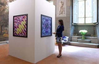
Sound also helps give your projects a sense of immediacy, creating a playful link with the visuals. How do you approach this aspect?
PS: Yes, sound is very important. It's a much more immediate feeling. We are born blind, so sound is the very first way we feel the world.
I like to play with people’s expectations of the sound something should make. Sounds remind us of memories, and natural sounds make for a more sensitive user experience.
Your recent interactive scarves project makes physical textiles into digitally interactive gallery exhibits. Are you also interested in the growing trend for wearable tech?
PS: For me, that's like asking if I'm interested in VR headsets. It's only a technology. What interests me more is how to you can appropriate a technology in a more sensitive way.
I am interested in any kind of new technology, but the trap is that people use tech without thinking. We use digital support for its innovative and surprising side, but why break with the real world at all costs? There's a real poetry when one finally tries to conciliate the two.
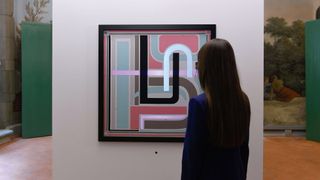
As your projects rely on physical interaction with an object, do you find it challenging to document them for people who aren’t there?
PS: We now live in a world where personal experiences are shared on social media, often for purposes of self-validation. We are in a race to exclusivity, and everyone is a journalist on a global scale.
Our projects deliver a unique and intimate interaction. If users want to share their experiences in their own way, they are free to do so – but we want other people to experience the installation physically. I like to believe in a world where people can experience things in ways other than through their smartphones.
What commercial opportunities are there for brands to make use of interactive projects like yours?
PS: I like working with brands. They force us to work with concrete objects, and interact around a difficult topic: the purchase.
Sometimes clients find it hard to feel the importance of UX, and prefer to apply economic rules and principles based on business plans. We base our work on sincere, personal feelings, but the two approaches can work together.
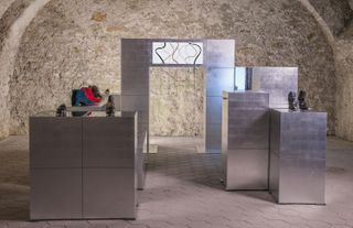
Do you think projects like your Magic Shoe installation can help attract consumers from online retailers into physical spaces?
PS: I like to think that people prefer to go to a store to experience with a product, and that a product is not just a picture on a screen.
But there's no ideal way for a consumer to appreciate an object. Even if an interactive installation can allow a customer to discover a product in a fun and playful way, there may be an equally interesting interaction when ordering online: the surprise box game, waiting for the box to arrive and looking every day in your mailbox.
All of this can be part of a game. It's a different experience, but it's still an experience. Forcing people to go to stores would be more a marketing idea, and there really is no business strategy behind our installations, aside from offering the spectator a sincere and touching emotion.
This article originally appeared in Computer Arts issue 266. Buy it here!
Related articles:

Thank you for reading 5 articles this month* Join now for unlimited access
Enjoy your first month for just £1 / $1 / €1
*Read 5 free articles per month without a subscription

Join now for unlimited access
Try first month for just £1 / $1 / €1

Nick has worked with world-class agencies including Wolff Olins, Taxi Studio and Vault49 on brand storytelling, tone of voice and verbal strategy for global brands such as Virgin, TikTok, and Bite Back 2030. Nick launched the Brand Impact Awards in 2013 while editor of Computer Arts, and remains chair of judges. He's written for Creative Bloq on design and branding matters since the site's launch.