Which logo do you wish you had designed?
Designers reveal the logos they most admire, and why.
Many logos cause controversy when first unleashed into the world, but that doesn't mean they won't be remembered fondly. But what is it about certain logos that mean they'll last forever?
With this in mind, we asked five designers to share the logo design they most admire, and tell us what it is about that logo that inspires them. Some picked classic logos, while others went for more recent work. If this post gets you thinking, feel free to share your favourite logo with us on social media.
01. Mozilla

"One recent logo design I really admire is the new Mozilla branding done by brand agency Johnson Banks," says Mimi Van Helfteren, designer at Coley Porter Bell. "Not only does it have a real smile-in-the-mind idea within the mark (the ‘ill’ of Mozilla is made out of URL characters), it was also created in a really forward-thinking way, asking the general public for input."
"The idea itself puts Mozilla at the heart of the internet, and is simple enough that it conveys their internet ethos of being open and free for everyone; while the typestyle is reminiscent of coding. Using the general public as a sounding board throughout the design process also ties into Mozilla’s values of transparency and participation that lets people all over the world have the creativity and freedom to publish opinions and ideas, and to collaborate without the restrictions of location. It feels well-rounded in both design and process, and true to the brand.”
02. CBBC

"Like many social media users, I was initially a little skeptical when the BBC unveiled its new logo for the CBBC channel," says Matt Smith, art editor at Mac|Life magazine. "Its previous incumbent had become tired, dated and inappropriate for a modern digital age, so a refresh was definitely on the cards. However the new direction had strong overtones of corporate design and was admonished by the CBBC Controller herself for 'not screaming children's TV'.
"While some of the criticisms had merit, I love the bold, colourful, playful approach, with the innovative placement of the 'B's. The abstract shapes also expanded the potential for fun idents and creative video transitions, which would appeal to a broader audience.
"Do kids really care about logos? Possibly not, but I love this logo. Viewed as a whole I think the redesign was smart and classy, and will hopefully be fondly remembered. After all, time is a great healer; how many classic logos were universally loved when they were first conceived?"
Get the Creative Bloq Newsletter
Daily design news, reviews, how-tos and more, as picked by the editors.
03. Led Zeppelin

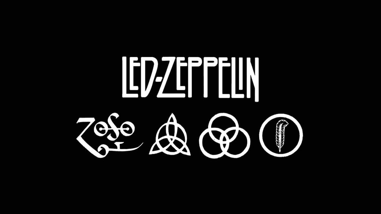
"The logo I admire the most is a combination of the original 1973 band logo for Led Zeppelin and the Led Zeppelin IV emblem with the four occult symbols, from the band’s nameless fourth album," says Ashley Milligan, art director of FINE.
"The letterwork, wordmark and the system of four symbols are iconic: one symbol for each member of the band steeped in their own personal mythology. Both the band’s wordmark, as well as the Led Zeppelin IV logo, have a simple black and white colour scheme that has stood the test of time. Maybe the symbols you see and love in your formative years stay with you in a way no other marks do, but I scrolled and doodled this logo on countless notebooks in school, proud to wear the mark on merch while sharing the secret of the symbols with others. One instantly feels cool surrounded by these iconic marks, and no other logo does that.”
For more music-related logos, see our post on beautiful band logos.
04. Empress Litho

"Which logo design do I admire most? The energy of the Nike Swoosh? The iconic colouring of Coca-Cola? The simplicity of Apple? These are classics all worthy of the top spot, sure. I allow my number one, though, to be ever-changing as brands are created and identities refreshed. So what’s caught my eye lately? It’s the rebrand of Empress Litho," says Ross Middleham, content lead at the Met Office.
"It does the basics right – it's legible, clear and versatile. The black and white use of negative space strikes a perfect balance between modern and traditional. The combination mark – with the two elements of graphic and type – allows for great flexibility. The crown, derived from a rotated ‘E’, gives the name importance and acts like a stamp of quality.
"It looks gorgeous on vehicle wraps, stationery and clothing, but translates just as effortlessly into the digital world. The simple shapes and angles can be broken apart to create dynamic animations for social or used to reflect precision and accuracy in print. It’s a winner for me because those elements help unify its appearance across everything – from a huge banner right down to the tiniest social avatar."
05. I heart NY

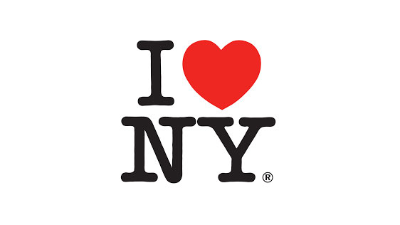
"For me it has to be the ‘I heart NY’ logo by Milton Glaser, which shows that the emoji phenomenon is not a new concept, and has a great story behind it," says Jade Trott, art director at OLIVER.
"In 1976, the American graphic designer originally designed a different version of this logo. And just as the designs were being printed, he hailed a cab to go home. And then he noticed something: little graffiti love hearts everywhere. The graffiti in New York never said the actual word ‘love’. There was only ever a love heart and a couple of initials either side. And then it dawned on him: the essence of New York was shortening all words into symbols. The kids in New York didn’t have any time for words.
"He drew ‘I heart NY’ on the back of an envelope, which is now on display in the MoMA, New York. And he raced back to the printers, stopped the press and changed it to the design we all know and love today. It’s timeless.”
A shorter version of this article was originally published in issue 286 of Computer Arts, the world's leading graphic design magazine. Buy issue 286 or subscribe here.
Read more:

Thank you for reading 5 articles this month* Join now for unlimited access
Enjoy your first month for just £1 / $1 / €1
*Read 5 free articles per month without a subscription

Join now for unlimited access
Try first month for just £1 / $1 / €1

Rosie Hilder is Creative Bloq's Deputy Editor. After beginning her career in journalism in Argentina – where she worked as Deputy Editor of Time Out Buenos Aires – she moved back to the UK and joined Future Plc in 2016. Since then, she's worked as Operations Editor on magazines including Computer Arts, 3D World and Paint & Draw and Mac|Life. In 2018, she joined Creative Bloq, where she now assists with the daily management of the site, including growing the site's reach, getting involved in events, such as judging the Brand Impact Awards, and helping make sure our content serves the reader as best it can.
