When design jargon goes wrong
Designers share their favourite tales of confusion, awkwardness and innuendo brought on by jargon.

Have you ever been told to put logos before logos? Have you ever fed your client a hamburger? Ever been backfilled?
Design jargon is a bit of a minefield, so we got in touch with some of our favourite designers to ask about the latest industry jargon. We wanted to know the new terms everybody's using. We were after the abbreviations, the euphemisms, the acronyms, and what they actually mean in plain English. But it turned out our favourite designers were unanimously against this idea. Design jargon, they said, has got to go.
Instead, we got stories about times design jargon has led to misunderstandings, awkwardness and panic. There were terms that were well and truly lost in translation, words that have other, far more salacious definitions, and phrases that just sound plain daft.
Check out our own jargon buster series on terms such as skeuomorphism. Meanwhile, read on for designers' tales of times design jargon has wreaked havoc on projects.
That's just rude
"I was once in a meeting about Iceland supermarkets," Simon Manchipp says. The SomeOne founder remembers how the team were looking at the brand and trying to work out what was unique about it. They wanted to show the company as being progressive.
"I was quite new to the project," Manchipp says, "and everyone was getting more and more heated until one of the very senior members of the agency shouted at the client and told them to ‘Bog off’. At this point, Manchipp had to leave the meeting. He was shocked at how this senior person had behaved towards the clients.
"I'd always been taught to treat people with respect – and particularly clients. It was some time until I realised it was an abbreviation for the sales mechanic that Iceland supermarkets had pioneered: The buy one, get one free – the "BOGOF."
Get the Creative Bloq Newsletter
Daily design news, reviews, how-tos and more, as picked by the editors.
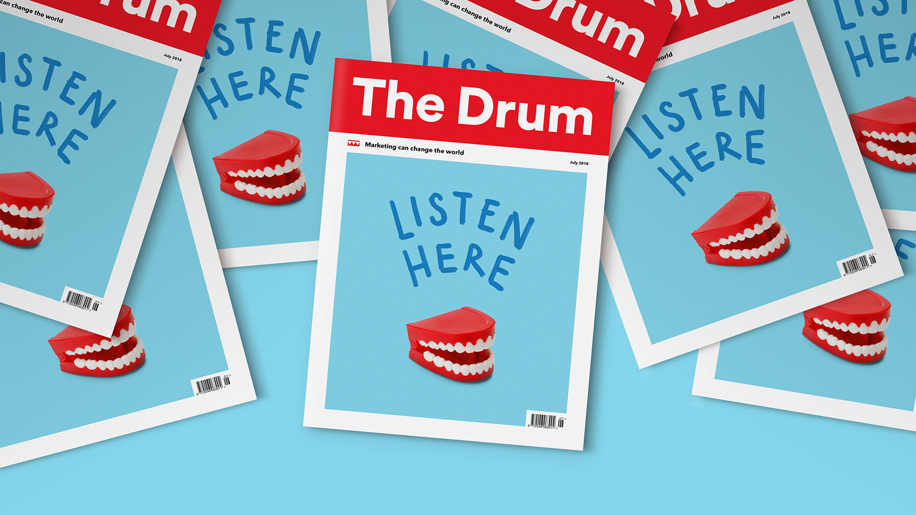
Alan Dye, owner and creative director at NB Studio, also once had a client who used a particularly unfortunate term. Dye's favourite bit of jargon is a double-entendre that used to make the whole team laugh. "We had a client," Dye says, "who always used to say to us: I'll backfill you next week."
Double meanings
Often, a term is so widely used that its other meanings are lost. Sometimes a definition changes entirely. For example, ‘literally’ (once the most misused word in English language) is now also defined as being used ‘to acknowledge that something is not literally true but is used for emphasis or to express strong feeling’.
That's the case with one particular word that you'll never hear David Airey saying. "I often see renowned design firms and designers being described as ‘seminal’," explains the logo design and brand identity specialist . It's meant as groundbreaking, influential, original. But that's not how Airey hears it. "It wouldn’t be my choice, considering the other definition," he adds.
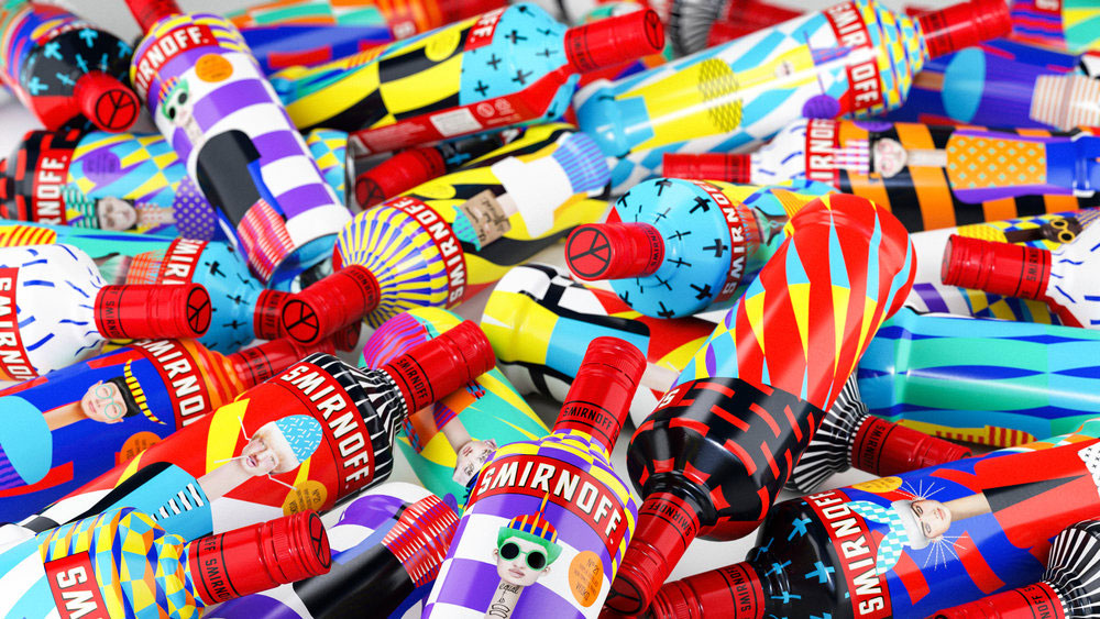
While we're on the subject of popular but unnecessarily lewd design terms, how about 'sexy'? "We find it super-funny when people ask us to make a design look 'sexy'," says Eva Yarza. Yarza is one half of Yarza Twins – the London studio she runs with twin sister Marta. Their clients include Smirnoff, adidas and MTV.
The big problem here is that the meaning isn't clear – the image a term summons in a client's mind could well be very different to what it means to the designer. So any client asking Yarza Twins for something ‘sexy’ might find themselves in for a surprise. "We always just imagine," she says, "adding in a picture of Pamela Anderson in Baywatch."
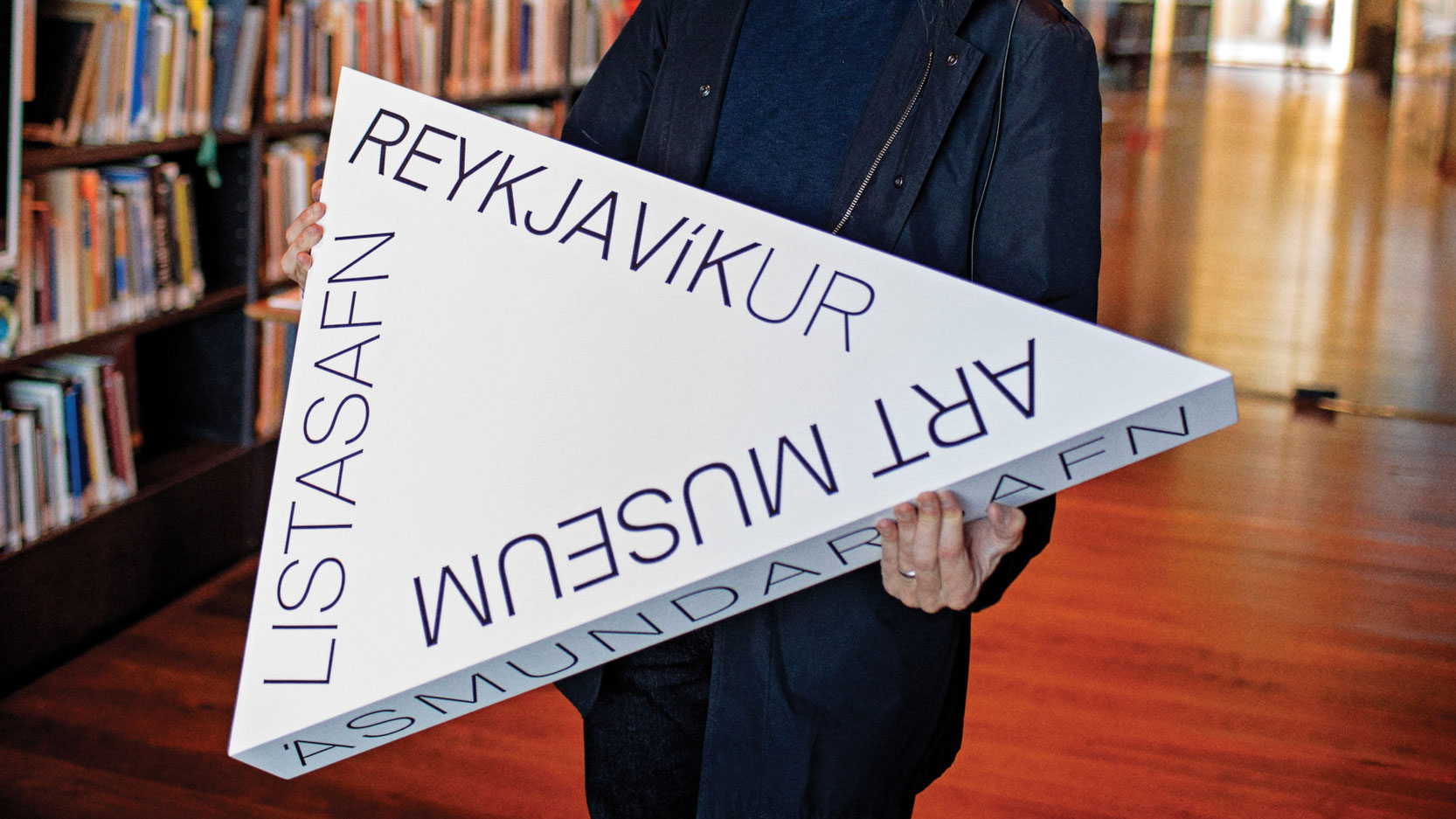
Peter Saluk brings a bit of class to the debate. The project manager at karlssonwilker explains he's fond of the phrase 'logos before logos'. This idea has proved useful in the New York studio's projects for clients like Samsung, Mini/BMW, and Time Magazine. But it's meaning is not instantly clear – especially when written down.
It means, Saluk says: "Logic and reason first, to avoid senseless visuals. Or: think before you design." Still stumped? Trying saying it out loud. Saluk says: "It's all about the correct Greek pronunciation."
Just plain weird
Jamie Ellul is now the creative director of Supple Studio, but during his days at Magpie Studio, he met with a client who used a term that got him into a bit of a panic. "We had an amazing new business opportunity with a US tech giant," he says. "They said they'd like to come over and meet us and asked if we could put together a presentation to share with them at the meeting, but that it shouldn't be ‘a dog and pony show’."
Ellul had to Google the term. It means 'an elaborate display or presentation'. "We then freaked out," he says, "about what was too over-the-top and what wasn't – but we got the gig, so I guess we pitched it on the right side of 'elaborate display'."
Snask founder and creative director Fredrik Öst had an equally confusing time with some jargon he came across while working on a film. Öst was born in South Korea, grew up in Sweden and was over in America when a few geographical terms went over his head. The set designers were stacking apple boxes for the shoot. They called out different names depending on which way the boxes went.
Longways was ‘New York’. On their side was ‘Chicago’. And flat was ‘LA’. Öst eventually figured out that these terms have to do with how tall the buildings are in the respective cities – New York being full of skyscrapers, LA being pretty flat, and Chicago being somewhere in the middle.
On the buzzword bandwagon
Now for some terms that everyone understands, but no one likes. "I absolutely hate the term ‘on-trend’," Rob Gonzalez says. Gonzalez is a partner at London studio Sawdust, which specialises in typography, brand displays, and visual identities for companies like Nike, Apple, and Coca-Cola. What it doesn’t specialise in is things that are ‘on-trend’.
But surely this one is harmless enough? It's a synonym for fashionable, popular, cool. It's meaning is clear. It's widely used. It's not wordy. What's the problem?
"On-trend makes me cringe," Gonzalez says. "On-trend is here today and gone tomorrow. On-trend is for the masses, the followers and the wannabes. On-trend is no longer unique, it’s the death of an idea."
Studio.Build creative director Michael C Place went to town when we asked him to give a few example of jargon he hates. "What's the critical path?… I can feel a serious amount of feature creep coming here… I can feel a bit of a pain point here, guys… The CFO needs to see what his Benjamins are being spent on... Feed them a hamburger, yeah?"
Most of it we understood. ‘CFO’ is chief financial officer. A ‘Benjamin’ is a $100 bill – it's money. ‘Feature creep’ is what happens when a job spirals out of control and unnecessary stuff is added to try and fix it. A ‘touchpoint’ is the bit where people interact with the project, and a ‘pain point’ is a problem, an irritation.
But we needed help on the hamburger. The manager of Build, Elena Dranfield, helped us out: "Michael says it's 'a technical term for user experience'." Ah, a hamburger menu, maybe?
Studio Sutherl&'s Jim Sutherland also has a few 'pet hates' when it comes to design buzzwords. Thinking is enough, Sutherland says. You don't need ‘blue-sky thinking’ or ‘left-field thinking’ or even ‘thinking outside of the box’.
But what he dislikes most is any phrases involving fruit or vegetables – in particular ‘brand onions’. This is the process of drawing a big circle with all the different layers that make up a company. Sutherland’s message in simple: let's all use common sense and plain English.
Read more:

Thank you for reading 5 articles this month* Join now for unlimited access
Enjoy your first month for just £1 / $1 / €1
*Read 5 free articles per month without a subscription

Join now for unlimited access
Try first month for just £1 / $1 / €1
Gary Evans is a journalist with a passion for creative writing. He's recently finished his Masters in creative writing, but when he's not hitting the books, he loves to explore the world of digital art and graphic design. He was previously staff writer on ImagineFX magazine in Bath, but now resides in Sunderland, where he muses on the latest tech and writes poetry.
