5 exciting web design trends for 2022
Here's how you can get ahead of the curve.
Trends in web design are cyclical, but 2022 may stand out for a variety of reasons. Yes, current events like the pandemic come into play, but in addition to that, mobile devices continue to become more powerful, and privacy and safety have become top-of-mind for many people.
With greater technical capabilities, we've seen a lot of complexity added into web sites over the last few years – but web designers and developers need to respond to cultural phenomena like economic recovery, privacy and safety. We think 2022 is the year in which sites that course-correct toward clarity, openness, and simplicity are the sites which will gain traction in the market.
Here's the trends we think are going to shape 2022, and how how you can get a jump start on leading them. For more advice and insight, see our web design tools or sign up to our brand new UX design course.
01. Sharing not telling
Is it a trend, or is it simply timeless advice? Inspiring people with your message means drawing them in with visuals and interactions that surprise and engage.In 2022, you’ll see more background video and animations that engage your visitor’s mind and will add gentle motion to your page, decrease bounce rate, and help visitors engage with the words and messaging.
Micro-interactions and micro-animations are also ways that give pages life and energy. Making them subtle, but noticeable, adds a level of detail that your visitors may not be able to articulate, but that helps you stand out.
What is a micro-interaction? Think of them as small animations that get triggered by hovering with your cursor, or by scrolling to a particular part of the page. When you hover the mouse over the button or a section of the site and something changes color, or an icon moves slightly, that engages you visually and gives the page a tactile feeling.
Animations are especially useful for illustrating complex concepts and processes in a simple, digestible way. While it can be overused, simple and refined animations illustrate your message in a way words never could.
Get the Creative Bloq Newsletter
Daily design news, reviews, how-tos and more, as picked by the editors.
02. Simplicity
Businesses are undergoing serious challenges going into 2022. Creating roadblocks to customer engagement simply isn’t a feasible strategy if your business is looking to grow. How does that translate into web design?
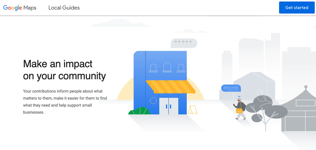
Fewer words, calming colours, vivid imagery, and very clear calls to action should be all the rage in 2022. Page design is going to trend toward lighter weight experiences that encourage the user to explore deeper, rather than putting everything up front in one page. They'll be simplified messaging that implores the visitor to want to learn more, rather than complex conversations that leave visitors feeling information overload.
While a few years ago the trend was toward things like infographics – tightly designed, typography-driven, space condensed - design in 2022 will incorporate more space and gentle motion. This still lets you convey information - but in a way that reveals and expands, rather than being so condensed and overwhelming.
Web forms are likely to get simpler and lighter weight to avoid losing the potential lead to a complex series of questions. A couple questions spaced over a few interactions is proving to be a more successful method for engaging new leads than putting one big form up - and it’s easier to engage with on mobile devices as well.
03. Safety first
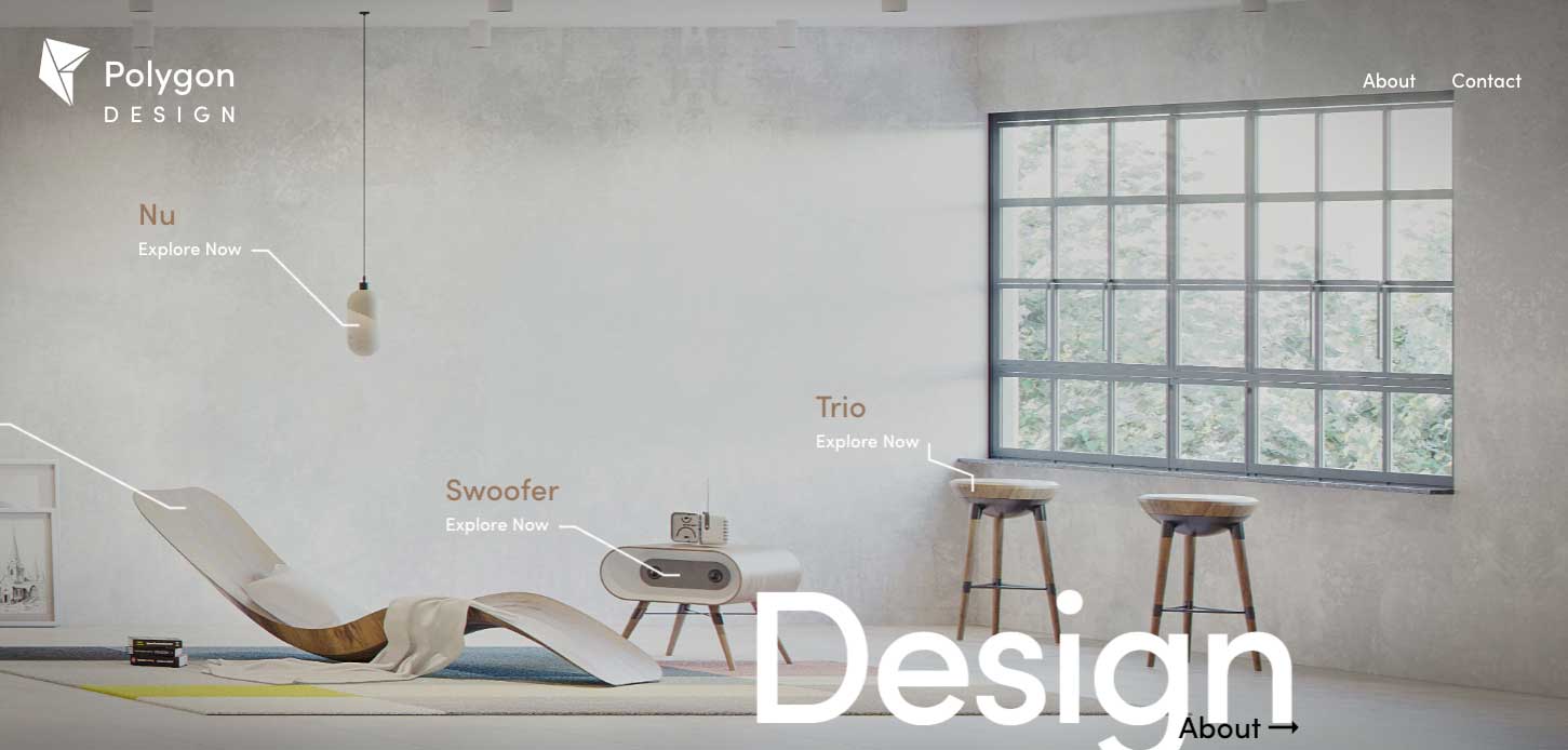
People are overwhelmed! And while everyone is figuring out how to engage with the new world after 2020 and 2021, design trends are evolving to help people feel both safe and ready to engage again. Much like offices and interior spaces are seeing restructuring to coax people back to in-person work, websites are adapting design to give people space, reduce anxiety, and feel comfortable and safe.
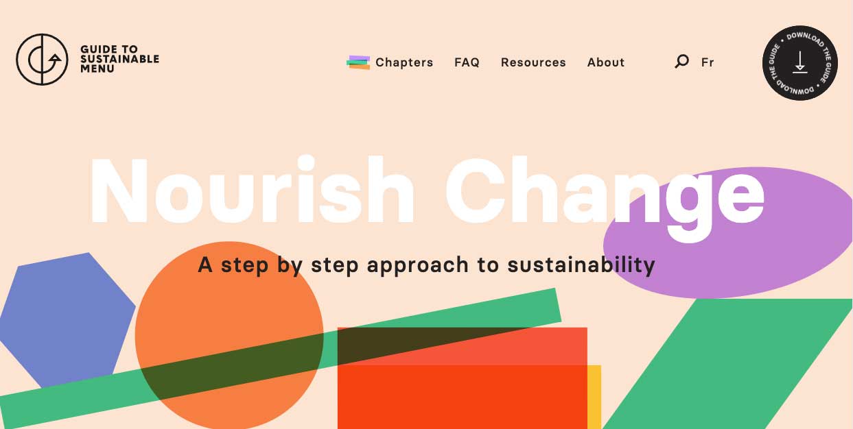
We see webpages integrating more imagery that evokes outdoor spaces and design inspired by home decor. Integrating natural, organic shapes helps the page feel unique, inspiring, and alive. We want to help our visitors feel that they’re in a new space – but they are just as safe as they are at home.
This is really about aesthetics and feelings – we want to be away from home, but at the same time, we want the safety of our homes. Designs that feel spacious, inviting, and accommodating will speak to your visitors’ sense of security and safety.
04. Customisation and accessibility
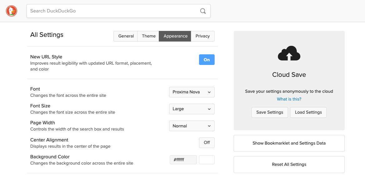
On the topic of being accommodating – accessibility is an ever-more-important element of web design, as our devices create more accommodations for visitors with visual or auditory impairments. Web design over the years has added multiple “do this first” concepts – mobile-first, shift left on security – but ultimately accessibility needs to be integrated in the design process from the start, just like security and device agnosticism. Web development is a holistic process where content and technical needs meet, and accessibility is at an equal footing with security, design, and content strategy for getting your message to everyone.
More websites are integrating theme and font customisations for a variety of reasons, and accessibility is at the top of that list. Supporting operating system features such as dark mode (so your website doesn’t hurt your eyes when you’re surfing the web at night), and accessibility features like font scaling and contrast adjustment are becoming much more widely implemented.
These features tell your customer that you’re thinking about their needs and desires, and you’re helping to accommodate them with the design of your site. Sites that do this stand out in your customers’ minds, because they’ve intentionally made the choice to use these features on their devices – if your site supports them, your visitors will notice.
05. Positive mindsets
Cultural mindsets motivate design trends. There are a lot of negative thoughts and mindsets that obscure and confuse the modern Internet. Information overload is prevalent and hurts our ability to cope and understand our experiences.
Successful websites in 2022 and beyond will counter this by creating experiences that help the user and generate positive thinking and goodwill. The themes of recovery and growth are fostered with clear messaging and inspiring imagery. These trends are all about helping your visitors rather than directing them, which will help them think positively about your site and their relationship with you.
Read more:

Thank you for reading 5 articles this month* Join now for unlimited access
Enjoy your first month for just £1 / $1 / €1
*Read 5 free articles per month without a subscription

Join now for unlimited access
Try first month for just £1 / $1 / €1
Paul DeLeeuw is the Director of Interactive at ddm marketing + communications. He provides leadership and oversight to ddm's interactive teams, creating complex database architecture and web programming for the company and its clients. Paul has been an integral part of ddm since his start in 2009, tackling projects for clients with a creative approach across many industries.

