For many years, web designers have strived to provide the optimal information people are searching for, quickly and effectively. It’s undeniable, when comparing websites from a decade ago to those of today, that the industry is getting better at this. But have we lost something along the way?
"I think we’re in an age of user feedback that drives well-optimised but increasingly generic executions," argues Simon Gater, creative director and co-owner at Mad River. "The quality feedback we get from users makes it much easier to get a solid understanding of whether your work is 'fit for purpose' quickly, and ensures we achieve client goals at a statistical level. But as more and more people get similar feedback, we’re at risk of being filtered down the same design trend or path of execution. Because of this, we now need to work harder for that point of differentiation while maintaining the optimum user experience."
So as we continue to walk the line between functionality and originality, usefulness and inspiration, what are the big trends we’ll need to take account of, in 2020 and beyond? In this article, we chat to some leading voices in the industry to find out.
If you're after more web design help, see our web design tools roundup, and see our web design tips.
01. Sophisticated micro-interactions
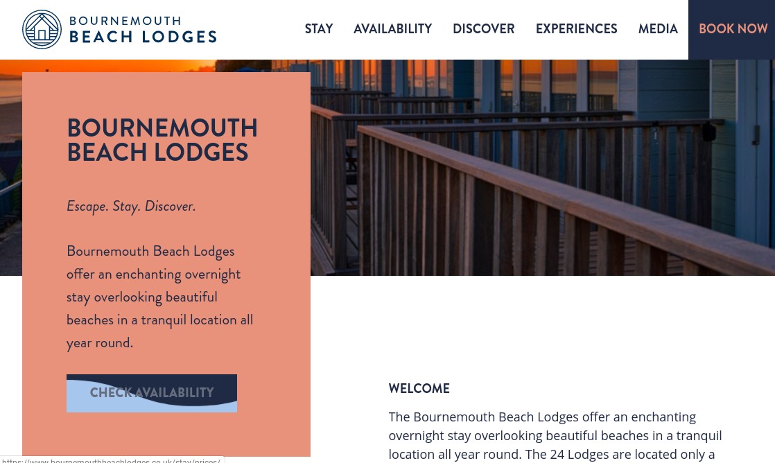
Micro-interactions have been around for years, especially on social media; an example would be the red heart popping up when a post is liked on Instagram. But as attention spans continue to constrict, Lee Poynter, global head of design at Crowd, believes they’re going to become a bigger deal in 2020. "Micro-interactions and micro-animations are going to become more sophisticated until they become part of everyone’s interactivity," he predicts. "They are a way to signpost, feedback and ensure trust."
His colleague, digital designer Vicky Kwan, agrees. "Micro-interactions are used to show the personality and the vibe of a brand," she explains. "For example, if a product wants to be presented in a sleek way, then the interactions will not be bouncy; instead, they’ll come in smoothly and slowly, so it gives the whole elegant feel when the person is looking at it."
02. Taller image crops
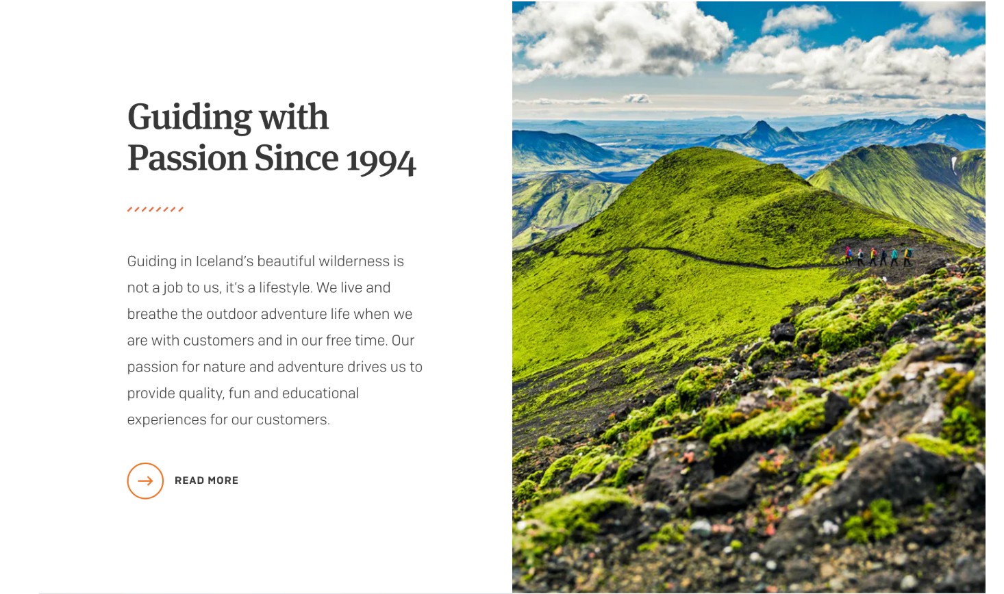
"I’ve noticed a real increase in the use of portrait imagery in desktop experiences this year," says Jake Young, senior digital designer at Mad River. "This is only going to become more prevalent as more and more people view content on their phones."
Get the Creative Bloq Newsletter
Daily design news, reviews, how-tos and more, as picked by the editors.
And this trend is bigger than a case of lazy mobile-first designers with portrait crops scaling up to desktop, he adds; nor is it confined to the common 4:5 ratio. "We’re increasingly seeing taller and taller image crops on desktop experiences... and they’re beautiful. This image consideration is resulting in taller, but well-considered designs, be them carousel or card."
03. Dark mode design
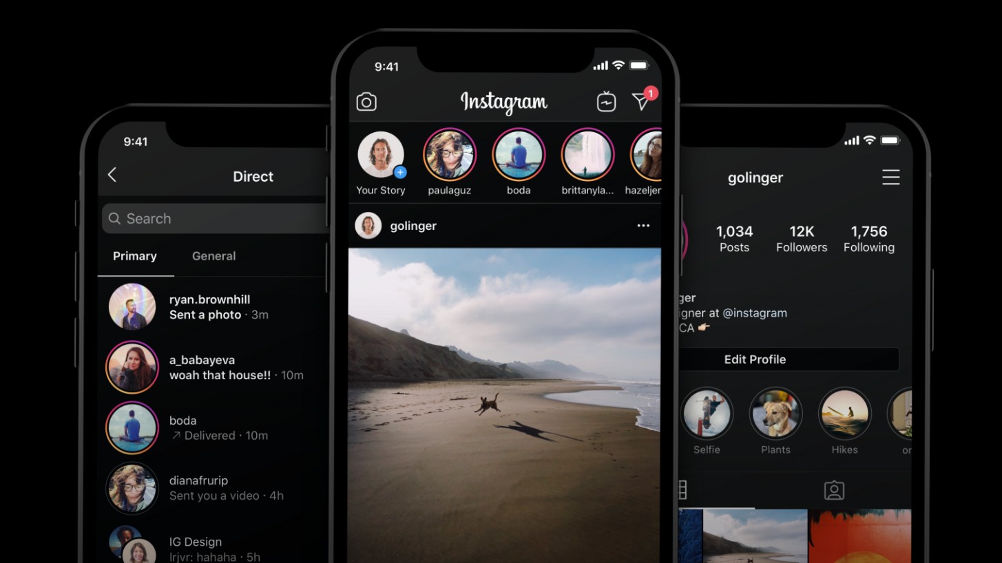
“Dark mode design has been a big topic of conversation this year,” notes Davide Barrata, design director at Impero. “We’ve seen pros and cons being discussed everywhere, notably asking if 'design' is being sacrificed over science. I expect the discussion to continue in 2020.”
Consuela Onighi, UX designer at Illustrate Digital, sees the trend as a good thing. “Dark mode is a nice option to have for a more delightful UX, as it brings out the content and it's easier on the eye,” she argues. “I wouldn’t be surprised if most designers started switching to dark mode in the new year.”
This concept isn’t new, of course. “However in 2019 we’ve seen brands like Pinterest, Slack and Instagram bring this into the mainstream, with Facebook and Whatsapp due to launch imminently,” points out Lee Hoddy, creative partner at Conran Design Group. And he heartily approves.
“Beyond the more functional benefits that dark mode offers, such as increased battery life and low-light settings, aesthetically speaking it achieves the feat of creating the impression of a truly bezel-less, notch-less design, something which the majority of smartphone makers are clamouring towards from a product design perspective,” Hoddy argues. “It is going to be interesting to see how designers push dark mode further in 2020.”
04. The foldable web
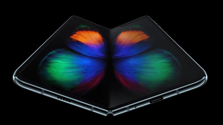
Many big trends in web design have been driven by new devices, most notably at the beginning of the 2010s by the rise of the iPad. And perhaps at the dawn of the 2020s, we’ll see a similar shift to respond to new foldable devices, such as the Samsung Galaxy Fold 5G.
"The rise of a 'foldable web' will mean more and more designs will recognise and provide a unique experience for foldable phones and tablets,” predicts Adam Innes, senior software developer at 50,000feet. “I think you'll see some of the more unique and innovative designs go viral while the concept is fresh."
05. Typographic diversity
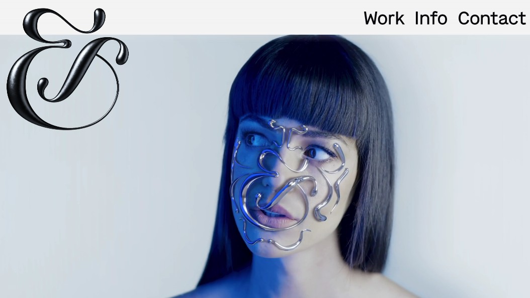
Will 2020 see more typographical experimentation on the web? “Bold lowercase sans-serif typefaces have been doing the rounds for years now and, as a result, lots of websites have begun to look a bit samey,” says James Wood, co-founder and creative director at ShopTalk. “But we’re seeing the seeds of change, and that’ll gain momentum in 2020. Handwritten type, retro fonts and animation typefaces are making a comeback.
“We’re also seeing combinations – things that look as though they shouldn’t belong together but somehow work anyway," he continues. "‘Imperfections’ can add real personality. Look out, too, for a big push in immersive 3D elements. &Walsh’s rotating 3D metal ampersand is a great example of this.”
06. Minimalism goes further
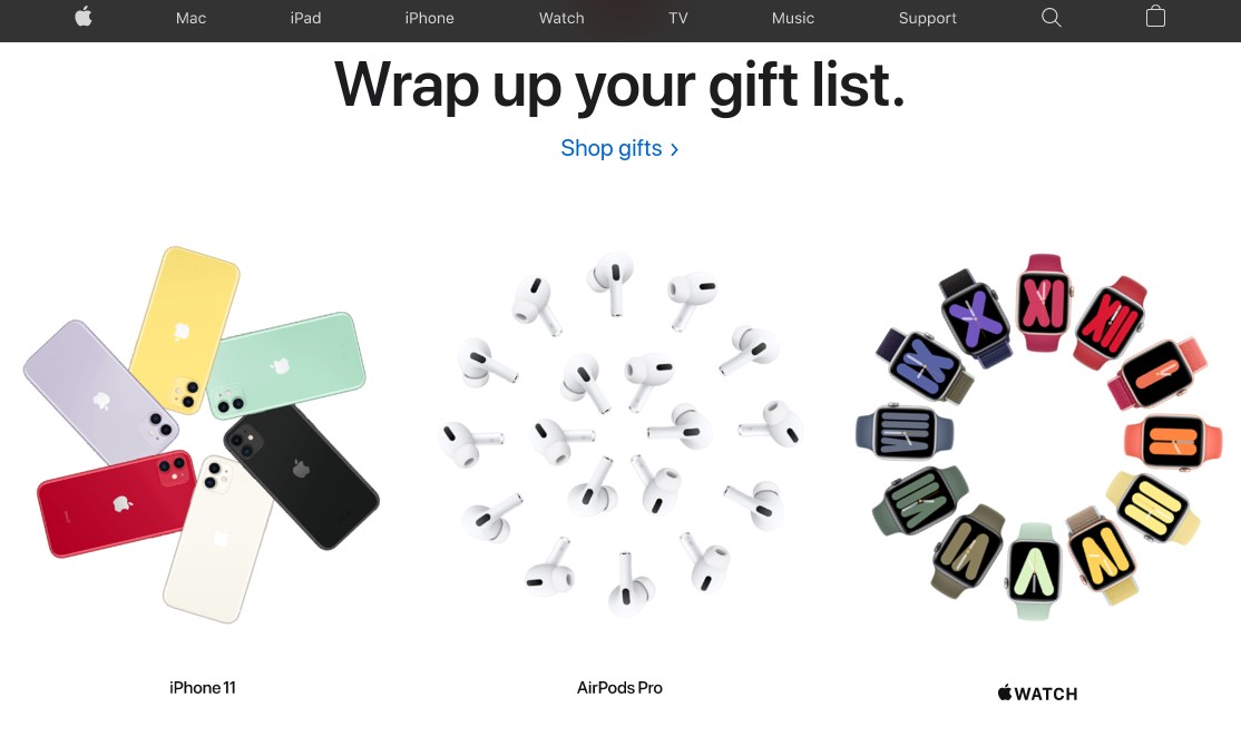
"One trend we’ve been seeing more and more of in 2019 is simple and minimalistic web page design," says Steve Sharp, director of Fat Cow Media. "Following in the footsteps of the Apples of this world, companies are looking for simple templates to land their brand message and showcase their products and services in a clear and concise way." And he’s a strong supporter of this approach. "It’s clean, modern and fresh and makes the user experience all the better. I’m excited to see this particular trend becoming more widely adopted into 2020.”
Of course, minimalism is ultimately about providing an easier and better experience for the user, and that's just as much about functionality as it is aesthetics. Alex Schleifer, chief design officer at Airbnb, believes that's going to see big strides in 2020. "We’ll become accustomed to very low-friction, or zero-friction interfaces when it comes to things like sign-ups and payments," he predicts. "One-tap registration and instant payments will become the norm, while entering credit card numbers and passwords will start to feel archaic." We're looking forward to that!

Join us in April 2020 with our lineup of JavaScript superstars at GenerateJS – the conference helping you build better JavaScript. Book now at generateconf.com
Read more:

Thank you for reading 5 articles this month* Join now for unlimited access
Enjoy your first month for just £1 / $1 / €1
*Read 5 free articles per month without a subscription

Join now for unlimited access
Try first month for just £1 / $1 / €1

Tom May is an award-winning journalist and editor specialising in design, photography and technology. Author of the Amazon #1 bestseller Great TED Talks: Creativity, published by Pavilion Books, Tom was previously editor of Professional Photography magazine, associate editor at Creative Bloq, and deputy editor at net magazine. Today, he is a regular contributor to Creative Bloq and its sister sites Digital Camera World, T3.com and Tech Radar. He also writes for Creative Boom and works on content marketing projects.
