12 huge web design trends for 2018
Experts predict the biggest web design trends for the coming year.
What were the biggest web design trends of 2017, and what will be big in 2018? As last year drew to a close, we asked leading designers and studio heads to share their views, perspectives and predictions.
Just as when we brought you 10 huge graphic design trends for 2018, this isn’t about following the creative herd: it’s about taking stock of where the industry is right now. So whether you follow these trends or not, it’s useful to know what they are. You might also want to check out our guide to the biggest illustration trends of 2018.
01. Web animation
"Animation can play a huge part in making ideas and interfaces easier to understand," says interactive designer Chris Gannon. "In a world where everyone is in a hurry and time is short, animation can convey complex ideas in a short amount of time whilst at the same time engaging and informing."
Bruno La Versa, senior digital designer at Lightful, agrees. "Storytelling and personality is something that new and old brands are working on in order to capture users' attention, and animations are starting to play a bigger role in this," he says. "Animations have shown and will continue to show the brand's strength in our digital world, giving a strong personality to the brand, making it less static and more dynamic," says La Versa.

So what specifically in animation are we going to see more of in 2018? Animated logos is an obvious trend, and one that gives a company a big opportunity to enhance their brand further. However, getting it right is a major responsibility. "It's a visual representation of the company in a tiny space and if it's a good logo it packs in a lot of meaning," Gannon explains.
We're also seeing the return of the GIF – partly thanks to the fact that basic animated GIFs can be read by almost anything. "It seems the world is ready (and indeed is crying out for) animation of everything, whether it be comedy loops of cats falling off tables or adding a sense of fun to the logo in your email signature," says Lee Fasciani, founder of Territory Projects.
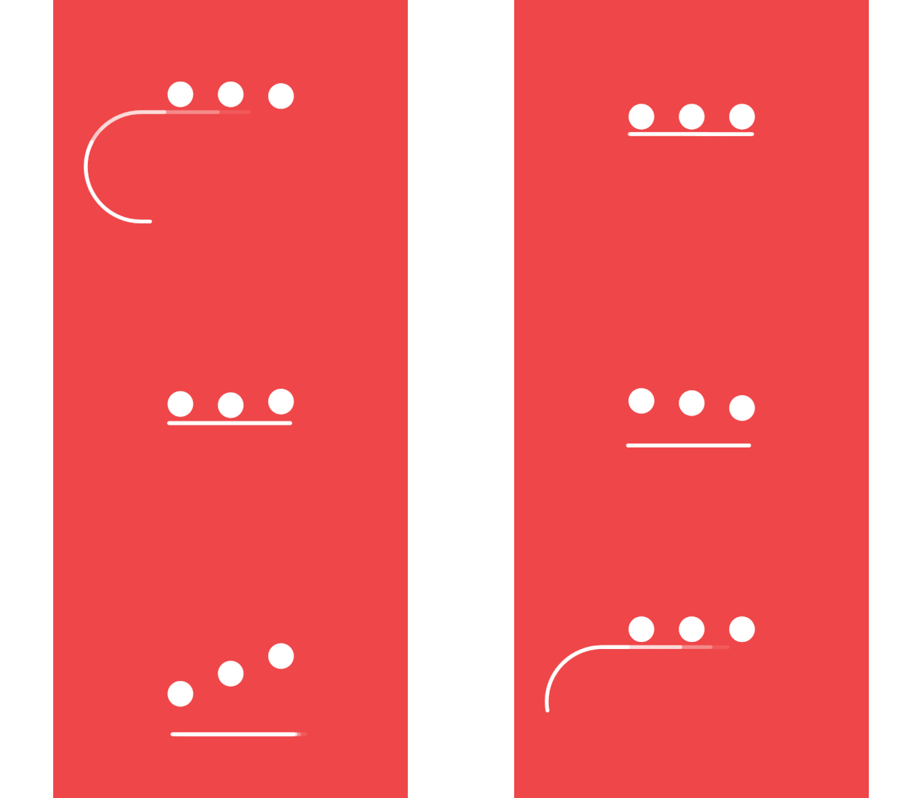
So what has caused this enthusiasm for animation? Well, the volume of creation tools now available to designers has played a big part. "Many of these tools are aimed at designers, developers or other non-animators and have interfaces that are designed to simplify the complexities of building them," says Gannon.
Get the Creative Bloq Newsletter
Daily design news, reviews, how-tos and more, as picked by the editors.
"This opens up the playing field to more and more people and allows them to experiment with animation. This is pretty huge because historically non-animators have steered clear of the animation part of the project."
Mireia Lopez, creative director at digital creative agency DARE, also noted how these tools are helping to blur the lines between design and development. "We've see design teams animating, prototyping and learning neat coding to use more intricate prototyping tools in order to communicate concepts to clients and explain digital journeys to developers," she says.
When you combine the availability of such tools with browser improvements it's easy to see why animation is going to be big in 2018. Today's browsers are exceeding 60fps, even on vector formats like SVG and mobile.
As with any trend it's important not to include it for the sake of including it – it's got to be right for your project. "We all have a responsibility to our audience to choose when and when not to use animation," warns Gannon.
"Does it enhance or otherwise contribute positively to the experience? My heart sinks when a client approaches me saying they want to ‘sprinkle animations all over our app'. Shoe-horning an animation into a design rarely ends well because the animation has no purpose other than to titillate."
But there's no arguing – when it's done well, animation can transform a good project to a great one. To get on board with the trend, check out our 5 steps to mastering web animation and 10 brilliant web animations by Chris Gannon.
02. More adventurous colours
“Over the past year we’ve seen an increase in the use of bold colours being used across digital platforms,” notes James Bearne, creative director of Kagool. One great example is that of DesignStudio's new branding scheme for The Premier League's 2016/2017 season.
"A confident departure from the previous identity, the striking visual treatment didn’t stop at the website or its app; it came roaring onto the pitches with billboards, social media and more.”

And this won’t slow down in 2018, Bearne predicts. “With new tools like Khroma helping us to find more interesting ways of using colour, it seems likely we’ll see more designers exploring how colour can be used to deliver exceptional experiences.
"What will be interesting to see is how colour can be used alongside customisation and personalisation to create truly unique experiences for consumers that tick several boxes at once.”
03. Inventive typography
In the battle for eyeballs, typography is a powerful weapon, and its use on the web has broadened out this year, says Kelly Morr, senior manager of content strategy at 99designs. “Typography is powerful and the bigger the better. So while neo-grotesque sans-serif styles like Helvetica remain in vogue, designers are branching out, turning to the huge variety of typefaces available.”
She predicts that 2018 will see the return of serifs to the screen, as well as increasing numbers of sites pairing serif and sans-serif fonts (as executed beautifully on GE) to create a dynamic user experience.
The fact that device resolutions are getting sharper, amping up the legibility factor, is also opening the door for a rise in custom fonts. “Designers are opting for typography with tons of personality not only for emphasis, but also for aesthetic effect. All of this, plus the drama afforded by oversized typefaces, goes to show that 2018 will not all be about subtlety, and we can expect to see bold trends continue to develop.”
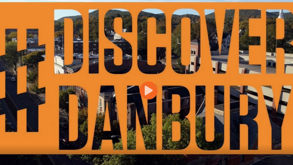
Another type-related trend identified by Gee Guntrip, studio manager at Hyped Marketing, is that of typography cutouts. “The technique uses a block of colour over a still or moving image that appears through clear lettering,” she says. “Choosing the right typeface and limiting the number of letters is paramount to making this work.
“For example, Danbury has done this really well with a bright text cutout that draws the user’s attention to its video. Comedie Francaise uses the typography effect on text hover. And Nurture Digital showcases video through letters.”
04. Data storytelling
“2017 has been a great year for design,” says Craig Taylor, senior data visualisation design manager at Ito World. “We’ve witnessed a boom in animated visualisations and an increased appetite for data representation from a 3D perspective. But what use is this data, beautiful or otherwise, if it’s not digestible and ultimately usable?”
Enter what Taylor calls the information storyteller. “There is now a huge emphasis on effective storytelling through design, conveying often complex information as simply and as engagingly as possible to a variety of audiences,” he explains. “Designers are thinking outside the box with new, bespoke creations – the muted palettes of old ditched in favour of vibrant colour transitions paired with minimalist yet bold typography.”
So what does 2018 hold for information design? “Greater accessibility to new technology will undoubtedly see an increase in the number of designers using animation as a means of storytelling,” believes Taylor.
“And with AR and VR advancements ushering in the prospect of simulated exploration of virtual models, it’s important that we remember to keep information and data at the heart of what we do. If we get this right, the overlapping spheres of data science and design will allow for ever increasingly informative, grounded and clear examples of data visualisation.”
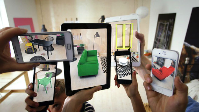
Lee Fasciani agrees that AR and VR have much more to offer going forward. “Technology has enabled us to more readily mix our real world with our screen-based world,” he says. “We’re moving on from an increasing desire to add video to our digital experiences; layering them with a depth and richness unachievable not so long ago.
"A mixed reality brings us firmly into the ‘new’, with large tech firms committed to innovating in AR, future design will need to consider our world in all four dimensions. We are seeing the start of this mixed reality in popular games and more function applications such as IKEA Place.”

For beginners looking to start exploring simpler data visualisation, there are plenty of new tools available. "Libraries like D3.JS are great but can be a little intimidating for non-developers," says data visualisation expert Mike Brondbjerg. "But there are lots of platforms now that will import, visualise and host your data projects. Platforms like Datawrapper are great for easily producing a range of standard charts, and Flourish are doing great things with journalistic, storytelling style visualisations."
However, with all this innovation must come some caution. Brondbjerg offers a word of warning: "In the age of fake news, high-quality data viz also needs to mean clear, transparent and trustworthy."
05. Standardisation between design tools
In 2017, it seems like not a day has gone past without a new app, tool or feature from the likes of InVision, Adobe XD, Figma, Axure, Marvel, Vectr and others. And that includes Sketch, whose open file format update, Sketch 43, has been a real game changer. (You can learn more about that in this guide.)
“Let’s just say that, if you’re still using Photoshop for UI design, you probably need to take a look around you,” says Bruno La Versa. “2017 has been the year of the new design tools: Figma, Webflow, InVision Studio just to name a few. The explosion in design tools highlights how design is becoming a core element to how businesses operate.”
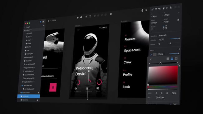
Bearne, however, notes that this trend does pose a particular challenge for agencies. “2017 has seen a plethora of tools race forth in the hope of being the ‘chosen tool’ for the industry, but simultaneously, the flood of products has become frustrating, as all have claimed to live up to huge expectations.
"This has created an issue for inter-agency working, where teams have different processes, as each was tested to discover if it could replace Sketch. The market has, in turn, become saturated with options but little guidance on how to create efficiencies.
“The launch of InVision Studio – set for January 2018 – will be interesting, as we’ll see if it can use its collaborative platform to finally bring a standardisation to the design process. What will happen to Sketch if InVision is as good as it looks? Has Photoshop’s fight for survival finally come to end?”
To learn more, read our post 30 web design tools to speed up your workflow in 2018.
06. Flat design 2.0
Flat design isn’t dying, but in 2018 it’s certainly having to learn to adapt to stay relevant, believes Morr. “This new, so-called Flat 2.0 or semi-flat design, relies on adding nuance and depth to its prior ascetic identity. How is it doing that? By indulging in a few design taboos: gradients and shadows. But don’t worry, it’s only in moderation.”
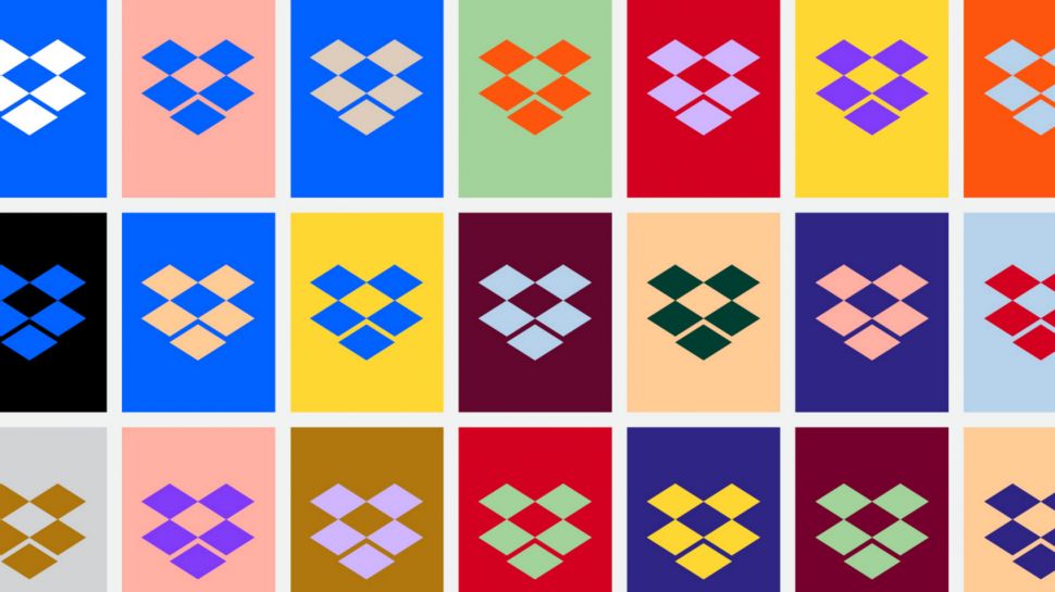
Since 2007, gradients have conjured images of corporate Powerpoint presentations, 00s era web headers, and dated logo designs. “But in 2018 they’re back, albeit evolved,” Morr continues. “Gradients are now rocking vibrant, updated colours palettes and softer, subtler transitions."
Flat design has made an impact on brands like Instagram, Stripe, and Apple’s iOS icons, as well as playing a starring role in the high-profile redesigns of companies like Dropbox and Mastercard.
"Thanks to headway made in web browser functionality, we’re also seeing a revival of shadows. Like gradients, shadows were shelved in favour of minimalism and 2D design. Realism and skeuomorphism are still out, but in 2018 designers will be experimenting more and more with updated, softened, and stylised shadows in their work.”
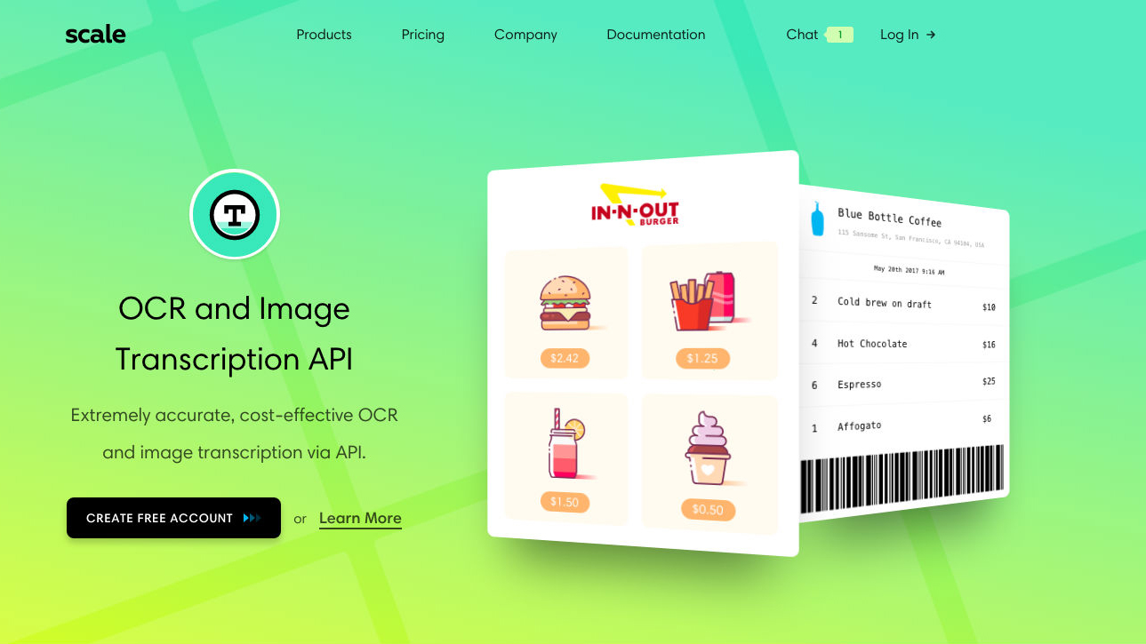
She offers the Scale website by way of example. “The interface has a strictly minimal layout, but features soft, oversaturated gradients, and makes heavy use of shadow-based micro-interactions,” she explains. “Not only are many of the clickable buttons accentuated with elongating shadows, but shadows also emphasise media and break up the page. Depth helps determine visual hierarchy, and can point users to input fields and calls to action on screen.”
Flat design was a radical departure from the skeuomorphism and hyperreality of the 00s, but has the pendulum swung too far? “In 2018, we’ll continue towards a best-of-both-worlds situation,” Morr believes, “in which clever reintroduction of shadows and gradients can add both functionality and beauty.”
07. Playful illustration
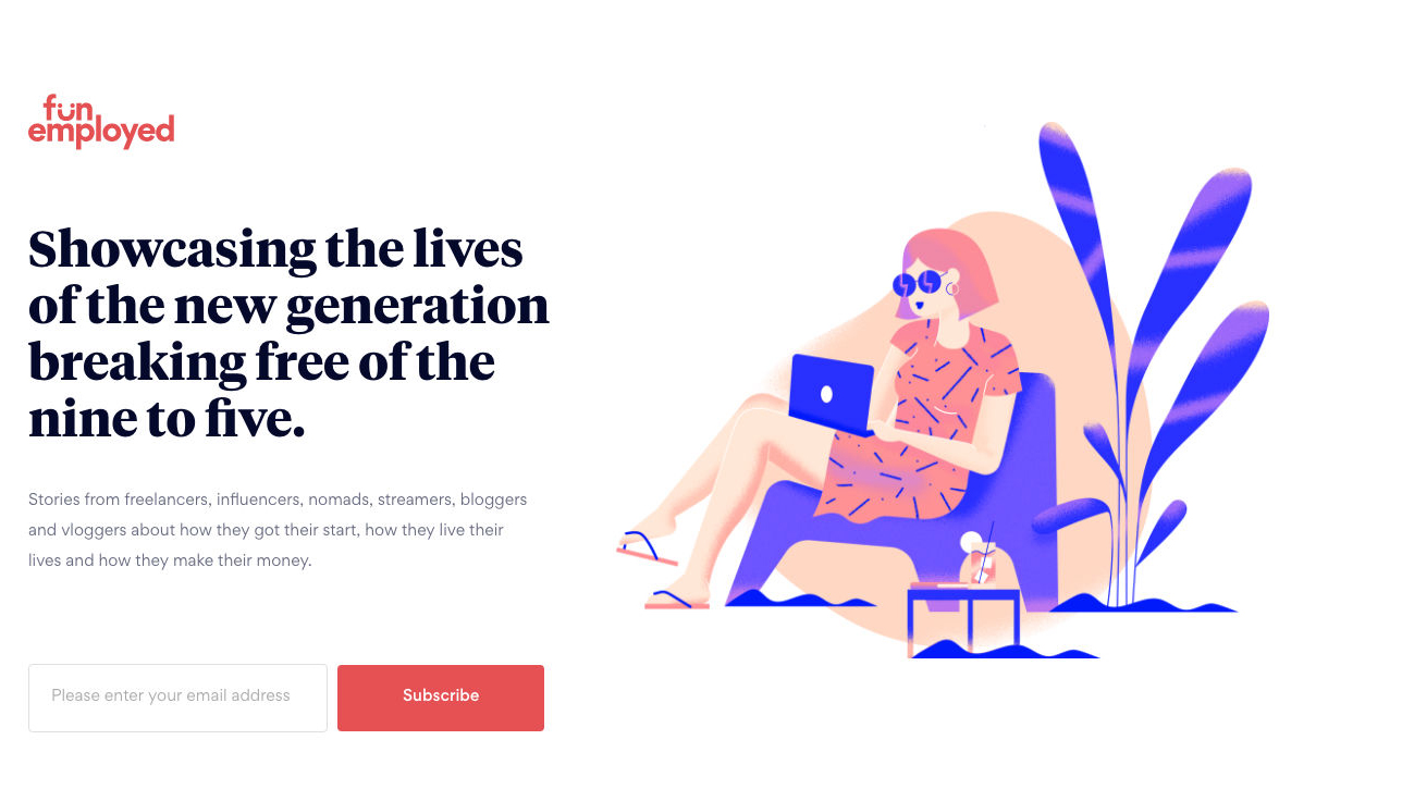
We’ve been seeing a lot more illustration on websites in 2017, and that’s no coincidence. “Brands want to stand out and illustrations are a fabulous way to inject personality into a website,” says Morr.
“They are visually engaging without getting in the way of functionality and simplicity; illustrations come in infinite shapes, sizes, styles, and are a dynamic element to look out for in 2018 and beyond. We’re learning not to neglect playfulness in the name of a straightforward user experience.”
This trend isn’t only about being whimsical, though. “Illustrations can be extremely practical ways of presenting or explaining information. Nobody wants a boring website, and custom drawings are a human touch that can breathe life into otherwise dry content.
"The marketplace is saturated and competitive, and web design needs to strike a balance between personality and functionality; illustrations are the perfect way to showcase who you are, just look at funemployed.life.”
08. The evolution of AI
Artificial intelligence is no longer a matter for sci-fi. AI has already worked its way into mainstream web design, through technologies like conversational interfaces (chatbots). Indeed, according to eBay product designer Elaine Lee, you may already be using AI in your day-to-day work without even knowing it.
As she explains in this post, what’s called ‘artificial narrow intelligence’ (ANI) is already hard at work powering voice assistants like Google Home and Apple’s Siri. It also runs recommendation technologies for the likes of Amazon, Spotify and Netflix, not to mention smart home devices, self-driving cars and chatbots.
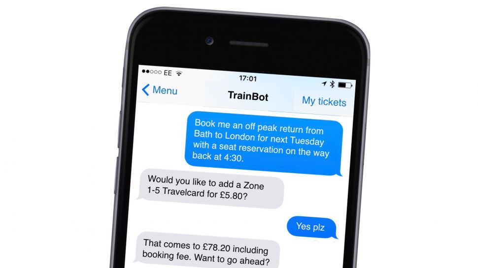
“As people become more accustomed to interacting with bots, we are seeing a rise in the use of conversational interfaces in design,” says Jim Bowes, CEO and Founder of Manifesto. “Looking forward, machine learning and AI will be introduced into many of the systems we interact with over the next couple of years.
“As a medium, design will adapt to this in a number of ways,” he predicts. “In some cases it will aim to demonstrate artificial intelligence, and sometimes design will work to make AI seem natural and invisible. I think we will see a large amount of design that will seek to demonstrate greater intelligence when, in actual fact, no true AI is being used. This will often be achieved by making better use of context in digital journeys.”
If you want to learn about creating your own chatbot, check out our How to build a chatbot interface post, How to design a chatbot experience tips and these 5 essential chatbot learning resources.
09. Asymmetric layouts
The responsive design movement of the 2010s has revolutionised web design and enabled designers to build sites that adapt seamlessly to different devices. “This year, we’ve seen an increase in designs that rebelled against the constraints of responsive design with an attempt to be more ‘creative’,” says Bearne.
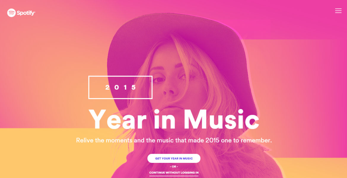
“You could almost hear the client feedback, saying: ‘Can it be less boxy’, and designers responded.” New technologies meant that in 2017, the traditional rules of web design were getting broken left, right and centre.
But Bearne suggests the trend is approached with caution. “Designs that pushed limits in asymmetry really came to the fore in 2015,” he notes. “In that year, Spotify used an asymmetrical design to deliver its ‘Year in Music’. It felt right in that situation, and added to the creativity and bold character of the brand. Unfortunately, its most basic form has started to become a normal approach and has made its way onto more websites, and not necessarily for the better.
“What has been highlighted in 2017 is a drive to constantly differentiate and break away from rules. Good designers accept rules; they like them, they work with them. But they also find ways to push them and to create new ways of presenting content. It’s something I hope continues into 2018.”
10. Making the most of mobile
2017 was a landmark year for the mobile web, as its usage finally overtook that of desktop browsing. And that means web designers will be more focused than ever on the mobile audience next year and beyond.
“As we move into 2018, I expect innovations to fully utilise mobile functionality we’ve never seen on the desktop,” says Morr. “2018 will continue to see designers develop clever ways to organise information beautifully and intuitively, leading to more sophisticated user experiences, with focuses on micro-interactions and gestures over icons and buttons.
"Simply put, intuitively navigable sites convert better; G-Star has put this into practice extremely well.”
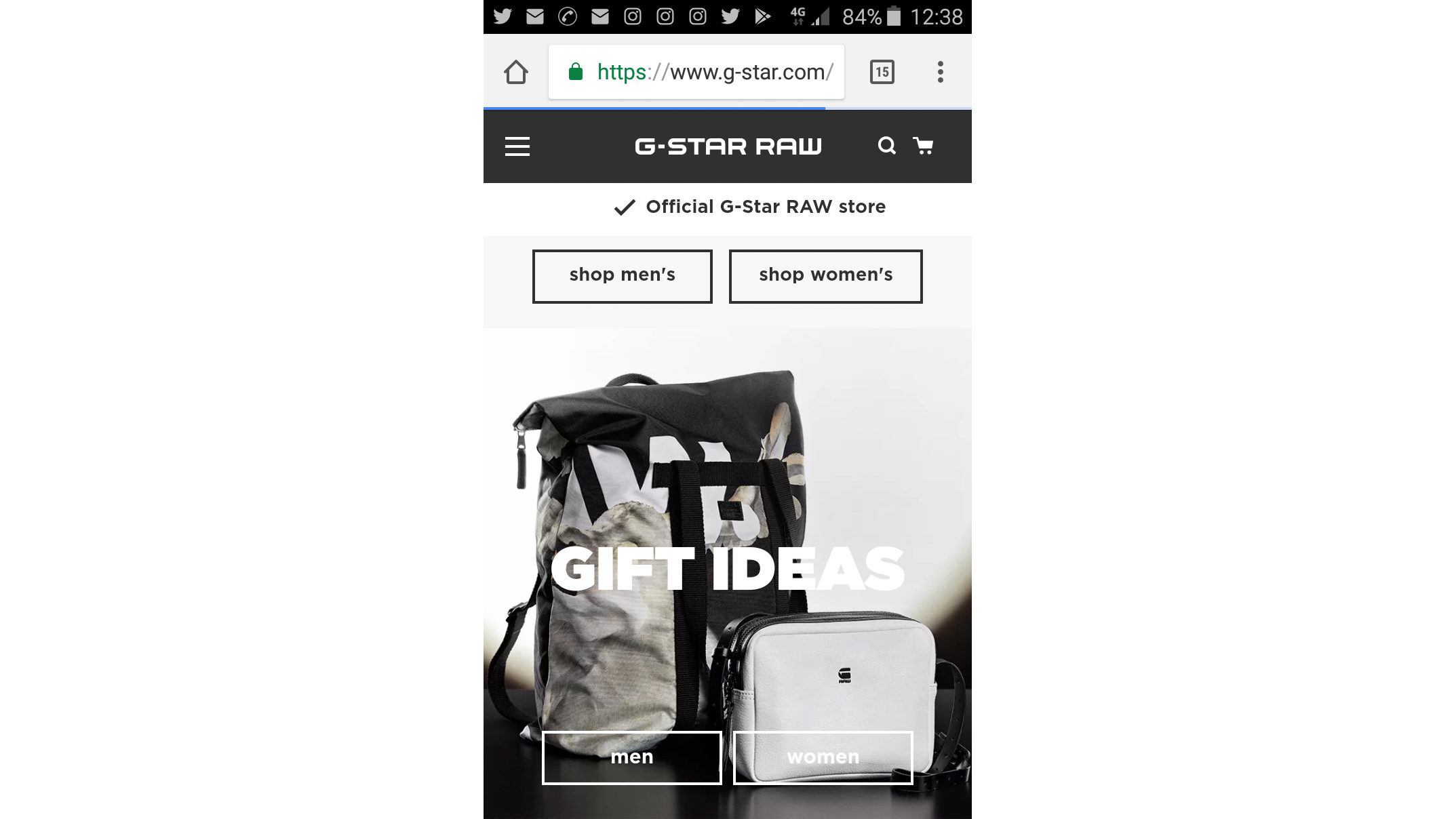
Lopez offers a specific example of how mobile-first is not just an airy principle but something that needs to be baked into the core design process. As we mentioned earlier, animations are now more and more present in web design – “but sometimes, it’s too much. There’s a danger of overdoing it and relying on motion to define an experience.
"Designers need to consider how mega animations and transitions are going to translate into browsers and devices like mobile, where there’s no hover states and content needs to adapt to reduced screen sizes.”
Check out these 10 tips for better mobile UX design to learn more.
11. Kinetic emails
“This has been the year that, in the UK at least, people finally moved on from just making their emails mobile-responsive and started looking at what comes next,” says Rob Pellow, head of digital design at Adestra.
“In fact, while there are still brands that come to us to ask about making their campaigns and templates mobile responsive, nearly all of them are asking the question: ‘What else can we do?’”
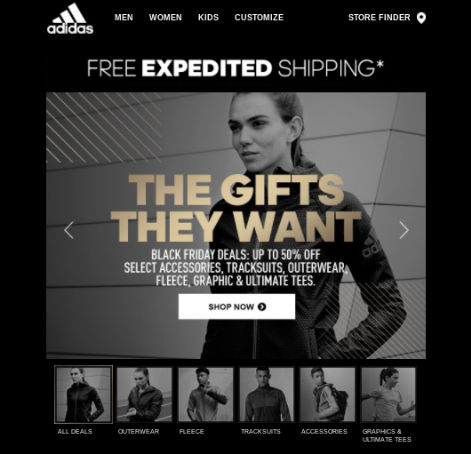
It’s been the first year, he says, that Adestra has seen regular use of ‘kinetic’ emails: using CSS3 and HTML to create interactivity within an email. This trend stems from the fact that users are so comfortable with the UI language of mobile apps and websites, they’re happy to see it in other places, including email.
“With these new opportunities have come the first steps towards treating a single email campaign as a journey in itself; B&Q treated us to another impressive carousel that worked in more email clients than ever before, Litmus gave us the ability to have a basket process in its summit email and Rebel (formerly Rebelmail) is now selling the ability to complete the whole checkout process within the email – the only web page you see is a confirmation page at the end.
"This is starting to change what email means to people because, if we can deliver these sorts of experiences here, we can combine these things with a level of personalisation that websites can only dream of. Who says email is dead?”
12. Ecommerce boom
Black Friday. Cyber Monday. What next? It's the trend that's only going to get bigger and bigger next year as more and more clients explore the possibilities that a strong ecommerce platform offers.
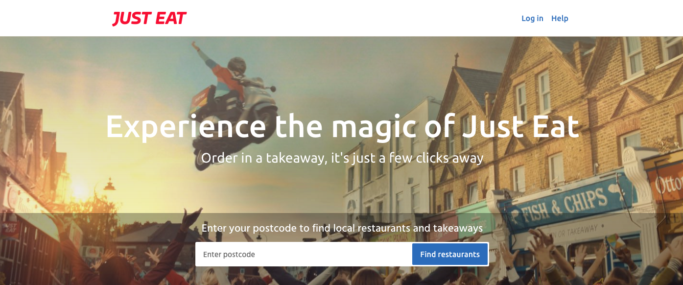
Owner of Dowson Design Co, Christopher Dowson, explains: "We are consumers by nature. We always need more things... and the internet is full of things. Sites like Deliveroo and Just Eat own no restaurants, but can bring almost any food right to our doors. Amazon owns no shops but we can have almost anything delivered next day. We're only just beginning to see the possibilities of ecommerce now we are moving away from the traditional storefront-on-the-web business model."
As well as getting a kinetic upgrade, email will continue to play a huge role in ecommerce strategy. "It's easy to track, easy to trigger and crucially for 2018 and onwards, much easier to personalise, and I'm not just talking about putting a name in a template," Dowson says. "Your shopping habits will inform the type of emails you receive – tailored to include products you are more likely to buy. Even cart abandonment emails – a godsend for any retailer – will be triggered to get to you at the time you're most likely to be receptive to completing the order. All based on how, when and where you shop."
As always, your customers will be key, and removing waiting times will be a big consideration, especially for the world's biggest brands. "We're already seeing Amazon delivering in hourly slots in key locations," says Dowson. "The culture of instant gratification will continue to permeate retail as an industry, so expect some delivery wars between big retailers – and take advantage of them!"
Apart from email, expect ecommerce in social media to become the norm. As Dowson explains: "Facebook is gradually rolling out the ability to buy items through Messenger, and some traditional bricks-and-mortar retailers are even offering a personal shopper experience through FaceTime and Facebook Live. You can now buy your drinks and have them delivered to your table at certain pub chains, which has knock-on effects you might not have even considered – namely, more time with your friends."
For a more web design trends to look out for in 2018, pick up net magazine issue 302 – on sale now.
Related articles:

Thank you for reading 5 articles this month* Join now for unlimited access
Enjoy your first month for just £1 / $1 / €1
*Read 5 free articles per month without a subscription

Join now for unlimited access
Try first month for just £1 / $1 / €1

Tom May is an award-winning journalist and editor specialising in design, photography and technology. Author of the Amazon #1 bestseller Great TED Talks: Creativity, published by Pavilion Books, Tom was previously editor of Professional Photography magazine, associate editor at Creative Bloq, and deputy editor at net magazine. Today, he is a regular contributor to Creative Bloq and its sister sites Digital Camera World, T3.com and Tech Radar. He also writes for Creative Boom and works on content marketing projects.
