Once upon a time, the word ‘automation’ conjured mainly negative connotations in the mind of the professional web designer. It made you think of programmatic web design tools that generated cheap but badly coded sites for those who couldn’t afford the services of a professional designer (unlike the new generation of website builder). Or perhaps the sort of basic service you yourself would offer a cash-poor client, using a pre-built WordPress theme or Drupal template.
- Main illustration: Marcus Faint
But all that is changing. The automation of web design is not just important to clients at the lower end of the food chain. It’s increasingly relevant to those at the upper end too. That’s because in a world where the biggest companies are increasingly design-driven – think Airbnb, Uber or Deliveroo – the digital services needed to keep today’s global consumers happy now far outstrip the capabilities of a single designer or small team crafting individual, bespoke pages.
And as clients demand bigger and more complex solutions (if you've got a complex site, you need web hosting that can keep up), there’s been a rise in the popularity of component libraries and design systems, bringing an element of automation into the design process and helping it scale.
If you’re a small web shop working mainly for small businesses, this may not have impacted on you… yet. But with no way of knowing where your clients, your career or indeed society as a whole is going next, it’s still a trend we all need to know about. So we’re examining where the automation train is heading and when might be a good time to jump on board.
Pattern libraries
The simplest form of automation in web design is the pattern library. Also known as the component library or pattern language, it’s essentially a collection of reusable UI elements that make up a website. These may include, for example, form inputs, buttons, spans, navigation bars, image sliders, related links and social-media features.
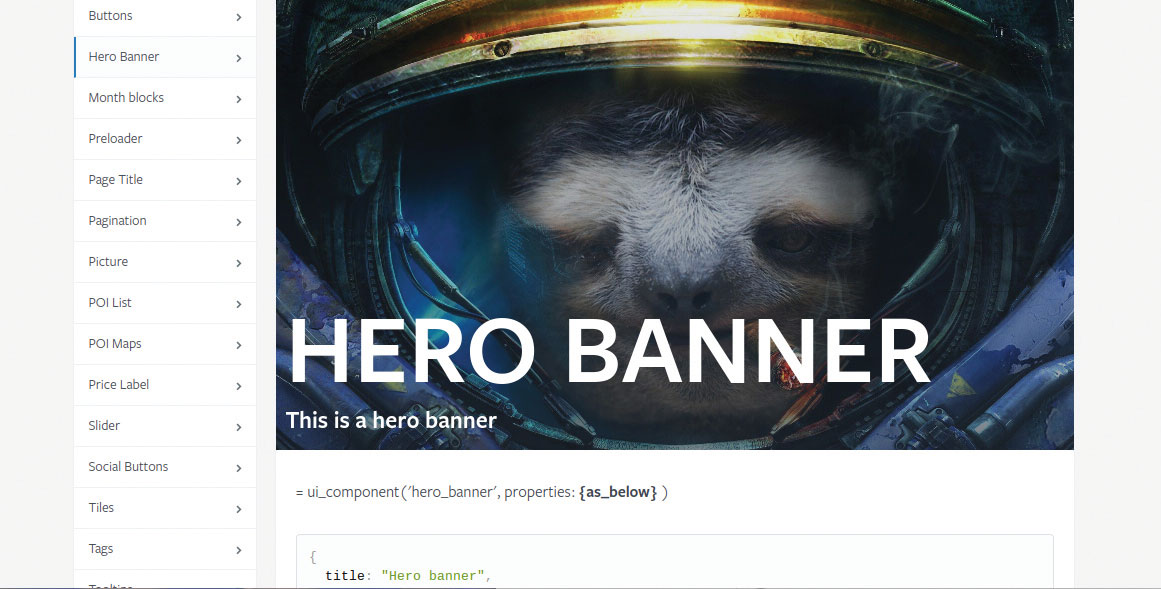
A pattern library defines what all these elements look like, along with how they function and also how they are coded. Some good examples to examine include those of MailChimp, Lonely Planet and also A List Apart.
But just because pattern libraries are trendy doesn’t mean you should necessarily use them. “I’d say that if you only have one website and one set of components, a pattern library might be overkill,” says Andy Budd, co-founder and CEO of Brighton-based UX consultancy Clearleft. “If you’ve only got two or three designers, they talk to each other well and you keep all your documents in a nicely structured Sketch or Photoshop file, really you don’t need to have one.”
Get the Creative Bloq Newsletter
Daily design news, reviews, how-tos and more, as picked by the editors.
If you only have one website and one set of components, a pattern library might be overkill
Andy Budd, Clearleft
Cellyn Tan, digital product designer at London digital consultancy Red Badger, concurs. “We make use of both pattern libraries and design systems to varying degrees,” she says. “However, how far we’ll go in systemising and maintaining a user experience is really based on what the project’s priorities are. In a relatively small product team, maintaining a set of design principles, consistent typographic hierarchy and colour schemes is manageable purely with well-organised files and conversations.”
Implementing a design system across a team? Decent cloud storage will help things stay cohesive.
For Daniel Smith, CEO of Bournemouth-based digital marketing agency Fireworx, striking this balance is about meeting the needs and expectations of clients. “With some companies we work for, everything is bespoke on their platforms and so automation doesn’t play a massive part; it’s very much a tailored solution,” he says. “I’ve always looked at it that you’ve got a suite of tools as an agency and what we want above all is to deliver the best outcome for a client.”
For some projects, though, creating a pattern library can provide powerful benefits. Removing the need to create elements from scratch, over and over again, means that the more your operations scale, the more consistency you can provide to users, the less repetitive your design work gets and the more productive – in theory, at least – your operation becomes.
That’s certainly what digital agency Masters Allen has found since shifting to a more automated approach, says senior developer Tim Jarram. “We now keep a familiar code base across all our websites, one we can work with quickly and efficiently,” he says. “And as a result of this, we’ve found that we have been able to work smarter and provide a clearer, more effective design and build process for our customers.”
Design systems
Although the term ‘pattern library’ is often used interchangeably with the terms ‘design system’ and ‘style guide’, there are important differences between them. In a nutshell, a style guide defines the basics of a user interface, such as colours and typography; the pattern library is a storage system for its components; and the design system explains how these two parts connect up and work together.
There’s no hard and fast rule, though, as to what a design system must contain or do. “A design system is a bit like a brand,” explains Craig Frost, design lead at Pusher, a specialist in real-time technologies based in London.
“A brand isn’t just a logo: it’s a broader, more squishy thing. And I think a design system is a broad, squishy thing too. Whether you’re designing a piece of software, an API, an interface, a piece of content or whatever, a design system allows you to figure out how you communicate your ideas and then solidify them in a way that makes them easy to teach to others.”
Tooling up
However, creating your design system is only one step on the road to automating your web designs. The next is to find a tool to help you manage, curate and centralise these systems. Many teams create their own but you may just want to use an off-the-peg solution, such as Fractal.
This is a tool that Clearleft created for its own internal purposes, which it has since made available to the community as a free and open-source download. It not only enables you to build component libraries for your web projects but it also gives you the ability to create integrated documentation, plus a full-featured API to assist devs to then integrate these libraries into their tools and production builds.
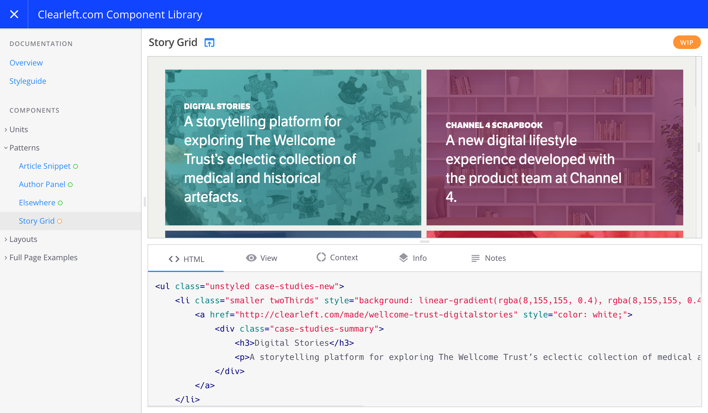
“Fractal is that central source of truth that everyone around the organisation goes to; it’s where all your documentation is,” explains Budd. “It’s where you’d say, for instance: ‘Here’s what a button looks like, here are five button styles and here is the code for each. And these are our three layouts.’ It’s that central storage space. For anyone who’s got a design system, you want something like that.”
How exactly you go about integrating your design system into your workflow will depend on the scale of the project and the technologies you’re using. But one thing’s for sure: there’s a great deal of innovation in this space right now and it certainly pays to look around for the best tool for the job.
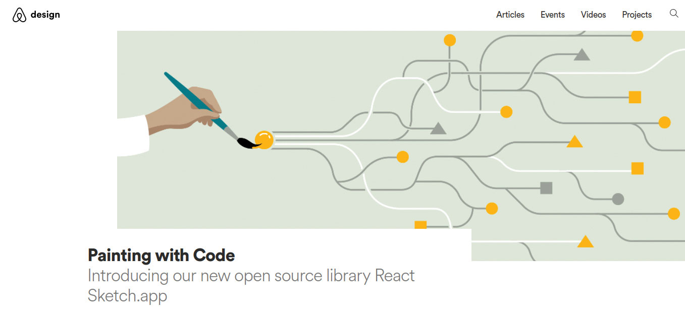
There’s a lot of buzz, for example, about the React Sketch app released by Airbnb’s design team: an open-source library that enables you to write React components that render to Sketch documents. Designed for teams working at large scale, you can learn more about the app in this blog post.
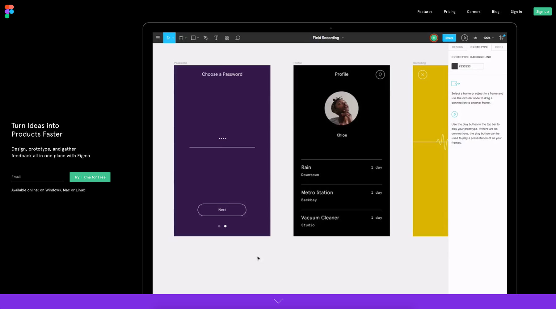
Meanwhile, Frost is excited that browser-based design tool Figma has opened up a Read API, with a Write API in the works. “You can build some cool things with the Read API,” he says. “For example, if you have a set of icons in Figma, you can edit them there, build them out and then have them version controlled in GitHub. What we’re really excited about, though, is doing things the other way round, using the forthcoming Write API.”
It’s easy for things to change during the build process and for that not to loop back to the design tool... For that reason, we’re thrilled about the prospect of having our source of truth not being a design tool
Craig Frost, Pusher
Given how this will enable designers to update their design systems as things evolve during the development process, Frost’s enthusiasm is easy to understand. “In my experience, while design tools are useful for exploring loose ideas and getting where you need to go, they’re not that good at maintaining that position,” he says.
“It’s really easy for things to become out of date, change during the build process and for that not to loop back round to the design tool. So what grows over time is inconsistency and a breakdown in communication: all the things that eventually lead you to look back in a couple of years and wonder what went wrong.
“For that reason, we’re thrilled about the prospect of having our source of truth not being a design tool. To use the latter for what it’s best at – being a whiteboard for throwing around ideas – but to keep those solid ideas about that system and all the things that it embodies out there in code, in a place we can version-control, look at and build on.”
DesignOps
Component libraries, design systems and the tools aimed at implementing them into your workflow are all helping web designers to automate their processes. But when you reach the scale of a global giant, you need something more. Step forward, DesignOps.
“In the last two or three years in the UK and in the last five or six in the US, a lot of design teams have gone from being relatively small and under-resourced into quite big, powerful units,” says Budd. “Five or six years ago when Jeff Veen and Doug Bowman were the first designers at Google, there was no need to worry about how to be effective and optimise performance. But jump forward to now and such companies have hundreds, even thousands of designers. So you need to think about how you utilise these skills.”
That thinking is cohering around a new movement called DesignOps, put forward by the likes of Kristin Skinner, executive design management champion at Chase, and design coach Dave Malouf. Well, kind of new, that is.
“DesignOps is the evolution of what we previously called design management,” says Stu Collett, founder of Super User Studio, a digital product and service design consultancy based in London and Bath. “In a nutshell, it’s about bringing optimisation or design thinking to an operational level. It facilitates cross-functional collaboration within an organisation and establishes a framework for working with efficiency and at pace.”
You might say, then, that DesignOps is like a design system on steroids. Or as Collett puts it: “In the same way that UX bleeds into service design, design systems start to bleed holistically into design operations.”
In the same way that UX bleeds into service design, design systems start to bleed holistically into design operations
Stu Collett, Super User Studio
That starts to happen, Budd says, when you reach a certain size. “If you’re a six-person team, you don’t need DesignOps,” he explains. “If you’re a 40, 50 or 60-person team, that’s probably when DesignOps starts being important. And if you’ve got a design team of about 250, I wouldn’t be surprised if you wanted six, eight or 10 people in your DesignOps team, doing loads of different tasks.”
In practice, he’s found that DesignOps often comes into play when an organisation has got lots of junior and mid-level designers and they’re all overwhelmed with work. “That’s what we’ve seen happen with some tech companies in San Francisco,” he explains. “And whatever happens in the States always happens in the UK three, four or five years later. So while DesignOps is still new to us Brits, it’s definitely coming to our shores soon.”
How soon it will be relevant to the company you work at or consult for depends largely on how ambitious they are, says Collett. “It’s most relevant to large enterprises but we’ve also worked with startups who are focused on this kind of thinking from the onset,” he says. “This is often due to aggressive growth plans and the relative uncertainty of their futures. Working with this kind of rigor mitigates against creating a monster (from an ongoing maintenance perspective) and enables them to be responsive and scale consistently as they grow. For smaller teams, it’s generally not so important; you can probably get away with creating a simple design repository and not overcooking it. But if your plan is to be a 200-person company in year three, it’s very relevant.”
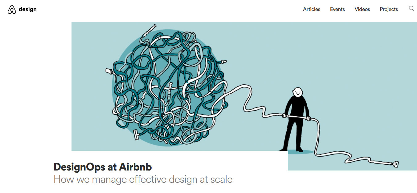
So what does DesignOps consist of exactly? Firstly, like its namesake cousin, DevOps, there is a technical element to it. “It’s partly about figuring out the tools and technologies you need to get designs from designers’ minds into the hands of the user as quickly as possible,” says Budd. “One way to do that is through these design systems, pattern languages and code libraries – and I think that’s the thing that people get initially fixated on and fetishise. But that’s not all that DesignOps is.”
Where DesignOps differs from DevOps, he explains, is that it’s also focused on the human, ‘soft skills’ you need to grow a design team. “It’s about making sure you’re promoting your design teams externally so people know what you’re doing – so there’s an element of comms. There’s also an element of HR because you’ve got to make sure you’ve got a really good recruitment process. A lot of design leaders are having to hire very large numbers of people very quickly, so having a DesignOps person working with HR to ensure that both hiring and onboarding is smooth is very important.”
DesignOps is about making sure you’re promoting your design teams externally so people know what you’re doing
DesignOps also looks at internal processes, he adds. “It asks: when do you have meetings, what kind of meetings do you have? How do you structure your organisation, where do designers fit? Are designers part of the design team or are they part of product teams? Who looks after their growth? Who judges them on their abilities? How do you decide when you give that person a raise? How do you manage other people in the organisation and make sure that when new product ideas are created, there’s a good, robust system for managing new products? And that obviously touches into product management as well.”
Spelled out in this way, DesignOps might sound like a major commitment of time, effort and money that you might find a little overwhelming. And in truth, you wouldn’t be far wrong. “Many larger organisations struggle to establish effective DesignOps,” admits Collett. “It’s tough getting disparate functions or teams to share new ways of working, to establish its importance against BAU tasks of the time and converging this in a way that works for the core business.”
Tough or not, DesignOps is here to stay and as digital companies become bigger and more complex, only those who take it seriously will survive. “Larger organisations or ambitious startups ignore DesignOps at the risk of facing problems with resourcing, workflows and systems, all of which impact their ability to scale, [respond] to market demands and remain competitive,” he concludes.
This article was originally published in net, the world's best-selling magazine for web designers and developers. Buy issue 307 or subscribe.

Web design event Generate London returns on 19-21 September 2018, offering a packed schedule of industry-leading speakers, a full day of workshops and valuable networking opportunities – don’t miss it. Get your Generate ticket now.
Read more:

Thank you for reading 5 articles this month* Join now for unlimited access
Enjoy your first month for just £1 / $1 / €1
*Read 5 free articles per month without a subscription

Join now for unlimited access
Try first month for just £1 / $1 / €1

Tom May is an award-winning journalist and editor specialising in design, photography and technology. Author of the Amazon #1 bestseller Great TED Talks: Creativity, published by Pavilion Books, Tom was previously editor of Professional Photography magazine, associate editor at Creative Bloq, and deputy editor at net magazine. Today, he is a regular contributor to Creative Bloq and its sister sites Digital Camera World, T3.com and Tech Radar. He also writes for Creative Boom and works on content marketing projects.
