Vivo is Sony Animation Pictures' upcoming animated musical, and the trailer has just dropped (see below). Netflix has also announced a release date of 6 August, so there's not too long to wait to watch the whole movie.
When you mix the talent behind The Croods, Spider-Man: Into The Spider-Verse, and Hamilton into one animated movie, you’d imagine a creative spectacle will result, but Vivo is something else: it's like a love letter to animation. It's also Lin-Manuel Miranda's first animated musical, and it's pitch perfect.
The movie follows adorable honey bear Vivo from Cuba to Miami as he delivers his friend’s last and greatest song to a former lover. It’s a road movie that celebrates Cuban music and culture across the decades, and every musical number stylistically recreates a different era of animation.
Watch the trailer above, and read on to find out more about how the film was made. If you want to know more about the world of animation, then don't miss our guides to the best animation software, top digital art tools and Disney's 12 principles of animation.
Vivo celebrates the rules of animation

Production designer Carlos Zaragoza reveals three main sources of inspiration were used to bring Vivo’s journey to life. “The first one is the stage design, the design, and the staging. The sense of the staging, and also finding a musicality in the way you design the architecture, the architectural detail, the railings in Havana, and the way we orchestrate how everything is laid out in a shot," says Zaragoza.
The second inspiration was a series of vintage graphic travel posters from the 1950s and 1960s. “That sense of vibrancy in the colour […] How to portray that, how to use them in our movie and still make it believable, and real for the characters,” explains Zaragoza. (See our top poster designs for more poster inspiration.)
The third main motif used throughout the whole design of the movie is juxtaposition. Zaragoza says: “In this case, the juxtaposition of the classic versus the contemporary.”
Get the Creative Bloq Newsletter
Daily design news, reviews, how-tos and more, as picked by the editors.
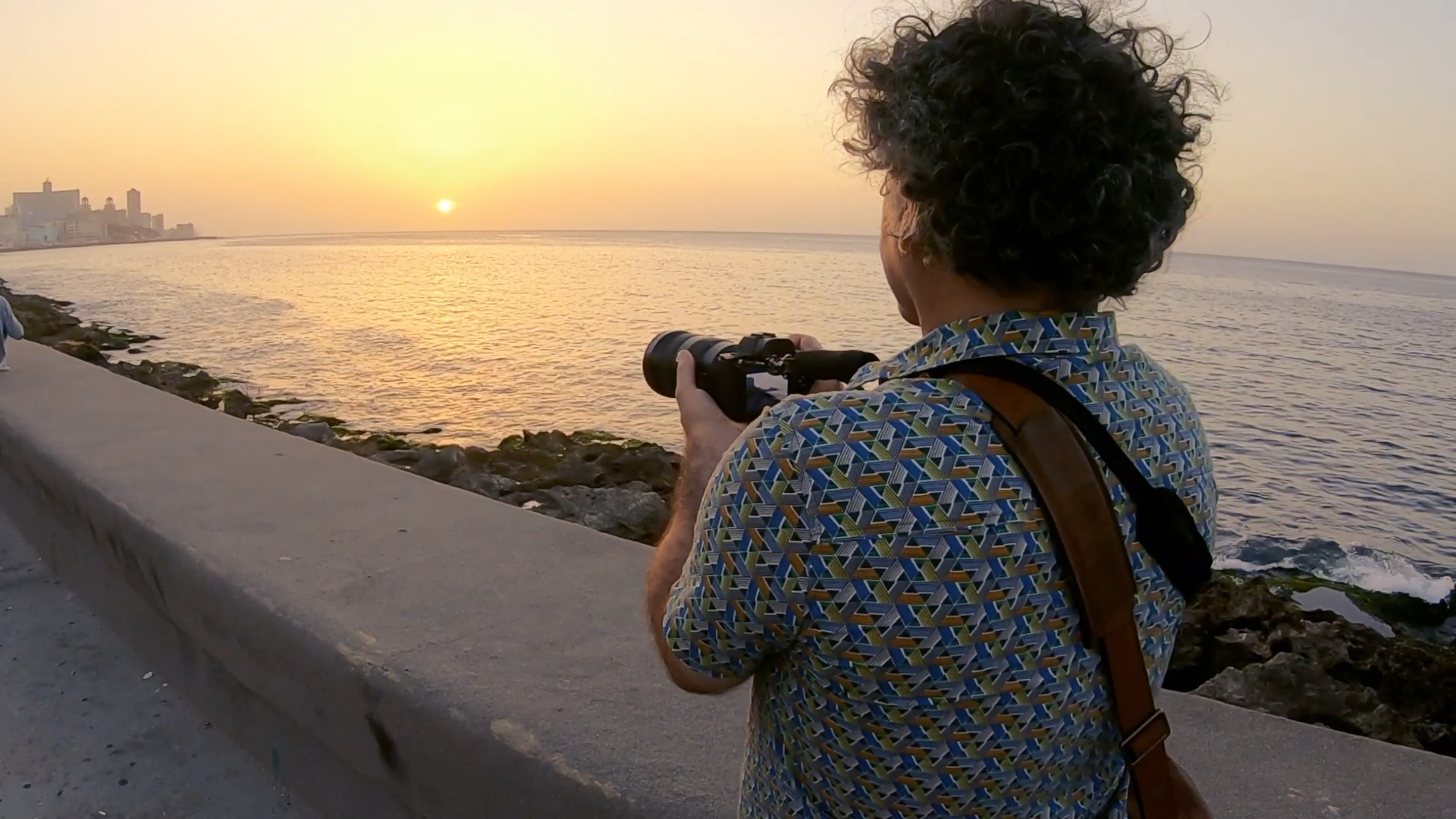
On location in Havana

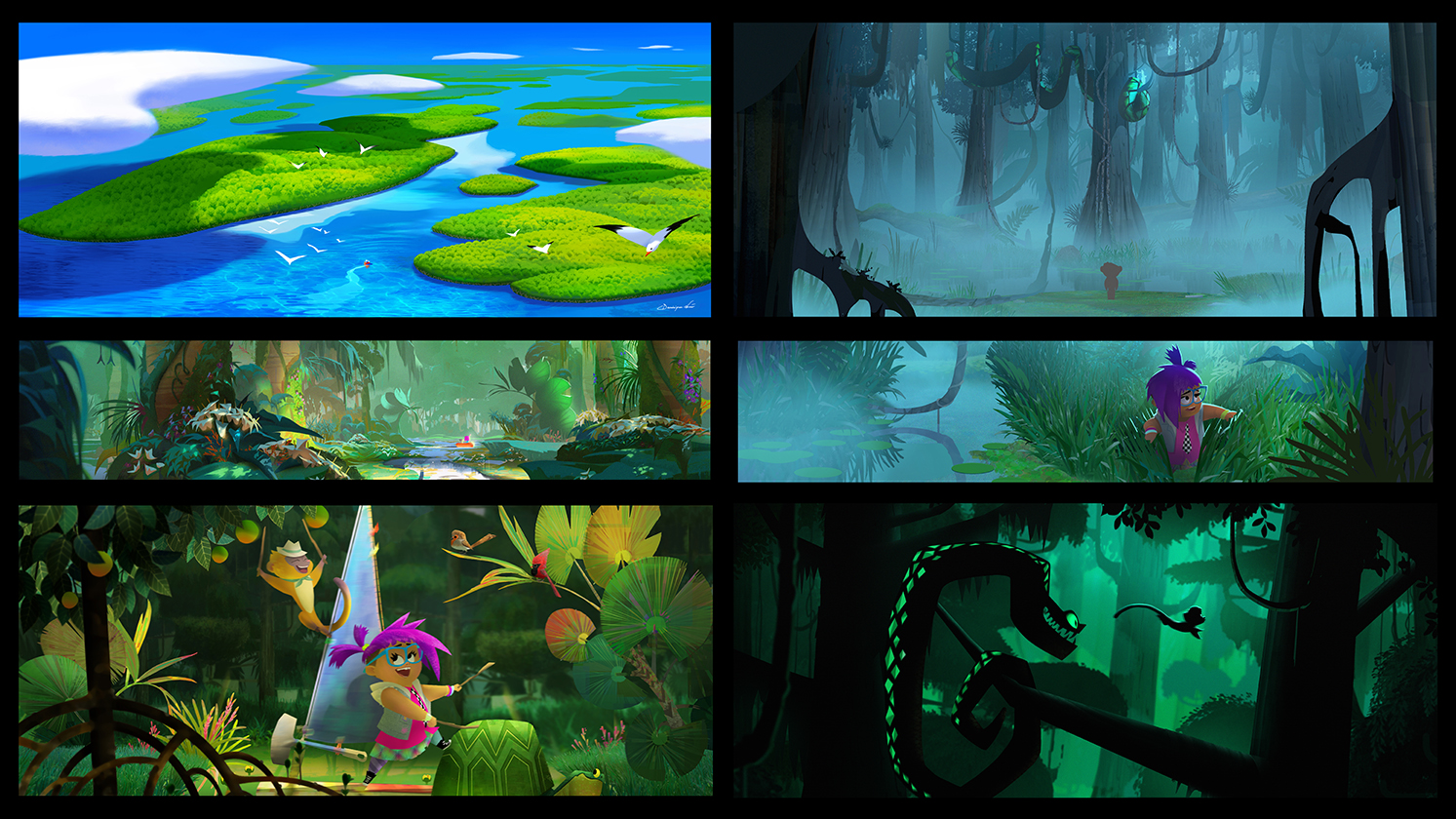
There are four main locations in the movie, Havana, Key West, the Everglades, and Miami. Zaragoza says each has its own personality in the movie.
“Each of them has its own colour palette and shade language. Havana and Miami are like the two sides of a mirror looking at each other. But Havana is the classic, and Miami is like Havana on steroids. We wanted to create something that feels more theatrical. Think of it more like an opera set but infinite.”
It meant the team set off on location visits to draw out the character of each place in line with the three tenants: staging, retro aesthetic, and contrast. They met local architects, musicians, and nature experts, who aided their research.
Developing a playful graphic approach

“One of the things that Carlos and I wanted to explore with the look of the picture for Vivo was the level of detail,” says art director Wendell Dalit. “Looking at our inspirations from the vintage travel posters and musical theatre stage design, we noticed that the artists depicted the backgrounds in a more graphic and simple way.”
The art team created test images to transfer the 2D graphic approach of the old posters into 3D. They even developed a new tool that distorted the backgrounds of their 3D images to emulate the brush strokes of vintage theatrical posters.
“[This] helped to give our sets the feeling that they are a hand painted backdrop, much like you would see in musical theatre. This really gave our characters a stage to perform and showcase their animation,” says Dalit.
Painting the world of Vivo

In the movie we can see how the details of Havana’s skyline fall away rapidly and become more graphic the further in the distance they go; the brush stroke tool renders materials to look painterly.
The colour palette is used to convey emotions and give each setting, or stage, a unique feel too (find out more about using colour with our colour theory guide). While Havana is bright and colourful, painting in orange and pink muted pastel tones, Key West shifts to stark blue and green. The graphic quality remains, and when Vivo reaches Miami the team turn everything up to eleven with vibrant neon colours and angular, graphic architecture. Havana was old and welcoming, Miami is modern, harsh and exciting.
Dalit explains: “We’re pushing the graphic quality in our shapes and architecture here. This is the final destination for our characters’ journey. It’s the Emerald City of our movie.”
Crafting the musical sequences

Where everything truly gels and tips over into a celebration of animation as an art form is in the film’s musical sequences. A number stand out, but Mambo Cabana and My Own Drum demonstrate the three motifs of the film – staging, vintage graphics, and juxtaposition of styles.
“We want to express what’s going on emotionally inside our characters, right? But in Mambo and My Own Drum, those emotions go beyond the real-tho-they go beyond the range,” says Zaragoza.
He adds: “So, we wanted to find the right tone to portray that, right? To support that visually. In Mambo Cabana, it’s about Andres bringing Vivo into his illusion, his dream of going to Miami. And this [is a] Miami he’s never visited. So, he’s building this imagined Miami and Havana out of his imagination, looking at the posters, and the illustrations, and the record cover from the 1950s.”

What this means in Vivo the movie is switching the visual style from 3D to a 2D vintage look that recalls the heyday of jazz infused UPA Animation MGM cartoons.
“Everything is feeling like an illustration in motion,” says Zaragoza. “We got inspiration early on from the mid-century, the glamorous mid-century illustrations from music record covers and posters. And also, from different explorations that we were doing in terms of how to portray music. And music is one of the most abstract arts, right?”
He continues: “We were looking at the early-to the avant-garde animation like Oskar Fischinger. We explored those aspects, non-real animation. And we want to make it feel also believable for these characters to be in this world. So, even the characters that you can see. They look like illustrations but they’re coming to life. Everything is growing and dancing as they move around.”
Read more: The best animated music videos
Making Bang My Drum

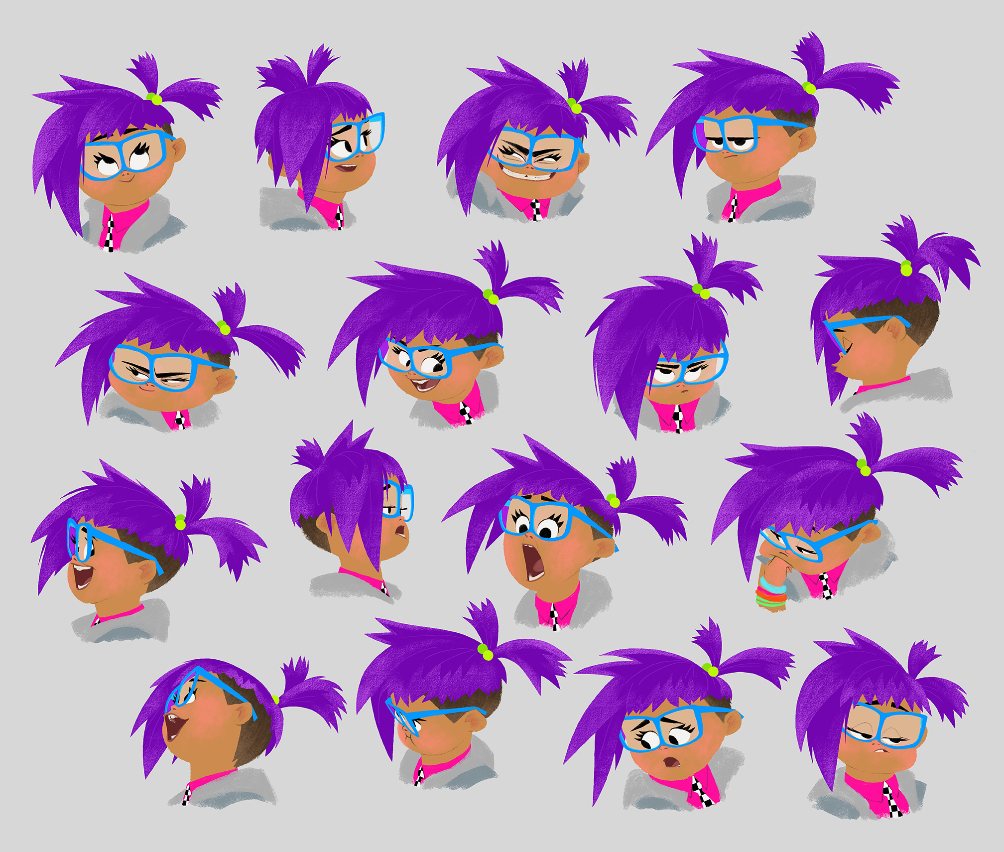
At the other end of the design spectrum is the sequence for Bang My Drum. This is Gabi’s song. She’s a rebellious tween who loves rap and punk. She’s modern and brash. “This gave us a fun opportunity to bring some of the real-world elements to life in the fantasy sequences,” reveals Dalit.
Looking closely at the design of Gabi’s bedroom Dalit shows how the art team laid the groundwork for what would become the Bany My Drum musical sequence.
He explains: “The checkerboard pattern on the rug mimics the lightbox room that kicks off the sequence. The chalkboard wall on the right-hand side hints at her drawings coming to life in the chalk world. And even her stuffed toys become the giant, inflatable balloons that march towards Vivo. My Own Drum is really the contemporary counterpart [to Mambo Cabana]. My Own Drum is really a showcase to Gabi’s character.”

The sequence is Gabi’s way of drawing Vivo into her world. It’s inspired by video games, music videos, and motion graphics. It’s a wild piece of animation that draws on all of the team’s talents to mix 3D and 2D, collides brash colourful graphics (marching bands, confetti, and a 90’s abstract graphic aesthetic that celebrates Photoshop 1.0) with withdrawn elements – at one moment the world turns to chalk textured lines to stall the party and pull on the heartstrings.
“We thought this gave her personality a little bit more depth. And it was a fun opportunity to create another unique look for this sequence,” says Dalit. “Throughout My Own Drum, you’ll notice the use of 2D graphics. I love how Sony’s last films, like Spider-Verse and Mitchells, incorporated 2D with 3D. And we wanted to continue that exploration and to help create a unique and fun visual look for My Own Drum.”
For more animation insights subscribe to ImagineFX, the world's best-selling magazine for digital artists. Buy it here.
Read more:
- How to get an animation job
- The best 3D modelling software
- 11 top animation tools for digital artists

Thank you for reading 5 articles this month* Join now for unlimited access
Enjoy your first month for just £1 / $1 / €1
*Read 5 free articles per month without a subscription

Join now for unlimited access
Try first month for just £1 / $1 / €1

Ian Dean is Editor, Digital Arts & 3D at Creative Bloq, and the former editor of many leading magazines. These titles included ImagineFX, 3D World and video game titles Play and Official PlayStation Magazine. Ian launched Xbox magazine X360 and edited PlayStation World. For Creative Bloq, Ian combines his experiences to bring the latest news on digital art, VFX and video games and tech, and in his spare time he doodles in Procreate, ArtRage, and Rebelle while finding time to play Xbox and PS5.
