How to unify your UX across platforms
Discover how to make a seamless UX across various devices.

In web design we’re boxed in to, well, websites. Our focus is very myopic. Our goal is to distil all the pain points in conversion and then improve upon them. But web design doesn’t just live on a desktop or mobile device anymore. It lives on all sorts of things, from smart watches to televisions, virtual reality to gaming consoles.
This forces us as professionals to take a step back, look at the complete user flow of a customer and try to understand why they choose to use a certain device. To help better understand how customers use a device a little user testing is needed.
Customers now experience brands and products on-demand and in the way that works best for them as individuals. But a brand experience is larger than the platform in which it’s experienced. When you build consistent experiences users attribute that to your brand – that establishes loyalty. They don’t really care how you built it or how it works. All they care about is how it impacts upon them personally. If you care about building the perfect site, check out our list of web builders.
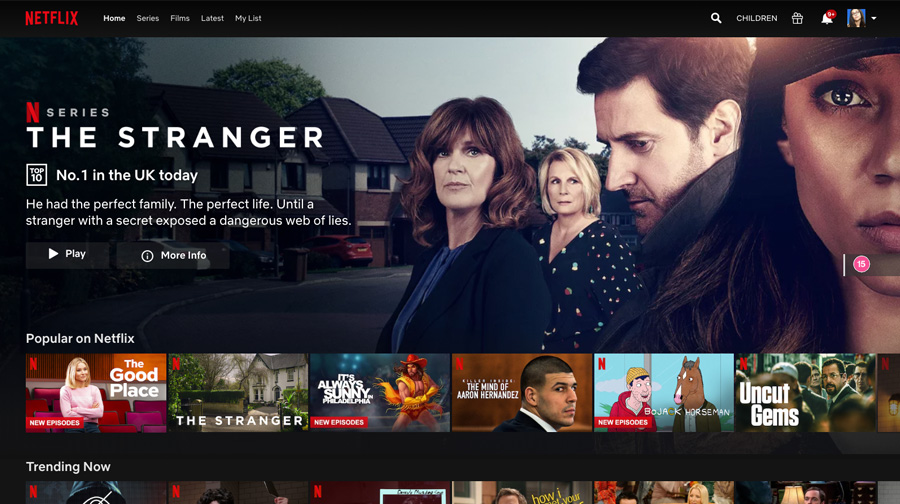
To get a better understanding of cross-platform UX and brand consistency, we are going to focus on Netflix and why it has become such as success. One big reason is that it removed the barrier of only being able to consume the content you wanted in a specific place. Now you can watch a movie wherever you are.
Consistency is a key to success
In 2013, Netflix launched a redesigned user experience that established a consistency of interaction whether you were accessing the service on a video game console, Roku device, tablet, phone and just about everything else that connects to the internet.
Up until that point, each device had a different user experience meaning customers had to learn how to use the service again when on a different device. Netflix had backed itself into a corner surrounded by speed bumps and each speed bump was a point of mental friction for users just trying to enjoy the product.
A redesign of its service may seem like a straightforward decision but at that time Netflix users were watching more than 5 billion hours of video per quarter and it had 44.35 million subscribers worldwide. Users do not like change (they want you to be as reliable as the best cloud storage options) – even if the result is generally better for them. That antipathy intensifies when they are paying you for access.
Get the Creative Bloq Newsletter
Daily design news, reviews, how-tos and more, as picked by the editors.

Making the decision to potentially impact customer satisfaction negatively was likely not an easy one for Netflix. After all, large companies are very risk averse, as one wrong step can derail years of hard work. However, when doing the cost analysis, its probable growth looked to outweigh the potential negative implications in various ways. The reduction of technical debt, support time and speed of improvement leads to new platform implementation and increased customer satisfaction (these are all things the perfect web hosting service will help you with).
This prioritisation in building a consistent user experience across all platforms took Netflix’s team nearly two years. Thankfully, its information architecture was already built with consistency in mind. It was standardised on WebKit, enabling its team to deliver nearly identical code across all platforms.
This opened the door to enabling users to access their account from anywhere. Everything was connected. Everything was the same. Like Netflix, many designers are left seeking out the middle ground of safety and progression. So, how do we step away from designing for individual platforms and look at the brand experience holistically?
Focus on the customer

The easiest way to become future proof is ignoring the moving target of software and technology. If you focus on that, you will always be playing catch up. New frameworks, devices and expectations manifest weekly. So instead focus on the constant, the sure thing: your customers. They are the centre of every successful decision you will make.
With a simple email survey, website questionnaire, user test or even a quick review of behavioural data from a service like Google Analytics, you unlock a roadmap toward improvement. It’s like having a cheat code to success. All you need to do is ask for it.
So how do you go about capturing valuable feedback and establishing a framework for consistency with your brand? Let’s break down a few core methods that are frequently used to assess types of user research.
Types of user research methods
How do you go about capturing valuable feedback and establishing a framework for consistency with your brand? Here we are going to break down a few core methods that are frequently used to assess types of user research.
01. See people in their natural environment

Going beyond a typical interview, in person or remotely, an ethnographic interview involves observing the participant in their natural environment. This can be very useful when it comes to collecting feedback that goes deeper than a simple pass/fail or qualifying how the participant felt. It enables the interviewer to find gaps in usability brought upon by the environment.
If a participant is sitting on their couch using a dating app it may provide a different perspective than if they typically use your app while on the public bus or in the office break room. Certain situational elements can play heavily into feedback. Not just qualitative feedback but also technical feedback like how the quality of wi-fi impacts their perception of your service.
This method is best applied when the world outside of your website or service is important to study. It can be paired well with usability tests in order to provide a holistic view.
02. Collect in-use feedback

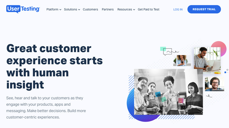
It’s possible that you’ve used a service like UserTesting to perform unmoderated usability tests with remote participants. It’s typically the most cost-effective way to collect in-use feedback and get to see results (typically) within 24 hours. These tests require a participant to agree to the testing scenario and install a small piece of software that records their screen, audio from their microphone and sometimes a webcam video so that you can capture their reactions.
Moderated testing is very similar but requires the participant to either meet in person, sometimes in a usability lab, or remotely via a screenshare service like GoToMeeting. The facilitator’s delivery and perception are crucial to the success of moderated tests, which is why smaller agencies or freelancers do not typically go that route.
Regardless of the format, usability testing can capture both qualitative and quantitative feedback from participants.
03. Send out surveys and questionnaires

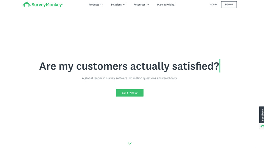
If your client or organisation does not have the resources (time or money) to invest in either of the previous options, you will likely be able to collect all that you need from surveys generated with tools such as Wufoo, SurveyMonkey or Google Docs.
These services enable you to quickly generate a form and email it to large groups of customers. If you do not have your own list of customer emails, with some services you can pay extra to send the survey to lookalike audiences that match your demographic requirements such as age, gender, location and household income.
The downside to the surveys is that you have no direct interaction with the participants. This leaves responses up to interpretation, which can be worse than having no data at all.
Remember, do user research throughout a project

Realistically, budget and available time will dictate which method you use but if you have the resources, start with low level data research or surveys. This will enable you to compare data to the goals of the business. This means you can form a hypothesis that outlines what may be happening and how you can improve an experience. From that, actual usability tests or ethnographic testing can be done to validate the assumption.
The most important thing to remember is that user research should be done incrementally throughout a project’s life cycle. It should never end. Users will come and go, creating fluctuation in demographics, expectations and satisfaction. Your product or business goals may change with time as well. User experience and user research are never a one size – or one test – fits all solution.
Having relevant data from recent testing is important for the next step.
The future of UX is tied to users, not technology
Each time a new device, technology or trend emerges, it’s important to not make reactive, knee-jerk decisions. It can be fun – and creatively fulfilling – to take an existing brand and explore the possibilities of adapting its current experiences to new platforms but it’s important to note that data and business context should always be the drive behind any recommendations.
If your boss or a client requests that their new app or service be adapted to the Apple Watch or VR, that’s great. But ask why. Is it because it’s trendy? Is it because those platforms are selling really well? Are their current customers requesting the change? Are their customers even using those platforms?
The future of user experience isn’t tied to technology. It’s tied to users. Each organisation is different. Each project is different. The process through which we collect and analyse data is the constant that can be leveraged to make sound decisions that have a shelf life to them. Following trends for the sake of not being left out is a recipe for disaster.
Every decision should be vetted against research. The depth at which this is done depends on the complexity of the feature or platform. Find a way to bridge the gap between business goals and user expectation and fight for that. It will move the discussion away from personal preference, trends and the loudest person in the room and toward future proofing strategic growth.
When you aren’t held back by trying to learn every piece of new software or new coding technique, you can move quickly to try new solutions or rapidly prototype an idea to determine if more time should be spent exploring a business case. Get the prototype in front of real users. See if they want it. Some organisations even offer hackathon or creative day style time at the office for exploration. Check out Netflix’s Hack Day breakdown, which dates back to 2014.
When an organisation can reach this level of UX maturity, there is a clearly defined process to validate the decision to move forward or question whether to have a discussion at all. This enables everyone to buy into the bigger picture and quickly determine if the solution is in alignment with expectations internally and externally. Stakeholder buy-in is just a fancy way of saying that you’ve understood the pain points from all sides and presented a reasonable solution for everyone. That is your sole responsibility with user experience.
Read more:

Thank you for reading 5 articles this month* Join now for unlimited access
Enjoy your first month for just £1 / $1 / €1
*Read 5 free articles per month without a subscription

Join now for unlimited access
Try first month for just £1 / $1 / €1
