
A few UI design tips can go a long way to help you create better user interfaces. Beyond session times and bounce rates, it's sometimes all too easy to forget that the core purpose of user interface design is to make things as effortless and enjoyable as possible for the user. Some tasks once considered the domain of UX designers are now commonly sought after in UI designers, with the roles increasingly crossing over.
Joss Cook is a freelance designer and design manager at Unity. He formerly worked at Lush Digital. Here he outlines his top 21 UI design tips that can make a difference when it comes to designing user interfaces that really consider the user. If you're looking for more pointers on UI design and UX, consider signing up for our online UX Design Foundations course. Make sure you also see our picks of the best web design tools, best website builders and the best web hosting).
Our essential UI design tips
01. Know who you're designing for
Tasks like user research, wireframing, testing and information architecture design are often seen as the responsibility of a UX designer, but we’ve increasingly seen a blend of the UX/UI designer role emerging.
According to Invision, “66% of UX designer job postings request UI skills” , and if it's become important for UX designers to understand visual design, branding and typography, it’s only right that UI designers should get involved, or at least have a base understanding of these UX skills.
A UI designer who gets involved in the creation of, or at minimum, pays heed to, the personas, wireframes and information architecture developed in the UX workstream, can make interaction, colour and type choices that are influenced by the people using the product or service, rather than their own stylistic preferences. By taking the time to understand the users they are designing for, UI designers will create interfaces that are more likely to suit users’ needs, both visually and functionally.
02. Avoid choice paralysis
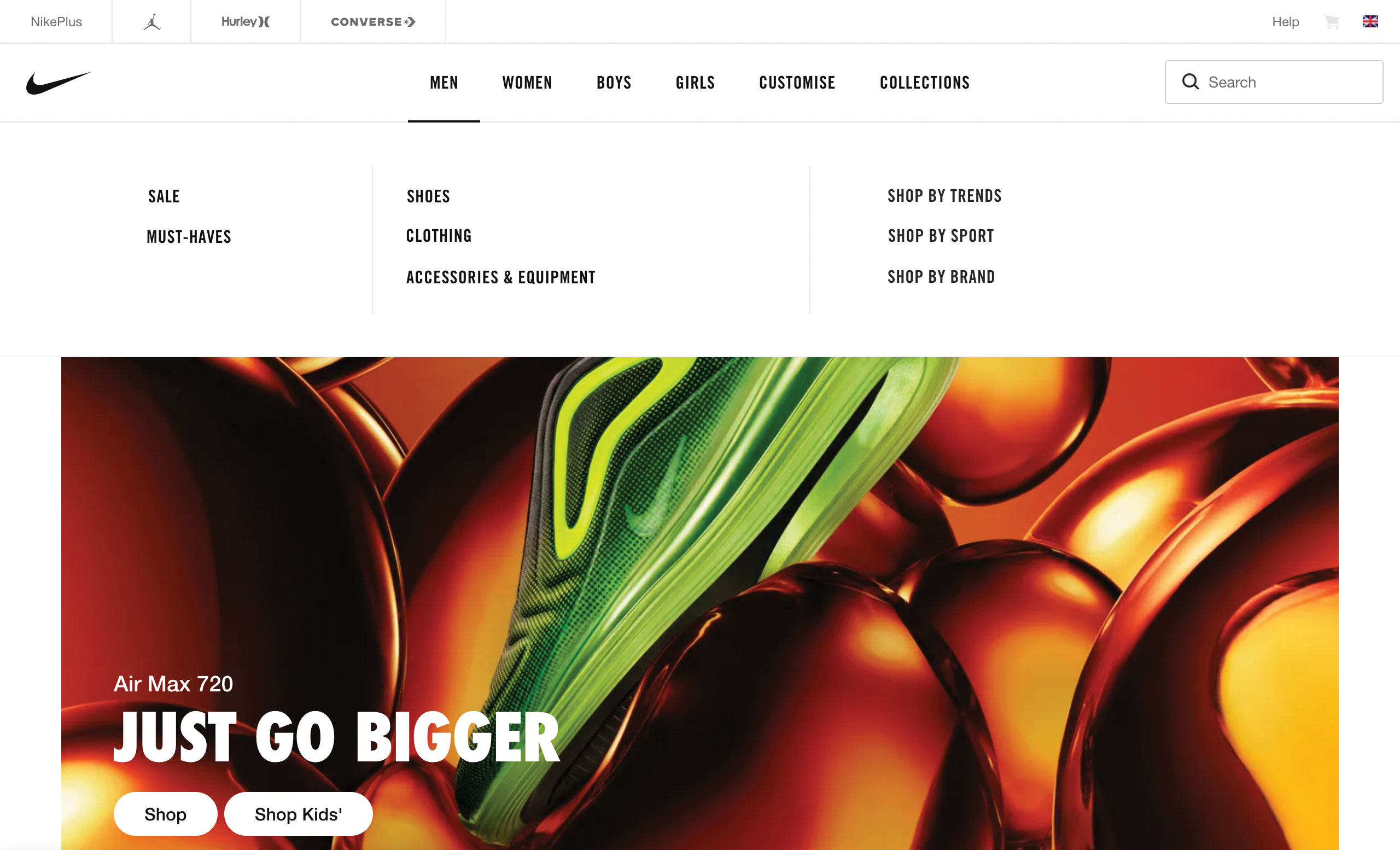
Mark Zuckerberg has a pretty simple wardrobe; it’s all grey t-shirts. In his own words: “I really want to clear my life to make it so that I have to make as few decisions as possible”. Whether you want to take style tips from Zuckerberg is one thing, but he's definitely on to something when it comes to UI tips because the same principle maps across to interface design.
Providing users with too many options can overwhelm them and cause them to over-analyse, which ultimately makes them less likely to complete an action or process. Where possible, we should limit the options available, or alternatively hide the options that are less relevant at that stage in the journey.
Get the Creative Bloq Newsletter
Daily design news, reviews, how-tos and more, as picked by the editors.
03. Help direct users with default states
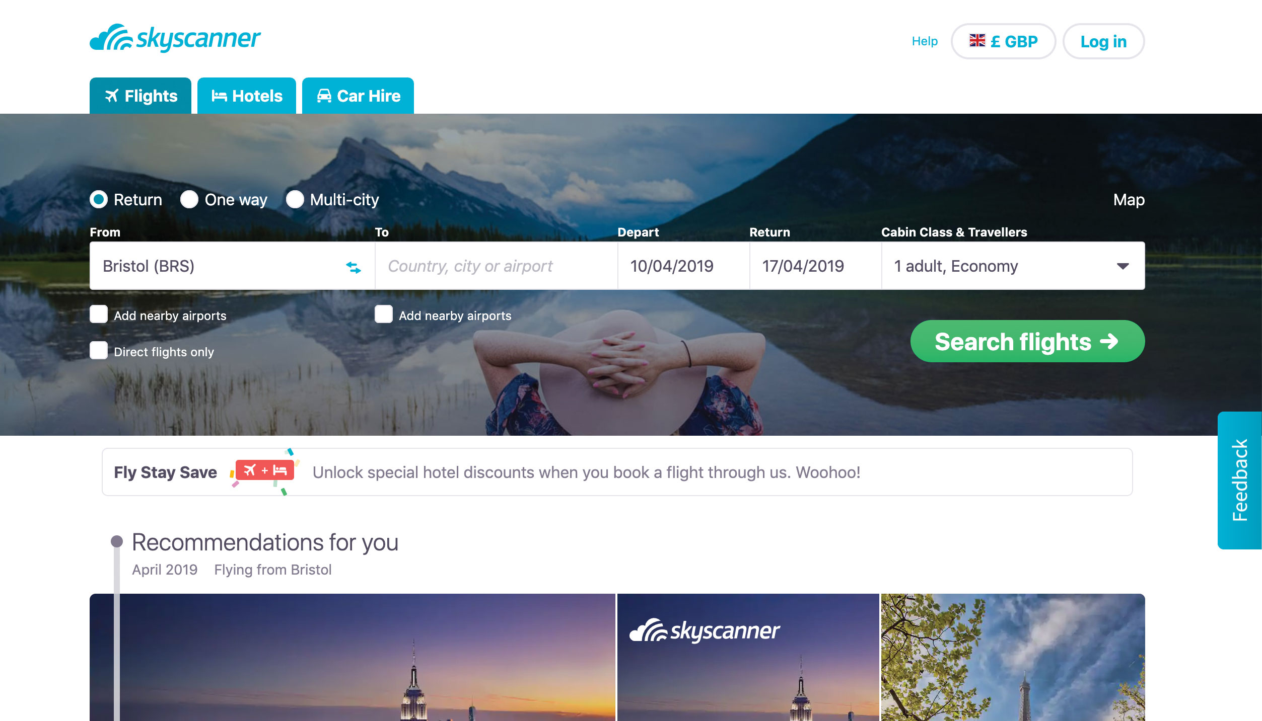
Default states can do more than just ask users to 'please select'. Websites like Skyscanner find the closest departure airport to the user, suggest dates that correlate to upcoming holidays, and preselect the number of passengers flying. Designing default states based on what is commonly chosen reduces the amount of effort required by users, allowing them to customise preselected options. And saving the user time through UI design can make them more likely to complete the journey.
04. Prompt action using empty states
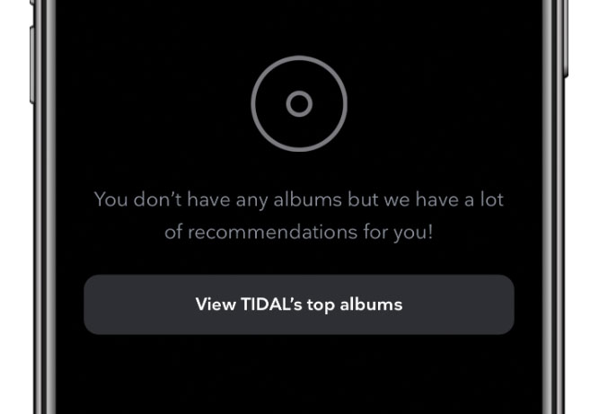
Unfilled baskets, uninhabited playlists and default search interfaces can often leave users with a sense of emptiness. Take heed from Tidal, which directs users that “don’t have any albums” towards their top recommendations. Rather than creating dead-ends within our interfaces, we can use empty states as an opportunity to help users discover new features and functions that will be of benefit to them.
05. Use error states to fail with flair
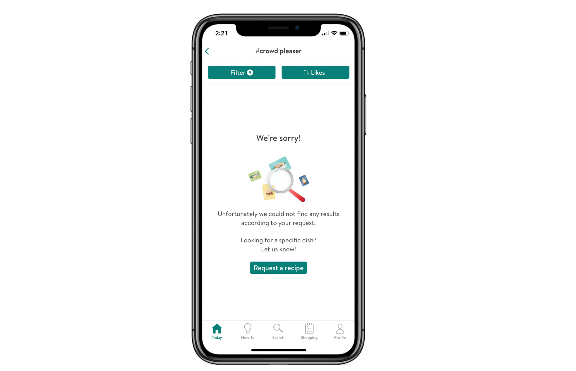
In the digital realm, things do sometimes go wrong, and not designing to account for this can lead to the user feeling disgruntled. As UI designers, we should create error states that encourage positive action and sentiment rather than throw out unintelligible messages that alienate the user. The Kitchen Stories app handles this brilliantly, apologising when it returns a blank result for a kitchen recipe, and providing a call to action that allows users to submit new requests. See our favourite 404 pages for more examples of this kind of thing.
06. Break choices down
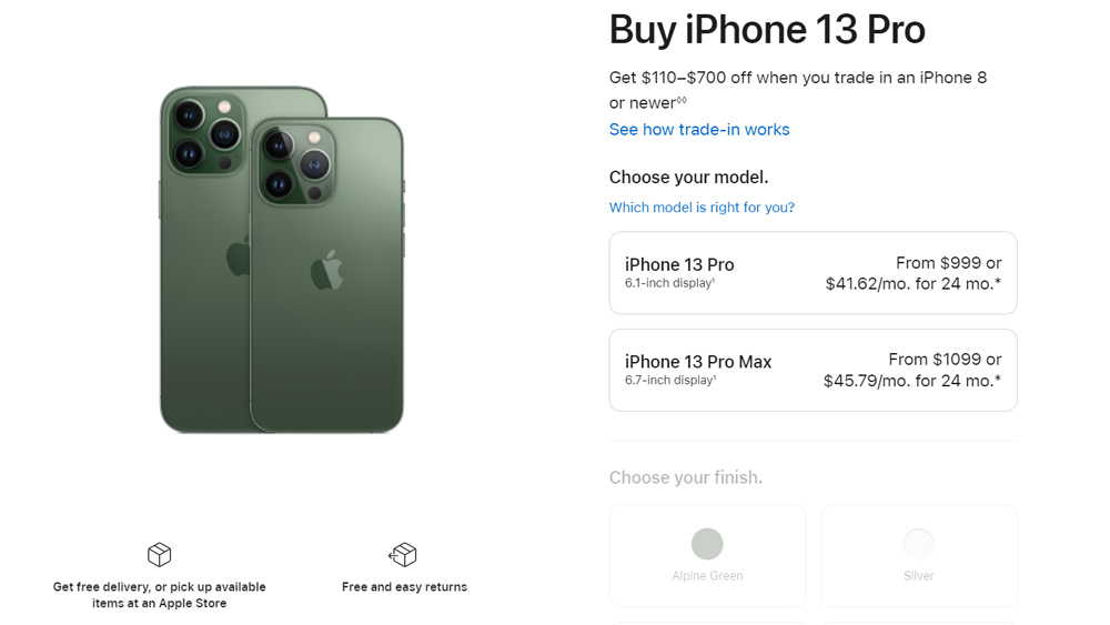
Another UI tip dealing with choices is to break them down. As well as limiting and grouping choices, we can make them less complex by dividing them into step-by-step processes. We can imagine Apple’s back end inventory of iPhone 13s as a big matrix list of hundreds of products with a variety of colours, sizes and networks. But for the user selecting a new phone on Apple's website, a simple step-by-step interface allows them to narrow down their options one selection at a time – first you choose a model, then a finish, then a storage capacity and so on. If we're presenting a lot of configuration options, the interface should do the heavy lifting rather than the user.
07. Reduce resistance
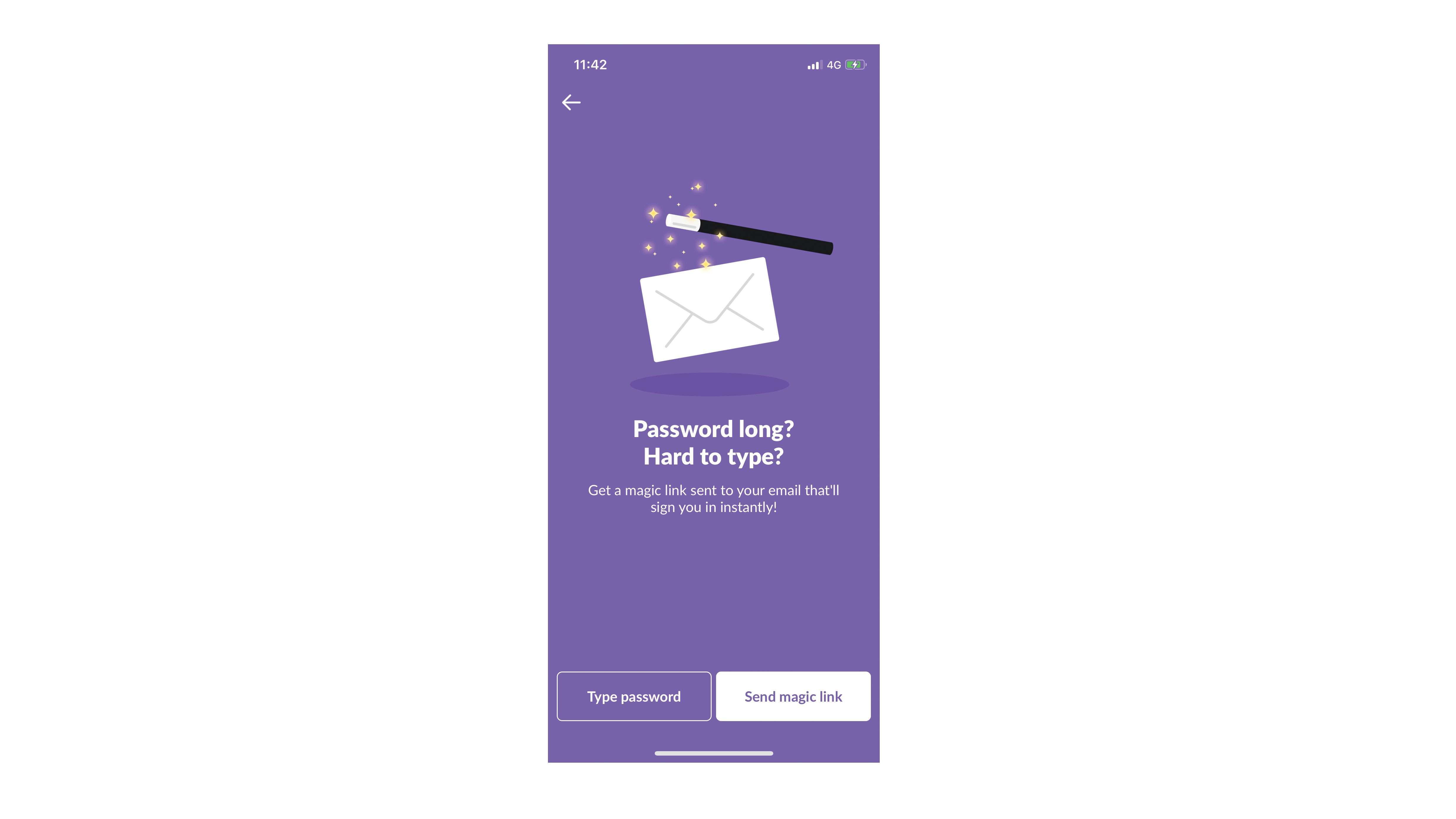
The interfaces we design should make it as easy as possible for users to complete the tasks within them. When signing into the Slack mobile app, the user gets a 'magic' verification link sent to their email address to skip the odious task of remembering and typing out a complicated password.
Putting the burden on the interface, rather than the user, makes users far less resistant to get to the end of any process within your website or application. If we have the technology available to speed up the interactions within our interfaces, we should design with this in mind.
08. Take only what you need
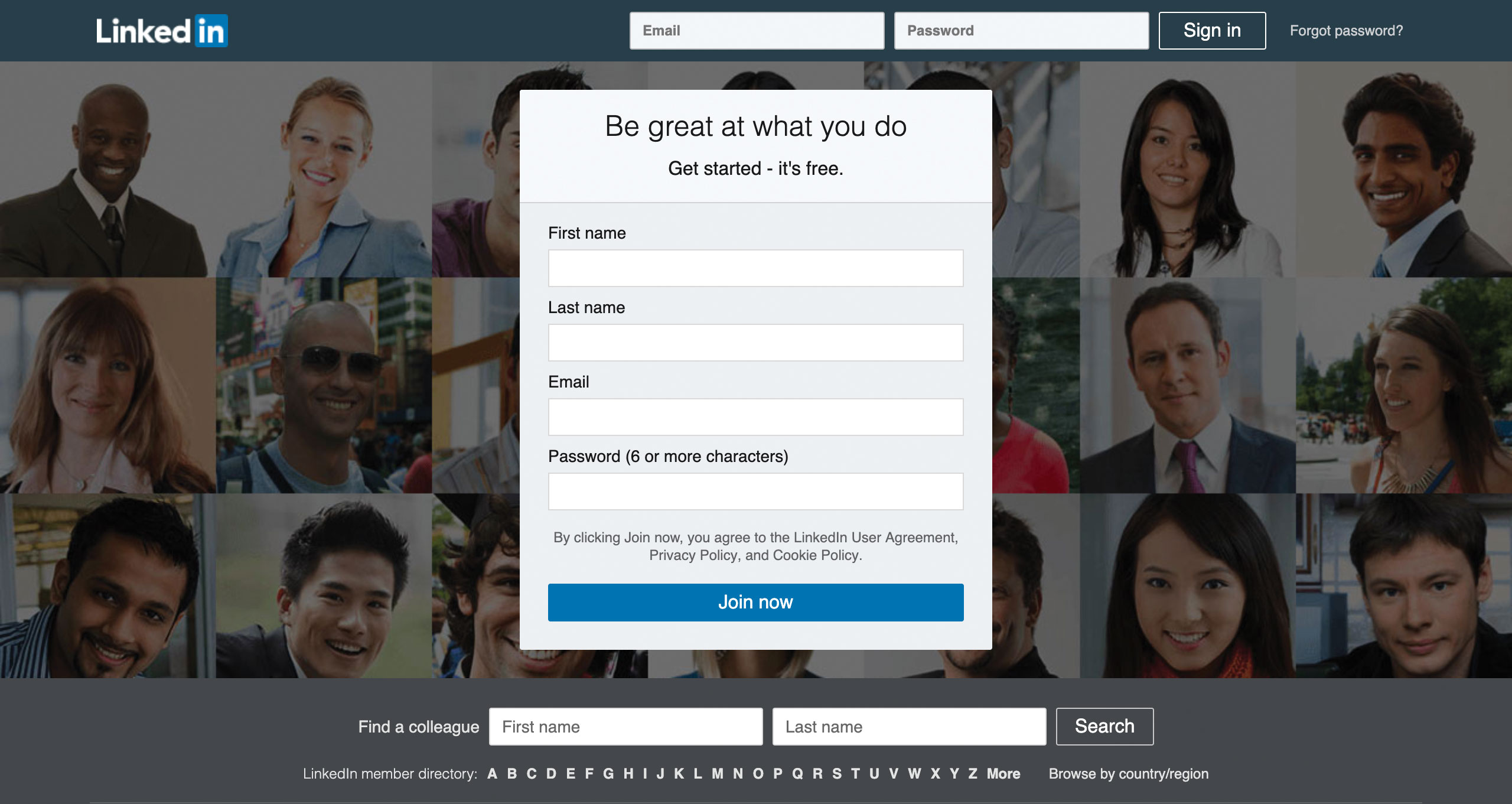
To create a path of least resistance, we should ask the user for as little information as possible at any given stage within our interfaces. The less data a user has to input, the more likely they are to complete an exercise.
Sites like LinkedIn ask for the bare minimum data (First name, Last name, Email and Password) when a user signs up to their platform, then they gamify the profile creation process by prompting the user to fill out one piece of personal information at a time once they’re onboarded. There’s no way anyone would sign up to LinkedIn if they had to input their entire professional history up immediately just to get through the door.
09. Create a sense of progression
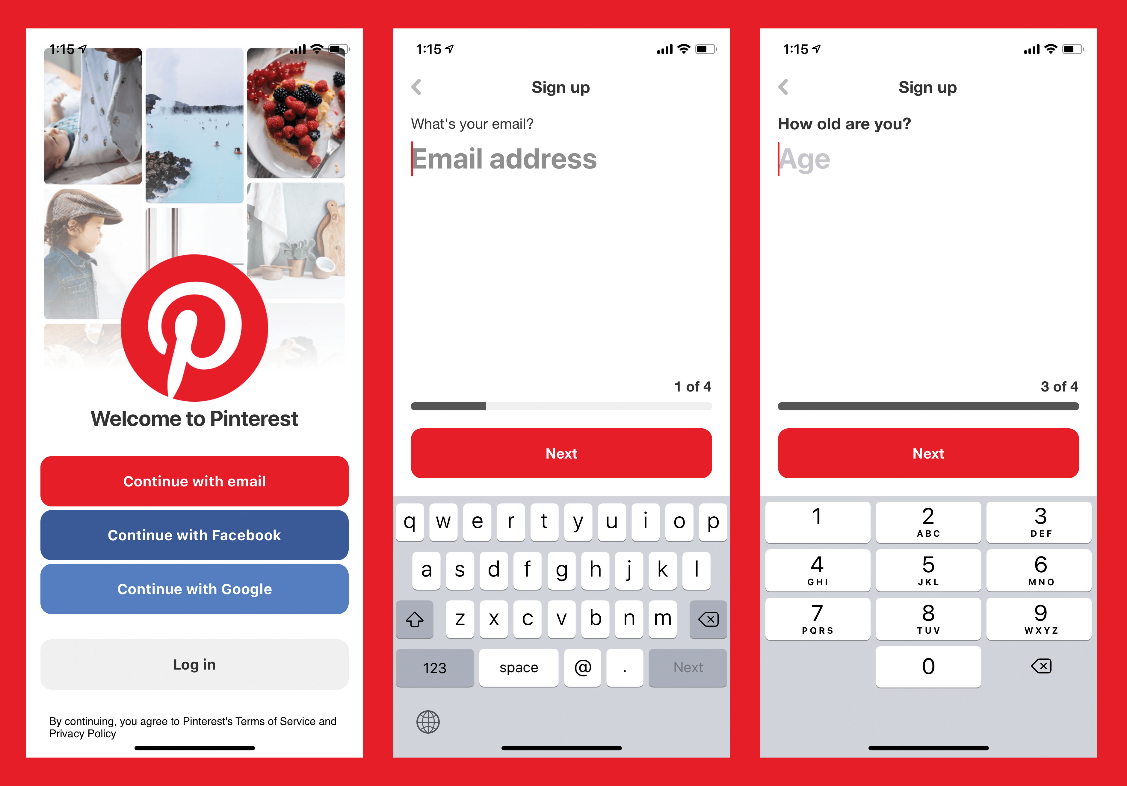
There are some instances where lengthy forms and processes are unavoidable. For example, many financial applications require extensive data input, and they take time to complete. One way to encourage the user through this is to give a visual sign of progress.
When users sign up to the Pinterest app, there's an indicator within the interface to show what step the user is at in the journey, providing assurance that they're making progress towards their end goal. This sense of momentum makes users less likely to become frustrated about not knowing when a process will end, and therefore less likely to abandon it altogether.
10. Pay heed to conventions
As UI designers, we naturally want to push our creativity and devise new and exciting ways for users to interact with and experience our digital products. That said, we need to strike a balance between originality and familiarity in order to ensure that our users don’t have to spend too much time learning how to use our interfaces.
Apps like Snapchat have alienated many older users with radical navigation options. Since you can swipe in every direction and pinch in and out to access different screens, it takes some time investment to learn the interactions before you can effectively use the application. Younger users have embraced that discoverability, but adults who understand the conventions of tapping and clicking as means of navigation use the app in fewer numbers.
As the web has grown, a number of conventions for element positioning (like baskets in the top right and hamburger menus in the top left) have emerged and consideration should always be given to whether it may be best to respect them. Our interfaces should excite and delight users, but should also be predictable enough to use if we want to keep up conversions and limit bounce rates.
11. Provide visual feedback
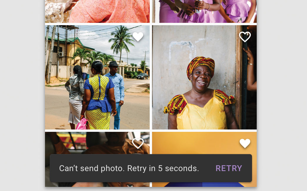
Feedback is a gift, and should be treated as such within our interface designs. Google’s Snackbars are a smart little micro-interaction that live in its Material Design system. They appear temporarily on the screen of an app or website interface to provide brief contextual instructions, errors or acknowledgements that keep the user informed of any consequences of the actions they have taken, be it saving a photo, sending an email or prompting a 'retry' when the app has an error.
As UI designers, we should provide visual feedback for each of the key interactions within our interfaces. If an item has been added to the user’s basket, let them know. If their payment has gone through successfully, inform them with a thank you message and direct them where to go if they have any queries about delivery or returns. Visual cues and animations can help users to acknowledge the completion of tasks, big and small, within your website or application, giving a sense of accomplishment and helping to reduce anxiety by acknowledging that an action has been taken.
12. Make the most of user-generated content
People buy based on what other people say, not just on the whimsical copywriting from brands. This is why so many ecommerce sites make a big thing of customer reviews. Sunglasses brand Meller increased its conversion rate by 13% by featuring images of real customersenjoying their products on their product pages, alongside the more traditional ecommerce photo gallery.
If you have user-generated content (UGC) available for the brand or company you're designing for, weaving it into the pages of our website or application UI can help increase conversions, especially if the audience are millennials.
13. Treat users as advocates

Delighting users with products and services is one thing, but they can also be our advocates, or even form part of our marketing team. GoPro has successfully used user video as the main hero video on its homepage in the past (see the best GoPro deals to get your own camera).
Using film shot by users demonstrated the capabilities of the camera to prospective buyers in a relatable context, and also rewarded the customers who submitted their videos with a bit of exposure. If we have a loyal audience, there are myriad ways we can utilise their voices and content, so this should be factored in when designing our next interface.
14. Use imagery to guide users
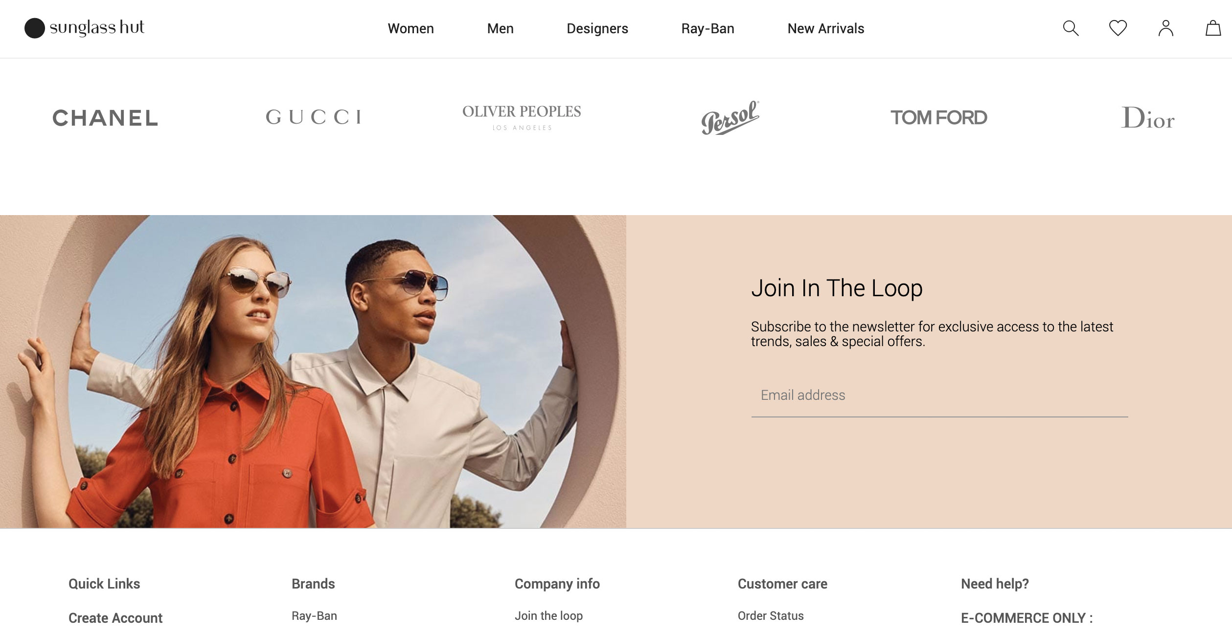
Beautiful imagery has the power to enhance an interface visually, but can also be used to direct attention to specific places within a page or screen (remember to back up your stunning images using cloud storage). If an image contains a person, users subconsciously follow that person’s line of vision, providing UI designers with an opportunity to subtly direct them towards calls to action or useful information.
The Sunglasses Hut website utilised this concept in its website footer, with the eye line of two people looking towards the email sign up. If you flip the image horizontally, they’re just models staring off into the distance.
15. Use negative space in clever ways
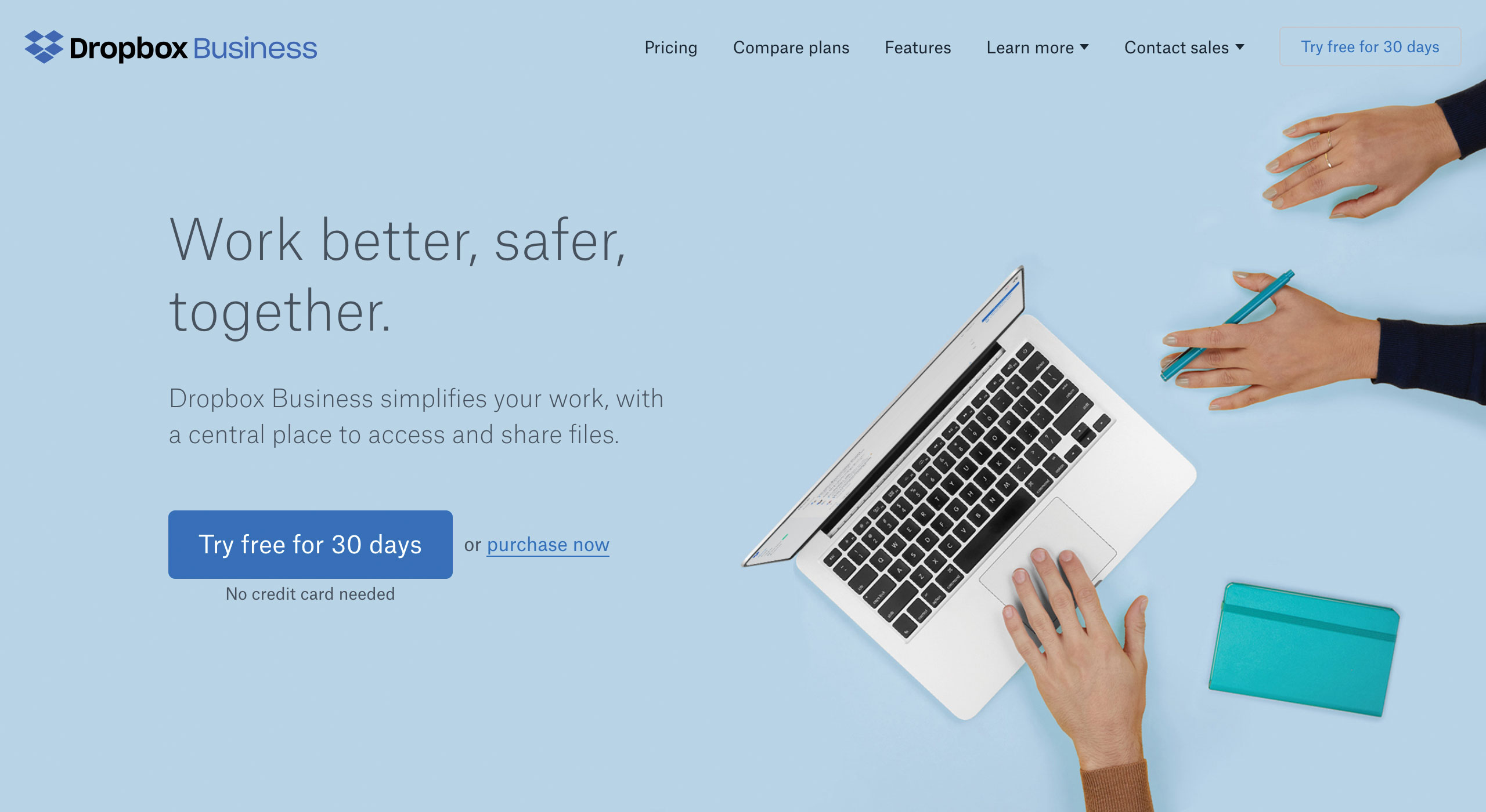
It’s a common mistake for UI designers to want to cram as much information as possible into each and every interface, but this can lead to visual overload, and will ultimately overwhelm users whose attention is being drawn to too many different areas on a page or screen.
The Dropbox Business landing page has used negative space to great effect, giving each and every element enough room to breathe, whilst providing a concise overview of the product’s benefits. Strategically maximising the space around key information and calls to action will draw users towards them, without other elements fighting for their attention.
16. Start with mobile
Given that in 2022, up to 70 per cent of website traffic comes from mobile phones, it's vital to craft digital interfaces that are optimised for mobile users. The desktop view has often been the canvas of choice for UI designers, starting with video-led banners and interactions like rollovers and hovers, then having to strip these out or devise workarounds as we scale these down to mobile.
As an alternative, designing the mobile view first forces us to strip out all of the unnecessary noise and focus on the elements that are crucial for users to perform the tasks within the interface. Scaling up allows us to add enhancements to the desktop view, adding features that are more suited to that experience once we have the key components in place.
17. Get the right type licence
There’s nothing worse than polishing off a beautiful interface, preparing the assets for the development team, then realising that our font choices come with a whacking great licensing fee – or even worse, aren’t optimised for web. There are a number of different types of font licence, some of which charge per user, some per time used, and others that charge a one-off fee.
When making font choices, it’s vital that we consider the financial implications that will result, as well as the capability of the font to render on the web. If budgets are tight, open-source solutions like Google Fonts offer hundreds of fonts that are free to use. Also see our pick of the best free fonts for designers.
18. Write your interfaces
When we strip back an interface down to the bare bones, remove the colours, fonts, images and animations, we’re ultimately left with one thing; copy. It’s tempting to jump straight to the visual aspect of interface design, dropping in lorem ipsum and placeholder text, but taking the time to write out our interfaces first can enable us to better develop the overall tone and reflect on the messages and stories we’re verbally communicating to our audiences.
We can really understand the flow of our pages when we read the copy in isolation, giving us the opportunity to accompany our words with visual assets that truly support and enforce the core of what we’re trying to say.
19. Onboard as appropriate

Onboarding should be seen as the process of increasing the likelihood of new users becoming successful when adopting a product. As UI designers, we play a key role in deciding how best to introduce our digital products and services to those users.
The language learning app Duolingo uses an onboarding flow that drops users straight into the task-based interface, allowing them to familiarise themselves with the product’s features and sample how it works, all before prompting sign up. The user effectively has the chance to test the product before committing to creating an account.
When our interfaces contain unavoidable, complicated or unfamiliar interactions, we need to teach people how to use them, whether this is done through slideshows, explanatory videos or tutorial overlays. Giving users a sample of 'how it works' as part of the onboarding or introduction will result in less confusion once the user is fully immersed within the experience, and will encourage adoption by those who see value in the offering up front.
20. Involve your developers
As the people who will end up building our designs, it pays to involve our developers in a project at the earliest stage possible. Designers create the things that users see, but developers enhance the experience of the interface by maximising performance, speeding up page load times and optimising what happens under the hood.
Involving developers continuously throughout the design process allows them to have input into the way the interface behaves beyond the visual aspect, giving them a chance to offer more input as to how tech like the Slack magic link we mentioned above can be utilised to make our interfaces as effortless to use as possible.
21. Use a design system
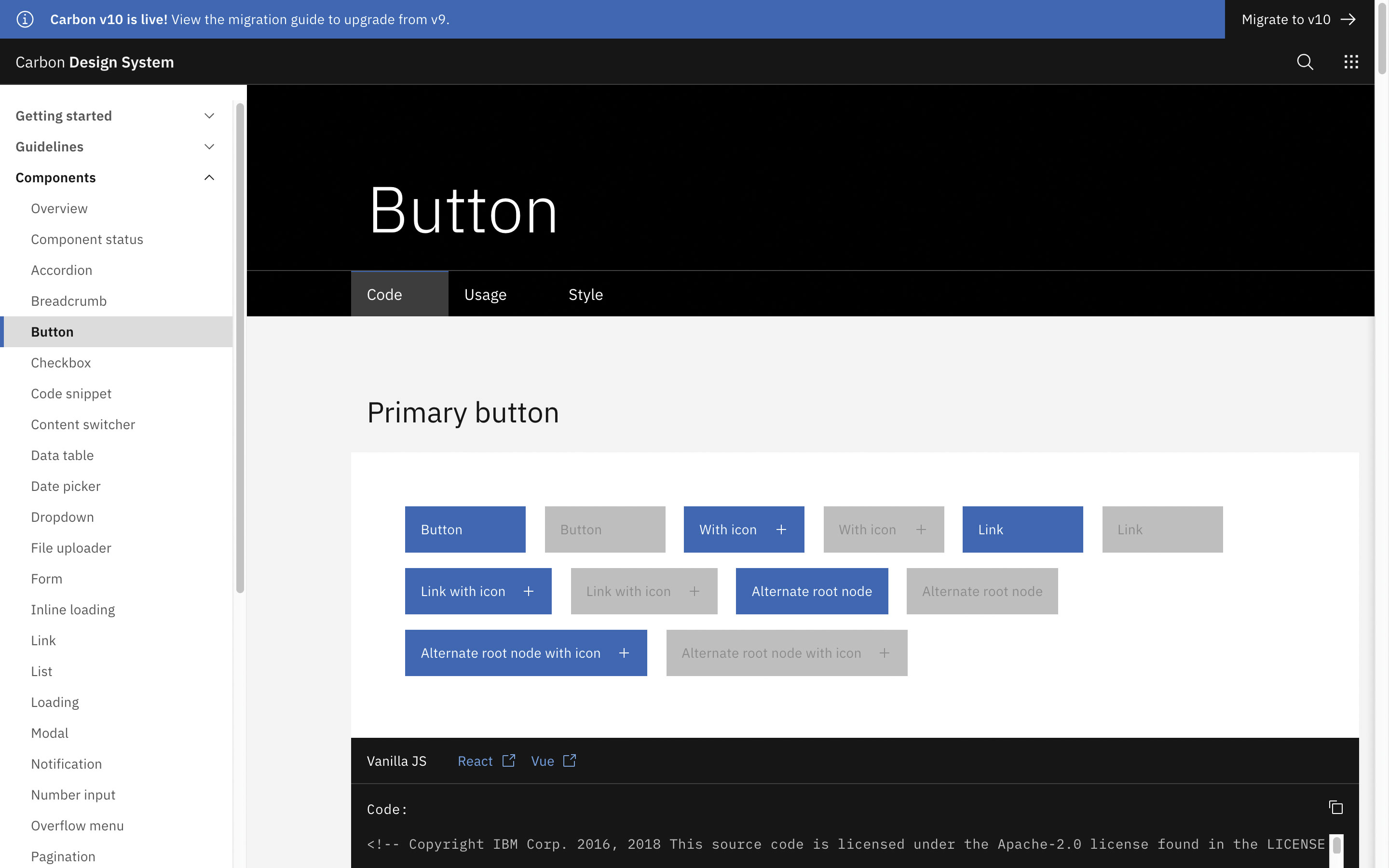
Ensuring consistency across our website or application interfaces can be a challenge when multiple designers are involved, and we can often end up with countless variations of the same UI components, meaning replicated work across the project as a whole. It can help to create a design system of reusable components, with clear standards so they can be assembled together to build the different applications needed.
IBM’s Carbon Design System, for example, provides a comprehensive repository of assets, code snippets and documentation for both designers and developers to access when working on UI projects, ensuring that the design team can work faster and smarter with one another. Some manner of design system, or at minimum a pattern library with all of the UI components within a specific project, should be utilised to make our interfaces consistent, assets reusable and maintenance easier.
22. Clean up your design files
Love it or hate it, some designers just work messy, and while this makes sense during the creative process, it can be frustrating to pick up a design file for the first time and discover that we need to invest a considerable amount of time working out which layer each element lives on.
If a project grows from a small team to include more people, maintaining a sensible design environment can really pay off. Taking the time to clean up our design files by naming layers, artboards and folders will make it much easier for any designer (including our future selves) to pick up and work on. Your developers will thank you too!

You can learn a lot more UI design secrets by signing up for Creative Bloq's UX design foundations course. Sign up today.
Read more:
- UI design tools: The tools you need to create stunning UI
- 10 painful UI fails (and what you can learn from them)
- Essential tips for UX design

Thank you for reading 5 articles this month* Join now for unlimited access
Enjoy your first month for just £1 / $1 / €1
*Read 5 free articles per month without a subscription

Join now for unlimited access
Try first month for just £1 / $1 / €1
Joss Cook is a freelance designer and design manager at Unity. Formerly design manager at Lush Digital, he was awarded Wirehive 100 Creative of the Year 2014 and voted No. 1 in The Drum Design Census 2015. He has written for Web Designer and Net magazines.
