The ultimate UI design guide
Discover top techniques and tools for creating great UI design.
Good UI design can make a world of difference to users and to the success of a product, but despite more awareness of UI and UX than ever before, we still see many examples that don't cut it. In our ultimate UI design guide, we delve into the concepts and techniques that make for great user interface design and look at some of the questions and confusions that arise around UI.
People often wonder what UI design is all about. Aesthetics? Usability? Accessibility? All of these factors combine to make for an optimal user experience, but we believe that accessibility should always come first, laying the foundations for optimal usability. And if a UI design is accessible and usable, you'll often find that it already looks pretty decent in terms of aesthetics. But below, we'll take a closer look at how all this works, and what can be done to ensure visual consistency.
The ultimate UI design guide
Below are our key pointers for great UI design. To learn everything you need to know to begin a career in UI and UX, sign up for our online UX design course: UX Design Foundations today to learn from experts from companies such as Google and Spotify. And to make sure you have the tools you need, see our pick of the best UI design tools and the best UI prototyping tools. And if you're just starting out and want to master UI for a website, you might want to consider using one of the best website builders)
01. Typography in UI design is about accessibility
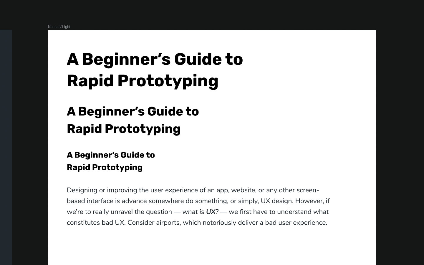
In UI design, great typography (like many aspects of UI design) is all about accessibility. Visual design adds to the user's overall experience but at the end of the day, users are interacting with the UI, not viewing it as art. Legible letters result in clarity and readable words are what help users digest content efficiently. Both are more important than any visual aesthetic.
However, well-designed typography can still be aesthetically satisfying. Black-on-white Helvetica (or a similar font) can be a thing of beauty after only a few simple typographic enhancements. By enhancements, we mean tweaking the font size, line height, letter spacing and so on – not the font or the colour of the text.
'Beautiful' typography is actually ugly when it's unreadable because frustration always trumps aesthetics. Great design is balanced and harmonious. Like many aspects of UI design, fine-tuning visuals to balance accessibility and aesthetics isn't the challenge. The challenge is maintaining consistency throughout the entire design. Consistency establishes clear hierarchy between elements of varying importance, which in turns helps users understand a UI faster and even digest content more efficiently.
When it comes to legibility and readability, the minimum acceptable font size as defined by the WCAG 2.0 Web Content Accessibility Guidelines is 18pt (or 14pt bold). The best font size to use largely depends on the font itself but it's important to be mindful of visual hierarchy and how this base size distinguishes itself from summaries and headings (ie <h1>, <h2>, <h3>).
Get the Creative Bloq Newsletter
Daily design news, reviews, how-tos and more, as picked by the editors.
To experiment, with your UI design tool of choice, create a series of text layers (T) and then adjust all of the sizes to correlate with the following template:
- <h1>: 44px
- <h2>: 33px
- <h3>: 22px
- <p>: 18px
With most UI design tools, this is done by adjusting the styles using the Inspector panel on the right-hand side.
Next choose your font, but beware because what you might notice with some fonts is that 18px <p> and 22px <h3> doesn't look all that different. We have two choices: tweak the font sizes or consider a different font for headings. Go with the latter if you anticipate that your design will be text-heavy.
Keep in mind that:
- Visual UI design is often a gut-feeling approach
- Nothing is fixed; everything is subject to change
Line height
Optimal line height ensures that lines of text have enough spacing between them in order to achieve decent levels of readability. This is becoming more and more recognised as a 'standard'; Google's Lighthouse Audit tool even suggests it as a manual check (or even a flag if the text contains links that may be too close together as a result of suboptimal line height).
Once again, the WCAG helps us out with this one, declaring that line heights should be 1.5x the font size. So, in your UI design tool under 'Line' (or similar), simply multiply the font size by – at least – 1.5. As an example, if the body text is 18px, then the line height would be 27px (18*1.5 – you can also execute the maths operation directly in the Inspector). Again, though, be mindful – if 1.6x feels a better fit, use 1.6x. Remember that different fonts will output different results.
It's too early to think about using real data in our design but, at the very least, we should still use somewhat realistic data (even lorem ipsum). InVision Studio has a native real data app to help us see what our typography might actually look like.
Paragraph spacing
Paragraph spacing isn't a style that we can declare using InVision Studio's Inspector. Instead, we'll need to manually align layers using Smart Guides (⌥). Similar to line height, the magic multiplier is 2x (double the font size).
As an example, if the font size is 18px, then there should be at least a 36px space before leading into the next text block. Letter spacing should be at least 0.12. However, we don't need to worry about this until we begin creating components.
Shared styles
If your UI design tool supports it (InVision Studio doesn't yet), consider turning these typographic styles into 'Shared Styles' to make them rapidly reusable while ensuring visual consistency. This is usually accomplished via the Inspector.
02. Pick the right colour palette for your UI design
Selecting the perfect colours for your design goes way beyond aesthetics: it can inform the entire hierarchy of your site. When it comes to UI design, colour is habitually one of the first things that we enjoy dabbling with but we're taught that diving straight into visual design is a bad thing. This is certainly true, however when it comes to visual consistency, colour should be a top concern because it plays other roles.
Colour in UI design can be mighty effective but since some users (many, actually) suffer from various types of visual disabilities, it's not always reliable. That being said, it's not necessarily about the specific colour that's being used, but rather the type of colour. This may not be true when it comes to branding since colour is used for emotional impact in this regard but, in UI design, colour is also used for communicating intent, meaning and, of course, visual hierarchy.
01. Stark
The Stark plugin is compatible with Sketch and Adobe XD and helps you check colour contrast and simulate colour blindness directly from the canvas. Support for Figma and InVision Studio coming very soon.
02. Colors
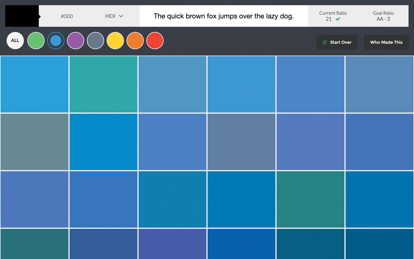
Colors is a set of 90 colour combinations that have the appropriate amount of colour contrast in order to satisfy the WCAG 2.0 Guidelines – some of them even manage to meet the AAA standard.
03. A11y Project
The A11y Project is a massive hub for all things accessibility related. It includes resources, tools, tips, tutorials and is created by the maker of the Stark plugin and receives funding from InVision.
The three types of colour
Colours hold meaning, so it's important to not have too many of them. Too many meanings results in more things that the user has to understand and remember – not to mention more colour combinations for us to worry about. Generally speaking, this would be the recommended format:
- A call-to-action colour (also the main brand colour)
- A neutral dark colour (better for UI elements or dark mode)
- For all of the above, a slightly lighter and darker variation
This enables the following:
- Dark mode will be easily achievable
- Our CTA colour will never conflict with other colours
- In any scenario we’ll be able to emphasise and de-emphasise

Set up your palette
With your UI design tool of choice, create one fairly large artboard (tap A) for each colour (named 'Brand', 'Neutral / Light' and 'Neutral / Dark'). Then, in each artboard, create additional smaller rectangles displaying the darker and lighter variations of the colour and also the other colours themselves.
We would consider slightly lighter and darker as 10 per cent extra white and 10 per cent extra black respectively. When you're done, display a copy of the typographic styles on each artboard. The colour of these text layers should be neutral light, except on the neutral light artboard where they should be neutral dark.
Contrast
Next we'll need to check our colours for optimal colour contrast. There are a variety of tools that can do this, for example the Stark plugin for Sketch and Adobe XD or Contrast for macOS – however, an online solution such as Contrast Checker or Colour Contrast Checker will do just fine.
Check the colour contrast for each combination and tweak the colours accordingly. If you're not sure what colours to use, try using Color Safe's recommendations.
03. Consider style links and buttons in your UI design
Size
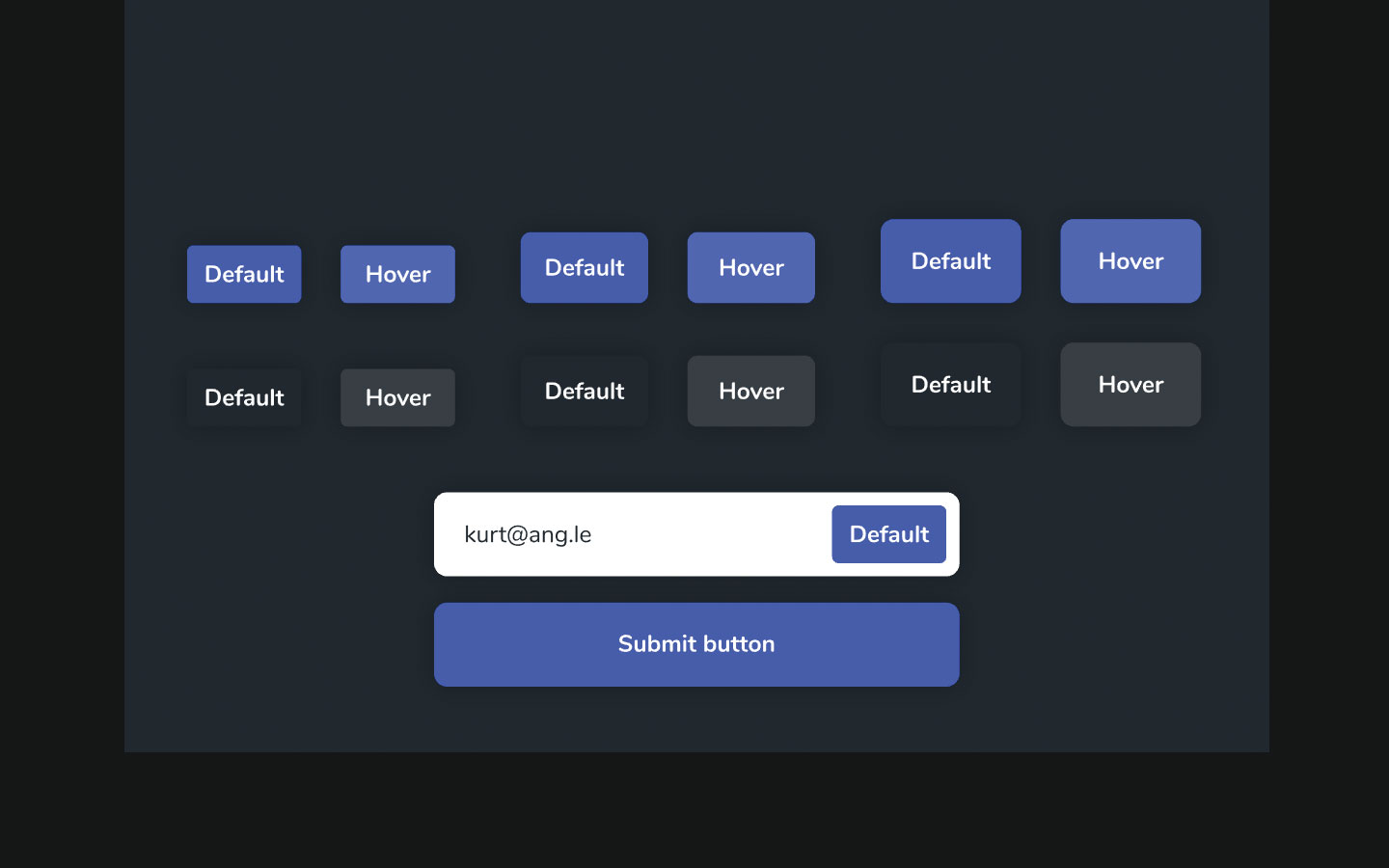
Buttons and links, much like typography, should have a few variations. After all, not all actions are of an equal level of importance and, as we discussed earlier, colour is an unreliable method of communication, so it cannot be the main method of influencing visual hierarchy. We also need to toy with size.
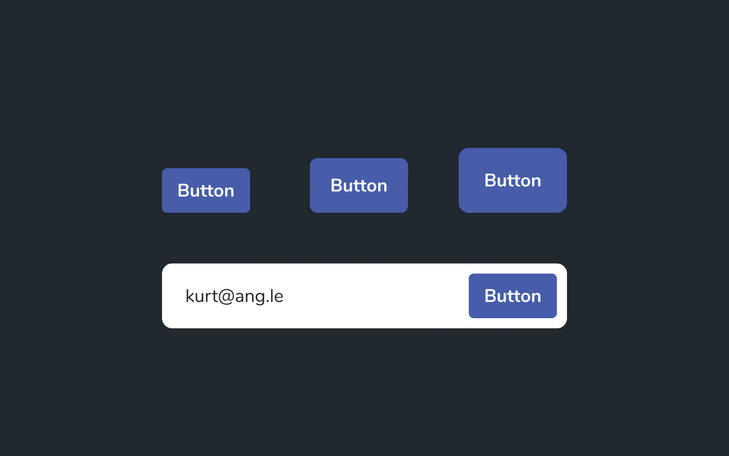
Generally, we would recommend that button text be declared as 18px (same as the body text) but that the buttons themselves have three variations in size:
- Normal: 44px in height (rounded corners: 5px)
- Large: 54px in height (rounded corners: 10px)
- Extra large: 64px in height (rounded corners: 15px)
This enables us to make certain buttons appear to be more important without reliance on colour and also to nest buttons (for example, use a button inside a minimal-looking form field).
Depth
Regardless of whether the tap target is a button or a form field, shadows should be used to increase depth and therefore suggest interactivity. A single shadow style for all variants of buttons and form fields is fine.
Interactivity
Each button type needs a variation to indicate its hover state. This clarifies to the user that what they've attempted to do is totally fine and ensures that they carry on without delay.
This is actually one of the more complex aspects of maintaining visual consistency because colour is often the favoured style to change when it comes to creating a state. Thankfully, these state changes can be relatively subtle, so it's fine to change the colour into its slightly lighter or darker variation – that's what they're for. This applies to links as well.
Deciding against this will cause us to use a colour that either already has significant meaning, resulting in users becoming confused, or else deciding to come up with another colour. Deciding to use a secondary colour is totally fine but it should be saved for marketing visuals rather than UI elements. Less is more (and easier).
Remember to repeat this step for every artboard. Don't include the branded CTA buttons on the brand artboard – later on we'll cover what happens when certain combinations don't work.
04. Create your UI design components
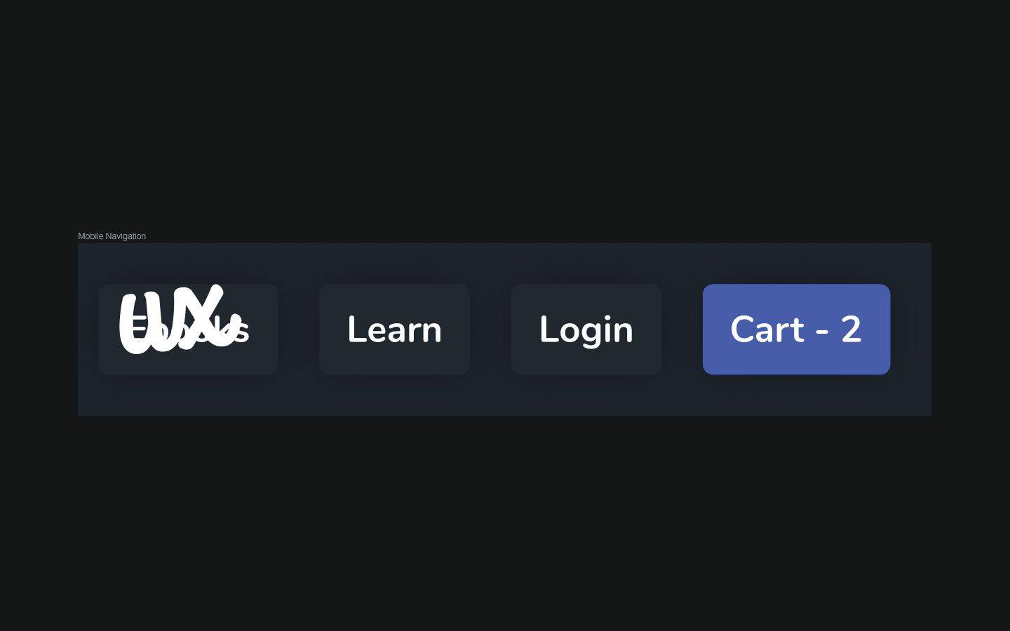
Components are a huge time saver and all UI design tools offer this feature (eg in Sketch, they're called Symbols). In Studio we can create components by selecting all of the layers that should make up the component and using the ⌘K shortcut.
Using components
Wireframes are very useful, not only for designing high-usability UIs but also for finding out what our UI will require in the long run. It’s sort of like future-proofing.
This doesn’t mean that we need to design loads of components or be ready for any possible scenario but it does mean that we need to employ a 'What if?' attitude.
For example, if our wireframe calls for a 3x1 component but we know that the content isn’t set in stone, a little contemplation might lead us to wonder: 'What if this components ends up being 4x1?'. The rule-of-thumb is: design only for the user needs that already exist but try to make solutions relatively flexible. Otherwise, we’ll wind up with some very messy 'design debt' later down the line.
Now we can reuse this component by dragging it onto the canvas from Libraries > Document on the left-hand side, although bear in mind that this workflow may differ depending on your UI tool.
This method of creating style guides (and eventually creating the design itself) works especially well with modular/card-based layouts, although 'common areas' such as headers, footers and navigations are also excellent candidates for a component.
Just as we've done with our typographic styles, colours and buttons, we must remember to organise our components carefully.
Utilising our rules
Earlier on we made a remark about not using branded CTA buttons on top of the brand colour, since branded CTA buttons obviously need to stand out amongst everything else. So how do we go about creating a branded component while still being able to use a branded CTA button? After all, if we're using neutral dark buttons for, let's say, navigational buttons or simply less-important buttons, that just wouldn't be an option, right?
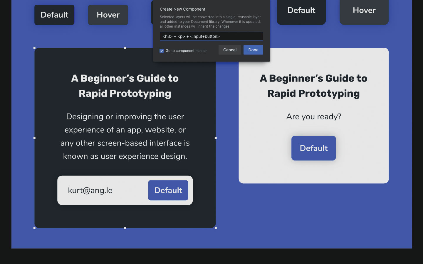
Right. So this would be an ideal opportunity to create a component – specifically, a heading + text + button combination. Notice how I've created a neutral light 'card' backdrop to enable the use of the branded button. Similarly, the neutral light form field (form fields are usually white because of the mental model historically synonymous with paper forms) doesn't look amazing on the neutral light background so they can only be used on the neutral dark background – either directly or within a neutral dark component. This is how we make our design flexible while obeying our rules and maintaining consistency.
Stress testing
Ideally, the quickest and most effective way of ensuring robustness in our design is to stress test it. Putting a design to the test means being cruel. Let's say that we have a navigation with X amount of nav items because that was the requirement; in order to really ensure flexibility, try changing these requirements by adding more nav items or, to really throw a spanner in the works, try also adding a nav item with a higher visual hierarchy than the others. Do our size, typography and colour rules allow for something like this? Or in order to offer optimal usability do we need another rule?
Bear in mind that there's a difference between adding rules and bending the rules. More edge cases means less consistency, so most of the time it's better for the sake of usability to simply rethink the component.
05. Document and collaborate
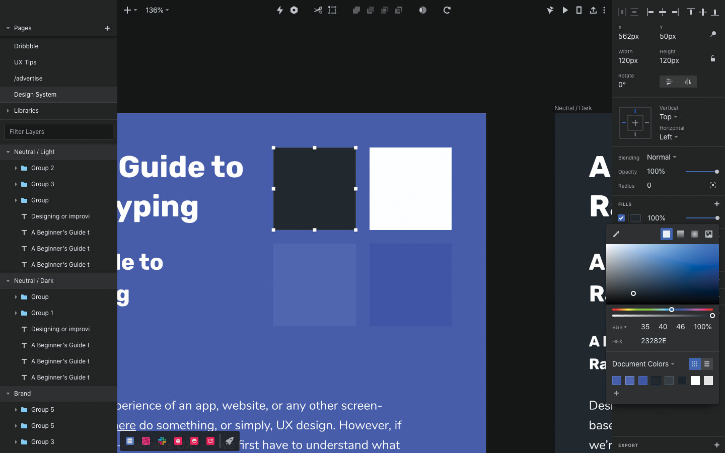
How do we make our design files easier to use for both ourselves and any other designers that might use our design file? We need to document our UI design and keep the components sade in reliable shared cloud storage is important.
Colours
The first step is to save all of the colours to the 'Document Colors' swatch if we haven't done so already – this will make them easier to access when we need to apply them in our design. To do this, open the colour chooser widget from the Inspector, choose 'Document Colors' from the dropdown and then click the + icon to add the colour to the swatch. This works the same way in most UI tools.
Shared Libraries
Next, we need to convert our document – complete with typographic styles, colours, buttons, common areas and basic components – into a shared library. Essentially this means that every element needs to be a component, even if it consists of only one layer.
It's easy enough to house a library in a cloud storage platform for other designers to use and update over time. When a change is made (locally or remotely), every file that uses the library (again, locally or remotely) will ask if you want to update the colours and components. This is how design libraries are maintained across teams.
When it comes to designing user interfaces that are visually consistent, reuse everything. Design buttons, then use buttons to create button components, then use button components to create other components such as alerts and dialogues. Just don’t create components that aren’t needed. Remember, building a library is an ongoing, collaborative effort. It doesn’t have to be completed all at once, completed by you alone or completed ever. It only has to convey a language.
Design at scale
As a design expands, managing it becomes harder. There are various adjustments we might want to make to keep it efficient and maintainable. For instance, we might want to use text layers to annotate our library as a means of explaining the use-cases of various elements. For the typographic styles, we could even edit the text to be more descriptive (eg "<h1> / 1.3 / 44px"). This says that <h1>s should be 44px and have a line height of 1.3.
Design Handoff
Design handoff tools display the various styles used by every element in the design so that developers can build the app or website. These tools include an overview of styles and also a copy of the 'document colors' swatch. Developers can even copy these styles as code, which is excellent if you've decided to create any written design documentation and you'd like to include code snippet representations of the components. If you're worried about troubleshooting and managing a website, making sure you've got the right web hosting service will help.
To learn more about the essentials of UI design, sign up for our 100% remote UX Design Foundations course
Read more:

Thank you for reading 5 articles this month* Join now for unlimited access
Enjoy your first month for just £1 / $1 / €1
*Read 5 free articles per month without a subscription

Join now for unlimited access
Try first month for just £1 / $1 / €1
Previously a design blog editor at Toptal and SitePoint, and before that a freelance product/UX designer and web developer for several years, Daniel Schwarz now advocates for better UX design alongside industry leaders such as InVision, Adobe, Net Magazine, and more. In his free time, Daniel loves gaming, café culture and Wikipedia, and also travels perpetually when there isn’t a pandemic.
